- Python Pandas - Basics
- Python Pandas - Introduction to Data Structures
- Python Pandas - Index Objects
- Python Pandas - Panel
- Python Pandas - Basic Functionality
- Python Pandas - Indexing & Selecting Data
- Python Pandas - Series
- Python Pandas - Series
- Python Pandas - Slicing a Series Object
- Python Pandas - Attributes of a Series Object
- Python Pandas - Arithmetic Operations on Series Object
- Python Pandas - Converting Series to Other Objects
- Python Pandas - DataFrame
- Python Pandas - DataFrame
- Python Pandas - Accessing DataFrame
- Python Pandas - Slicing a DataFrame Object
- Python Pandas - Modifying DataFrame
- Python Pandas - Removing Rows from a DataFrame
- Python Pandas - Arithmetic Operations on DataFrame
- Python Pandas - IO Tools
- Python Pandas - IO Tools
- Python Pandas - Working with CSV Format
- Python Pandas - Reading & Writing JSON Files
- Python Pandas - Reading Data from an Excel File
- Python Pandas - Writing Data to Excel Files
- Python Pandas - Working with HTML Data
- Python Pandas - Clipboard
- Python Pandas - Working with HDF5 Format
- Python Pandas - Comparison with SQL
- Python Pandas - Data Handling
- Python Pandas - Sorting
- Python Pandas - Reindexing
- Python Pandas - Iteration
- Python Pandas - Concatenation
- Python Pandas - Statistical Functions
- Python Pandas - Descriptive Statistics
- Python Pandas - Working with Text Data
- Python Pandas - Function Application
- Python Pandas - Options & Customization
- Python Pandas - Window Functions
- Python Pandas - Aggregations
- Python Pandas - Merging/Joining
- Python Pandas - MultiIndex
- Python Pandas - Basics of MultiIndex
- Python Pandas - Indexing with MultiIndex
- Python Pandas - Advanced Reindexing with MultiIndex
- Python Pandas - Renaming MultiIndex Labels
- Python Pandas - Sorting a MultiIndex
- Python Pandas - Binary Operations
- Python Pandas - Binary Comparison Operations
- Python Pandas - Boolean Indexing
- Python Pandas - Boolean Masking
- Python Pandas - Data Reshaping & Pivoting
- Python Pandas - Pivoting
- Python Pandas - Stacking & Unstacking
- Python Pandas - Melting
- Python Pandas - Computing Dummy Variables
- Python Pandas - Categorical Data
- Python Pandas - Categorical Data
- Python Pandas - Ordering & Sorting Categorical Data
- Python Pandas - Comparing Categorical Data
- Python Pandas - Handling Missing Data
- Python Pandas - Missing Data
- Python Pandas - Filling Missing Data
- Python Pandas - Interpolation of Missing Values
- Python Pandas - Dropping Missing Data
- Python Pandas - Calculations with Missing Data
- Python Pandas - Handling Duplicates
- Python Pandas - Duplicated Data
- Python Pandas - Counting & Retrieving Unique Elements
- Python Pandas - Duplicated Labels
- Python Pandas - Grouping & Aggregation
- Python Pandas - GroupBy
- Python Pandas - Time-series Data
- Python Pandas - Date Functionality
- Python Pandas - Timedelta
- Python Pandas - Sparse Data Structures
- Python Pandas - Sparse Data
- Python Pandas - Visualization
- Python Pandas - Visualization
- Python Pandas - Additional Concepts
- Python Pandas - Caveats & Gotchas
- Python Pandas Useful Resources
- Python Pandas - Quick Guide
- Python Pandas - Cheatsheet
- Python Pandas - Useful Resources
- Python Pandas - Discussion
Python Pandas - Box Plot
Box plots, also known as box-and-whisker plots, are widely used statistical visualization tools for summarizing the distribution of numerical data through their quartiles. These plots displays the statistical measures such as the minimum, first quartile (Q1), median (Q2), third quartile (Q3), and maximum of the data. By using these plots you can compare multiple data sets, identifying outliers, and understanding the variability within the data.

The Pandas library provides an easy way to create box plots using the plot.box() method for Series and DataFrames or the boxplot() function available within the plotting module.
In this tutorial, we will learn about how to create and customize box plots using Pandas, with multiple examples demonstrating different plotting options and styling techniques.
Creating Box Plots in Pandas
The simplest way to create a box plot is by using the boxplot() function or plot.box() method.
Syntax
Following is the syntax of the boxplot() function −
pandas.plotting.boxplot(data, column=None, by=None, ax=None, fontsize=None, rot=0, grid=True, figsize=None, layout=None, return_type=None, **kwargs)
Where,
data (DataFrame): The dataset for which the box plot is drawn.
column: Specifies which column or list of columns to plot.
by: Grouping variable for grouped plots.
ax: An optional parameter specifies the Matplotlib Axes to plot on.
fontsize: Determines the font size of tick labels on the plot.
rot: Rotation angle of labels.
grid: Specifies whether to display a grid on the plot.
figsize: Defines the figure size in inches as (width, height).
return_type: Controls the type of object returned, Options include 'axes', 'dict', 'both' or None, by default it is set to 'axes'.
**kwargs: Additional keyword arguments passed to matplotlib.pyplot.boxplot() for customizing the box plot.
Example: Simple Box Plot
This is the basic example of using the boxplot() function in pandas for creating the basic box plot.
import pandas as pd
import numpy as np
import matplotlib.pyplot as plt

# Create a DataFrame with random Data
np.random.seed(42)
data = pd.DataFrame(np.random.randn(10, 4), columns=['A', 'B', 'C', 'D'])

# Create a box plot for all columns
plt.figure(figsize=(7, 4))
pd.plotting.boxplot(data)
plt.title("Simple Box Plot")
plt.show()
Output
On executing the above code we will get the following output −

Example: Box Plot for Selected Columns
You can specify which columns to include in the box plot by using the column parameter of the boxplot() function. Following example demonstrates same.
import pandas as pd
import numpy as np
import matplotlib.pyplot as plt

# Create a random Data
np.random.seed(42)
data = pd.DataFrame(np.random.randn(10, 4), columns=['A', 'B', 'C', 'D'])

# Box plot for selected columns
plt.figure(figsize=(7, 4))
pd.plotting.boxplot(data, column=['A', 'C'])
plt.title("Box Plot for Specific Columns")
plt.show()
Output
After executing the above code, we get the following output −

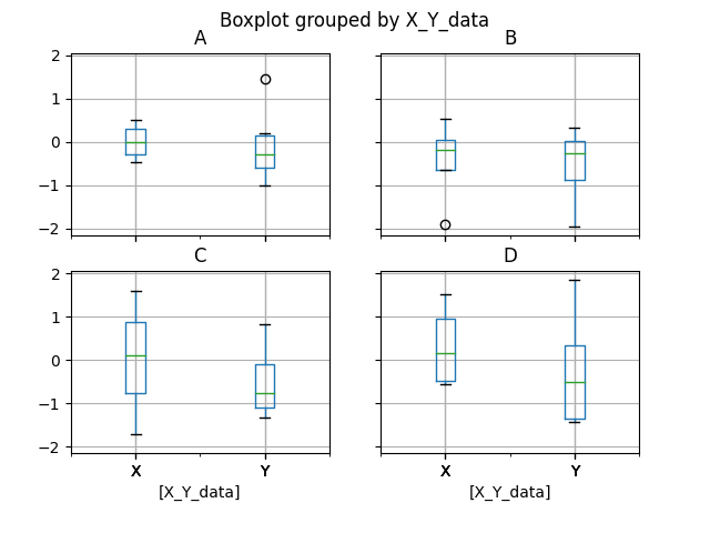
Grouped Box Plots
Pandas allows you to group data by another column and visualize the distribution for each group using the by parameter.
Example
This example uses the by parameter of the DataFrame.boxplot() method to create box plots for grouped data.
import pandas as pd
import numpy as np
import matplotlib.pyplot as plt

# Create a random Data
np.random.seed(42)
data = pd.DataFrame(np.random.randn(10, 4), columns=['A', 'B', 'C', 'D'])

# Adding a grouping column
data['X_Y_data'] = ['X', 'X', 'X', 'X', 'Y', 'Y', 'Y', 'Y', 'Y', 'Y']

# Grouped box plot
plt.figure(figsize=(7, 4))
data.boxplot(by='X_Y_data')
plt.show()
Output
On executing the above code we will get the following output −
Customizing the Box Plot
You can customize the appearance of the box plot by adjusting parameters like color, rotation, fontsize and more.
Example: Colored Box Plot
Following example demonstrates the customization of the box plot appearance using the different parameters of the plot.box() method.
import pandas as pd
import numpy as np
import matplotlib.pyplot as plt

# Create a random Data
np.random.seed(42)
data = pd.DataFrame(np.random.randn(10, 4), columns=['A', 'B', 'C', 'D'])

# Customizing box plot appearance
color_dict = {'boxes': 'DarkRed', 'whiskers': 'DarkGreen',
'medians': 'DarkBlue', 'caps': 'black'}

data.plot.box(color=color_dict, grid=False, sym='r*', notch=True, figsize=(7, 4))
plt.title("Customized Box Plot")
plt.show()
Output
Following is the output of the above code −

Example: Horizontal Box Plot
Pandas box plots are built on top of Matplotlib, so you can pass additional Matplotlib arguments for further customization.
Here is the another example demonstrating the customization of the box plot appearance. In this we will create horizontal box plots using vert=False.
import pandas as pd
import numpy as np
import matplotlib.pyplot as plt

# Create a random Data
np.random.seed(42)
data = pd.DataFrame(np.random.randn(10, 4), columns=['A', 'B', 'C', 'D'])

# Customizing box plot appearance
data.plot.box(vert=False, figsize=(7, 4))
plt.title('Horizontal Box Plot')
plt.show()
Output
After executing the above code, we get the following output −

