- ReactJS Tutorial
- ReactJS - Home
- ReactJS - Introduction
- ReactJS - Installation
- ReactJS - Features
- ReactJS - Advantages & Disadvantages
- ReactJS - Architecture
- ReactJS - Creating a React Application
- ReactJS - JSX
- ReactJS - Components
- ReactJS - Nested Components
- ReactJS - Using Newly Created Components
- ReactJS - Component Collection
- ReactJS - Styling
- ReactJS - Properties (props)
- ReactJS - Creating Components using Properties
- ReactJS - props Validation
- ReactJS - Constructor
- ReactJS - Component Life Cycle
- ReactJS - Event management
- ReactJS - Creating an Event−Aware Component
- ReactJS - Introduce Events in Expense Manager APP
- ReactJS - State Management
- ReactJS - State Management API
- ReactJS - Stateless Component
- ReactJS - State Management Using React Hooks
- ReactJS - Component Life Cycle Using React Hooks
- ReactJS - Layout Component
- ReactJS - Pagination
- ReactJS - Material UI
- ReactJS - Http client programming
- ReactJS - Form Programming
- ReactJS - Controlled Component
- ReactJS - Uncontrolled Component
- ReactJS - Formik
- ReactJS - Conditional Rendering
- ReactJS - Lists
- ReactJS - Keys
- ReactJS - Routing
- ReactJS - Redux
- ReactJS - Animation
- ReactJS - Bootstrap
- ReactJS - Map
- ReactJS - Table
- ReactJS - Managing State Using Flux
- ReactJS - Testing
- ReactJS - CLI Commands
- ReactJS - Building and Deployment
- ReactJS - Example
- Hooks
- ReactJS - Introduction to Hooks
- ReactJS - Using useState
- ReactJS - Using useEffect
- ReactJS - Using useContext
- ReactJS - Using useRef
- ReactJS - Using useReducer
- ReactJS - Using useCallback
- ReactJS - Using useMemo
- ReactJS - Custom Hooks
- ReactJS Advanced
- ReactJS - Accessibility
- ReactJS - Code Splitting
- ReactJS - Context
- ReactJS - Error Boundaries
- ReactJS - Forwarding Refs
- ReactJS - Fragments
- ReactJS - Higher Order Components
- ReactJS - Integrating With Other Libraries
- ReactJS - Optimizing Performance
- ReactJS - Profiler API
- ReactJS - Portals
- ReactJS - React Without ES6 ECMAScript
- ReactJS - React Without JSX
- ReactJS - Reconciliation
- ReactJS - Refs and the DOM
- ReactJS - Render Props
- ReactJS - Static Type Checking
- ReactJS - Strict Mode
- ReactJS - Web Components
- Additional Concepts
- ReactJS - Date Picker
- ReactJS - Helmet
- ReactJS - Inline Style
- ReactJS - PropTypes
- ReactJS - BrowserRouter
- ReactJS - DOM
- ReactJS - Carousel
- ReactJS - Icons
- ReactJS - Form Components
- ReactJS - Reference API
- ReactJS Useful Resources
- ReactJS - Quick Guide
- ReactJS - Useful Resources
- ReactJS - Discussion
ReactJS - static defaultProps Property
React is a popular user interface development library. Sometimes while creating a React app we may want to set default settings for some properties. This is the case where the "defaultProps" idea comes into play.
What is defaultProps?
DefaultProps is a React feature that allows us to provide default values for our component's properties (or props). When a prop is not provided, is undefined, or is missing, these default values will be used. It is important to note, that defaultProps will not be applied if a prop is explicitly set to null.
Usage of defaultProps
class Button extends Component {
   static defaultProps = {
      color: 'blue'
   };

   render() {
      return <button className={this.props.color}>Click me</button>;
   }
}
In this code, we have a Button component that takes a 'color' prop. If the 'color' prop is not given or is undefined, defaultProps moves in and sets the 'color' prop to 'blue' by default.
Examples of defaultProps in Action
If no 'color' prop is provided, the Button component will be set to 'blue' by default.
<Button />
{/* The color is "blue" */}
Even if we directly set the 'color' prop to undefined, defaultProps still takes effect, giving 'color' a default value of 'blue'.
<Button color={undefined} />
{/* The color is "blue" */}
If we change the 'color' prop to null, defaultProps will not override it, and the 'color' will be null.
<Button color={null} />
{/* The color is null */}
If we give a value for the 'color' prop, it will be used instead of the default.
<Button color="red" />
{/* The color is "red" */}
Examples
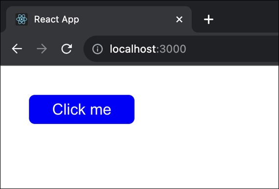
Example − Button Component app
So we will create a React app in which we will show a button component having blue color to show the usage of defaultProps.
Now open the project and navigate to the src folder in the project directory using the code editor. Replace the following code in App.js file −
import React, { Component } from 'react';
import './App.css'; // Import the CSS file

class Button extends Component {
   static defaultProps = {
      color: 'blue'
   };
   render() {
      return <button className={`button ${this.props.color}`}>Click me</button>;
   }
}
class App extends Component {
   render() {
      return (
         <div className="App">
            <Button />
         </div>
      );
   }
}

export default App;
App.css
.button {
   background-color: rgb(119, 163, 208);
   color: white;
   padding: 5px 20px;
   border: 2px;
   margin-top: 25px;
   border-radius: 5px;
   cursor: pointer;
}

.blue {
   background-color: blue;
}
Output
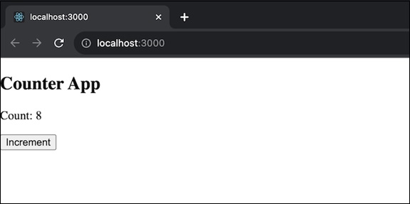
Example − Simple Counter App
In this app we will display a counter that starts from a specified initial value (default is 0). So users can click a button to increment the counter. This app will show us how to use static defaultProps to provide default values for certain properties. The code for this app is given below −
import React, { Component } from 'react';

class Counter extends Component {
   static defaultProps = {
      initialValue: 0,
   };
   constructor(props) {
      super(props);
      this.state = {
         count: this.props.initialValue,
      };
   }
   increment = () => {
      this.setState((prevState) => ({ count: prevState.count + 1 }));
   };

   render() {
      return (
         <div>
            <h2>Counter App</h2>
            <p>Count: {this.state.count}</p>
            <button onClick={this.increment}>Increment</button>
         </div>
      );
   }
}

export default Counter;
Output
Example − Toggle Switch App
In this app we will feature a toggle switch that can be turned on or off. So we will set the initial state to on or off (default is off). And the user can click a button to toggle the switch. So the code for this app is as follows −
import React, { Component } from 'react';

class ToggleSwitch extends Component {
   static defaultProps = {
      defaultOn: false,
   };
   constructor(props) {
      super(props);
      this.state = {
         isOn: this.props.defaultOn,
      };
   }
   toggle = () => {
      this.setState((prevState) => ({ isOn: !prevState.isOn }));
   };

   render() {
      return (
         <div>
            <h2>Toggle Switch App</h2>
            <p>Switch is {this.state.isOn ? 'ON' : 'OFF'}</p>
            <button onClick={this.toggle}>Toggle</button>
         </div>
      );
   }
}

export default ToggleSwitch;
Output
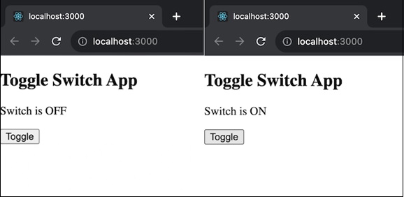
In the above output we can see that there is a button called Toggle so when we click it the message will be changed as per the condition. If the message is Switch is OFF so after clicking the button the message will be changed to Switch is ON.
Summary
defaultProps is a useful feature in React that improves the handling of default values for component properties. It makes sure our components function effectively even if some props are missing or undefined. We can make the code simpler and user-friendly by defining default values.
To Continue Learning Please Login