- Adobe Flex Tutorial
- Flex - Home
- Flex - Overview
- Flex - Environment
- Flex - Applications
- Flex - Create Application
- Flex - Deploy Application
- Flex - Life Cycle Phases
- Flex - Style with CSS
- Flex - Style with Skin
- Flex - Data Binding
- Flex - Basic Controls
- Flex - Form Controls
- Flex - Complex Controls
- Flex - Layout Panels
- Flex - Visual Effects
- Flex - Event Handling
- Flex - Custom Controls
- Flex - RPC Services
- Flex - FlexUnit Integration
- Flex - Debug Application
- Flex - Internationalization
- Flex - Printing Support
- Adobe Flex Resources
- Flex - Quick Guide
- Flex - Useful Resources
- Flex - Discussion
Flex - ProgressBar Control
Introduction
The ProgressBar control provides users a visual representation of the progress of a task over time.
Class Declaration
Following is the declaration for mx.controls.ProgressBar class −
public class ProgressBar
   extends UIComponent
      implements IFontContextComponent
Public Properties
| Sr.No | Property & Description |
|---|---|
| 1 | alignToolTip : String = "Align" The ToolTip that appears when the user hovers over the text alignment buttons. |
| 2 | conversion : Number Number used to convert incoming current bytes loaded value and the total bytes loaded values. |
| 3 | direction : String Direction in which the fill of the ProgressBar expands toward completion. |
| 4 | indeterminate : Boolean Whether the ProgressBar control has a determinate or indeterminate appearance. |
| 5 | label : String Text that accompanies the progress bar. |
| 6 | labelPlacement : String |
| 7 | maximum : Number Largest progress value for the ProgressBar. |
| 8 | minimum : Number Smallest progress value for the ProgressBar. |
| 9 | mode : String Specifies the method used to update the bar. |
| 10 | percentComplete : Number [read-only] Percentage of process that is completed.The range is 0 to 100. |
| 11 | source : Object Refers to the control that the ProgressBar is measuring the progress of. |
| 12 | value : Number [read-only] Read-only property that contains the amount of progress that has been made - between the minimum and maximum values. |
Public Methods
| Sr.No | Method & Description |
|---|---|
| 1 | ProgressBar() Constructor. |
| 2 | setProgress(value:Number, total:Number):void Sets the state of the bar to reflect the amount of progress made when using manual mode. |
Events
| Sr.No | Event & Description |
|---|---|
| 1 | complete Dispatched when the load completes. |
| 2 | hide Dispatched when an object's state changes from visible to invisible. |
| 3 | progress Dispatched as content loads in event or polled mode. |
| 4 | show Dispatched when the component becomes visible. |
Methods Inherited
This class inherits methods from the following classes −
- mx.core.UIComponent
- mx.core.FlexSprite
- flash.display.Sprite
- flash.display.DisplayObjectContainer
- flash.display.InteractiveObject
- flash.display.DisplayObject
- flash.events.EventDispatcher
- Object
Flex ProgressBar Control Example
Let us follow the following steps to check usage of ProgressBar control in a Flex application by creating a test application −
| Step | Description |
|---|---|
| 1 | Create a project with a name HelloWorld under a package com.tutorialspoint.client as explained in the Flex - Create Application chapter. |
| 2 | Modify HelloWorld.mxml as explained below. Keep rest of the files unchanged. |
| 3 | Compile and run the application to make sure business logic is working as per the requirements. |
Following is the content of the modified mxml file src/com.tutorialspoint/HelloWorld.mxml.
<?xml version = "1.0" encoding = "utf-8"?>
<s:Application xmlns:fx = "http://ns.adobe.com/mxml/2009"
   xmlns:s = "library://ns.adobe.com/flex/spark"
   xmlns:mx = "library://ns.adobe.com/flex/mx"
   width = "100%" height = "100%" minWidth = "500" minHeight = "500">

   <fx:Style source = "/com/tutorialspoint/client/Style.css" />
   <fx:Script>
      <![CDATA[
         private var increment:uint = 10;

         private function runProgressBar():void {
            if(increment < =  100) {
               progressBar.setProgress(increment,100);
               progressBar.label =  "Current Progress" + " " + increment + "%";
               increment+ = 10;
            }

            if(increment > 100) {
               increment = 0;
            }
         }
      ]]>
   </fx:Script>

   <s:BorderContainer width = "630" height = "480" id = "mainContainer"
      styleName = "container">
      <s:VGroup width = "100%" height = "100%" gap = "50"
         horizontalAlign = "center" verticalAlign = "middle">
         <s:Label id = "lblHeader" text = "Complex Controls Demonstration"
            fontSize = "40" color = "0x777777" styleName = "heading" />

         <s:Panel id = "progressBarPanel" title = "Using ProgressBar"
            width = "500" height = "300">
            <s:layout>
               <s:VerticalLayout  gap = "10" verticalAlign = "middle"
                  horizontalAlign = "center" />
            </s:layout>

            <s:Label color = "0x323232"
               text = "Click the button to start the progress bar." />
            <s:Button id = "btnStart" label = "Start"
               click = "runProgressBar();" />

            <mx:ProgressBar id = "progressBar"
               labelPlacement = "bottom" minimum = "0"
               visible = "true" maximum = "100"
               color = "0x323232" label = "CurrentProgress 0%"
               direction = "right" mode = "manual" width = "90%" />
         </s:Panel>
      </s:VGroup>
   </s:BorderContainer>
</s:Application>
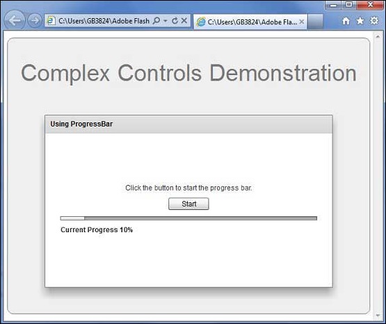
Once you are ready with all the changes done, let us compile and run the application in normal mode as we did in Flex - Create Application chapter. If everything is fine with your application, it will produce the following result: [ Try it online ]