
Article Categories
- All Categories
-
 Data Structure
-
 Networking
-
 RDBMS
RDBMS
-
 Operating System
-
 Java
Java
-
 MS Excel
-
 iOS
iOS
-
 HTML
HTML
-
 CSS
CSS
-
 Android
-
 Python
-
 C Programming
-
 C++
C++
-
 C#
C#
-
 MongoDB
-
 MySQL
MySQL
-
 Javascript
-
 PHP
PHP
Using Cards in Snack
Sometimes, the task is to show a small bounded area with some text, picture, or colors and to retrieve more information from it later or to perform some actions on selecting that item. For this Card from react-native-paper can be used. More than one Card can also be used on a Screen, integrating it as a list item and it can be made clickable. In this article, the React native and javascript code is shown with two different examples where first a single card with an Image is used in an app, and in the second example multiple cards are used with icons and are made clickable.
Algorithm-1
Step 1 ? Import Text, View, StyleSheet, and Button from 'react-native'. Also import Card from react-native-paper.
Step 2 ? Make the App.js and write the code for using the card. Use <Card.Cover> to set the required image and use <Card.Content> to set the content inside the card.
Step 3 ? To specify further actions Buttons are used with onPress() functions, inside the <Card> tags.
Step 4 ? Card content formatting styles are implemented using StyleSheet.
Step 5 ? Check the Card Output. Click the buttons and check the results.
Example 1: Using a Single Card with an Image.
The important file used in the project is
App.js
Stars11.jpg is the image file that is used in this project.
App.js : This is the main javascript file for this project.
Example
import {Component} from 'react';
import {Text, View, StyleSheet, Button } from 'react-native';
import { Card } from 'react-native-paper';

export default class CardsExampleOne extends Component{
   constructor() {
      super();
      this.state = {
         myMsgNote: ''
      };
   }
   render() {
      return (
         <View style={styles.mainSpace}>

            <Text style={styles.textSty}>
               Greeting Card Example
            </Text>
            <Card>
               <Card.Content style={{padding: 6, margin:5, justifyContent:"center"}}>
                  <Text style={styles.textSty}>
                     {this.state.myMsgNote}
                  </Text>
                  <Card.Cover style={{width: 294, height: 126, paddingLeft:8}} source={require('./stars11.jpg')}>
                  </Card.Cover>
               </Card.Content>

               <Button onPress={()=>this.setState({ myMsgNote: "Happy Birthday To You!" })} title="Show Message" color="#088da5" />
               <Button onPress={()=>this.setState({ myMsgNote: "" })
               }
               title="Hide Message" color="#61bdac" />
            </Card>
         </View>
      );
   }
}
const styles = StyleSheet.create({
   mainSpace: {
      flex: 1,
      justifyContent: 'center',
      backgroundColor: '#cce0ff',
      padding: 8,
   },
   textSty: {
      margin: 24,
      fontSize: 18,
      fontWeight: 'bold',
      textAlign: 'center',
      padding: 6,
   },
});
Output
The result can be seen online. As the user types in the code the Web view is selected by default and the result appears instantly.
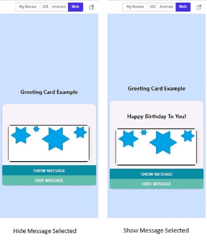
Card Output in the Web view in Snack.
Algorithm-2
Step 1 ? Import Text, View, and StyleSheet from 'react-native'. Also import Card, and List from react-native-paper.
Step 2 ? Make the App.js and write the code for using the List. Use ?List.Icon> tags to integrate the icons with list items.
Step 3 ? Use <List.Item> tag to specify the left and right contents of the list item and also the action to be performed on clicking it. Use <Card> tag inside the <List.Item> tag. Also, use <Card.Content> to set the content inside the card.
Step 4 ?To specify further actions onPress() functions inside the <List.Item> tags are specified.
Step 5 ? Card content formatting styles are implemented using StyleSheet.
Step 6 ? Click the list of Items (anywhere on the Cards and Icons) and check the results.
Example 2: Using Multiple Cards as List Items.
The Important file used in the project is
App.js
App.js : This is the main javascript file for this project.
Example
import{Component}from'react';
import{Text,View,StyleSheet}from'react-native';
import{Card,List}from'react-native-paper';

exportdefaultclassCardsExampleOneextendsComponent{
   constructor(){
      super();
      this.state={
         myMsgNote:''
      };
   }

   render(){
      return(
         <Viewstyle={styles.mainSpace}>

            <Textstyle={styles.textSty}>
               TelephoneDirectory
            </Text>

            <List.Item
               onPress={()=>console.log('CallingHomeNow')}
               left={props=><List.Iconicon="phone"/>}
               right={props=><Cardstyle={styles.cardSty}>

            <Card.Contentstyle={{}}>
               <Textstyle={styles.textSty}>
                  Home
               </Text>
            </Card.Content>

            </Card>}
            />
            <List.Item
               onPress={()=>console.log('CallingSchoolNow')}
               left={props=><List.Iconicon="phone"/>}
               right={props=><Cardstyle={styles.cardSty}>
            <Card.Content>
               <Textstyle={styles.textSty}>
                  School
               </Text>
            </Card.Content>
            </Card>}
            />

            <List.Item
               onPress={()=>console.log('CallingOfficeNow')}
               left={props=><List.Iconicon="phone"/>}
               right={props=><Cardstyle={styles.cardSty}>
            <Card.Content>
               <Textstyle={styles.textSty}>
                  Office
               </Text>
            </Card.Content>
            </Card>}
            />
         </View>
      );
   }
}

conststyles=StyleSheet.create({
   mainSpace:{
      flex:1,
      justifyContent:'center',
      backgroundColor:'#cce0ff',
      padding:8,
   },
   textSty:{
      fontSize:18,
      fontWeight:'bold',
      textAlign:'center',
   },
   cardSty:{
      shadowColor:'black',
      elevation:4,
      width:"90%",
      backgroundColor:"#aaaa2d",
   }
});
Output
The result can be seen online.
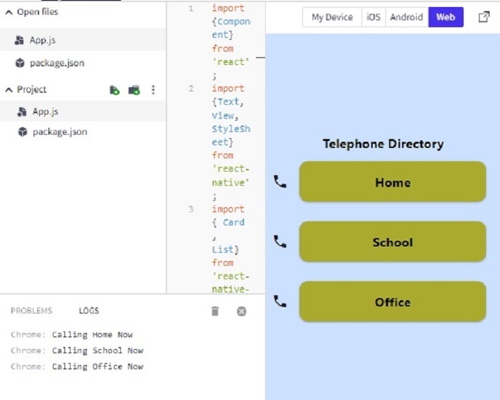
Note ? This project uses the List from 'react-native-paper'.
In this article, using two different examples, the way to use cards on Expo Snack is given. First, the method is given for using a single card with an image and then the process of performing further action is specified. The method of using multiple cards as List Items and performing the actions on clicking a card is also shown in example 2.

407 Views
