
Article Categories
- All Categories
-
 Data Structure
-
 Networking
-
 RDBMS
RDBMS
-
 Operating System
-
 Java
Java
-
 MS Excel
-
 iOS
iOS
-
 HTML
HTML
-
 CSS
CSS
-
 Android
-
 Python
-
 C Programming
-
 C++
C++
-
 C#
C#
-
 MongoDB
-
 MySQL
MySQL
-
 Javascript
-
 PHP
PHP
-
 Economics & Finance
Using Tabs in Snack
Tabs are created to implement multipage views in apps. Tabs are often placed on the top or at the bottom of the screen. Some libraries permit making tabs in mobile apps. Tabs can also be made using simple components like buttons. In this article, the React native and javascript code is shown with two different examples where in the first example, the buttons are used to make tabs. In the other example, the createMaterialTopTabNavigator from '@react-navigation/material-top-tabs' is used to make tabs and then render these on the screen of the device.
Algorithm 1
Step 1 ? Import Text, View, StyleSheet, and Button from 'react-native'.
Step 2 ? Write separate function to show the contents of different pages.
Step 3 ? Make the App.js and write the code. Make four buttons and place these as top tabs.
Step 4 ? Create the page content for the specified tabs and display it through the button clicks.
Step 5 ? Create a new style and call it selectedOne . Set this style when a given Tab is selected. This will make the specified tab look different from the other non selected tabs in that row.
Step 6 ? Check the results.
Example 1: Making Tabs using Buttons on Snack.
The important file used in the project is
App.js
App.js : This is the main javascript file for this project.
Example
import{Component}from'react';
import{Text,View,StyleSheet,Button}from'react-native';

exportdefaultclassAppextendsComponent{
   constructor(props){
      super(props);
      this.state={
         LessonSelected:'One',
         btnClr:"#6690ad",
      };
   }
   render(){
      return(
         <Viewstyle={styles.mainSpace}>
            <Viewstyle={styles.Lessonbuttons}>

               <Viewstyle={this.state.LessonSelected==='One'?styles.selectedOne:null}>
                  <Button
                  onPress={()=>{
                     this.setState({LessonSelected:'One'});
                  }}
                  title="Lesson1"
                  color={this.state.btnClr}
                  borderColor='#000'
                  />
               </View>
               <Viewstyle={this.state.LessonSelected==='Two'?styles.selectedOne:null}>
                  <Button
                  onPress={()=>{
                     this.setState({LessonSelected:'Two'});
                  }}
                  title="Lesson2"
                  color={this.state.btnClr}
                  />
               </View>
               <Viewstyle={this.state.LessonSelected==='Three'?styles.selectedOne:null}>
                  <Button
                  onPress={()=>{
                     this.setState({LessonSelected:'Three'});
                  }}
                  title="Lesson3"
                  color={this.state.btnClr}
                  />

               </View>
               <Viewstyle={this.state.LessonSelected==='Four'?styles.selectedOne:null}>
                  <Button
                  onPress={()=>{
                     this.setState({LessonSelected:'Four'});
                  }}
                  title="Lesson4"
                  color={this.state.btnClr}
                  />
               </View>
            </View>

            {this.state.LessonSelected==='One'?this.showLesson1()
               :this.state.LessonSelected==='Two'?this.showLesson2()
               :this.state.LessonSelected==='Three'?this.showLesson3()
               :this.state.LessonSelected==='Four'?this.showLesson4()
               :this.showLesson1()
            }
         </View>
      );
   }
   showLesson1=()=>(
      <Viewstyle={[styles.Lessoncontents,styles.Lessons]}>
         <Textstyle={styles.LessonHeader}>Lesson1</Text>
         <Textstyle={styles.LessonContent}>Contents</Text>
      </View>
   );

   showLesson2=()=>(
      <Viewstyle={[styles.Lessoncontents,styles.Lessons]}>
         <Textstyle={styles.LessonHeader}>Lesson2</Text>
         <Textstyle={styles.LessonContent}>Contents</Text>
      </View>
   );

   showLesson3=()=>(
      <Viewstyle={[styles.Lessoncontents,styles.Lessons]}>
         <Textstyle={styles.LessonHeader}>Lesson3</Text>
         <Textstyle={styles.LessonContent}>Contents</Text>
      </View>
   );

   showLesson4=()=>(
      <Viewstyle={[styles.Lessoncontents,styles.Lessons]}>
         <Textstyle={styles.LessonHeader}>Lesson4</Text>
         <Textstyle={styles.LessonContent}>Contents</Text>
      </View>
   );
}

conststyles=StyleSheet.create({
   mainSpace:{
      flex:1,
      marginTop:50,
   },
   Lessonbuttons:{
      width:'100%',
      flexDirection:'row',
      justifyContent:'space-between',
   },
   Lessoncontents:{
      flex:1,
      width:'100%',
      padding:10,
      marginTop:10,
      borderWidth:1,
      borderColor:'black',
   },
   LessonHeader:{
      color:'black',
      fontSize:28,
      textAlign:'center',
   },
   selectedOne:{
      borderBottomWidth:10,
      borderBottomColor:'#ffc181',
   },
});
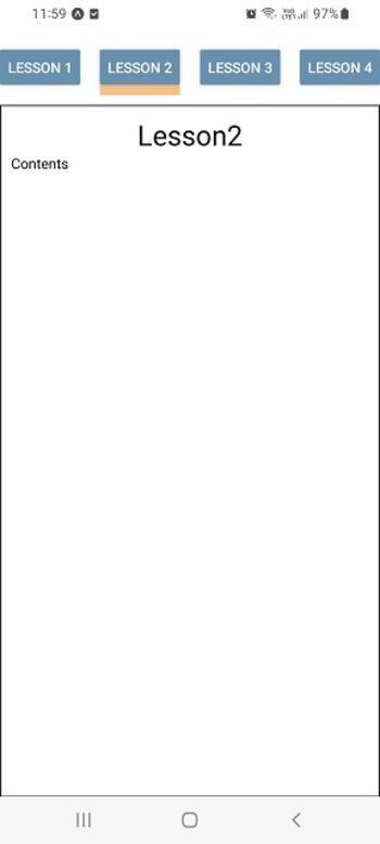
Output
Although the result can be seen online, however, it is given here as shown on the personal mobile device.
Algorithm 2
Step 1 ? Import Text, View, StyleSheet from 'react-native'.
Step 2 ? Import NavigationContainer from '@react-navigation/native' and then import createMaterialTopTabNavigator from '@react-navigation/material-top-tabs'
Step 3 ? Write separate function to show the contents of different pages.
Step 4 ? Make the App.js and write the code. Make a LessonTab using createMaterialTopTabNavigator()
Step 5 ? Make NavigationContainer tags and create LessonTab.Navigator inside these. Call the page content functions from different LessonTab.Screen.
Step 6 ? Check the results
Example 2: Making Tabs using createMaterialTopTabNavigator from '@react-navigation/material-top-tabs'..
The Important file used in the project is
App.js
App.js : This is the main javascript file for this project.
Example
import {Component} from 'react';
import { Text, View, StyleSheet } from 'react-native';
import { NavigationContainer } from '@react-navigation/native';
import { createMaterialTopTabNavigator } from '@react-navigation/material-top-tabs';

const LessonTab = createMaterialTopTabNavigator();

export default class TopTabs extends Component {
   constructor(props) {
      super(props);
      this.state = {
         LessonSelected: 'One',
         btnClr: "#6690ad",
      };
   }
   render(){
      return (
         <View style={styles.mainSpace}>
            <NavigationContainer>
               <LessonTab.Navigator
               tabBarOptions={{
               activeTintColor: '#e3486a',
               inactiveTintColor: '#7448e3',
               }}
               >
                  <LessonTab.Screen name="Lesson 1" component={this.showLesson1} />
                  <LessonTab.Screen name="Lesson 2" component={this.showLesson2} />
                  <LessonTab.Screen name="Lesson 3" component={this.showLesson3} />
                  <LessonTab.Screen name="Lesson 4" component={this.showLesson4} />
               </LessonTab.Navigator>
            </NavigationContainer>
         </View>
      );
   }
   showLesson1 = () => (
      <View style={[styles.Lessoncontents, styles.Lessons]}>
         <Text style={styles.LessonHeader}>Lesson1</Text>
         <Text style={styles.LessonContent}>Contents</Text>
      </View>
   );
   showLesson2 = () => (
      <View style={[styles.Lessoncontents, styles.Lessons]}>
         <Text style={styles.LessonHeader}>Lesson2</Text>
         <Text style={styles.LessonContent}>Contents</Text>
      </View>
   );

   showLesson3 = () => (
      <View style={[styles.Lessoncontents, styles.Lessons]}>
         <Text style={styles.LessonHeader}>Lesson3</Text>
         <Text style={styles.LessonContent}>Contents</Text>
      </View>
   );

   showLesson4 = () => (
      <View style={[styles.Lessoncontents, styles.Lessons]}>
         <Text style={styles.LessonHeader}>Lesson 4 </Text>
         <Text style={styles.LessonContent}>Contents</Text>
      </View>
   );
}

const styles = StyleSheet.create({
   mainSpace: {
      flex: 1,
      marginTop: 50,
   },
   Lessoncontents: {
      flex: 1,
      width: '100%',
      padding: 10,
      marginTop: 10,
      borderWidth: 1,
      borderColor: 'black',
   },
   LessonHeader: {
      color: 'black',
      fontSize: 28,
      textAlign: 'center',
   },
});
Output
The result can be seen online. As the user types in the code the Web view is selected by default and the result appears instantly.

In this article, using two different examples, the ways to make top tabs on Expo Snack are given. First the method is given for making tabs using simple buttons and then the method of making top tabs using createMaterialTopTabNavigator from '@react-navigation/material-top-tabs' is presented as an example and the outputs of these on online web view and the personal mobile device are shown.

348 Views
