- Time Series - Home
- Time Series - Introduction
- Time Series - Programming Languages
- Time Series - Python Libraries
- Data Processing & Visualization
- Time Series - Modeling
- Time Series - Parameter Calibration
- Time Series - Naive Methods
- Time Series - Auto Regression
- Time Series - Moving Average
- Time Series - ARIMA
- Time Series - Variations of ARIMA
- Time Series - Exponential Smoothing
- Time Series - Walk Forward Validation
- Time Series - Prophet Model
- Time Series - LSTM Model
- Time Series - Error Metrics
- Time Series - Applications
- Time Series - Further Scope
- Time Series Useful Resources
- Time Series - Quick Guide
- Time Series - Useful Resources
- Time Series - Discussion
Time Series - Auto Regression
For a stationary time series, an auto regression models sees the value of a variable at time t as a linear function of values p time steps preceding it. Mathematically it can be written as −
$$y_{t} = \:C+\:\phi_{1}y_{t-1}\:+\:\phi_{2}Y_{t-2}+...+\phi_{p}y_{t-p}+\epsilon_{t}$$
Where,p is the auto-regressive trend parameter
$\epsilon_{t}$ is white noise, and
$y_{t-1}, y_{t-2}\:\: ...y_{t-p}$ denote the value of variable at previous time periods.
The value of p can be calibrated using various methods. One way of finding the apt value of p is plotting the auto-correlation plot.
Note − We should separate the data into train and test at 8:2 ratio of total data available prior to doing any analysis on the data because test data is only to find out the accuracy of our model and assumption is, it is not available to us until after predictions have been made. In case of time series, sequence of data points is very essential so one should keep in mind not to lose the order during splitting of data.
An auto-correlation plot or a correlogram shows the relation of a variable with itself at prior time steps. It makes use of Pearsons correlation and shows the correlations within 95% confidence interval. Lets see how it looks like for temperature variable of our data.
Showing ACP
In [141]:
split = len(df) - int(0.2*len(df))
train, test = df['T'][0:split], df['T'][split:]
In [142]:
from statsmodels.graphics.tsaplots import plot_acf

plot_acf(train, lags = 100)
plt.show()
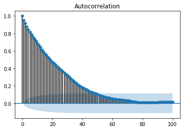
All the lag values lying outside the shaded blue region are assumed to have a csorrelation.
