- Salesforce - Home
- Salesforce - Overview
- Salesforce - Architecture
- Salesforce - Environment
- Salesforce - Sales Cloud
- Salesforce - Service Cloud
- Salesforce - Navigating Setup
- Salesforce - Standard Objects
- Salesforce - Custom Objects
- Salesforce - Master Detail
- Salesforce - Lookup Relationship
- Salesforce - Schema Builder
- Data Security
- Salesforce - Control Access Org
- Salesforce - Control Access Objects
- Salesforce - Control Access Fields
- Salesforce - Control Access Records
- Salesforce - Create a Role Hierarchy
- Salesforce - Define Sharing Rules
- Process Builder
- Automate Business Processes
- Salesforce - Importing Data
- Salesforce - Exporting Data
- Salesforce - Reports
- Salesforce - Dashboards
- Salesforce - Using Formula Fields
- Visualforce
- Salesforce - Visualforce Pages
- Salesforce - Variables & Formulas
- Salesforce - Standard Controllers
- Salesforce - Records, Fields & Tables
- Salesforce - Using Forms
- Salesforce - List Controllers
- Salesforce - Static Resources
- Salesforce Useful Resources
- Salesforce - Quick Guide
- Salesforce - Useful Resources
- Salesforce - Discussion
Salesforce - Dashboards
Dashboards provide more insights than reports as they combine the data from many reports and show a summarized result. Looking at many reports at a time gives the flexibility of combining the results from them quickly. Also summaries in dashboards help us decide on action plans quicker. The dashboards can contain charts, graphs and Tabular data.
Let us now see the steps to create a dashboard.
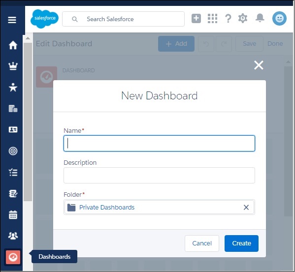
Step 1
Go to the Dashboard button on the left menu bar in the Salesforce Home Page. Now, click on the New Dashboard and the following window appears. Fill in the name and description.
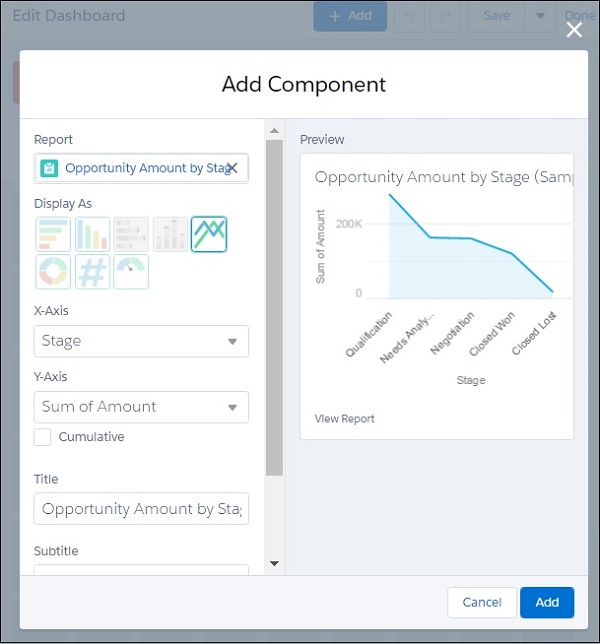
Step 2
Next we add components to the dashboards. Components are graphical objects which present the summarized or tabular data with visual indicators like colors, etc. In our case we add two components as shown below.
Choose the Opportunity Amount by Stage report and present it as a line chart.
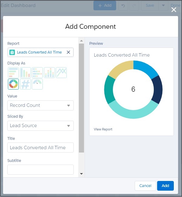
Similarly, we choose another component to be added. Choose the report Leads Converted All Time as shown below.
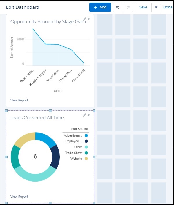
Step 3
In this step, we see both the components are visible in the dashboard. We can resize the components for better visibility. And there is still more place for additional components.