- Mobile Angular UI - Home
- Mobile Angular UI - Overview
- Mobile Angular UI - Installation
- Mobile Angular UI - Project Setup
- Mobile Angular UI - My First App
- Mobile Angular UI - Layouts
- Mobile Angular UI - Components
- Mobile Angular UI - Dropdowns
- Mobile Angular UI - Accordions
- Mobile Angular UI - Tabs
- Mobile Angular UI - Drag and Drop
- Mobile Angular UI - Scrollable Areas
- Mobile Angular UI - Forms
- Mobile Angular UI - Swipe Gestures
- Mobile Angular UI - Toggle Switch
- Mobile Angular UI - Sections
- Mobile Angular UI - Core Details
- Mobile Angular UI - Touch Events
- Mobile Angular UI - PhoneGap & Cordova
- Mobile Angular UI - Creating APK File
- Mobile Angular UI - APP Development
- Mobile Angular UI - Examples
- Mobile Angular UI Resources
- Mobile Angular UI - Quick Guide
- Mobile Angular UI - Useful Resources
- Mobile Angular UI - Discussion
Mobile Angular UI - Quick Guide
Mobile Angular UI - Overview
Mobile Angular UI is an open-source framework for developing hybrid mobile apps. Mobile Angular UI makes use of Twitter Bootstrap and AngularJS that helps to create attractive HTML5 hybrid mobile and desktop apps.
Features of Mobile Angular UI
Mobile Angular UI has some cool components that are listed below −
Navbars − Navbars makes use of the top and bottom portion of the device screen. We can use the top navbar to display the menu items or the header section. The bottom navbar can be used to display the footer section.
Scrollable Areas − This feature makes the app more user friendly. Adding css classes .scrollable-header/.scrollable-footer, will add fixed header/footer to the scrollable area you want. You dont have to take any trouble about the height and positioning, the css will take care of everything.
Accordion − Accordions are mostly used when the content is supposed to be in section type of view and any, one section is visible at a time. You can hide and open the next section to view the contents in it.
Dropdowns − To work with dropdowns adding the css .dropdown-menu to the container serves the purpose.
Modals and Overlays − Modals and Overlays will show a pop-up type window on your screen. Overlays differ from modal only in how the container is displayed for it.
Sections − Sections are containers that are displayed inside the body. You can modify the layout of your display in the device with classes available with sections. You can make use of the classes like .section-default, .section-primary, .section-success, .section-info, .section-warning or .section-danger to change the layout.
Sidebars − The sidebars occupy the left and right side of the screen. They are always hidden and activated when the item connected to the left side or right side is clicked. It is the best way to utilize the space on the screen.
Toggle Switch − Mobile Angular UI offers toggle switch elements using the ui-switch directive. The ui-switch directive makes a toggle when applied on to a boolean ngModel value.
Tabs − Tabs are useful components available in angular mobile ui.Tabs are available in the same wrapper and show your contents in separate pane just like how the tabs are opened in the browser. Only one tab is displayed to the user at a time.
Advantages of Mobile Angular UI
The following are the advantages of Mobile Angular UI −
Mobile Angular UI provides cool UI mobile components like navbar, sidebars, modals and overlays, switches, etc.
Easy to create hybrid apps as it makes use of AngularJS and Twitter Bootstrap that is very easy to learn and get started. Also, its a free open source framework.
It is possible to use ionic components along with Mobile Angular UI components.
Disadvantages of Mobile Angular UI
The following are the disadvantages of Mobile Angular UI −
Being a JavaScript-only framework, applications written in AngularJS are not safe. Server-side authentication and authorization are must to keep an application secure.
As the AngularJS directives are added to the HTML markup debugging becomes a little difficult when the error comes up.
Mobile Angular UI - Installation
In this chapter, we will install Mobile Angular UI, so that we can use it in our project.
There are two ways to install Mobile Angular UI −
- Download from Github
- Using Npm
Download from Github
Go to the following github link − https://github.com/mcasimir/mobile-angular-ui/releases and you can download the latest angular mobile UI. The github link for mobile angular ui is as follows
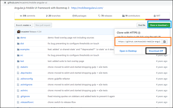
Click on the Clone or download button (highlighted in blue) and it shows you the GitHub link (highlighted in orange) that can be cloned and a Download ZIP (highlighted in black) wherein you can download the full code of Angular Mobile UI.
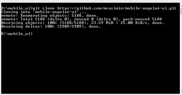
To clone the GitHub link you need to install git. Make sure you have git installed on your system if you dont have to follow this link to install GIT.
First will clone the github link − https://github.com/mcasimir/mobile-angular-ui.git.
To get the mobile angular UI files − cd mobile-angular-ui/src/js.
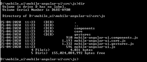
The files that you need are present as shown above.
Using Npm
Using npm is the easiest way to install. Make sure you have nodejs and npm installed. If not, follow this link to install nodejs on your system.
Open your command prompt and create a directory called uiformobile/. Go inside the uiformobile/ using cd command.
Now execute the following command −
npm init
The command npm init will initialize the project −
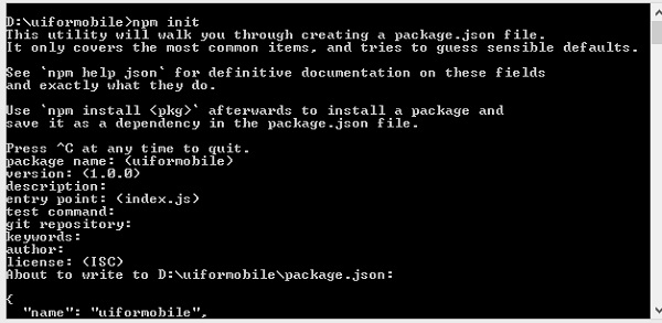
It will create package.json as shown below −
{
   "name": "uiformobile",
   "version": "1.0.0",
   "description": "",
   "main": "index.js",
   "scripts": {
      "test": "echo \"Error: no test specified\" && exit 1"
   },
   "author": "",
   "license": "ISC"
}
Now run the following command to install mobile angular UI.
npm install --save mobile-angular-ui
You are done with installing the mobile angular UI, let us now see how to make use of it to create a mobile app.
Mobile Angular UI - Project Setup
This chapter will work on the project setup. We are going to make use of this setup to work with examples in the rest of the chapters.
The project setup will be done using npm, as it is easy to install any packages required.
Open your command prompt and create a directory called uiformobile/ and enter the directory using cd command.
Now execute the following command −
npm init
The command npm init will initialize the proect −
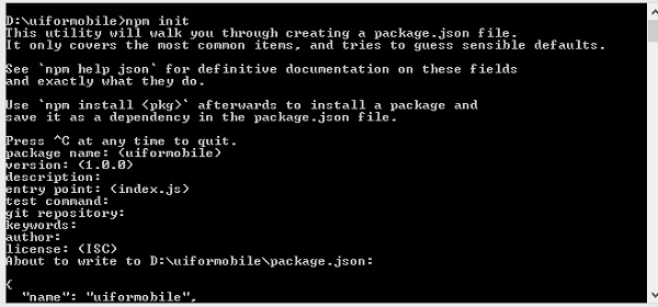
It will create package.json as shown below −
{
   "name": "uiformobile",
   "version": "1.0.0",
   "description": "",
   "main": "index.js",
   "scripts": {
      "test": "echo \"Error: no test specified\" && exit 1"
   },
   "author": "",
   "license": "ISC"
}
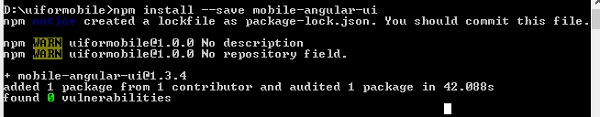
Now run following command to install mobile angular ui.
npm install --save mobile-angular-ui

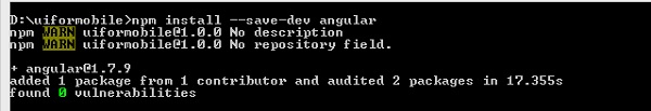
To work with Mobile Angular UI, we need AngularJS. Let us install that using the following command −
npm install --save-dev angular
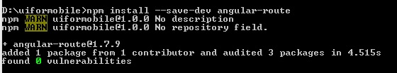
We also need the angular-route to work with routing. To install it the command is −
npm install --save-dev angular-route
We would need a server that will run our app in the browser. We will make use of express.
The command to install express is −
npm install --save-dev express
Create a file server.js inside the root folder. This file will have the express command to start the server.
Here are the details of server.js −
const express=require('express')
const app=express();
const port=3000;
var path=require("path");
app.use("/node_modules", express.static("D:/uiformobile/node_modules"));
app.use("/src", express.static("D:/uiformobile/src/"));
app.use("/src/js", express.static("D:/uiformobile/src/js"));
app.all("/*", function (req, res, next) {
   res.sendFile("index.html", { root: "D:/uiformobile/" });
});
app.listen(port, () => console.log('Starting your Mobile Angular App on port ${port}!'))
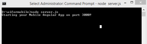
To start the server, use the following command −
node server.js.
The server will start at port 3000. You can make use of http://localhost:3000/ to see the UI in your browser.
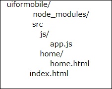
The final folder structure is as shown below −
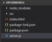
The folder node_modules/ has all the packages installed for mobile_angular_ui, angularjs, and angular-route.
The src/ folder will have the HTML and js files required for the development of UI. The index.html is the start point that will be seen when you hit http://localhost:3000/.
Now the required packages are installed. Let us now talk about the important css and js files we need. Though the framework is meant for Mobile Application, it can also be used for desktop apps.
Following are the important css files that are mandatory to be included in your .html files.
| Sr.No | File & Description |
|---|---|
| 1 | mobile-angular-ui-base.css This css file is meant for mobile devices and tablets. |
| 2 | mobile-angular-ui-desktop.css Responsive css file meant to be used on desktop and mobile devices. |
| 3 | mobile-angular-ui-hover.css This has css rules for hover. |
| 4 | angular.min.js AngularJS file that we need to start with the project. |
| 5 | mobile-angular-ui.min.js This is the mobile angular UI js file that we need to use in the dependency module in AngularJS module. This is the core module. |
| 6 | angular-route.min.js This is an AngularJS Route file used for Routing. |
All the above files are present inside node_modules/. We are done with the project setup, now we are going to make use of this project in the next chapter to develop our first app.
Mobile Angular UI - My First App
In this chapter, we will create our first app that will run on mobile as well as on desktop.
The project setup we created in previous chapter has the following structure −
uiformobile/
   node_modules/
   src/
   package.json
   index.html
Follow the steps to build a simple UI using Mobile Angular UI.
Step 1
Add following css files in the html head section as shown below −
<!-- Required for desktop -->
<link rel="stylesheet" href="/node_modules/mobile-angular-ui/dist/css/mobile-angular-ui-hover.min.css" />

<!-- Mandatory CSS -->
<link rel="stylesheet" href="/node_modules/mobile-angular-ui/dist/css/mobile-angular-ui-base.min.css" />

<!-- Required for desktop -->
<link rel="stylesheet" href="/node_modules/mobile-angular-ui/dist/css/mobile-angular-ui-desktop.min.css" />
Next add the js files −
<script src="/node_modules/angular/angular.min.js"></script>
<script src="/node_modules/angular-route/angular-route.min.js"></script>
<script src="/node_modules/mobile-angular-ui/dist/js/mobile-angular-ui.min.js"></script>
The index.html file will look as follows −
<!DOCTYPE html>
<html>
   <head>
      <meta charset="utf-8">
      <title>My App</title>
      <!-- Required for desktop -->
      <link rel="stylesheet" href="/node_modules/mobile-angular-ui/dist/css/mobile-angular-ui-hover.min.css" />

      <!-- Mandatory CSS -->
      <link rel="stylesheet" href="/node_modules/mobile-angular-ui/dist/css/mobile-angular-ui-base.min.css" />

      <!-- Required for desktop -->
      <link rel="stylesheet" href="/node_modules/mobile-angular-ui/dist/css/mobile-angular-ui-desktop.min.css" />
      <script src="/node_modules/angular/angular.min.js"></script>
      <script src="/node_modules/angular-route/angular-route.min.js"></script>
      <script src="/node_modules/mobile-angular-ui/dist/js/mobile-angular-ui.min.js"></script>
   </head>
   <body>
   </body>
</html>
Step 2
We will see the basic layout of the mobile angular UI as below −
<body ng-app="myFirstApp">

   <!-- Sidebars -->
   <div class="sidebar sidebar-left"><!-- ... --></div>
   <div class="sidebar sidebar-right"><!-- ... --></div>

   <div class="app">
   <div class="navbar navbar-app navbar-absolute-top"><!-- Top Navbar --></div>
   <div class="navbar navbar-app navbar-absolute-bottom"><!-- Bottom Navbar --></div>

      <!-- App body -->
         <div class='app-body'>
            <div class='app-content'>
               <ng-view></ng-view>
            </div>
         </div>
      </div><!-- ~ .app -->

   <!-- Modals and Overlays -->
   <div ui-yield-to="modals"></div>

</body>
Step 3
Create a js/ folder in src/ and add app.js to it.
Define the module and add Mobile angular UI and Angular Route as dependency as shown below −
<script type="text/javascript">
   'ngRoute',
      angular.module('myFirstApp', [
      'mobile-angular-ui'
   ]);
</script>
Add ng-app=myFirstApp to the <body> tag −
<body ng-app="myFirstApp">
The mobile-angular-ui module has the following list of modules −
angular.module('mobile-angular-ui', [
   'mobile-angular-ui.core.activeLinks',      /* adds .active class to current links */
   'mobile-angular-ui.core.fastclick',        /* polyfills overflow: auto */
   'mobile-angular-ui.core.sharedState',      /* SharedState service and directives */
   'mobile-angular-ui.core.outerClick',       /* outerClick directives */
   'mobile-angular-ui.components.modals',     /* modals and overlays */
   'mobile-angular-ui.components.switch',     /* switch form input */
   'mobile-angular-ui.components.sidebars',   /* sidebars */
   'mobile-angular-ui.components.scrollable', /* uiScrollable directives */
   'mobile-angular-ui.components.capture',    /* uiYieldTo and uiContentFor directives */
   'mobile-angular-ui.components.navbars'     /* navbars */
]);
The mobile-angular-ui.min.js, has all the above core and components modules in it. You can also load the required components as per your requirement instead of loading the entire mobile-angular-ui.min.js.
Step 4
Add controller to your body tag as shown below −
<body ng-app="myFirstApp" ng-controller="MainController">
Step 5
In the basic layout, we have added <ng-view></ng-view>, that will load the views for us.
Let us define the routes in app.js using ngRoute. The files that are required for routing are already added in the head section.
Create a folder home/ in src/. Add home.html to it with the following details −
<div class="list-group text-center">
   <div class="list-group-item list-group-item-home">
      <h1>{{msg}}</h1>
   </div>
</div>
Now when we start the app, by default, we want home.html to be displayed inside <ng-view></ng-view>.
The routing is configured inside app.config() as shown below −
app.config(function($routeProvider, $locationProvider) {
   $routeProvider
   .when("/", {
      templateUrl : "src/home/home.html"
   });
   $locationProvider.html5Mode({enabled:true, requireBase:false});
});
Step 6
We have added {{msg}} inside home.html as shown below −
<div class="list-group text-center">
   <div class="list-group-item list-group-item-home">
      <h1>{{msg}}</h1>
   </div>
</div>
Let us define the same in the controller as shown below −
app.controller('MainController', function($rootScope, $scope, $routeParams) {
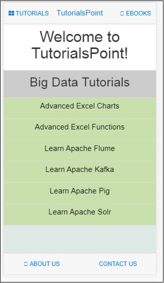
$scope.msg="Welcome to Tutorialspoint!"
});
Step 7
Now run the command to start the app using the below command −
node server.js
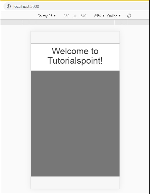
Step 8
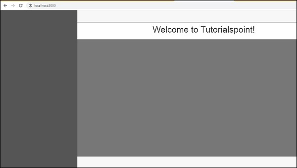
Load your app at http://localhost:3000 in the browser −
You will see the following screen in mobile mode −
You will see the following screen in Desktop mode −
Let us understand the details of each component in Mobile Angular UI in the next chapters.
Here is the final code for the above display. The folder structure so far is as follows −
index.html
<!DOCTYPE html>
<html>
   <head>
      <meta charset="utf-8" />
      <title>Mobile Angular UI Demo</title>
      <meta http-equiv="X-UA-Compatible" content="IE=edge,chrome=1" />
      <meta name="apple-mobile-web-app-capable" content="yes" />
      <meta name="viewport" content="user-scalable=no, initial-scale=1.0, maximum-scale=1.0, minimal-ui" />

      <meta name="apple-mobile-web-app-status-bar-style" content="yes" />
      <link rel="shortcut icon" href="/assets/img/favicon.png" type="image/x-icon" />
      <link rel="stylesheet" href="node_modules/mobile-angular-ui/dist/css/mobile-angular-ui-hover.min.css" />
      <link rel="stylesheet" href="node_modules/mobile-angular-ui/dist/css/mobile-angular-ui-base.min.css" />
      <link rel="stylesheet" href="node_modules/mobile-angular-ui/dist/css/mobile-angular-ui-desktop.min.css" />
      <script src="node_modules/angular/angular.min.js"></script>
      <script src="node_modules/angular-route/angular-route.min.js"></script>
      <script src="node_modules/mobile-angular-ui/dist/js/mobile-angular-ui.min.js"></script>
      <script src="src/js/app.js"></script>
   </head>

   <body ng-app="myFirstApp" ng-controller="MainController">

      <!-- Sidebars -->
      <div class="sidebar sidebar-left"><!-- ... --></div>
      <div class="sidebar sidebar-right"><!-- ... --></div>

      <div class="app">
         <div class="navbar navbar-app navbar-absolute-top"><!-- Top Navbar --></div>
         <div class="navbar navbar-app navbar-absolute-bottom"><!-- Bottom Navbar --></div>

         <!-- App body -->

         <div class='app-body'>
            <div class='app-content'>
               <ng-view></ng-view>
            </div>
         </div>
      </div><!-- ~ .app -->

      <!-- Modals and Overlays -->
      <div ui-yield-to="modals"></div>
   </body>

</html>
js/app.js
/* eslint no-alert: 0 */

'use strict';
//
// Here is how to define your module
// has dependent on mobile-angular-ui
//
var app=angular.module('myFirstApp', [
   'ngRoute',
   'mobile-angular-ui'
]);
app.config(function($routeProvider, $locationProvider) {
   $routeProvider
   .when("/", {
      templateUrl : "src/home/home.html"
   });
   $locationProvider.html5Mode({enabled:true, requireBase:false});
});
app.controller('MainController', function($rootScope, $scope, $routeParams) {
   $scope.msg="Welcome to Tutorialspoint!"
});
home/home.html
<div class="list-group text-center">
   <div class="list-group-item list-group-item-home">
      <h1>{{msg}}</h1>
   </div>
</div>
Mobile Angular UI - Layouts
In this chapter, we will understand the basic layout display available in Mobile Angular UI.
The structure of basic layout is as follows
<body ng-app="myFirstApp" ng-controller="MainController">

   <!-- Sidebars -->
   <div class="sidebar sidebar-left"><!-- ... --></div>
   <div class="sidebar sidebar-right"><!-- ... --></div>

   <div class="app">
      <div class="navbar navbar-app navbar-absolute-top"><!-- Top Navbar --></div>
      <div class="navbar navbar-app navbar-absolute-bottom"><!-- Bottom Navbar --></div>

      <!-- App body -->
      <div class='app-body'>
         <div class='app-content'>
            <ng-view></ng-view>
         </div>
      </div>
   </div><!-- ~ .app -->

   <!-- Modals and Overlays -->
   <div ui-yield-to="modals"></div>

</body>
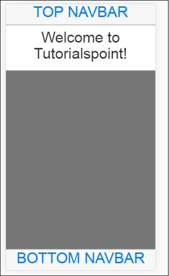
The screen of your mobile or desktop is divided into sections.
Sidebar
The body section starts with sidebar div containers, one for left side and the next one for the right side −
<!-- Sidebars -->
<div class="sidebar sidebar-left"><!-- ... --></div>
<div class="sidebar sidebar-right"><!-- ... --></div>
A sidebar helps well to utilize the space efficiently specially on mobile and that makes the UI very interactive and neat. By sidebar, the windows open from the left side and right side.
Navbars
The next section is the navbars. Following are the div containers for navbars to be shown −
<div class="navbar navbar-app navbar-absolute-top"><!-- Top Navbar --></div>
<div class="navbar navbar-app navbar-absolute-bottom"><!-- Bottom Navbar --></div>
They are shown at the top and at the bottom.
App Body Section
This section is the main place where your contents are displayed for the user to interact or read.
<div class='app-body'>
   <div class='app-content'>
      <ng-view></ng-view>
   </div>
</div>
It makes use of <ng-view></ng-view> directive that will get replaced with actual contents based on user interaction on the UI. AngularJS NgRoute is used here to replace the views.
Modals and Overlays
The last section is the modals and overlays section. The div container to show modals and overlays are as follows −
<!-- Modals and Overlays -->
<div ui-yield-to="modals"></div>
Mobile Angular UI - Components
In this chapter, we are going to understand the important components in mobile angular UI. They are as follows −
- Navbars
- Sidebars
- Modals
- Overlays
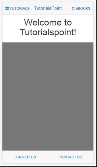
Navbars
Navbars make use of the top and bottom portion of the device screen. We can use the top navbar to display the menu items or the header section. The bottom navbar can be used to display the footer section.
A simple display of navbar on the screen is as follows −
Navbar can be shown in two ways: fixed and overflow approach.
Important CSS classes
In Mobile Angular UI to show navbar you have to make use of css classes − navbar, .navbar-app.
Classes for Top/Bottom Overflow approach
For the top navbar the css class − .navbar-absolute-top.
For the bottom navbar the css class − .navbar-absolute-bottom.
Classes for Top/Bottom fixed approach
For the top navbar the css class − .navbar-fixed-top.
For the bottom navbar the css class − .navbar-fixed-bottom.
Let us work on the Overflow Navbar on the UI.
Following is the HTML code for the same −
Navbar-Top
<div class="navbar navbar-app navbar-absolute-top">
   <div class="btn-group pull-left">
      <div class="btn">
         <i class="fa fa-th-large "></i> Library
      </div>
   </div>
   <div class="navbar-brand navbar-brand-center" ui-yield-to="title">
      TutorialsPoint
   </div>
   <div class="btn-group pull-right" ui-yield-to="navbarAction">
      <div class="btn">
         <i class="fal fa-search"></i> eBooks
      </div>
   </div>
</div>
Navbar-Bottom
<div class="navbar navbar-app navbar-absolute-bottom">
   <div class="btn-group justified">
      <a href="https://www.tutorialspoint.com/about/index.htm" class="btn btn-navbar"><i class="fal fa-globe"></i> About us</a>
      <a href="https://www.tutorialspoint.com/about/contact_us.htm" class="btn btn-navbar"><i class="fal fa-map-marker-alt"></i> Contact us</a>
   </div>
</div>
This is how the display looks like −
Sidebars
The sidebars occupy the left and right side of the screen. They are always hidden and activated when the item connected to the left side or right side is clicked. It is the best way to utilize the space on the screen.
So far we have seen the working of navbars. Let us now make use of the navbar item on the left side and right side to open the sidebars.
You can place sidebars on the left side or right side.
Important CSS classes
The css classes for left side sidebar − sidebar sidebar-left.
The css classes for right side sidebar − sidebar sidebar-right.
The div container for sidebar is as follows −
<!-- Sidebars -->
<div class="sidebar sidebar-left"><!-- ... --></div>
<div class="sidebar sidebar-right"><!-- ... --></div>
Interaction with Sidebars
To open and close the sidebars added on the left side and right side you need to add the following to the html tag that will open the sidebars.
For example, to open left sidebar on click on a link you can add the following −
Sidebar makes use of sharedstate uiSidebarLeft and uiSidebarRight to toggle the sidebar items.
We are going to make use of the top navbar we added earlier. Add ui-toggle=uiSidebarLeft and ui-toggle="uiSidebarRight" and also the class sidebar-toggle and sidebar-right-toggle.
<div ui-toggle="uiSidebarLeft" class="btn sidebar-toggle"><i class="fa fa-th-large "></i> Library</div>
<div ui-toggle="uiSidebarRight" class="btn sidebar-right-toggle"><i class="fal fa-search"></i> Search</div>
Let us now add a div container for the left sidebar and right sidebar.
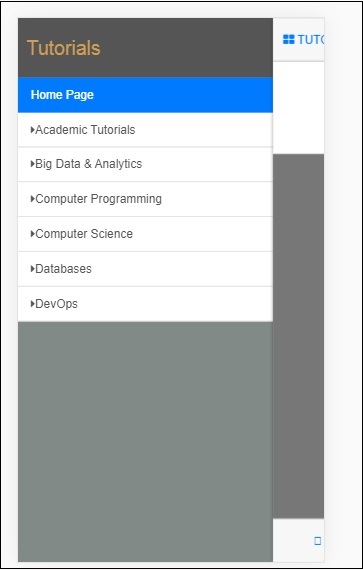
Left Sidebar
<div class="sidebar sidebar-left">
   <div class="scrollable">
      <h1 class="scrollable-header app-name">Tutorials</h1>
      <div class="scrollable-content">
         <div class="list-group" ui-turn-off='uiSidebarLeft'>
            <a class="list-group-item" href="/">Home Page </a>
            <a class="list-group-item" href="#/academic"><i class="fa fa-caret-right"></i>Academic Tutorials </a>
            <a class="list-group-item" href="#/bigdata"><i class="fa fa-caret-right"></i>Big Data & Analytics </a>
            <a class="list-group-item" href="#/computerProg"><i class="fa fa-caret-right"></i>Computer Programming </a>
            <a class="list-group-item" href="#/computerscience"><i class="fa fa-caret-right"></i>Computer Science </a>
            <a class="list-group-item" href="#/databases"><i class="fa fa-caret-right"></i>Databases </a>
            <a class="list-group-item" href="#/devops"><i class="fa fa-caret-right"></i>DevOps </a>
         </div>
      </div>
   </div>
</div>
You can make use of ui-turn-off='uiSidebarLeft' or ui-turn-off='uiSidebarRight' in your sidebar template to close the sidebar when clicked anywhere inside the sidebar. The sidebar will be closed by default when clicked anywhere outside the sidebar template.
In the left side bar when the user clicks on the links, the sidebar will be closed as we have added ui-turn-off='uiSidebarLeft' to the left sidebar template.
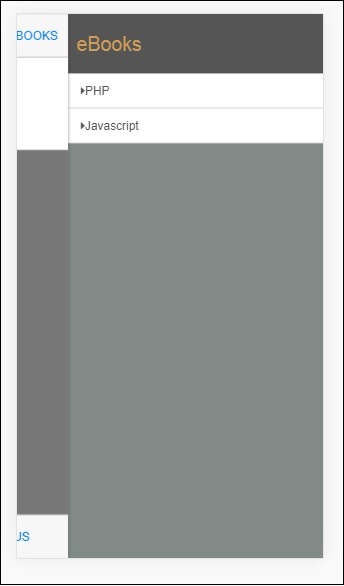
Right Sidebar
<div class="sidebar sidebar-right">
   <div class="scrollable">
      <h1 class="scrollable-header app-name">eBooks</h1>
      <div class="scrollable-content">
         <div class="list-group" ui-toggle="uiSidebarRight">
            <a class="list-group-item" href="#/php"><i class="fa fa-caret-right"></i>PHP </a>
            <a class="list-group-item" href="#/Javascript"><i class="fa fa-caret-right"></i>Javascript </a>
         </div>
      </div>
   </div>
</div>
The display of sidebar in the browser is as follows −
Click on Tutorials to get left sidebar menu as shown below −
Click on Ebooks to get right side menu as shown below −
Modals and Overlays
Modals and Overlays will show a pop-up type window on your screen. Overlays differ from modal only in how the container is displayed for it.
You need to make use of ngIf/uiIf or ngHide/uiHide along with uiState to activate/dismiss the overlay or modal.
The css for modal will be .modal, and for overlay, it will be .modal-overlay.
To show modal and overlay, add the following div container inside your index.html.
<div ui-yield-to="modals"></div>
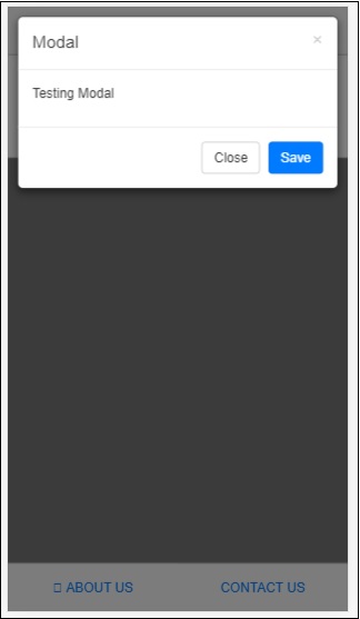
Let us assign a modal to the navbar footer we have done earlier.
Here ABOUT US will act as a modal and CONTACT US will act as an overlay.
Add the following changes to the links of ABOUT US and CONTACT US −
<div class="navbar navbar-app navbar-absolute-bottom">
   <div class="btn-group justified">
      <a ui-turn-on="aboutus_modal" class="btn btn-navbar"><i class="fal fa-globe"></i> About us</a>
      <a ui-turn-on="contactus_overlayl" class="btn btn-navbar"><i class="fal fa-map-marker-alt"></i> Contact us</a>
   </div>
</div>
If we click on this link, the modal and overlay will open.
The content for modal and overlay is added inside src/home/home.html file.
The main content for modal and overlay has to be wrapped inside the following div container −
<div ui-content-for="modals">
   <div class="modal"><!-- ... --></div>
</div>
Let us add content to the modal and overlay view. The name we have used on the links i.e., ui-turn-on="aboutus_modal" and ui-turn-on="contactus_overlay", the same are used inside for the aboutus modal content and contactus overlay content.
<div ui-content-for="modals">
   <div class="modal" ui-if="aboutus_modal" ui-shared-state="aboutus_modal">
      <div class="modal-backdrop in"></div>
      <div class="modal-dialog">
         <div class="modal-content">
            <div class="modal-header">
               <button class="close"
                  ui-turn-off="aboutus_modal">×</button>
               <h4 class="modal-title">Modal</h4>
            </div>
            <div class="modal-body">
               <p>Testing Modal</p>
            </div>
            <div class="modal-footer">
               <button ui-turn-off="aboutus_modal" class="btn btn-default">Close</button>
               <button ui-turn-off="aboutus_modal" class="btn btn-primary">Save</button>
            </div>
         </div>
      </div>
   </div>
   <div class="modal modal-overlay" ui-if="contactus_overlay" ui-shared-state="contactus_overlay">
      <div class="modal-dialog">
         <div class="modal-content">
            <div class="modal-header">
               <button class="close"
                  ui-turn-off="contactus_overlay">×</button>
               <h4 class="modal-title">Overlay</h4>
            </div>
            <div class="modal-body">
               <p>Testing Overlay</p>
            </div>
            <div class="modal-footer">
               <button ui-turn-off="contactus_overlay" class="btn btn-default">Close</button>
               <button ui-turn-off="contactus_overlay" class="btn btn-primary">Save</button>
            </div>
         </div>
      </div>
   </div>
</div>
The display for modal and overlay is as follows −
Onclick of ABOUT US it will display modal as shown below −
Onclick of CONTACT US, it will display overlay as shown below −
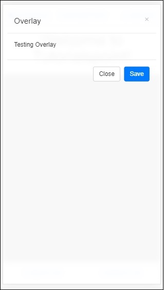
Click on the close button to close the modal window.
Mobile Angular UI - Dropdowns
To work with dropdowns in mobile angular ui, you need to make use of class .dropdown-menu.
Here is an example that displays dropdown.
We will add the changes in src/home/home.html.
<div class="list-group text-center">
   <div class="list-group-item list-group-item-home">
      <h1>{{msg}}</h1>
   </div>
   <div class="list-group-item list-group-item-home">
      <div class="btn-group">
         <a ui-turn-on='testDropdown' class='btn'>
            <i class="fa fa-caret-down" aria-hidden="true"></i>Tutorials
         </a>
         <ul
            class="dropdown-menu"
            ui-outer-click="Ui.turnOff('testDropdown')"
            ui-outer-click-if="Ui.active('testDropdown')"
            role="menu"
            ui-show="testDropdown"
            ui-state="testDropdown"
            ui-turn-off="testDropdown">
            <li><a>PHP</a></li>
            <li><a>JAVA</a></li>
            <li><a>MYSQL</a></li>
            <li class="divider"></li>
            <li><a>PYTHON</a></li>
         </ul>
      </div>
   </div>
</div>
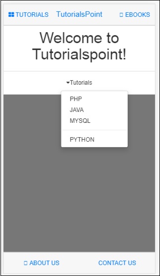
We are having a list of Tutorials shown in the dropdown. The output on the screen is as follows −
Mobile Angular UI - Accordions
Accordions are mostly used when the content is supposed to be in section type of view and any one section is visible at a time. You can hide and open the next section to view the contents in it.
Let us work on an example to see the working of an Accordion in Mobile Angular UI.
index.html
<!DOCTYPE html>
<html>
   <head>
      <meta charset="utf-8" />
      <title>Mobile Angular UI Demo</title>
      <meta http-equiv="X-UA-Compatible" content="IE=edge,chrome=1" />
      <meta name="apple-mobile-web-app-capable"  content="yes" />
      <meta name="viewport" content="user-scalable=no, initial-scale=1.0, maximum-scale=1.0, minimal-ui" />
      <meta name="apple-mobile-web-app-status-bar-style" content="yes" />
      <link rel="shortcut icon" href="/assets/img/favicon.png" type="image/x-icon" />
      <link rel="stylesheet" href="node_modules/mobile-angular-ui/dist/css/mobile-angular-ui-hover.min.css" />
      <link rel="stylesheet" href="node_modules/mobile-angular-ui/dist/css/mobile-angular-ui-base.min.css" />
      <link rel="stylesheet" href="node_modules/mobile-angular-ui/dist/css/mobile-angular-ui-desktop.min.css" />
      <script src="node_modules/angular/angular.min.js"></script>
      <script src="node_modules/angular-route/angular-route.min.js"></script>
      <script src="node_modules/mobile-angular-ui/dist/js/mobile-angular-ui.min.js"></script>
      <script src="node_modules/angular-route/angular-route.min.js"></script>
      <link rel="stylesheet" href="src/css/app.css" />
      <script src="src/js/app.js"></script>
   </head>
   <body ng-app="myFirstApp" ng-controller="MainController">
      <!-- Sidebars -->
      <div class="sidebar sidebar-left">
         <div class="scrollable">
            <h1 class="scrollable-header app-name">Tutorials</h1>
            <div class="scrollable-content">
               <div class="list-group" ui-turn-off='uiSidebarLeft'>
                  <a class="list-group-item" href="/">Home Page </a>
                  <a class="list-group-item" href="#/academic"><i class="fa fa-caret-right"></i>Academic Tutorials </a>
                  <a class="list-group-item" href="#/bigdata"><i class="fa fa-caret-right"></i>Big Data & Analytics </a>
                  <a class="list-group-item" href="#/computerProg"><i class="fa fa-caret-right"></i>Computer Programming </a>
                  <a class="list-group-item" href="#/computerscience"><i class="fa fa-caret-right"></i>Computer Science </a>
                  <a class="list-group-item" href="#/databases"><i class="fa fa-caret-right"></i>Databases </a>
                  <a class="list-group-item" href="#/devops"><i class="fa fa-caret-right"></i>DevOps </a>
               </div>
            </div>
         </div>
      </div>
      <div class="sidebar sidebar-right">
         <div class="scrollable">
            <h1 class="scrollable-header app-name">eBooks</h1>
            <div class="scrollable-content">
               <div class="list-group" ui-toggle="uiSidebarRight">
                  <a class="list-group-item" href="#/php"><i class="fa fa-caret-right"></i>PHP </a>
                  <a class="list-group-item" href="#/Javascript"><i class="fa fa-caret-right"></i>Javascript </a>
               </div>
            </div>
         </div>
      </div>

      <div class="app">
         <div class="navbar navbar-app navbar-absolute-top">
            <div class="navbar-brand navbar-brand-center" ui-yield-to="title">
               TutorialsPoint
            </div>
            <div class="btn-group pull-left">
               <div ui-toggle="uiSidebarLeft" class="btn sidebar-left-toggle">
                  <i class="fa fa-th-large "></i> Tutorials
               </div>
            </div>
            <div class="btn-group pull-right" ui-yield-to="navbarAction">
               <div ui-toggle="uiSidebarRight" class="btn sidebar-right-toggle">
                  <i class="fal fa-search"></i> eBooks
               </div>
            </div>
         </div>
         <div class="navbar navbar-app navbar-absolute-bottom">
            <div class="btn-group justified">
               <a ui-turn-on="aboutus_modal" class="btn btn-navbar"><i class="fal fa-globe"></i> About us</a>
               <a ui-turn-on="contactus_overlay" class="btn btn-navbar"><i class="fal fa-map-marker-alt"></i> Contact us</a>
            </div>
         </div>

         <!-- App body -->
         <div class='app-body'>
            <div class='app-content'>
               <ng-view></ng-view>
            </div>
         </div>
      </div><!-- ~ .app -->

      <!-- Modals and Overlays -->
      <div ui-yield-to="modals"></div>
   </body>
</html>
src/js/app.js
/* eslint no-alert: 0 */

'use strict';

//
// Here is how to define your module
// has dependent on mobile-angular-ui
//
var app=angular.module('myFirstApp', [
   'ngRoute',
   'mobile-angular-ui'
]);
app.config(function($routeProvider, $locationProvider) {
   $routeProvider
   .when("/", {
      templateUrl : "src/home/home.html"
   });
   $locationProvider.html5Mode({enabled:true, requireBase:false});
});

app.controller('MainController', function($rootScope, $scope, $routeParams) {
   $scope.msg="Welcome to Tutorialspoint!"
   $scope.sections="Testing of Accordion using
   Mobile Angular UI!Testing of Accordion using
   Mobile Angular UI!Testing of Accordion using
   Mobile Angular UI!";
});
The accordion template is added inside src/home/home.html.
<div class="scrollable">
   <div class="scrollable-content">
      <div class="section">
      <div class="panel-group"
         ui-shared-state="testAccordion"
         ui-default='2'>

         <div class="panel panel-default" ng-repeat="i in [1,2,3,4,5]">
         <div class="panel-heading" ui-set="{'testAccordion': i}">

            <h4 class="panel-title">
               Accordion Group Item #{{i}}
            </h4>
         </div>

         <div ui-if="testAccordion == {{i}}">
            <div class="panel-body">
               {{sections}}
            </div>
         </div>
         </div>
      </div>
   </div>
</div>
</div>
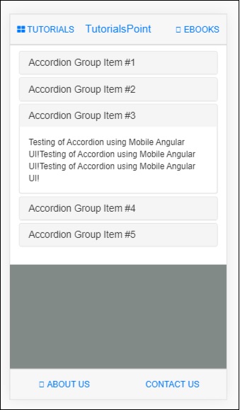
Following is the display in the browser −
Mobile Angular UI - Tabs
Tabs are useful components available in angular mobile ui. Tabs are available in the same wrapper and show your contents in separate pane just like how the tabs are opened in the browser. Only one tab is displayed to the user at a time.
Here is a working example of Tabs component.
index.html
<!DOCTYPE html>
<html>
   <head>
      <meta charset="utf-8" />
      <title>Mobile Angular UI Demo</title>
      <meta http-equiv="X-UA-Compatible" content="IE=edge,chrome=1" />
      <meta name="apple-mobile-web-app-capable" content="yes" />
      <meta name="viewport" content="user-scalable=no, initial-scale=1.0, maximum-scale=1.0, minimal-ui" />
      <meta name="apple-mobile-web-app-status-bar-style" content="yes" />
      <link rel="shortcut icon" href="/assets/img/favicon.png" type="image/x-icon" />
      <link rel="stylesheet" href="node_modules/mobile-angular-ui/dist/css/mobile-angular-ui-hover.min.css" />
      <link rel="stylesheet" href="node_modules/mobile-angular-ui/dist/css/mobile-angular-ui-base.min.css" />
      <link rel="stylesheet" href="node_modules/mobile-angular-ui/dist/css/mobile-angular-ui-desktop.min.css" />
      <script src="node_modules/angular/angular.min.js"></script>
      <script src="node_modules/angular-route/angular-route.min.js"></script>
      <script src="node_modules/mobile-angular-ui/dist/js/mobile-angular-ui.min.js"></script>
      <script src="node_modules/angular-route/angular-route.min.js"></script>
      <link rel="stylesheet" href="src/css/app.css" />
      <script src="src/js/app.js"></script>
   </head>
   <body ng-app="myFirstApp" ng-controller="MainController">
      <!-- Sidebars -->
      <div class="sidebar sidebar-left">
         <div class="scrollable">
            <h1 class="scrollable-header app-name">Tutorials</h1>
            <div class="scrollable-content">
               <div class="list-group" ui-turn-off='uiSidebarLeft'>
                  <a class="list-group-item" href="/">Home Page </a>
                  <a class="list-group-item" href="#/academic"><i class="fa fa-caret-right"></i>Academic Tutorials </a>
                  <a class="list-group-item" href="#/bigdata"><i class="fa fa-caret-right"></i>Big Data & Analytics </a>
                  <a class="list-group-item" href="#/computerProg"><i class="fa fa-caret-right"></i>Computer Programming </a>
                  <a class="list-group-item" href="#/computerscience"><i class="fa fa-caret-right"></i>Computer Science </a>
                  <a class="list-group-item" href="#/databases"><i class="fa fa-caret-right"></i>Databases </a>
                  <a class="list-group-item" href="#/devops"><i class="fa fa-caret-right"></i>DevOps </a>
               </div>
            </div>
         </div>
      </div>
      <div class="sidebar sidebar-right">
         <div class="scrollable">
            <h1 class="scrollable-header app-name">eBooks</h1>
            <div class="scrollable-content">
               <div class="list-group" ui-toggle="uiSidebarRight">
                  <a class="list-group-item" href="#/php"><i class="fa fa-caret-right"></i>PHP </a>
                  <a class="list-group-item" href="#/Javascript"><i class="fa fa-caret-right"></i>Javascript </a>
               </div>
            </div>
         </div>
      </div>

      <div class="app">
         <div class="navbar navbar-app navbar-absolute-top">
            <div class="navbar-brand navbar-brand-center" ui-yield-to="title">
               TutorialsPoint
            </div>
            <div class="btn-group pull-left">
               <div ui-toggle="uiSidebarLeft" class="btn sidebar-left-toggle">
                  <i class="fa fa-th-large "></i> Tutorials
               </div>
            </div>
            <div class="btn-group pull-right" ui-yield-to="navbarAction">
               <div ui-toggle="uiSidebarRight" class="btn sidebar-right-toggle">
                  <i class="fal fa-search"></i> eBooks
               </div>
            </div>
         </div>
         <div class="navbar navbar-app navbar-absolute-bottom">
            <div class="btn-group justified">
               <a ui-turn-on="aboutus_modal" class="btn btn-navbar"><i class="fal fa-globe"></i> About us</a>
               <a ui-turn-on="contactus_overlay" class="btn btn-navbar"><i class="fal fa-map-marker-alt"></i> Contact us</a>
            </div>
         </div>

         <!-- App body -->
         <div class='app-body'>
            <div class='app-content'>
               <ng-view></ng-view>
            </div>
         </div>
      </div><!-- ~ .app -->

      <!-- Modals and Overlays -->
      <div ui-yield-to="modals"></div>
      </body>
</html>
src/js/app.js
/* eslint no-alert: 0 */

'use strict';

//
// Here is how to define your module
// has dependent on mobile-angular-ui
//
var app=angular.module('myFirstApp', [
   'ngRoute',
   'mobile-angular-ui'
]);
app.config(function($routeProvider, $locationProvider) {
   $routeProvider
   .when("/", {
      templateUrl : "src/home/home.html"
   });
   $locationProvider.html5Mode({enabled:true, requireBase:false});
});

app.controller('MainController', function($rootScope, $scope, $routeParams) {
   $scope.msg="Welcome to Tutorialspoint!"
   $scope.js="JavaScript is a lightweight, interpreted programming language. It is designed
   for creating network-centric applications. It is
   complimentary to and integrated with Java.
   JavaScript is very easy to implement because it is integrated with HTML. It is open and
   cross-platform.";
   $scope.angularjs="AngularJS is a very powerful
   JavaScript Framework. It is used in Single Page Application (SPA) projects. It extends HTML DOM
   with additional attributes and makes it more responsive to user actions. AngularJS is open
   source, completely free, and used by thousands of
   developers around the world. It is licensed under the Apache license version 2.0.";
   $scope.reactjs="React is a front-end library
   developed by Facebook. It is used for handling
   the view layer for web and mobile apps. ReactJS allows us to create reusable UI components. It is
   currently one of the most popular JavaScript
   libraries and has a strong foundation and large community behind it.";
});
src/home/home.html
<div class="scrollable">
   <div class="scrollable-content">
      <div class="section">
         <ui-shared-state id="activeTab" default="1"></ui-shared-state>

         <ul class="nav nav-tabs">
            <li ui-class="{'active': activeTab == 1}">
               <a ui-set="{'activeTab': 1}">Javascript</a>
            </li>
            <li ui-class="{'active': activeTab == 2}">
               <a ui-set="{'activeTab': 2}">AngularJS</a>
            </li>
            <li ui-class="{'active': activeTab == 3}">
               <a ui-set="{'activeTab': 3}">ReactJS</a>
            </li>
         </ul>

         <div ui-if="activeTab == 1">
            <h3 class="page-header">Javascript</h3>
            <p>{{js}}</p>
         </div>

         <div ui-if="activeTab == 2">
            <h3 class="page-header">AngularJS</h3>
            <p>{{angularjs}}</p>
         </div>

         <div ui-if="activeTab == 3">
            <h3 class="page-header">ReactJS</h3>
            <p>{{reactjs}}</p>
         </div>
            <div class="btn-group justified nav-tabs">
            <a ui-set="{'activeTab': 1}"
               ui-class="{'active': activeTab == 1}" class="btn btn-default">Javascript</a>
            <a ui-set="{'activeTab': 2}"
               ui-class="{'active': activeTab == 2}" class="btn btn-default">AngularJS</a>
            <a ui-set="{'activeTab': 3}"
               ui-class="{'active': activeTab == 3}" class="btn btn-default">ReactJS</a>
         </div>
      </div>
   </div>
</div>
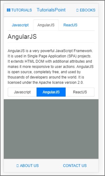
Following is the display in browser −
Mobile Angular UI - Drag and Drop
Drag and drop feature allows you to take control of a html element by grabbing it and dragging and placing the element to a different location.
To work with drag and drop features in Mobile Angular UI, you need to add the gestures module.
First add the JavaScript file inside index.html as shown below −
<script src="node_modules/mobile-angular-ui/dist/js/mobile-angular-ui.gestures.min.js"></script>
Later add the gestures module as a dependency in app.js as shown below −
var app=angular.module('myFirstApp', [
   'ngRoute',
   'mobile-angular-ui',
   'mobile-angular-ui.gestures'
]);
We need to create a custom directive to drag the item, using the $drag module.
The syntax to use $drag module is as follows −
$drag.bind(element, dragOptions, touchOptions);
Parameters
element − The html element you want to drag.
dragOptions − It is an object with the following details −
var dragOptions= {
   transform: $drag.TRANSLATE_BOTH,
   start: function(dragInfo, event){},
   end: function(dragInfo, event){},
   move: function(dragInfo, event){},
   cancel: function(dragInfo, event){}
};
For transform, you can make use of following options −
$drag.NULL_TRANSFORM − no transform movement for the element.
$drag.TRANSLATE_BOTH − The element will move on both x and y axis.
$drag.TRANSLATE_HORIZONTAL − The element will move on x axis.
$drag.TRANSLATE_UP − The element will move on the negative y axis.
$drag.TRANSLATE_DOWN − The element will move on a positive y axis.
$drag.TRANSLATE_LEFT − The element will move on the negative x axis.
$drag.TRANSLATE_RIGHT − The element will move on the positive x axis.
$drag.TRANSLATE_VERTICAL − The element will move on y axis.
$drag.TRANSLATE_INSIDE − It makes use of a function as shown below −
{
   transform: $drag.TRANSLATE_INSIDE(myElement)
}
The start, end, move, cancel is a function with draginfo and event details as params.
draginfo − It is an extended version of $touch module. It has following details −
originalTransform − The $transform object relative to CSS transform before $drag is bound.
originalRect − The Bounding Client Rect for bound element before any drag action.
startRect − The Bounding Client Rect for bound element registered at start event.
startTransform − The $transform at start event.
rect − The current Bounding Client Rect for bound element.
transform − The current $transform.
reset − A function restoring element to originalTransform.
undo − A function restoring element to startTransform.
touchOptions − is an option object to be passed to underlying $touch service.
Create a directive using $drag module inside src/js/app.js as shown below −
app.directive('dragItem', ['$drag', function($drag) {
   return {
      controller: function($scope, $element) {
         $drag.bind($element,
            {
               transform: $drag.TRANSLATE_BOTH,
               end: function(drag) {
                  drag.reset();
               }
            },
            {
               sensitiveArea: $element.parent()
            }
         );
      }
   };
}]);
Let us see a working example of dragging an element −
Index.html
<!DOCTYPE html>
<html>
   <head>
      <meta charset="utf-8" />
      <title>Mobile Angular UI Demo</title>
      <meta http-equiv="X-UA-Compatible" content="IE=edge,chrome=1" />
      <meta name="apple-mobile-web-app-capable" content="yes" />
      <meta name="viewport" content="user-scalable=no, initial-scale=1.0, maximum-scale=1.0, minimal-ui" />
      <meta name="apple-mobile-web-app-status-bar-style" content="yes" />
      <link rel="shortcut icon" href="/assets/img/favicon.png" type="image/x-icon" />
      <link rel="stylesheet" href="node_modules/mobile-angular-ui/dist/css/mobile-angular-ui-hover.min.css" />
      <link rel="stylesheet" href="node_modules/mobile-angular-ui/dist/css/mobile-angular-ui-base.min.css" />
      <link rel="stylesheet" href="node_modules/mobile-angular-ui/dist/css/mobile-angular-ui-desktop.min.css" />
      <script src="node_modules/angular/angular.min.js"></script>
      <script src="node_modules/angular-route/angular-route.min.js"></script>
      <script src="node_modules/mobile-angular-ui/dist/js/mobile-angular-ui.min.js"></script>
      <script src="node_modules/angular-route/angular-route.min.js"></script>
      <script src="node_modules/mobile-angular-ui/dist/js/mobile-angular-ui.gestures.min.js"></script>
      <link rel="stylesheet" href="src/css/app.css" />
      <script src="src/js/app.js"></script>
   </head>
   <body ng-app="myFirstApp" ng-controller="MainController">

      <!-- Sidebars -->
      <div class="sidebar sidebar-left">
         <div class="scrollable">
            <h1 class="scrollable-header app-name">Tutorials</h1>
            <div class="scrollable-content">
               <div class="list-group" ui-turn-off='uiSidebarLeft'>
                  <a class="list-group-item" href="/">Home Page </a>
                     <a class="list-group-item" href="#/academic"><i class="fa fa-caret-right"></i>Academic Tutorials </a>
                     <a class="list-group-item" href="#/bigdata"><i class="fa fa-caret-right"></i>Big Data & Analytics </a>
                     <a class="list-group-item" href="#/computerProg"><i class="fa fa-caret-right"></i>Computer Programming </a>
                     <a class="list-group-item" href="#/computerscience"><i class="fa fa-caret-right"></i>Computer Science </a>
                     <a class="list-group-item" href="#/databases"><i class="fa fa-caret-right"></i>Databases </a>
                     <a class="list-group-item" href="#/devops"><i class="fa fa-caret-right"></i>DevOps </a>
                  </div>
               </div>
            </div>
         </div>
         <div class="sidebar sidebar-right">
            <div class="scrollable">
               <h1 class="scrollable-header app-name">eBooks</h1>
               <div class="scrollable-content">
                  <div class="list-group" ui-toggle="uiSidebarRight">
                     <a class="list-group-item" href="#/php"><i class="fa fa-caret-right"></i>PHP </a>
                     <a class="list-group-item" href="#/Javascript"><i class="fa fa-caret-right"></i>Javascript </a>
                  </div>
               </div>
            </div>
      </div>
      <div class="app">
         <div class="navbar navbar-app navbar-absolute-top">
            <div class="navbar-brand navbar-brand-center" ui-yield-to="title">
               TutorialsPoint
            </div>
            <div class="btn-group pull-left">
               <div ui-toggle="uiSidebarLeft" class="btn sidebar-left-toggle">
                  <i class="fa fa-th-large "></i> Tutorials
               </div>
            </div>
            <div class="btn-group pull-right" ui-yield-to="navbarAction">
               <div ui-toggle="uiSidebarRight" class="btn sidebar-right-toggle">
                  <i class="fal fa-search"></i> eBooks
               </div>
            </div>
         </div>
         <div class="navbar navbar-app navbar-absolute-bottom">
            <div class="btn-group justified">
               <a ui-turn-on="aboutus_modal" class="btn btn-navbar"><i class="fal fa-globe"></i> About us</a>
               <a ui-turn-on="contactus_overlay" class="btn btn-navbar"><i class="fal fa-map-marker-alt"></i> Contact us</a>
            </div>
         </div>

         <!-- App body -->
         <div class='app-body'>
            <div class='app-content'>
               <ng-view></ng-view>
            </div>
         </div>
      </div><!-- ~ .app -->
      <!-- Modals and Overlays -->
      <div ui-yield-to="modals"></div>
   </body>
</html>
src/js/app.js
/* eslint no-alert: 0 */

'use strict';
//
// Here is how to define your module
// has dependent on mobile-angular-ui
//
var app=angular.module('myFirstApp', [
   'ngRoute',
   'mobile-angular-ui',
   'mobile-angular-ui.gestures'
]);
app.config(function($routeProvider, $locationProvider) {
   $routeProvider
   .when("/", {
      templateUrl : "src/home/home.html"
   });
   $locationProvider.html5Mode({enabled:true, requireBase:false});
});
app.directive('dragItem', ['$drag', function($drag) {
   return {
      controller: function($scope, $element) {
         $drag.bind($element,
            {
               transform: $drag.TRANSLATE_BOTH,end: function(drag) {
                  drag.reset();
               }
            },
            {
               sensitiveArea: $element.parent()
            }
         );
      }
   };
}]);
app.controller('MainController', function($rootScope, $scope, $routeParams) {
   $scope.msg="Welcome to Tutorialspoint!"
   $scope.js="JavaScript is a lightweight, interpreted programming language. It is designed
   for creating network-centric applications. It is
   complimentary to and integrated with Java.
   JavaScript is very easy to implement because it
   is integrated with HTML. It is open and cross-platform.";
   $scope.angularjs="AngularJS is a very powerful
   JavaScript Framework. It is used in Single Page
   Application (SPA) projects. It extends HTML DOM
   with additional attributes and makes it more
   responsive to user actions. AngularJS is open
   source, completely free, and used by thousands of
   developers around the world. It is licensed under the Apache license version 2.0.";
   $scope.reactjs="React is a front-end library
   developed by Facebook. It is used for handling
   the view layer for web and mobile apps. ReactJS
   allows us to create reusable UI components. It is
   currently one of the most popular JavaScript
   libraries and has a strong foundation and large community behind it.";
});
The drag element is added inside src/home/home.html −
<div style="height: 100%; width: 100%; padding: 40px;">
<div style="height: 100%; width: 100%; border: 1px solid #444; position: relative;">
<div drag-Item>
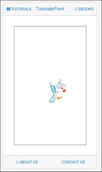
<img src="src/img/test.png" width="100" height="100" />
</div>
</div>
</div>
An image is used to drag as shown below −

The display in the browser is as follows −
You can drag the image in the UI and once the mouse is released, it will reset back to the original position as we have used drag.reset()inside the end function.
$drag.bind($element, {
      transform: $drag.TRANSLATE_BOTH,
      end: function(drag) {
         drag.reset();
      }
   },
   {
      sensitiveArea: $element.parent()
   }
);
Mobile Angular UI - Scrollable Areas
There are issues faced on some devices for fixed positioned elements. To work with scrollable areas Mobile Angular UI makes use of overflow:auto.
The template for scrollable area is as follows −
<div class="scrollable">
   <div class="scrollable-content">...</div>
</div>
Adding Headers and Footers in Scrollable Areas
Adding css classes .scrollable-header/.scrollable-footer, we will add fixed header/footer to the scrollable area you want. You do not have to take any trouble about the height and positioning, the css will take care of everything.
Template for header/footer is shown below −
<div class="scrollable">
   <div class="scrollable-header"><!-- ... --></div>
   <div class="scrollable-content"><!-- ... --></div>
   <div class="scrollable-footer"><!-- ... --></div>
</div>
Directives in Scrollable Areas
Following are the directives that are very helpful when working with scrollable areas −
uiScrollTop − To be used when you want to do something when the scroll reaches at the top. For e.g ui-scroll-top="callyourfunc()".
uiScrollBottom − To be used when you want to do something when the scroll reaches at the bottom. For e.g ui-scroll-bottom="callyourfunc()".
uiScrollableHeader − To be used when you want to do something when the scroll reaches the header. For e.g ui-scroll-header="callyourfunc()".
uiScrollableFooter − To be used when you want to do something when the scroll reaches the footer. For e.g ui-scroll-footer="callyourfunc()".
An example of uiScrollBottom directive −
<div class="scrollable">
   <div class="scrollable-content section" ui-scroll-bottom="callyourfunc()">
      <ul>
         <li ng-repeat="a in lists">
            {{a.name}}
         </li>
      </ul>
   </div>
</div>
Here is a working example of Scrollable Areas.
index.html
<!DOCTYPE html>
<html>
   <head>
      <meta charset="utf-8" />
      <title>Mobile Angular UI Demo</title>
      <meta http-equiv="X-UA-Compatible" content="IE=edge,chrome=1" />
      <meta name="apple-mobile-web-app-capable" content="yes" />
      <meta name="viewport" content="user-scalable=no, initial-scale=1.0, maximum-scale=1.0, minimal-ui" />
      <meta name="apple-mobile-web-app-status-bar-style" content="yes" />
      <link rel="shortcut icon" href="/assets/img/favicon.png" type="image/x-icon" />
      <link rel="stylesheet" href="node_modules/mobile-angular-ui/dist/css/mobile-angular-ui-hover.min.css" />
      <link rel="stylesheet" href="node_modules/mobile-angular-ui/dist/css/mobile-angular-ui-base.min.css" />
      <link rel="stylesheet" href="node_modules/mobile-angular-ui/dist/css/mobile-angular-ui-desktop.min.css" />
      <script src="node_modules/angular/angular.min.js"></script>
      <script src="node_modules/angular-route/angular-route.min.js"></script>
      <script src="node_modules/mobile-angular-ui/dist/js/mobile-angular-ui.min.js"></script>
      <script src="node_modules/angular-route/angular-route.min.js"></script>
      <script src="node_modules/mobile-angular-ui/dist/js/mobile-angular-ui.gestures.min.js"></script>
      <link rel="stylesheet" href="src/css/app.css" />
      <script src="src/js/app.js"></script>
   </head>

   <body ng-app="myFirstApp" ng-controller="MainController">

      <!-- Sidebars -->
      <div class="sidebar sidebar-left">
         <div class="scrollable">
            <h1 class="scrollable-header app-name">Tutorials</h1>
            <div class="scrollable-content">
               <div class="list-group" ui-turn-off='uiSidebarLeft'>
                  <a class="list-group-item" href="/">Home Page </a>
                  <a class="list-group-item" href="#/academic"><i class="fa fa-caret-right"></i>Academic Tutorials </a>
                  <a class="list-group-item" href="#/bigdata"><i class="fa fa-caret-right"></i>Big Data & Analytics </a>
                  <a class="list-group-item" href="#/computerProg"><i class="fa fa-caret-right"></i>Computer Programming </a>
                  <a class="list-group-item" href="#/computerscience"><i class="fa fa-caret-right"></i>Computer Science </a>
                  <a class="list-group-item" href="#/databases"><i class="fa fa-caret-right"></i>Databases </a>
                  <a class="list-group-item" href="#/devops"><i class="fa fa-caret-right"></i>DevOps </a>
               </div>
            </div>
         </div>
      </div>
      <div class="sidebar sidebar-right">
         <div class="scrollable">
            <h1 class="scrollable-header app-name">eBooks</h1>
            <div class="scrollable-content">
               <div class="list-group" ui-toggle="uiSidebarRight">
               <a class="list-group-item" href="#/php"><i class="fa fa-caret-right"></i>PHP </a>
               <a class="list-group-item" href="#/Javascript"><i class="fa fa-caret-right"></i>Javascript </a>
            </div>
         </div>
      </div>
   </div>

   <div class="app">

      <div class="navbar navbar-app navbar-absolute-top">
         <div class="navbar-brand navbar-brand-center" ui-yield-to="title">
            TutorialsPoint
         </div>
         <div class="btn-group pull-left">
            <div ui-toggle="uiSidebarLeft" class="btn sidebar-left-toggle">
               <i class="fa fa-th-large "></i> Tutorials
            </div>
         </div>
         <div class="btn-group pull-right" ui-yield-to="navbarAction">
            <div ui-toggle="uiSidebarRight" class="btn sidebar-right-toggle">
               <i class="fal fa-search"></i> eBooks
            </div>
         </div>
      </div>
      <div class="navbar navbar-app navbar-absolute-bottom">
         <div class="btn-group justified">
            <a ui-turn-on="aboutus_modal" class="btn btn-navbar"><i class="fal fa-globe"></i> About us</a>
            <a ui-turn-on="contactus_overlay" class="btn btn-navbar"><i class="fal fa-map-marker-alt"></i> Contact us</a>
         </div>
      </div>

      <!-- App body -->
      <div class='app-body'>
         <div class='app-content'>
            <ng-view></ng-view>
         </div>
      </div>
   </div><!-- ~ .app -->
   <!-- Modals and Overlays -->
   <div ui-yield-to="modals"></div>

   </body>
</html>
src/js/app.js
/* eslint no-alert: 0 */

'use strict';

//
// Here is how to define your module
// has dependent on mobile-angular-ui
//
var app=angular.module('myFirstApp', [
   'ngRoute',
   'mobile-angular-ui',
   'mobile-angular-ui.gestures'
]);
app.config(function($routeProvider, $locationProvider) {
   $routeProvider
   .when("/", {
      templateUrl : "src/home/home.html"
   });
   $locationProvider.html5Mode({enabled:true, requireBase:false});
});
app.directive('dragItem', ['$drag', function($drag) {
   return {
      controller: function($scope, $element) {
         $drag.bind($element,
            {
               transform: $drag.TRANSLATE_BOTH,
               end: function(drag) {
                  drag.reset();
               }
            },
            {
               sensitiveArea: $element.parent()
            }
         );
      }
   };
}]);
app.controller('MainController', function($rootScope, $scope, $routeParams) {
   $scope.msg="Welcome to Tutorialspoint!"
   $scope.js="JavaScript is a lightweight, interpreted programming language. It is designed
   for creating network-centric applications. It is
   complimentary to and integrated with Java.
   JavaScript is very easy to implement because it
   is integrated with HTML. It is open and cross-platform.";
   $scope.angularjs="AngularJS is a very powerful JavaScript Framework. It is used in Single Page
   Application (SPA) projects. It extends HTML DOM
   with additional attributes and makes it more
   responsive to user actions. AngularJS is open
   source, completely free, and used by thousands of
   developers around the world. It is licensed under the Apache license version 2.0.";
   $scope.reactjs="React is a front-end library developed by Facebook. It is used for handling
   the view layer for web and mobile apps. ReactJS
   allows us to create reusable UI components. It is
   currently one of the most popular JavaScript
   libraries and has a strong foundation and large community behind it.";
   var storyList=[];

   for (var i=1; i <= 100; i++) {
      storyList.push('My story no ' + i);
   }

   $scope.storylist=storyList;
   $scope.bottom=function() {
      alert('End of the stories');
   };
});
src/home/home.html
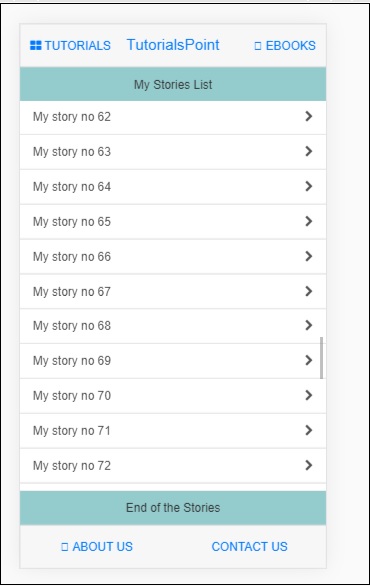
<div class="scrollable">
   <div class="scrollable-header">My Stories List</div>
   <div class="scrollable-content" ui-scroll-bottom="bottom()">
      <div class="list-group">
         <a ng-repeat="item in storylist" href="" class="list-group-item">
            {{ item }} <i class="fa fa-chevron-right pull-right"></i>
         </a>
      </div>
   </div>
   <div class="scrollable-footer">End of the Stories</div>
</div>
Following is the display in the browser −
Mobile Angular UI - Forms
This chapter will focus on forms. Let us take a look at a working example to get a better understanding of forms.
In index.html the code will be as follows −
<!DOCTYPE html>
<html>
   <head>
      <meta charset="utf-8" />
      <title>Mobile Angular UI Demo</title>
      <meta http-equiv="X-UA-Compatible" content="IE=edge,chrome=1" />
      <meta name="apple-mobile-web-app-capable" content="yes" />
      <meta name="viewport" content="user-scalable=no, initial-scale=1.0, maximum-scale=1.0, minimal-ui" />
      <meta name="apple-mobile-web-app-status-bar-style" content="yes" />
      <link rel="shortcut icon" href="/assets/img/favicon.png" type="image/x-icon" />
      <link rel="stylesheet" href="node_modules/mobile-angular-ui/dist/css/mobile-angular-ui-hover.min.css" />
      <link rel="stylesheet" href="node_modules/mobile-angular-ui/dist/css/mobile-angular-ui-base.min.css" />
      <link rel="stylesheet" href="node_modules/mobile-angular-ui/dist/css/mobile-angular-ui-desktop.min.css" />
      <script src="node_modules/angular/angular.min.js"></script>
      <script src="node_modules/angular-route/angular-route.min.js"></script>
      <script src="node_modules/mobile-angular-ui/dist/js/mobile-angular-ui.min.js"></script>
      <script src="node_modules/angular-route/angular-route.min.js"></script>
      <script src="node_modules/mobile-angular-ui/dist/js/mobile-angular-ui.gestures.min.js"></script>
      <link rel="stylesheet" href="src/css/app.css" />
      <script src="src/js/app.js"></script>
   </head>
   <body ng-app="myFirstApp" ng-controller="MainController" class="listening">

      <!-- Sidebars -->
         <div class="sidebar sidebar-left ">
            <div class="scrollable">
               <h1 class="scrollable-header app-name">Tutorials</h1>
               <div class="scrollable-content">
                  <div class="list-group" ui-turn-off='uiSidebarLeft'>
                  <a class="list-group-item" href="/">Home Page </a>
                  <a class="list-group-item" href="#/academic"><i class="fa fa-caret-right"></i>Academic Tutorials </a>
                  <a class="list-group-item" href="#/bigdata"><i class="fa fa-caret-right"></i>Big Data & Analytics </a>
                  <a class="list-group-item" href="#/computerProg"><i class="fa fa-caret-right"></i>Computer Programming </a>
                  <a class="list-group-item" href="#/computerscience"><i class="fa fa-caret-right"></i>Computer Science </a>
                  <a class="list-group-item" href="#/databases"><i class="fa fa-caret-right"></i>Databases </a>
                  <a class="list-group-item" href="#/devops"><i class="fa fa-caret-right"></i>DevOps </a>
               </div>
            </div>
         </div>
      </div>
      <div class="sidebar sidebar-right">
         <div class="scrollable">
            <h1 class="scrollable-header app-name">eBooks</h1>
            <div class="scrollable-content">
               <div class="list-group" ui-toggle="uiSidebarRight">
                  <a class="list-group-item" href="#/php"><i class="fa fa-caret-right"></i>PHP </a>
                  <a class="list-group-item" href="#/Javascript"><i class="fa fa-caret-right"></i>Javascript </a>
               </div>
            </div>
         </div>
      </div>
      <div class="app">
         <div class="navbar navbar-app navbar-absolute-top">
            <div class="navbar-brand navbar-brand-center" ui-yield-to="title">
               TutorialsPoint
            </div>
            <div class="btn-group pull-left">
               <div ui-toggle="uiSidebarLeft" class="btn sidebar-left-toggle">
                  <i class="fa fa-th-large "></i> Tutorials
               </div>
            </div>
            <div class="btn-group pull-right" ui-yield-to="navbarAction">
               <div ui-toggle="uiSidebarRight" class="btn sidebar-right-toggle">
                  <i class="fal fa-search"></i> eBooks
               </div>
            </div>
         </div>
         <div class="navbar navbar-app navbar-absolute-bottom">
            <div class="btn-group justified">
               <a ui-turn-on="aboutus_modal" class="btn btn-navbar"><i class="fal fa-globe"></i> About us</a>
               <a ui-turn-on="contactus_overlay" class="btn btn-navbar"><i class="fal fa-map-marker-alt"></i> Contact us</a>
            </div>
         </div>

         <!-- App body -->
         <div class='app-body'>
            <div class='app-content'>
               <ng-view></ng-view>
            </div>
         </div>
      </div><!-- ~ .app -->

      <!-- Modals and Overlays -->
      <div ui-yield-to="modals"></div>
   </body>
</html>
In home/home.html
<div class="scrollable">
   <div class="scrollable-content section">

      <form name="myform" role="form" ng-submit='myform.$valid && addDetails()'>
         <fieldset>
            <legend>Personal Details</legend>
               <div class="form-group has-success has-feedback">
                  <label>First Name</label>
                  <input type="text"
                     ng-model="fname"
                     class="form-control"
                     placeholder="Enter First Name" required>
               </div>
               <div class="form-group has-success has-feedback">
                  <label>Last Name</label>
                     <input type="text"
                     ng-model="lname"
                     class="form-control"
                     placeholder="Enter Last Name" required>
               </div>
               <div class="form-group has-success has-feedback">
                  <label>Email</label>
                  <input type="email"
                     ng-model="email"
                     class="form-control"
                     placeholder="Enter email" required>
               </div>
         </fieldset>
         <hr>
         <input class="btn btn-primary btn-block" type="submit" value="Save" />
      </form>
   </div>
</div>
The src/app.js will have following details −
/* eslint no-alert: 0 */
'use strict';
//
// Here is how to define your module
// has dependent on mobile-angular-ui
//
var app=angular.module('myFirstApp', [
'ngRoute',
'mobile-angular-ui',
'mobile-angular-ui.gestures'
]);
app.config(function($routeProvider, $locationProvider) {
$routeProvider
.when("/", {
templateUrl : "src/home/home.html"
});
$locationProvider.html5Mode({enabled:true, requireBase:false});
});
app.directive('dragItem', ['$drag', function($drag) {
return {
controller: function($scope, $element) {
$drag.bind($element,
{
transform: $drag.TRANSLATE_BOTH,
end: function(drag) {
drag.reset();
}
},
{
sensitiveArea: $element.parent()
}
);
}
};
}]);
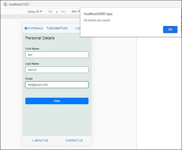
app.controller('MainController', function($rootScope, $scope, $routeParams) {
$scope.addDetails=function() {
alert("All details are saved!");
};
});
The display in browser is as follows −
Enter the details in the form and click on the Save button.
Mobile Angular UI - Swipe Gestures
The functionality like touch, swipes, dragging items is handled by the gestures module in Mobile Angular UI. The gestures module has a directive and services to take care of the functionality required in touch, swipe and drag.
To work with gestures features in Mobile Angular UI, you need to add the gestures module.
First add the JavaScript file inside index.html as shown below −
<script src="node_modules/mobile-angular-ui/dist/js/mobile-angular-ui.gestures.min.js"></script>
Later add the gestures module as a dependency in app.js as shown below −
var app=angular.module('myFirstApp', [
   'ngRoute',
   'mobile-angular-ui',
   'mobile-angular-ui.gestures'
]);
We have already discussed how drag functionality works using the gesture module. Take a look at the same in Drag and Drop Chapter.
Here will take a look at the swipe functionality.
The directive uiSwipeLeft and uiSwipeRight present helps to detect the direction in which the user has swiped.
Here is a working example on Swipe −
index.html
<!DOCTYPE html>
<html>
   <head>
      <meta charset="utf-8" />
      <title>Mobile Angular UI Demo</title>
      <meta http-equiv="X-UA-Compatible" content="IE=edge,chrome=1" />
      <meta name="apple-mobile-web-app-capable" content="yes" />
      <meta name="viewport" content="user-scalable=no, initial-scale=1.0, maximum-scale=1.0, minimal-ui" />
      <meta name="apple-mobile-web-app-status-bar-style" content="yes" />
      <link rel="shortcut icon" href="/assets/img/favicon.png" type="image/x-icon" />
      <link rel="stylesheet" href="node_modules/mobile-angular-ui/dist/css/mobile-angular-ui-hover.min.css" />
      <link rel="stylesheet" href="node_modules/mobile-angular-ui/dist/css/mobile-angular-ui-base.min.css" />
      <link rel="stylesheet" href="node_modules/mobile-angular-ui/dist/css/mobile-angular-ui-desktop.min.css" />
      <script src="node_modules/angular/angular.min.js"></script>
      <script src="node_modules/angular-route/angular-route.min.js"></script>
      <script src="node_modules/mobile-angular-ui/dist/js/mobile-angular-ui.min.js"></script>
      <script src="node_modules/angular-route/angular-route.min.js"></script>
      <script src="node_modules/mobile-angular-ui/dist/js/mobile-angular-ui.gestures.min.js"></script>
      <link rel="stylesheet" href="src/css/app.css" />
      <script src="src/js/app.js"></script>
   </head>
   <body ng-app="myFirstApp" ng-controller="MainController">

      <!-- Sidebars -->
      <div class="sidebar sidebar-left">
         <div class="scrollable">
            <h1 class="scrollable-header app-name">Tutorials</h1>
            <div class="scrollable-content">
               <div class="list-group" ui-turn-off='uiSidebarLeft'>
                  <a class="list-group-item" href="/">Home Page </a>
                  <a class="list-group-item" href="#/academic"><i class="fa fa-caret-right"></i>Academic Tutorials </a>
                  <a class="list-group-item" href="#/bigdata"><i class="fa fa-caret-right"></i>Big Data & Analytics </a>
                  <a class="list-group-item" href="#/computerProg"><i class="fa fa-caret-right"></i>Computer Programming </a>
                  <a class="list-group-item" href="#/computerscience"><i class="fa fa-caret-right"></i>Computer Science </a>
                  <a class="list-group-item" href="#/databases"><i class="fa fa-caret-right"></i>Databases </a>
                  <a class="list-group-item" href="#/devops"><i class="fa fa-caret-right"></i>DevOps </a>
               </div>
            </div>
         </div>
      </div>
      <div class="sidebar sidebar-right">
         <div class="scrollable">
            <h1 class="scrollable-header app-name">eBooks</h1>
            <div class="scrollable-content">
               <div class="list-group" ui-toggle="uiSidebarRight">
                  <a class="list-group-item" href="#/php"><i class="fa fa-caret-right"></i>PHP </a>
                  <a class="list-group-item" href="#/Javascript"><i class="fa fa-caret-right"></i>Javascript </a>
               </div>
            </div>
         </div>
      </div>
      <div class="app">
         <div class="navbar navbar-app navbar-absolute-top">
            <div class="navbar-brand navbar-brand-center" ui-yield-to="title">
               TutorialsPoint
            </div>
            <div class="btn-group pull-left">
               <div ui-toggle="uiSidebarLeft" class="btn sidebar-left-toggle">
                  <i class="fa fa-th-large "></i> Tutorials
               </div>
            </div>
            <div class="btn-group pull-right" ui-yield-to="navbarAction">
               <div ui-toggle="uiSidebarRight" class="btn sidebar-right-toggle">
                  <i class="fal fa-search"></i> eBooks
               </div>
            </div>
         </div>
         <div class="navbar navbar-app navbar-absolute-bottom">
            <div class="btn-group justified">
               <a ui-turn-on="aboutus_modal" class="btn btn-navbar"><i class="fal fa-globe"></i> About us</a>
               <a ui-turn-on="contactus_overlay" class="btn btn-navbar"><i class="fal fa-map-marker-alt"></i> Contact us</a>
            </div>
         </div>

         <!-- App body -->
         <div class='app-body'>
            <div class='app-content'>
               <ng-view></ng-view>
            </div>
         </div>
      </div><!-- ~ .app -->

      <!-- Modals and Overlays -->
      <div ui-yield-to="modals"></div>
   </body>
</html>
/js/app.js
/* eslint no-alert: 0 */

'use strict';

//
// Here is how to define your module
// has dependent on mobile-angular-ui
//
var app=angular.module('myFirstApp', [
   'ngRoute',
   'mobile-angular-ui',
   'mobile-angular-ui.gestures'
]);
app.config(function($routeProvider, $locationProvider) {
   $routeProvider
   .when("/", {
      templateUrl : "src/home/home.html"
   });
   $locationProvider.html5Mode({enabled:true, requireBase:false});
});
app.directive('dragItem', ['$drag', function($drag) {
   return {
      controller: function($scope, $element) {
         $drag.bind($element,
            {
               transform: $drag.TRANSLATE_BOTH,
               end: function(drag) {
                  drag.reset();
               }
            },
            {
               sensitiveArea: $element.parent()
            }
         );
      }
   };
}]);
app.controller('MainController', function($rootScope, $scope, $routeParams) {
   $scope.testSwipe=function(direction) {
      alert('You swiped ' + direction);
   };
});
src/home/home.html
<div class="scrollable">
      <div class="scrollable-content section"
         ui-swipe-left="testSwipe('left side')"
         ui-swipe-right="testSwipe('right side')">
      <h2>Testing of Swipe gesture</h2>
      <div>
         Swipe left and right to activate the uiSwipeLeft and uiSwipeRight Directive.
      </div>
   </div>
</div>
Following is the display in the browser −
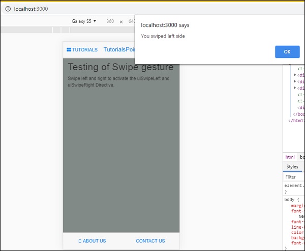
The directive for swipe are added inside home.html.
<div class="scrollable-content section"
   ui-swipe-left="testSwipe('left side')"
   ui-swipe-right="testSwipe('right side')">
It calls a method testSwipe(), it is defined in app.js.
$scope.testSwipe=function(direction) {
   alert('You swiped ' + direction);
};
Mobile Angular UI - Toggle Switch
Mobile Angular UI offers toggle switch elements using the ui-switch directive. The ui-switch directive makes a toggle when applied on to a Boolean ngModel value.
Here is a working example of Toggle Switch.
Index.html
<!DOCTYPE html>
<html>
   <head>
      <meta charset="utf-8" />
      <title>Mobile Angular UI Demo</title>
      <meta http-equiv="X-UA-Compatible" content="IE=edge,chrome=1" />
      <meta name="apple-mobile-web-app-capable" content="yes" />
      <meta name="viewport" content="user-scalable=no, initial-scale=1.0, maximum-scale=1.0, minimal-ui" />
      <meta name="apple-mobile-web-app-status-bar-style" content="yes" />
      <link rel="shortcut icon" href="/assets/img/favicon.png" type="image/x-icon" />
      <link rel="stylesheet" href="node_modules/mobile-angular-ui/dist/css/mobile-angular-ui-hover.min.css" />
      <link rel="stylesheet" href="node_modules/mobile-angular-ui/dist/css/mobile-angular-ui-base.min.css" />
      <link rel="stylesheet" href="node_modules/mobile-angular-ui/dist/css/mobile-angular-ui-desktop.min.css" />
      <script src="node_modules/angular/angular.min.js"></script>
      <script src="node_modules/angular-route/angular-route.min.js"></script>
      <script src="node_modules/mobile-angular-ui/dist/js/mobile-angular-ui.min.js"></script>
      <script src="node_modules/angular-route/angular-route.min.js"></script>
      <script src="node_modules/mobile-angular-ui/dist/js/mobile-angular-ui.gestures.min.js"></script>
      <link rel="stylesheet" href="src/css/app.css" />
      <script src="src/js/app.js"></script>
      <style>
         a.active {
            color: blue;
         }
      </style>
   </head>

   <body ng-app="myFirstApp" ng-controller="MainController" class="listening">
      <!-- Sidebars -->
      <div class="sidebar sidebar-left ">
         <div class="scrollable">
            <h1 class="scrollable-header app-name">Tutorials</h1>
            <div class="scrollable-content">
               <div class="list-group" ui-turn-off='uiSidebarLeft'>
                  <a class="list-group-item" href="/">Home Page </a>
                  <a class="list-group-item"
                  href="#/academic"><i class="fa fa-caret-right"></i>Academic Tutorials </a>
                  <a class="list-group-item" href="#/bigdata">
                  <i class="fa fa-caret-right"></i>Big Data & Analytics </a>
                  <a class="list-group-item" href="#/computerProg"><i
                  class="fa fa-caret-right"></i>Computer Programming </a>
                  <a class="list-group-item" href="#/computerscience"><
                  i class="fa fa-caret-right"></i>Computer Science </a>
                  <a class="list-group-item" href="#/databases"><i
                  class="fa fa-caret-right"></i>Databases </a>
                  <a class="list-group-item"
                  href="#/devops"><i class="fa fa-caret-right"></i>DevOps </a>
               </div>
            </div>
         </div>
      </div>
      <div class="sidebar sidebar-right">
         <div class="scrollable">
            <h1 class="scrollable-header app-name">eBooks</h1>
            <div class="scrollable-content">
               <div class="list-group" ui-toggle="uiSidebarRight">
                  <a class="list-group-item" href="#/php"><i class=
                  "fa fa-caret-right"></i>PHP </a>
                  <a class="list-group-item"
                  href="#/Javascript"><i class="fa fa-caret-right"></i>Javascript </a>
               </div>
            </div>
         </div>
      </div>
      <div class="app">
         <div class="navbar navbar-app navbar-absolute-top">
            <div class="navbar-brand navbar-brand-center" ui-yield-to="title">
               TutorialsPoint
            </div>
            <div class="btn-group pull-left">
               <div ui-toggle="uiSidebarLeft" class="btn sidebar-left-toggle">
                  <i class="fa fa-th-large "></i> Tutorials
               </div>
            </div>
            <div class="btn-group pull-right" ui-yield-to="navbarAction">
               <div ui-toggle="uiSidebarRight" class="btn sidebar-right-toggle">
                  <i class="fal fa-search"></i> eBooks
               </div>
            </div>
         </div>
         <div class="navbar navbar-app navbar-absolute-bottom">
            <div class="btn-group justified">
               <a ui-turn-on="aboutus_modal" class="btn btn-navbar"><i class="fal fa-globe"></i> About us</a>
               <a ui-turn-on="contactus_overlay" class="btn btn-navbar"><i class="fal fa-map-marker-alt"></i> Contact us</a>
            </div>
         </div>

         <!-- App body -->
         <div class='app-body'>
            <div class='app-content'>
               <ng-view></ng-view>
            </div>
         </div>
      </div><!-- ~ .app -->

      <!-- Modals and Overlays -->
      <div ui-yield-to="modals"></div>

   </body>
</html>
app.js
/* eslint no-alert: 0 */

'use strict';

//n mobile-angular-ui
//
var app=angular.
// Here is how to define your module
// has dependent omodule('myFirstApp', ['ngRoute',
   'mobile-angular-ui',
   'mobile-angular-ui.gestures',
]);
app.config(function($routeProvider, $locationProvider) {
   $routeProvider
   .when("/", {
      templateUrl : "src/home/home.html"
   });
   $locationProvider.html5Mode({enabled:true, requireBase:false});
});
app.controller('MainController', function($rootScope, $scope, $routeParams) {
   $scope.msg="Welcome to TutorialsPoint!";
});
src/home/home.html
<div class="scrollable">
   <div class="scrollable-content">
      <form>
         <h1>Testing Toogle Switch </h1>
         <ui-switch id="enabled" name="enabled" ng-model="enabled" class="green"></ui-switch>
         <p>{{ enabled }}</p>
      </form>
   </div>
</div>
The display in the browser is as follows −
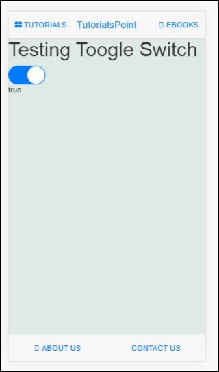
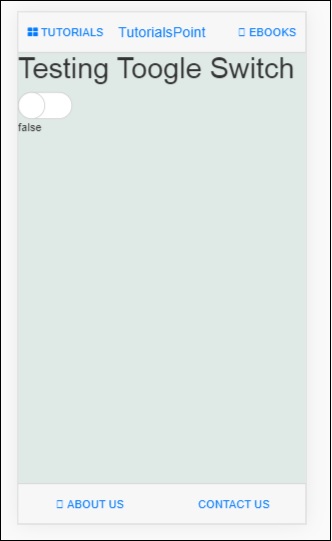
Mobile Angular UI - Sections
Sections are containers that are displayed inside the body. Mobile Angular UI makes use of classes available for sections to change the layout structure.
Here is the index.html −
<!DOCTYPE html>
<html>
   <head>
      <meta charset="utf-8" />
      <title>Mobile Angular UI Demo</title>
      <meta http-equiv="X-UA-Compatible" content="IE=edge,chrome=1" />
      <meta name="apple-mobile-web-app-capable" content="yes" />
      <meta name="viewport" content="user-scalable=no, initial-scale=1.0, maximum-scale=1.0, minimal-ui" />
      <meta name="apple-mobile-web-app-status-bar-style" content="yes" />
      <link rel="shortcut icon" href="/assets/img/favicon.png" type="image/x-icon" />
      <link rel="stylesheet" href="node_modules/mobile-angular-ui/dist/css/mobile-angular-ui-hover.min.css" />
      <link rel="stylesheet" href="node_modules/mobile-angular-ui/dist/css/mobile-angular-ui-base.min.css" />
      <link rel="stylesheet" href="node_modules/mobile-angular-ui/dist/css/mobile-angular-ui-desktop.min.css" />
      <script src="node_modules/angular/angular.min.js"></script>
      <script src="node_modules/angular-route/angular-route.min.js"></script>
      <script src="node_modules/mobile-angular-ui/dist/js/mobile-angular-ui.min.js"></script>
      <script src="node_modules/angular-route/angular-route.min.js"></script>
      <script src="node_modules/mobile-angular-ui/dist/js/mobile-angular-ui.gestures.min.js"></script>
      <link rel="stylesheet" href="src/css/app.css" />
      <script src="src/js/app.js"></script>
      <style>
         a.active {
            color: blue;
         }
      </style>
   </head>
   <body ng-app="myFirstApp" ng-controller="MainController" class="listening">

      <!-- Sidebars -->
      <div class="sidebar sidebar-left ">
         <div class="scrollable">
            <h1 class="scrollable-header app-name">Tutorials</h1>
            <div class="scrollable-content">
               <div class="list-group" ui-turn-off='uiSidebarLeft'>
                  <a class="list-group-item" href="/">Home Page </a>
                  <a class="list-group-item" href="#/academic">
                  <i class="fa fa-caret-right"></i>Academic Tutorials </a>
                  <a class="list-group-item" href="#/bigdata">
                  <i class="fa fa-caret-right"></i>Big Data & Analytics </a>
                  <a class="list-group-item" href="#/computerProg">
                  <i class="fa fa-caret-right"></i>Computer Programming </a>
                  <a class="list-group-item" href="#/computerscience">
                  <i class="fa fa-caret-right"></i>Computer Science </a>
                  <a class="list-group-item" href="#/databases">
                  <i class="fa fa-caret-right"></i>Databases </a>
                  <a class="list-group-item" href="#/devops">
                  <i class="fa fa-caret-right"></i>DevOps </a>
               </div>
            </div>
         </div>
      </div>
      <div class="sidebar sidebar-right">
         <div class="scrollable">
            <h1 class="scrollable-header app-name">eBooks</h1>
            <div class="scrollable-content">
               <div class="list-group" ui-toggle="uiSidebarRight">
                  <a class="list-group-item" href="#/php"><i class=
                  "fa fa-caret-right"></i>PHP </a>
                  <a class="list-group-item"
                  href="#/Javascript"><i class="fa fa-caret-right"></i>Javascript </a>
               </div>
            </div>
         </div>
      </div>
      <div class="app">
         <div class="navbar navbar-app navbar-absolute-top">
            <div class="navbar-brand navbar-brand-center" ui-yield-to="title">
               TutorialsPoint
            </div>
            <div class="btn-group pull-left">
               <div ui-toggle="uiSidebarLeft" class="btn sidebar-left-toggle">
                  <i class="fa fa-th-large "></i> Tutorials
               </div>
            </div>
            <div class="btn-group pull-right" ui-yield-to="navbarAction">
               <div ui-toggle="uiSidebarRight" class="btn sidebar-right-toggle">
                  <i class="fal fa-search"></i> eBooks
               </div>
            </div>
         </div>
         <div class="navbar navbar-app navbar-absolute-bottom">
            <div class="btn-group justified">
               <a ui-turn-on="aboutus_modal" class="btn btn-navbar"><i class="fal fa-globe"></i> About us</a>
               <a ui-turn-on="contactus_overlay" class="btn btn-navbar"><i class="fal fa-map-marker-alt"></i> Contact us</a>
            </div>
         </div>

         <!-- App body -->
         <div class='app-body'>
            <div class='app-content'>
               <ng-view></ng-view>
            </div>
         </div>
      </div><!-- ~ .app -->

      <!-- Modals and Overlays -->
      <div ui-yield-to="modals"></div>
   </body>
</html>
app.js
/* eslint no-alert: 0 */

'use strict';

//
// Here is how to define your module
// has dependent on mobile-angular-ui
//
var app=angular.module('myFirstApp', ['ngRoute',
   'mobile-angular-ui',
   'mobile-angular-ui.gestures',
]);
app.config(function($routeProvider, $locationProvider) {
   $routeProvider.when("/", { templateUrl : "src/home/home.html" });
   $routeProvider.when("/academic", {templateUrl : "src/academic/academic.html" });
   $routeProvider.when("/bigdata", {templateUrl : "src/bigdata/bigdata.html" });
   $locationProvider.html5Mode({enabled:true, requireBase:false});
});
app.directive('touchtest', ['$touch', function($touch) {
   return {
      restrict: 'C',
      link: function($scope, elem) {
         $scope.touch=null;
         $touch.bind(elem, {
            start: function(touch) {
               $scope.containerRect=elem[0].getBoundingClientRect();
               $scope.touch=touch;
               $scope.$apply();
            },
            cancel: function(touch) {
               $scope.touch=touch;
               $scope.$apply();
            },
            move: function(touch) {
               $scope.touch=touch;
               $scope.$apply();
            },
            end: function(touch) {
               $scope.touch=touch;
               $scope.$apply();
            }
         });
      }
   };
}]);
app.controller('MainController', function($rootScope, $scope, $routeParams) {
   $scope.msg="Welcome to TutorialsPoint!";
});
home/home.html
<div class="scrollable ">
   <div class="scrollable-content ">
      <div class="list-group text-center">
         <div class="list-group text-center">
            <div class="list-group-item list-group-item-home">
               <h1>{{msg}}</h1>
            </div>
         </div>

         <div class="list-group-item list-group-item-home" style="background-color: #ccc;">
            <div>
               <h2 class="home-heading">List of Latest Courses</h2>
            </div>
         </div>

         <div class="list-group-item list-group-item-home list-tuts">
            <div>
               <h4 class="home-heading">Information Technology</h4>
            </div>
         </div>

         <div class="list-group-item list-group-item-home list-tuts">
            <div>
               <h4 class="home-heading">Academics</h4>
            </div>
         </div>

         <div class="list-group-item list-group-item-home list-tuts">
            <div>
               <h4 class="home-heading">Development</h4>
            </div>
         </div>
         <div class="list-group-item list-group-item-home list-tuts">
            <div>
               <h4 class="home-heading">Business</h4>
            </div>
         </div>
         <div class="list-group-item list-group-item-home list-tuts">
            <div>
               <h4 class="home-heading">Design</h4>
            </div>
         </div>

         <div class="list-group-item list-group-item-home list-tuts">
            <div>
               <h4 class="home-heading">Others</h4>
            </div>
         </div>

      </div>
   </div>
</div>
The container with class .app, holds the top and bottom navbar and the main contents that are displayed on the screen. The class .app does not have any padding or background.
The class .section has the css to add padding and background.
Here is a layout without a section.

After adding class .section, you will see the padding added to the layout −
<div class="app section"></div>

There are some more variations in sections for the layout.
.section-wide : makes horizontal padding as 0
.section-condensed : makes vertical padding as 0
.section-break : this class will add margin-bottom as well shadow to show the break in sections on the screen.
You can also play around with the additional classes like .section-default, .section-primary, .section-success, .section-info, .section-warning or .section-danger to change the layout.
Mobile Angular UI - Core Details
The Mobile Angular Core module manages all the core functionalities. You can make use of it inside the angular app using mobile-angular-ui.core as a dependency module. In earlier chapters, we have used mobile-angular-ui directly that has the core module too. But you can standalone make use of the mobile-angular-ui.core module. You can do this when you need limited functionality, i.e., only the core functionality of Mobile Angular UI in your app.
Following are the important sub modules that we will talk in Mobile Angular Core Module −
Mobile Angular UI - Touch Events
To work with Touch and its events you need to add the following module −
mobile-angular-ui.gestures
If you are just interested in the touch module, then you can add only mobile-angular-ui.gestures.touch.
$touch is a service available with touch module. It will work on any input devices you want to work with. It gives details like movement, duration, velocity, direction, etc.
Methods in $touch
The following are the available methods in $touch −
bind
Let us take a look at the bind method.
Syntax
$touch.bind(element, eventHandlers, [options])
Parameters
element − html element you want to deal with touch details.
eventHandlers − An object with handlers for specific touch events. The eventHandlers available are −
start − it's a callback for touchstart event.
end − its a callback event for touchend.
move − its a callback for touchmove event.
cancel − its a callback for touchcancel event.
options − It is an object that can have details as follows −
movementThreshold − An integer value. The number of pixels of movement before start to trigger touchmove handlers.
valid − Its a function that returns a boolean value that decides if a touch should be handled or ignored.
sensitiveArea − It can be a function, or element or BoundingClientRect. Sensitive area defines boundaries to release touch when movement is outside.
pointerTypes − It is an array of pointer that has keys which are a subset of default pointer events map.
Types available in $touch
The following are the types available in $touch −
| Property | Type | Description |
|---|---|---|
| type | string | This will tell you the type of event. For example − touchmove, touchstart, touchend, touchcancel |
| timestamp | Date | The timestamp when the touch happened |
| duration | int | Difference between current touch event and touch start |
| startX | float | X coordinate of touchstart |
| startY | float | Y coordinate of touchstart |
| prevX | float | X coordinate of the previously happened touchstart or touchmove |
| prevY | float | Y coordinate of the previously happened touchstart or touchmove |
| x | float | X coordinate of touch event |
| y | float | Y coordinate of touch event |
| step | float | The distance between prevX,prevY and x,y points |
| stepX | float | The distance between prevX and x points |
| stepY | float | The distance between prevY and y points |
| velocity | float | Velocity in pixels of a touch event per second |
| averageVelocity | float | Average velocity of touchstart event per second |
| distance | float | The distance between startX, startY and x,y points |
| distanceX | float | The distance between startX and x points |
| distanceY | float | The distance between startY and y points |
| total | float | The total movement i.e horizontal and vertical movement done across the device |
| totalX | float | The total movement i.e horizontal direction.It also includes turnarounds and changes of direction |
| totalY | float | The total movement i.e vertical direction.It also includes turnarounds and changes of direction |
| direction | float | The left, top, bottom, right direction location of touch |
| angle | float | The angle in degrees from the x and y axis |
Here is a working example showing the touch types.
index.html
<!DOCTYPE html>
<html>
   <head>
      <meta charset="utf-8" />
      <title>Mobile Angular UI Demo</title>
      <meta http-equiv="X-UA-Compatible" content="IE=edge,chrome=1" />
      <meta name="apple-mobile-web-app-capable" content="yes" />
      <meta name="viewport" content="user-scalable=no, initial-scale=1.0, maximum-scale=1.0, minimal-ui" />
      <meta name="apple-mobile-web-app-status-bar-style" content="yes" />
      <link rel="shortcut icon" href="/assets/img/favicon.png" type="image/x-icon" />
      <link rel="stylesheet" href="node_modules/mobile-angular-ui/dist/css/mobile-angular-ui-hover.min.css" />
      <link rel="stylesheet" href="node_modules/mobile-angular-ui/dist/css/mobile-angular-ui-base.min.css" />
      <link rel="stylesheet" href="node_modules/mobile-angular-ui/dist/css/mobile-angular-ui-desktop.min.css" />
      <script src="node_modules/angular/angular.min.js"></script>
      <script src="node_modules/angular-route/angular-route.min.js"></script>
      <script src="node_modules/mobile-angular-ui/dist/js/mobile-angular-ui.min.js"></script>
      <script src="node_modules/angular-route/angular-route.min.js"></script>
      <script src="node_modules/mobile-angular-ui/dist/js/mobile-angular-ui.gestures.min.js"></script>
      <link rel="stylesheet" href="src/css/app.css" />
      <script src="src/js/app.js"></script>
      <style>
         a.active {
            color: blue;
         }
      </style>
   </head>

   <body ng-app="myFirstApp" ng-controller="MainController" class="listening">

      <!-- Sidebars -->
      <div class="sidebar sidebar-left ">
         <div class="scrollable">
            <h1 class="scrollable-header app-name">Tutorials</h1>
            <div class="scrollable-content">
               <div class="list-group" ui-turn-off='uiSidebarLeft'>
                  <a class="list-group-item" href="/">Home Page </a>
                  <a class="list-group-item" href="#/academic"><i class ="fa fa-caret-right"></i>Academic Tutorials </a>
                  <a class="list-group-item" href="#/bigdata"><i class ="fa fa-caret-right"></i>Big Data & Analytics </a>
                  <a class="list-group-item" href="#/computerProg"><i class="fa fa-caret-right"></i>Computer Programming </a>
                  <a class="list-group-item" href="#/computerscience"><i class="fa fa-caret-right"></i>Computer Science </a>
                  <a class="list-group-item" href="#/databases"><i class="fa fa-caret-right"></i>Databases </a>
                  <a class="list-group-item" href="#/devops"><i class="fa fa-caret-right"></i>DevOps </a>
               </div>
            </div>
         </div>
      </div>
      <div class="sidebar sidebar-right">
         <div class="scrollable">
            <h1 class="scrollable-header app-name">eBooks</h1>
            <div class="scrollable-content">
               <div class="list-group" ui-toggle="uiSidebarRight">
                  <a class="list-group-item" href="#/php"><i class="fa fa-caret-right"></i>PHP </a>
                  <a class="list-group-item" href="#/Javascript"><i class="fa fa-caret-right"></i>Javascript </a>
               </div>
            </div>
         </div>
      </div>
      <div class="app">
         <div class="navbar navbar-app navbar-absolute-top">
            <div class="navbar-brand navbar-brand-center" ui-yield-to="title">
               TutorialsPoint
            </div>
            <div class="btn-group pull-left">
               <div ui-toggle="uiSidebarLeft" class="btn sidebar-left-toggle">
                  <i class="fa fa-th-large "></i> Tutorials
               </div>
            </div>
            <div class="btn-group pull-right" ui-yield-to="navbarAction">
               <div ui-toggle="uiSidebarRight" class="btn sidebar-right-toggle">
                  <i class="fal fa-search"></i> eBooks
               </div>
            </div>
         </div>
         <div class="navbar navbar-app navbar-absolute-bottom">
            <div class="btn-group justified">
               <a ui-turn-on="aboutus_modal" class="btn btn-navbar"><i class="fal fa-globe"></i> About us</a>
               <a ui-turn-on="contactus_overlay" class="btn btn-navbar"><i class="fal fa-map-marker-alt"></i> Contact us</a>
            </div>
         </div>

         <!-- App body -->
         <div class='app-body'>
            <div class='app-content'>
               <ng-view></ng-view>
            </div>
         </div>
      </div><!-- ~ .app -->

      <!-- Modals and Overlays -->
      <div ui-yield-to="modals"></div>
   </body>
</html>
There is touchtest directive added in app.js that makes use of the $touch.bind method.
directive('touchtest', ['$touch', function($touch) {
   return {
      restrict: 'C',
      link: function($scope, elem) {
         $scope.touch=null;
         $touch.bind(elem, {
            start: function(touch) {
               $scope.containerRect=elem[0].getBoundingClientRect();
               $scope.touch=touch;
               $scope.$apply();
            },
            cancel: function(touch) {
               $scope.touch=touch;
               $scope.$apply();
            },
            move: function(touch) {
               $scope.touch=touch;
               $scope.$apply();
            },
            end: function(touch) {
               $scope.touch=touch;
               $scope.$apply();
            }
         });
      }
   };
}]);
The complete code inside app.js is as follows −
/* eslint no-alert: 0 */

'use strict';
//
// Here is how to define your module
// has dependent on mobile-angular-ui
//
var app=angular.module('myFirstApp', ['ngRoute',
   'mobile-angular-ui',
   'mobile-angular-ui.gestures',
]);
app.config(function($routeProvider, $locationProvider) {
   $routeProvider
   .when("/", {
      templateUrl : "src/home/home.html"
   });
   $locationProvider.html5Mode({enabled:true, requireBase:false});
});
app.directive('touchtest', ['$touch', function($touch) {
   return {
      restrict: 'C',
      link: function($scope, elem) {
         $scope.touch=null;
         $touch.bind(elem, {
            start: function(touch) {
               $scope.containerRect=elem[0].getBoundingClientRect();
               $scope.touch=touch;
               $scope.$apply();
            },
            cancel: function(touch) {
               $scope.touch=touch;
               $scope.$apply();
            },
            move: function(touch) {
               $scope.touch=touch;
               $scope.$apply();
            },
            end: function(touch) {
               $scope.touch=touch;
               $scope.$apply();
            }
         });
      }
   };
}]);
app.controller('MainController', function($rootScope, $scope, $routeParams) {
   $scope.msg="Welcome to TutorialsPoint!";
});
src/home/home.html
The directive touchtest is used inside the html as shown below −
<div class="section touchtest">
   <h4>Touch Around on the screen to see the values changing</h4>
   <div>
      <p>type: {{touch.type}}</p>
      <p>direction: {{touch.direction == null ? '-' : touch.direction}}</p>
      <p>point: [{{touch.x}}, {{touch.y}}]</p>
      <p>step: {{touch.step}} [{{touch.stepX}}, {{touch.stepY}}]</p>
      <p>distance: {{touch.distance}} [{{touch.distanceX}}, {{touch.distanceY}}]</p>
      <p>total: {{touch.total}} [{{touch.totalX}}, {{touch.totalY}}]</p>
      <p>velocity: {{touch.velocity}} px/sec</p>
      <p>averageVelocity: {{touch.averageVelocity}} px/sec</p>
      <p>angle: {{touch.angle == null ? '-' : touch.angle}} deg</p>
   </div>
</div>
Now let us test the display in the browser. The resultant screen is as follows −
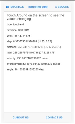
Mobile Angular UI - PhoneGap and Cordova
In this chapter, we will understand how to set-up the app using phonegap and cordova.
Let us first install the following in our system −
Mobile Angular UI - Creating APK File
In this chapter, we will create an apk file of the Mobile Angular UI app. We are going to make use of app setup done using cordova and phonegap in the previous chapter. So please check the previous chapter about App Setup using PhoneGap and Cordova where we have already installed cordova, phonegap and created Mobile Angular UI app in cordova.
Let us now create a APK file for the app created. For that we need to install the following −
- Java Development Kit (jdk 1.8)
- Gradle
- Android SDK Tools
Java Development Kit (jdk 1.8)
To create the app and build it, one important requirement is JDK 1.8. We need the version of jdk as 1.8 as that is a stable one so far with cordova build.
Go to the following link to install jdk1.8.
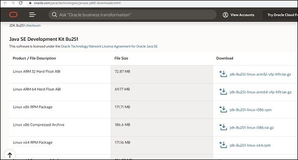
Install the Jdk as per your operating system. Once the installation is done, it is necessary to update the environment path JAVA_HOME. In case you face difficulty in installation of Jdk refer this Java installation tutorial.
For windows users to update Envionment Path, right click on My computer → properties→ Advanced System Settings
It will display screen as shown below −
Click on Environment Variables. It will display screen as shown below −
Click on New button, it will display a screen as shown below −
The variable name will be JAVA_HOME and the Variable value will be the path where jdk 1.8 is located.
Once done close your command prompt and open it again. Now type java version, it should display the version of java you have installed as shown below −
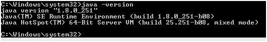
We are done with installing JAVA.
Gradle
Now install gradle, which is one of important requirements to build the app.
Go to Gradle install page and install latest version of gradle as per your operating system.Download and install it on your system. Once installed you need to update the path of Gradle in environment variables. In case you face any difficulty in installation refer this gradle tutorial.
For windows users to update environment variable, add the location of gradle to in Path variable as shown below −
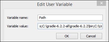
Once done, close the command prompt if open. Now open the command prompt and check for the version of gradle installed.
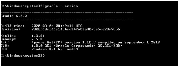
We have installed Gradle version 6.2.2 for this tutorial.
Android SDK Tools
Now install Android studio on your system. Along with Android studio, the Android sdk package will also get installed. We are more interested in the Android SDK package. The SDK package will have tools and build-tools, we need to add the same to Environment Variables for cordova to access during build. Incase you face any difficulty refer this tutorial for Android Studio Installation.
For windows users locate the path of android sdk and add the Variable ANDROID _SDK_ROOT to environment variable as shown below −
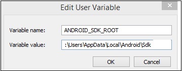
Now add the tools and build-tools path for example −
C:\Users\AppData\Local\Android\Sdk\build-tools;C:\Users\AppData\Local\Android\Sdk\tools\bin;
To the path variable at the end as shown below −
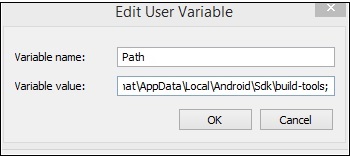
Once done close the command prompt and open it again.
Execute the command: sdkmanager "platform-tools" "platforms;android-28" in your the command prompt. It will install the android-28 target api that we need. For more details on sdkmanager refer the below link −
https://www.tutorialspoint.com/android/android_sdk_manager.htmWe have already created a project setup using cordova and phonegap in the previous chapter. This is how the app looks in the browser −
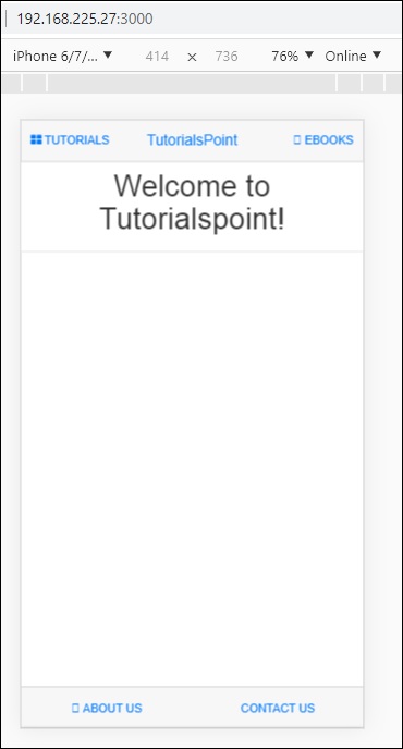
Let us now check if cordova has all the details to build the app. To do that we can use the following command − cordova requirements.
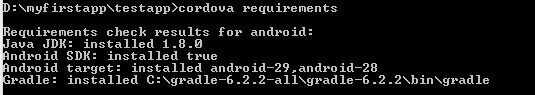
Build the App
To build the app using cordova the command is as follows −
cordova build
The above command will build the app for all the platforms you have added.
The run the build platform wise you can make use of following command −
cordova build ios
cordova build android
We have added for only one platform i.e android, hence can use the cordova build command directly.
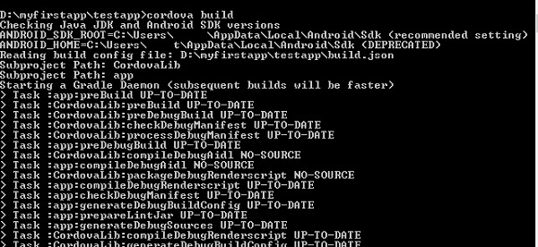
If the build is successful, you should get the following output −
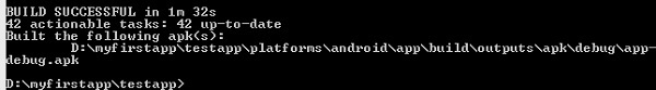
It displays the location of the app apk file. Now we have the apk, but we cannot publish the same, as it is an app-debug.apk. We need a release apk that can be published in Google Play Store.
App Release
To create app-release, we need to create a keystore. A keystore is a file that has private keys and certificates.
To create a keystore file will make use of JAVA keytool. A JAVA keytool is a tool that helps to create a certificate.
Following is the command to create a keystore −
keytool -genkey -v -keystore testapp-key.keystore
-alias testapp-key -keyalg RSA -keysize 2048 -validity 10000
The name of the keystore we have used is as follows −
testapp-key.keystore
The alias is testapp-key same as the name.
Execute the command in the command line from the project root folder.
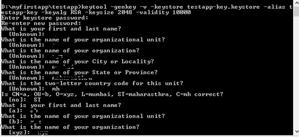
When the command executes, it will ask you some questions, like password, first and last name, organization unit, city, state, etc. You can enter the information and once done the keystore will be created and the keystore file will be stored inside the project root folder.
Once the keystore is done, create a build.json inside myfirstapp\testapp\platforms\android\build.json.
The details are as shown below −
{
   "android":{
      "release":{
         "keystore":"testapp-key.keystore",
         "storePassword":"testapp123",
         "alias":"testapp-key",
         "password":"testapp123",
         "keystoreType":""
      }
   }
}
You will have to enter the keystore details, as well the password you entered while generating the keystore.
Once the keystore and build.json are done, we are now ready to build the apk for release.
Following is the command to build it −
cordova build android --release
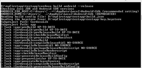
Once the build is successful, you will get the release apk as shown below −
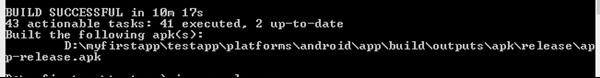
Now you can use this apk in your Google Play Store to publish it and get your app live.
Google Play Store
Once you have app-release.apk ready, you need to upload in to Google Play Store. To upload you need to sign-in in Google Play Store. The first time user has to pay $25 as the developer start price. Once that is done you can proceed and upload your apk file. You can follow the steps given here to upload your APK file.
Mobile Angular UI - APP Development
In this chapter, we will discuss the use of Using AngularJS and Ionic for app development.
Ionic is an open source framework used for developing mobile applications. It provides tools and services for building Mobile UI with native look and feel. Ionic framework needs native wrapper to be able to run on mobile devices.
In this chapter, we will learn just the basics on how we can make use of ionic and mobile angular UI to develop your app.
For details of ionic refer − https://www.tutorialspoint.com/ionic/index.htm.
To start working with ionic and angularjs, we need to first install cordova. The command is as follows −
npm install -g cordova
Creating Project Setup Using Cordova
Create a folder ionic_mobileui/ and in that let us create our project setup using the below command −
cordova create ionic-mobileui-angularjs
Here ionic-mobileui-angularjs is the name of our app.
Now let us install the packages that we need in our project. The list is given below −
npm install --save-dev angular angular-route mobile-angular-ui @ionic/core
The files are installed and the folder structure is shown below −
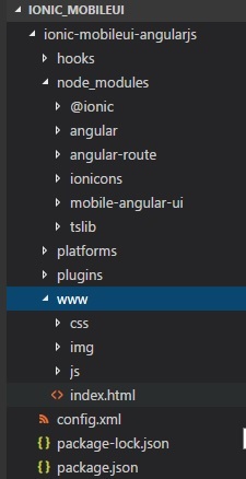
All the angular and ionic files are inside node_modules. We are going to make use of www/ folder. Hence move the angular and ionic js and css files inside www/css/ and www/js/ folders.
Let us modify the index.html with mobile angular UI components and also add app.js in js/ folder.
index.html
<!DOCTYPE html>
<!--
   Licensed to the Apache Software Foundation (ASF) under one or more contributor license agreements.
   See the NOTICE file distributed with this work for additional information regarding copyright
   ownership. The ASF licenses this file to you under the Apache License, Version 2.0 (the
   "License"); you may not use this file except in compliance with the License. You may obtain a
   copy of the License at

   http://www.apache.org/licenses/LICENSE-2.0

   Unless required by applicable law or agreed to in writing, software distributed under the License
   is distributed on an "AS IS" BASIS, WITHOUT WARRANTIES OR CONDITIONS OF ANY KIND, either
   express or implied. See the License for the specific language governing permissions and
   limitations under the License.
-->
<html>

   <head>
      <!--
      Customize this policy to fit your own app's needs. For more guidance, see:
         https://github.com/apache/cordova-plugin-whitelist/blob/master/README.md#content-security-policy
      Some notes:
         * gap: is required only on iOS (when using UIWebView) and is needed for JS->native communication
         * https://ssl.gstatic.com is required only on Android and is needed for TalkBack to function properly
         * Disables use of inline scripts in order to mitigate risk of XSS vulnerabilities. To change this:
            * Enable inline JS: add 'unsafe-inline' to default-src
      -->
      <meta http-equiv="Content-Security-Policy" content="default-src 'self' data: gap: https://ssl.gstatic.com 'unsafe-eval'; style-src 'self' 'unsafe-inline'; media-src *; img-src 'self' data: content:;">
      <meta name="format-detection" content="telephone=no">
      <meta name="msapplication-tap-highlight" content="no">
      <meta name="viewport" content="initial-scale=1, width=device-width, viewport-fit=cover">
      <link rel="stylesheet" type="text/css" href="css/index.css">
      <title>Mobile Angular UI Demo</title>
      <meta http-equiv="X-UA-Compatible" content="IE=edge,chrome=1" />
      <meta name="apple-mobile-web-app-capable" content="yes" />
      <meta name="viewport" content="user-scalable=no, initial-scale=1.0, maximum-scale=1.0, minimal-ui" />
      <meta name="apple-mobile-web-app-status-bar-style" content="yes" />
      <link rel="shortcut icon" href="/assets/img/favicon.png" type="image/x-icon" />
      <link rel="stylesheet" href="css/mobile-angular-ui-hover.min.css" /> <link rel="stylesheet" href="css/mobile-angular-ui-base.min.css" />
      <link rel="stylesheet" href="css/mobile-angular-ui-desktop.min.css" />
      <script src="js/angular.min.js"></script>
      <script src="js/angular-route.min.js"></script>
      <script src="js/mobile-angular-ui.min.js"></script>
      <script src="js/ionic.js"></script>
      <link rel="stylesheet" href="css/app.css" />
      <script src="js/app.js"></script>
      </head>
      <body ng-app="myFirstApp" ng-controller="MainController">
         <!-- Sidebars -->
            <div class="sidebar sidebar-left">
               <div class="scrollable">
                  <h1 class="scrollable-header app-name">Tutorials</h1>
                  <div class="scrollable-content"> <div class="list-group" ui-turn-off='uiSidebarLeft'>
                  <a class="list-group-item" href="/">Home Page </a>
                  <a class="list-group-item" href="#/academic"><i class="fa fa-caret-right"></i>Academic Tutorials </a>
                  <a class="list-group-item" href="#/bigdata"><i class="fa fa-caret-right"></i>Big Data & Analytics </a>
                  <a class="list-group-item" href="#/computerProg"><i class="fa fa-caret-right"></i>Computer Programming </a>
                  <a class="list-group-item" href="#/computerscience"><i class="fa fa-caret-right"></i>Computer Science </a>
                  <a class="list-group-item" href="#/databases"><i class="fa fa-caret-right"></i>Databases </a> <a class="list-group-item" href="#/devops"><i class="fa fa-caret-right"></i>DevOps </a>
               </div>
            </div>
         </div>
      </div>
      <div class="sidebar sidebar-right">
         <div class="scrollable">
            <h1 class="scrollable-header app-name">eBooks</h1>
               <div class="scrollable-content">
                  <div class="list-group" ui-toggle="uiSidebarRight">
                     <a class="list-group-item" href="#/php"><i class="fa fa-caret-right"></i>PHP </a>
                     <a class="list-group-item" href="#/Javascript"><i class="fa fa-caret-right"></i>Javascript </a>
                  </div>
               </div>
            </div>
      </div>

      <div class="app">
         <div class="navbar navbar-app navbar-absolute-top">
            <div class="navbar-brand navbar-brand-center" ui-yield-to="title">
               TutorialsPoint
            </div>
            <div class="btn-group pull-left">
               <div ui-toggle="uiSidebarLeft" class="btn sidebar-left-toggle">
                  <i class="fa fa-th-large "></i> Tutorials
               </div>
            </div>
            <div class="btn-group pull-right" ui-yield-to="navbarAction">
               <div ui-toggle="uiSidebarRight" class="btn sidebar-right-toggle">
                  <i class="fal fa-search"></i> eBooks
               </div>
            </div>
         </div>
         <div class="navbar navbar-app navbar-absolute-bottom">
            <div class="btn-group justified">
               <a ui-turn-on="aboutus_modal" class="btn btn-navbar"><i class="fal fa-globe"></i> About us</a>
               <a ui-turn-on="contactus_overlay" class="btn btn-navbar"><i class="fal fa-map-marker-alt"></i> Contact us</a>
            </div>
         </div>

         <!-- App body -->
         <div class='app-body'>
            <div class='app-content'>
               <ng-view></ng-view>
            </div>
         </div>
      </div><!-- ~ .app -->

      <!-- Modals and Overlays -->
      <div ui-yield-to="modals"></div>

      <div class="app">
         <h1>Apache Cordova</h1>
         <div id="deviceready" class="blink">
            <p class="event listening">Connecting to Device</p>
            <p class="event received">Device is Ready</p>
         </div>
      </div>
      <script type="text/javascript" src="cordova.js"></script>
      <script type="text/javascript" src="js/index.js"></script>
   </body>
</html>
All the js and css files are added in the head section. The module and controller is created inside app.js as shown below −
/* eslint no-alert: 0 */

'use strict';
//
// Here is how to define your module
// has dependent on mobile-angular-ui
// var app=angular.module('myFirstApp', [
   'ngRoute',
   'mobile-angular-ui'
]);
app.config(function($routeProvider, $locationProvider) {
   $routeProvider
   .when("/", {
      templateUrl : "home/home.html"
   });
   $locationProvider.html5Mode({enabled:true, requireBase:false});
});
app.directive('dragItem', ['$drag', function($drag) {
   return {
      controller: function($scope, $element) {
         $drag.bind($element,
            {
               transform: $drag.TRANSLATE_BOTH,
               end: function(drag) {
                  drag.reset();
               }
            },
            {
               sensitiveArea: $element.parent()
            }
         );
      }
   };
}]);
app.controller('MainController', function($rootScope, $scope, $routeParams) {
   $scope.msg="Welcome to Tutorialspoint!";
});
Create home/home.html file in www/ folder. Following are details inside home.html.
<div class="list-group text-center">
   <div class="list-group-item list-group-item-home">
      <h1>{{msg}}</h1>
   </div>
</div>
To run the app using cordova, execute the following command −
cordova platform add browser
Next, execute the below command to test the app in the browser −
cordova run
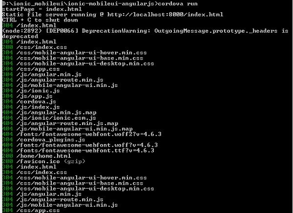
Hit the url : http://localhost:8000 in the browser, to test the app.
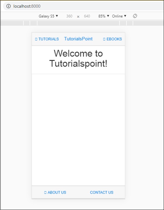
Adding Ionic Component to Mobile Angular UI App
Open home/home.html, add the following ionic card template −
home/home.html
<ion-card>
   <ion-card-header>
      <ion-card-subtitle>Ionic Card</ion-card-subtitle>
      <ion-card-title>Mobile Angular UI + Ionic</ion-card-title>
   </ion-card-header>

   <ion-card-content>
      Welcome To TutorialsPoint!
   </ion-card-content>
</ion-card>
Once done stop cordova run and run it again. You should see the ionic card details as shown below −
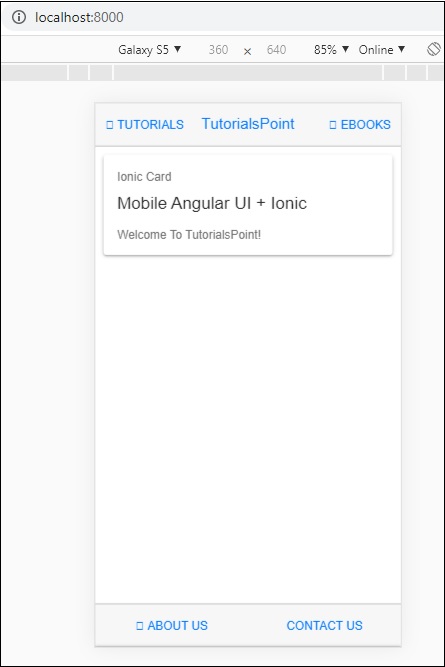
So now you can create an app of your choice by using AngularJs, Mobile Angular UI and Ionic.
Mobile Angular UI - Examples
In this chapter, we will take a look at an example of the app created using Mobile Angular UI. The files required are mentioned below, with the code details.
index.html
<!DOCTYPE html>
<html>
   <head>
      <meta charset="utf-8" />
      <title>Mobile Angular UI Demo</title>
      <meta http-equiv="X-UA-Compatible" content="IE=edge,chrome=1" />
      <meta name="apple-mobile-web-app-capable"  content="yes" />
      <meta name="viewport" content="user-scalable=no, initial-scale=1.0, maximum-scale=1.0, minimal-ui" />
      <meta name="apple-mobile-web-app-status-bar-style" content="yes" />
      <link rel="shortcut icon" href="/assets/img/favicon.png" type="image/x-icon" />
      <link rel="stylesheet" href="node_modules/mobile-angular-ui/dist/css/mobile-angular-ui-hover.min.css" />
      <link rel="stylesheet" href="node_modules/mobile-angular-ui/dist/css/mobile-angular-ui-base.min.css" />
      <link rel="stylesheet" href="node_modules/mobile-angular-ui/dist/css/mobile-angular-ui-desktop.min.css" />
      <script src="node_modules/angular/angular.min.js"></script>
      <script src="node_modules/angular-route/angular-route.min.js"></script>
      <script src="node_modules/mobile-angular-ui/dist/js/mobile-angular-ui.min.js"></script>
      <script src="node_modules/angular-route/angular-route.min.js"></script>
      <link rel="stylesheet" href="src/css/app.css" />
      <script src="src/js/app.js"></script>
   </head>
   <body ng-app="myFirstApp" ng-controller="MainController">
      <!-- Sidebars -->
      <div class="sidebar sidebar-left">
         <div class="scrollable">
            <h1 class="scrollable-header app-name">Tutorials</h1>
            <div class="scrollable-content">
               <div class="list-group" ui-turn-off='uiSidebarLeft'>
                  <a class="list-group-item" href="/">Home Page </a>
                  <a class="list-group-item" href="#/academic"><i class="fa fa-caret-right"></i>Academic Tutorials </a>
                  <a class="list-group-item" href="#/bigdata"><i class="fa fa-caret-right"></i>Big Data & Analytics </a>
                  <a class="list-group-item" href="#/computerProg"><i class="fa fa-caret-right"></i>Computer Programming </a>
                  <a class="list-group-item" href="#/computerscience"><i class="fa fa-caret-right"></i>Computer Science </a>
                  <a class="list-group-item" href="#/databases"><i class="fa fa-caret-right"></i>Databases </a>
                  <a class="list-group-item" href="#/devops"><i class="fa fa-caret-right"></i>DevOps </a>
               </div>
            </div>
         </div>
      </div>
      <div class="sidebar sidebar-right">
         <div class="scrollable">
            <h1 class="scrollable-header app-name">eBooks</h1>
            <div class="scrollable-content">
               <div class="list-group" ui-toggle="uiSidebarRight">
                  <a class="list-group-item" href="#/php"><i class="fa fa-caret-right"></i>PHP </a>
                  <a class="list-group-item" href="#/Javascript"><i class="fa fa-caret-right"></i>Javascript </a>
               </div>
            </div>
         </div>
      </div>

      <div class="app">
         <div class="navbar navbar-app navbar-absolute-top">
            <div class="navbar-brand navbar-brand-center" ui-yield-to="title">
               TutorialsPoint
            </div>
            <div class="btn-group pull-left">
               <div ui-toggle="uiSidebarLeft" class="btn sidebar-left-toggle">
                  <i class="fa fa-th-large "></i> Tutorials
               </div>
            </div>
            <div class="btn-group pull-right" ui-yield-to="navbarAction">
               <div ui-toggle="uiSidebarRight" class="btn sidebar-right-toggle">
                  <i class="fal fa-search"></i> eBooks
               </div>
            </div>
         </div>
         <div class="navbar navbar-app navbar-absolute-bottom">
            <div class="btn-group justified">
               <a ui-turn-on="aboutus_modal" class="btn btn-navbar"><i class="fal fa-globe"></i> About us</a>
               <a ui-turn-on="contactus_overlay" class="btn btn-navbar"><i class="fal fa-map-marker-alt"></i> Contact us</a>
            </div>
         </div>

         <!-- App body -->
         <div class='app-body'>
            <div class='app-content'>
               <ng-view></ng-view>
            </div>
         </div>
      </div><!-- ~ .app -->

      <!-- Modals and Overlays -->
      <div ui-yield-to="modals"></div>
   </body>
</html>
In app.js, we will build the ngroute for all the routes mentioned here −
<div class="list-group" ui-turn-off='uiSidebarLeft'>
   <a class="list-group-item" href="/">Home Page </a>
   <a class="list-group-item" href="/academic"><i class="fa fa-caret-right"></i>Academic Tutorials </a>
   <a class="list-group-item" href="/bigdata"><i class="fa fa-caret-right"></i>Big Data & Analytics </a>
   <a class="list-group-item" href="/computerProg"><i class="fa fa-caret-right"></i>Computer Programming </a>
   <a class="list-group-item" href="/computerscience"><i class="fa fa-caret-right"></i>Computer Science </a>
   <a class="list-group-item" href="/databases"><i class="fa fa-caret-right"></i>Databases </a>
   <a class="list-group-item" href="/devops"><i class="fa fa-caret-right"></i>DevOps </a>
</div>
app.js
/* eslint no-alert: 0 */

'use strict';

//
// Here is how to define your module
// has dependent on mobile-angular-ui
//
var app=angular.module('myFirstApp', ['ngRoute',
   'mobile-angular-ui',
   'mobile-angular-ui.gestures',
]);
app.config(function($routeProvider, $locationProvider) {
   $routeProvider.when("/", { templateUrl : "src/home/home.html" });
   $routeProvider.when("/academic", { templateUrl : "src/academic/academic.html" });
   $routeProvider.when("/bigdata", { templateUrl : "src/bigdata/bigdata.html" });
   $locationProvider.html5Mode({enabled:true, requireBase:false});
});
app.directive('touchtest', ['$touch', function($touch) {
   return {
      restrict: 'C',
      link: function($scope, elem) {
         $scope.touch=null;
         $touch.bind(elem, {
            start: function(touch) {
               $scope.containerRect=elem[0].getBoundingClientRect();
               $scope.touch=touch;
               $scope.$apply();
            },
            cancel: function(touch) {
               $scope.touch=touch;
               $scope.$apply();
            },
            move: function(touch) {
               $scope.touch=touch;
               $scope.$apply();
            },
            end: function(touch) {
               $scope.touch=touch;
               $scope.$apply();
            }
         });
      }
   };
}]);
app.controller('MainController', function($rootScope, $scope, $routeParams) {
   $scope.msg="Welcome to TutorialsPoint!";
});
The routes for the links in sidebar are listed here −
app.config(function($routeProvider, $locationProvider) {
   $routeProvider.when("/", { templateUrl : "src/home/home.html" });
   $routeProvider.when("/academic", { templateUrl : "src/academic/academic.html" });
   $routeProvider.when("/bigdata", { templateUrl : "src/bigdata/bigdata.html" });
   $locationProvider.html5Mode({enabled:true, requireBase:false});
});
Right now, we have added for home, academic and bigdata. Similarly, you can design app of your choice and add routes as shown above.
The home/home.html will be as follows
<div class="scrollable ">
   <div class="scrollable-content ">
      <div class="list-group text-center">
         <div class="list-group text-center">
            <div class="list-group-item list-group-item-home">
               <h1>{{msg}}</h1>
            </div>
         </div>

         <div class="list-group-item list-group-item-home" style="background-color: #ccc;">
            <div>
               <h2 class="home-heading">List of Latest Courses</h2>
            </div>
         </div>
         <div class="list-group-item list-group-item-home list-tuts">
            <div>
               <h4 class="home-heading">Information Technology</h4>
            </div>
         </div>
         <div class="list-group-item list-group-item-home list-tuts">
            <div>
               <h4 class="home-heading">Academics</h4>
            </div>
         </div>
         <div class="list-group-item list-group-item-home list-tuts">
            <div>
               <h4 class="home-heading">Development</h4>
            </div>
         </div>
         <div class="list-group-item list-group-item-home list-tuts">
            <div>
               <h4 class="home-heading">Business</h4>
            </div>
         </div>
         <div class="list-group-item list-group-item-home list-tuts">
            <div>
               <h4 class="home-heading">Design</h4>
            </div>
         </div>

         <div class="list-group-item list-group-item-home list-tuts">
            <div>
               <h4 class="home-heading">Others</h4>
            </div>
         </div>

      </div>
   </div>
</div>
academic/academic.html
<div class="scrollable">
   <div class="scrollable-content">
      <div class="list-group text-center">
         <div class="list-group text-center">
            <div class="list-group-item list-group-item-home">
               <h1>{{msg}}</h1>
            </div>
         </div>
         <div class="list-group-item list-group-item-home" style="background-color: #ccc;">
            <div>
               <h2 class="home-heading">Academic Tutorials</h2>
            </div>
         </div>
         <div class="list-group-item list-group-item-home list-tuts">
            <div>
               <h4 class="home-heading">CBSE Syllabus</h4>
            </div>
         </div>
         <div class="list-group-item list-group-item-home list-tuts">
            <div>
               <h4 class="home-heading">Learn Accounting Basics</h4>
            </div>
         </div>
         <div class="list-group-item list-group-item-home list-tuts">
            <div>
               <h4 class="home-heading">Auditing</h4>
            </div>
         </div>
         <div class="list-group-item list-group-item-home list-tuts">
            <div>
               <h4 class="home-heading">Learn Financial Accounting</h4>
            </div>
         </div>
         <div class="list-group-item list-group-item-home list-tuts">
            <div>
               <h4 class="home-heading">Learn Forex Trading</h4>
            </div>
         </div>
         <div class="list-group-item list-group-item-home list-tuts">
            <div>
               <h4 class="home-heading">Learn Statistics</h4>
            </div>
         </div>
      </div>
   </div>
</div>
bigdata/bigdata.html
<div class="scrollable">
   <div class="scrollable-content">

      <div class="list-group text-center">
         <div class="list-group text-center">
            <div class="list-group-item list-group-item-home">
               <h1>{{msg}}</h1>
            </div>
         </div>
         <div class="list-group-item list-group-item-home" style="background-color: #ccc;">
            <div>
               <h2 class="home-heading">Big Data Tutorials</h2>
            </div>
         </div>
         <div class="list-group-item list-group-item-home list-tuts">
            <div>
               <h4 class="home-heading">Advanced Excel Charts</h4>
            </div>
         </div>
         <div class="list-group-item list-group-item-home list-tuts">
            <div>
               <h4 class="home-heading">Advanced Excel Functions</h4>
            </div>
         </div>
         <div class="list-group-item list-group-item-home list-tuts">
            <div>
               <h4 class="home-heading">Learn Apache Flume</h4>
            </div>
         </div>
         <div class="list-group-item list-group-item-home list-tuts">
            <div>
               <h4 class="home-heading">Learn Apache Kafka</h4>
            </div>
         </div>
         <div class="list-group-item list-group-item-home list-tuts">
            <div>
               <h4 class="home-heading">Learn Apache Pig</h4>
            </div>
         </div>
         <div class="list-group-item list-group-item-home list-tuts">
            <div>
               <h4 class="home-heading">Learn Apache Solr</h4>
            </div>
         </div>
      </div>
   </div>
</div>
The display in the browser for - Home page is as follows −

The display in the browser when user clicks on Tutorials −
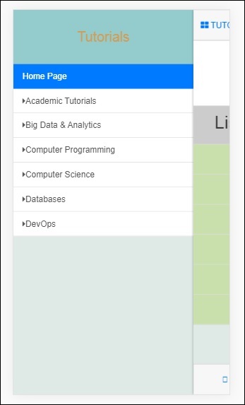
Now click on Academic Tutorials −
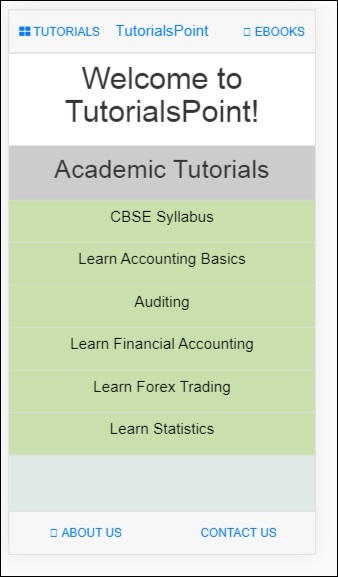
Click on Tutorials → Big Data