- Mobile Angular UI - Home
- Mobile Angular UI - Overview
- Mobile Angular UI - Installation
- Mobile Angular UI - Project Setup
- Mobile Angular UI - My First App
- Mobile Angular UI - Layouts
- Mobile Angular UI - Components
- Mobile Angular UI - Dropdowns
- Mobile Angular UI - Accordions
- Mobile Angular UI - Tabs
- Mobile Angular UI - Drag and Drop
- Mobile Angular UI - Scrollable Areas
- Mobile Angular UI - Forms
- Mobile Angular UI - Swipe Gestures
- Mobile Angular UI - Toggle Switch
- Mobile Angular UI - Sections
- Mobile Angular UI - Core Details
- Mobile Angular UI - Touch Events
- Mobile Angular UI - PhoneGap & Cordova
- Mobile Angular UI - Creating APK File
- Mobile Angular UI - APP Development
- Mobile Angular UI - Examples
- Mobile Angular UI Resources
- Mobile Angular UI - Quick Guide
- Mobile Angular UI - Useful Resources
- Mobile Angular UI - Discussion
Mobile Angular UI - Sections
Sections are containers that are displayed inside the body. Mobile Angular UI makes use of classes available for sections to change the layout structure.
Here is the index.html −
<!DOCTYPE html>
<html>
   <head>
      <meta charset="utf-8" />
      <title>Mobile Angular UI Demo</title>
      <meta http-equiv="X-UA-Compatible" content="IE=edge,chrome=1" />
      <meta name="apple-mobile-web-app-capable" content="yes" />
      <meta name="viewport" content="user-scalable=no, initial-scale=1.0, maximum-scale=1.0, minimal-ui" />
      <meta name="apple-mobile-web-app-status-bar-style" content="yes" />
      <link rel="shortcut icon" href="/assets/img/favicon.png" type="image/x-icon" />
      <link rel="stylesheet" href="node_modules/mobile-angular-ui/dist/css/mobile-angular-ui-hover.min.css" />
      <link rel="stylesheet" href="node_modules/mobile-angular-ui/dist/css/mobile-angular-ui-base.min.css" />
      <link rel="stylesheet" href="node_modules/mobile-angular-ui/dist/css/mobile-angular-ui-desktop.min.css" />
      <script src="node_modules/angular/angular.min.js"></script>
      <script src="node_modules/angular-route/angular-route.min.js"></script>
      <script src="node_modules/mobile-angular-ui/dist/js/mobile-angular-ui.min.js"></script>
      <script src="node_modules/angular-route/angular-route.min.js"></script>
      <script src="node_modules/mobile-angular-ui/dist/js/mobile-angular-ui.gestures.min.js"></script>
      <link rel="stylesheet" href="src/css/app.css" />
      <script src="src/js/app.js"></script>
      <style>
         a.active {
            color: blue;
         }
      </style>
   </head>
   <body ng-app="myFirstApp" ng-controller="MainController" class="listening">

      <!-- Sidebars -->
      <div class="sidebar sidebar-left ">
         <div class="scrollable">
            <h1 class="scrollable-header app-name">Tutorials</h1>
            <div class="scrollable-content">
               <div class="list-group" ui-turn-off='uiSidebarLeft'>
                  <a class="list-group-item" href="/">Home Page </a>
                  <a class="list-group-item" href="#/academic">
                  <i class="fa fa-caret-right"></i>Academic Tutorials </a>
                  <a class="list-group-item" href="#/bigdata">
                  <i class="fa fa-caret-right"></i>Big Data & Analytics </a>
                  <a class="list-group-item" href="#/computerProg">
                  <i class="fa fa-caret-right"></i>Computer Programming </a>
                  <a class="list-group-item" href="#/computerscience">
                  <i class="fa fa-caret-right"></i>Computer Science </a>
                  <a class="list-group-item" href="#/databases">
                  <i class="fa fa-caret-right"></i>Databases </a>
                  <a class="list-group-item" href="#/devops">
                  <i class="fa fa-caret-right"></i>DevOps </a>
               </div>
            </div>
         </div>
      </div>
      <div class="sidebar sidebar-right">
         <div class="scrollable">
            <h1 class="scrollable-header app-name">eBooks</h1>
            <div class="scrollable-content">
               <div class="list-group" ui-toggle="uiSidebarRight">
                  <a class="list-group-item" href="#/php"><i class=
                  "fa fa-caret-right"></i>PHP </a>
                  <a class="list-group-item"
                  href="#/Javascript"><i class="fa fa-caret-right"></i>Javascript </a>
               </div>
            </div>
         </div>
      </div>
      <div class="app">
         <div class="navbar navbar-app navbar-absolute-top">
            <div class="navbar-brand navbar-brand-center" ui-yield-to="title">
               TutorialsPoint
            </div>
            <div class="btn-group pull-left">
               <div ui-toggle="uiSidebarLeft" class="btn sidebar-left-toggle">
                  <i class="fa fa-th-large "></i> Tutorials
               </div>
            </div>
            <div class="btn-group pull-right" ui-yield-to="navbarAction">
               <div ui-toggle="uiSidebarRight" class="btn sidebar-right-toggle">
                  <i class="fal fa-search"></i> eBooks
               </div>
            </div>
         </div>
         <div class="navbar navbar-app navbar-absolute-bottom">
            <div class="btn-group justified">
               <a ui-turn-on="aboutus_modal" class="btn btn-navbar"><i class="fal fa-globe"></i> About us</a>
               <a ui-turn-on="contactus_overlay" class="btn btn-navbar"><i class="fal fa-map-marker-alt"></i> Contact us</a>
            </div>
         </div>

         <!-- App body -->
         <div class='app-body'>
            <div class='app-content'>
               <ng-view></ng-view>
            </div>
         </div>
      </div><!-- ~ .app -->

      <!-- Modals and Overlays -->
      <div ui-yield-to="modals"></div>
   </body>
</html>
app.js
/* eslint no-alert: 0 */

'use strict';

//
// Here is how to define your module
// has dependent on mobile-angular-ui
//
var app=angular.module('myFirstApp', ['ngRoute',
   'mobile-angular-ui',
   'mobile-angular-ui.gestures',
]);
app.config(function($routeProvider, $locationProvider) {
   $routeProvider.when("/", { templateUrl : "src/home/home.html" });
   $routeProvider.when("/academic", {templateUrl : "src/academic/academic.html" });
   $routeProvider.when("/bigdata", {templateUrl : "src/bigdata/bigdata.html" });
   $locationProvider.html5Mode({enabled:true, requireBase:false});
});
app.directive('touchtest', ['$touch', function($touch) {
   return {
      restrict: 'C',
      link: function($scope, elem) {
         $scope.touch=null;
         $touch.bind(elem, {
            start: function(touch) {
               $scope.containerRect=elem[0].getBoundingClientRect();
               $scope.touch=touch;
               $scope.$apply();
            },
            cancel: function(touch) {
               $scope.touch=touch;
               $scope.$apply();
            },
            move: function(touch) {
               $scope.touch=touch;
               $scope.$apply();
            },
            end: function(touch) {
               $scope.touch=touch;
               $scope.$apply();
            }
         });
      }
   };
}]);
app.controller('MainController', function($rootScope, $scope, $routeParams) {
   $scope.msg="Welcome to TutorialsPoint!";
});
home/home.html
<div class="scrollable ">
   <div class="scrollable-content ">
      <div class="list-group text-center">
         <div class="list-group text-center">
            <div class="list-group-item list-group-item-home">
               <h1>{{msg}}</h1>
            </div>
         </div>

         <div class="list-group-item list-group-item-home" style="background-color: #ccc;">
            <div>
               <h2 class="home-heading">List of Latest Courses</h2>
            </div>
         </div>

         <div class="list-group-item list-group-item-home list-tuts">
            <div>
               <h4 class="home-heading">Information Technology</h4>
            </div>
         </div>

         <div class="list-group-item list-group-item-home list-tuts">
            <div>
               <h4 class="home-heading">Academics</h4>
            </div>
         </div>

         <div class="list-group-item list-group-item-home list-tuts">
            <div>
               <h4 class="home-heading">Development</h4>
            </div>
         </div>
         <div class="list-group-item list-group-item-home list-tuts">
            <div>
               <h4 class="home-heading">Business</h4>
            </div>
         </div>
         <div class="list-group-item list-group-item-home list-tuts">
            <div>
               <h4 class="home-heading">Design</h4>
            </div>
         </div>

         <div class="list-group-item list-group-item-home list-tuts">
            <div>
               <h4 class="home-heading">Others</h4>
            </div>
         </div>

      </div>
   </div>
</div>
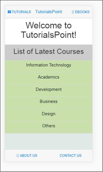
The container with class .app, holds the top and bottom navbar and the main contents that are displayed on the screen. The class .app does not have any padding or background.
The class .section has the css to add padding and background.
Here is a layout without a section.
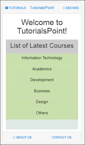
After adding class .section, you will see the padding added to the layout −
<div class="app section"></div>
There are some more variations in sections for the layout.
.section-wide : makes horizontal padding as 0
.section-condensed : makes vertical padding as 0
.section-break : this class will add margin-bottom as well shadow to show the break in sections on the screen.
You can also play around with the additional classes like .section-default, .section-primary, .section-success, .section-info, .section-warning or .section-danger to change the layout.
