- Mobile Angular UI - Home
- Mobile Angular UI - Overview
- Mobile Angular UI - Installation
- Mobile Angular UI - Project Setup
- Mobile Angular UI - My First App
- Mobile Angular UI - Layouts
- Mobile Angular UI - Components
- Mobile Angular UI - Dropdowns
- Mobile Angular UI - Accordions
- Mobile Angular UI - Tabs
- Mobile Angular UI - Drag and Drop
- Mobile Angular UI - Scrollable Areas
- Mobile Angular UI - Forms
- Mobile Angular UI - Swipe Gestures
- Mobile Angular UI - Toggle Switch
- Mobile Angular UI - Sections
- Mobile Angular UI - Core Details
- Mobile Angular UI - Touch Events
- Mobile Angular UI - PhoneGap & Cordova
- Mobile Angular UI - Creating APK File
- Mobile Angular UI - APP Development
- Mobile Angular UI - Examples
- Mobile Angular UI Resources
- Mobile Angular UI - Quick Guide
- Mobile Angular UI - Useful Resources
- Mobile Angular UI - Discussion
Mobile Angular UI - Cordova
Cordova is a platform that is used for building mobile apps using HTML, CSS and JS. We can think of Cordova as a container for connecting our web app with native mobile functionalities. Web applications cannot use native mobile functionalities by default. This is where Cordova comes into picture. It offers a bridge for connection between web app and mobile device. By using Cordova, we can make hybrid mobile apps that can use camera, geolocation, file system and other native mobile functions.
Create a folder myfirstapp and install cordova using the command given below. It will install cordova globally.
npm install -g cordova
Next create a testapp as shown below using cordova −
D:\myfirstapp>cordova create testapp com.example.testapp HelloWorld
The following command will create your app −
testapp
Enter into the folder using cd testapp.
Add the platforms on which you want to serve your app. The options available are ios and android. For now, we will add android platform using the following command −
cordova platform add android
Now install the packages that we need in our project.
npm install --save-dev angular angular-route mobile-angular-ui
Now the testapp will have a basic app installed. The folder structure is as follows −
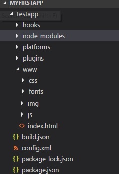
Cordova creates a www/ folder where the details of the project are stored. The index.html is the start point. You need to keep your css and js files in css/ and js/ folders.
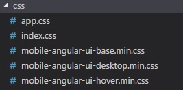
Let us now arrange the mobile angular UI app in the structure shown above. We will add all the js files and css files in the js and css folders as shown above.
Javascript files
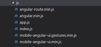
The index.js file is created by cordova. The details of index.js are as follows −
var app={
   // Application Constructor
   initialize: function() {
      document.addEventListener('deviceready', this.onDeviceReady.bind(this), false);
   },

   // deviceready Event Handler
   //
   // Bind any cordova events here. Common events are:
   // 'pause', 'resume', etc.
   onDeviceReady: function() {
      this.receivedEvent('deviceready');
   },

   // Update DOM on a Received Event
   receivedEvent: function(id) {
      var parentElement=document.getElementById(id);
      var listeningElement=parentElement.querySelector('.listening');
      var receivedElement=parentElement.querySelector('.received');
      listeningElement.setAttribute('style', 'display:none;');
      receivedElement.setAttribute('style', 'display:block;');
      console.log('Received Event: ' + id);
   }
};
app.initialize();
Css files
The index.html added by cordova is as follows −
<!DOCTYPE html>
<html>
   <head>
      <meta http-equiv="Content-Security-Policy" content="default-src 'self' data: gap:
      https://ssl.gstatic.com 'unsafe-eval'; style-src 'self' 'unsafe-inline'; media-src *; img-src 'self' data: content:;">
      <meta name="format-detection" content="telephone=no">
      <meta name="msapplication-tap-highlight" content="no">
      <meta name="viewport" content="initial-scale=1, width=device-width, viewport-fit=cover">
      <link rel="stylesheet" type="text/css" href="css/index.css">
      <title>Hello World</title>
   </head>
   <body>
      <div class="app">
         <h1>Apache Cordova</h1>
         <div id="deviceready" class="blink">
            <p class="event listening">Connecting to Device</p>
            <p class="event received">Device is Ready</p>
         </div>
      </div>
      <script type="text/javascript" src="cordova.js"></script>
      <script type="text/javascript" src="js/index.js"></script>
   </body>
</html>
Now let us update the index.html with the given index.html that has the Mobile Angular UI app that we have created.
<!DOCTYPE html>
<html>
   <head>
      <meta http-equiv="Content-Security-Policy" content="default-src 'self' data: gap: https://ssl.gstatic.com 'unsafe-eval';
      style-src 'self' 'unsafe-inline'; media-src *; img-src 'self' data: content:;">
      <meta name="format-detection" content="telephone=no">
      <meta name="msapplication-tap-highlight" content="no">
      <meta name="viewport" content="initial-scale=1, width=device-width, viewport-fit=cover">
      <link rel="stylesheet" type="text/css" href="css/index.css">
      <title>Mobile Angular UI Demo</title>
      <meta http-equiv="X-UA-Compatible" content="IE=edge,chrome=1" />
      <meta name="apple-mobile-web-app-capable" content="yes" />
      <meta name="viewport" content="user-scalable=no, initial-scale=1.0, maximum-scale=1.0, minimal-ui" />
      <meta name="apple-mobile-web-app-status-bar-style" content="yes" />
      <link rel="shortcut icon" href="/assets/img/favicon.png"type="image/x-icon" />
      <link rel="stylesheet" href="css/mobile-angular-ui-hover.min.css" />
      <link rel="stylesheet" href="css/mobile-angular-ui-base.min.css" />
      <link rel="stylesheet" href="css/mobile-angular-ui-desktop.min.css" />
      <script src="js/angular.min.js"></script>
      <script src="js/angular-route.min.js"></script>
      <script src="js/mobile-angular-ui.min.js"></script>
      <script src="js/mobile-angular-ui.gestures.min.js"></script>
      <link rel="stylesheet" href="css/app.css" />
      <script src="js/app.js"></script>
   </head>
   <body ng-app="myFirstApp" ng-controller="MainController">
      <!-- Sidebars -->
      <div class="sidebar sidebar-left">
         <div class="scrollable">
            <h1 class="scrollable-header app-name">Tutorials</h1>
            <div class="scrollable-content">
               <div class="list-group" ui-turn-off='uiSidebarLeft'>
                  <a class="list-group-item" href="/">Home Page </a>
                  <a class="list-group-item" href="#/academic"><i class="fa fa-caret-right"></i>Academic Tutorials </a>
                  <a class="list-group-item" href="#/bigdata" ><i class="fa fa-caret-right"></i>Big Data & Analytics </a>
                  <a class="list-group-item" href="#/computerProg"><i class="fa fa-caret-right"></i>Computer Programming </a>
                  <a class="list-group-item" href="#/computerscience"><i class="fa fa-caret-right"></i>Computer Science </a>
                  <a class="list-group-item" href="#/databases"><i class="fa fa-caret-right"></i>Databases </a>
                  <a class="list-group-item" href="#/devops"><i class="fa fa-caret-right"></i>DevOps </a>
               </div>
            </div>
         </div>
      </div>
      <div class="sidebar sidebar-right">
         <div class="scrollable">
            <h1 class="scrollable-header app-name">eBooks</h1>
            <div class="scrollable-content">
               <div class="list-group" ui-toggle="uiSidebarRight">
                  <a class="list-group-item" href="#/php"><i class="fa fa-caret-right"></i>PHP </a>
                  <a class="list-group-item" href="#/Javascript" ><i class="fa fa-caret-right"></i>Javascript </a>
               </div>
            </div>
         </div>
      </div>
      <div class="app">
         <div class="navbar navbar-app navbar-absolute-top">
            <div class="navbar-brand navbar-brand-center" ui-yield-to="title">
               TutorialsPoint
            </div>
            <div class="btn-group pull-left">
               <div ui-toggle="uiSidebarLeft" class="btn sidebar-left-toggle">
                  <i class="fa fa-th-large "></i> Tutorials
               </div>
            </div>
            <div class="btn-group pull-right" ui-yield-to="navbarAction">
               <div ui-toggle="uiSidebarRight" class="btn sidebar-right-toggle">
                  <i class="fal fa-search"></i> eBooks
               </div>
            </div>
         </div>
      <div class="navbar navbar-app navbar-absolute-bottom">
         <div class="btn-group justified">
            <a ui-turn-on="aboutus_modal" class="btn btn-navbar"><i class="fal fa-globe"></i> About us</a>
            <a ui-turn-on="contactus_overlay" class="btn btn-navbar"><i class="fal fa-map-marker-alt"></i> Contact us</a>
         </div>
      </div>

      <!-- App body -->
      <div class='app-body'>
         <div class='app-content'>
            <ng-view></ng-view>
         </div>
      </div>
      </div><!-- ~ .app -->

      <!-- Modals and Overlays -->
      <div ui-yield-to="modals"></div>

      <div class="app">
         <h1>Apache Cordova</h1>
         <div id="deviceready" class="blink">
            <p class="event listening">Connecting to Device</p>
            <p class="event received">Device is Ready</p>
         </div>
      </div>
      <script type="text/javascript" src="cordova.js"></script>
      <script type="text/javascript" src="js/index.js"></script>
   </body>
</html>
The cordova related code has been left at the end of the index.html.
Create home/folder and add home.html with the following details −
<div class="list-group text-center">
   <div class="list-group-item list-group-item-home">
      <h1>{{msg}}</h1>
   </div>
</div>
The js/app.js file is as follows −
/* eslint no-alert: 0 */

'use strict';

//
// Here is how to define your module
// has dependent on mobile-angular-ui
//
var app=angular.module('myFirstApp', [
   'ngRoute',
   'mobile-angular-ui',
   'mobile-angular-ui.gestures'
]);
app.config(function($routeProvider, $locationProvider) {
   $routeProvider
      .when("/", {
      templateUrl : "home/home.html"
   });
   $locationProvider.html5Mode({enabled:true, requireBase:false});
});
app.directive('dragItem', ['$drag', function($drag) {
   return {
      controller: function($scope, $element) {
         $drag.bind($element,
            {
               transform: $drag.TRANSLATE_BOTH,
               end: function(drag) {
                  drag.reset();
               }
            },
            {
               sensitiveArea: $element.parent()
            }
         );
      }
   };
}]);
app.controller('MainController', function($rootScope, $scope, $routeParams) {
   $scope.msg="Welcome to Tutorialspoint!";
});
We will use phonegap to serve the app in the browser.
