- Mobile Angular UI - Home
- Mobile Angular UI - Overview
- Mobile Angular UI - Installation
- Mobile Angular UI - Project Setup
- Mobile Angular UI - My First App
- Mobile Angular UI - Layouts
- Mobile Angular UI - Components
- Mobile Angular UI - Dropdowns
- Mobile Angular UI - Accordions
- Mobile Angular UI - Tabs
- Mobile Angular UI - Drag and Drop
- Mobile Angular UI - Scrollable Areas
- Mobile Angular UI - Forms
- Mobile Angular UI - Swipe Gestures
- Mobile Angular UI - Toggle Switch
- Mobile Angular UI - Sections
- Mobile Angular UI - Core Details
- Mobile Angular UI - Touch Events
- Mobile Angular UI - PhoneGap & Cordova
- Mobile Angular UI - Creating APK File
- Mobile Angular UI - APP Development
- Mobile Angular UI - Examples
- Mobile Angular UI Resources
- Mobile Angular UI - Quick Guide
- Mobile Angular UI - Useful Resources
- Mobile Angular UI - Discussion
Mobile Angular UI - Components
In this chapter, we are going to understand the important components in mobile angular UI. They are as follows −
- Navbars
- Sidebars
- Modals
- Overlays
Navbars
Navbars make use of the top and bottom portion of the device screen. We can use the top navbar to display the menu items or the header section. The bottom navbar can be used to display the footer section.
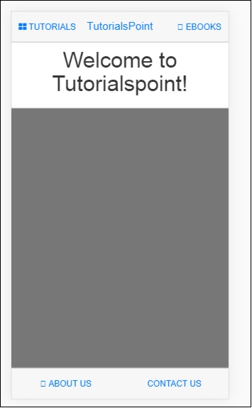
A simple display of navbar on the screen is as follows −
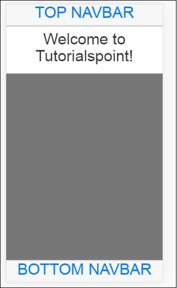
Navbar can be shown in two ways: fixed and overflow approach.
Important CSS classes
In Mobile Angular UI to show navbar you have to make use of css classes − navbar, .navbar-app.
Classes for Top/Bottom Overflow approach
For the top navbar the css class − .navbar-absolute-top.
For the bottom navbar the css class − .navbar-absolute-bottom.
Classes for Top/Bottom fixed approach
For the top navbar the css class − .navbar-fixed-top.
For the bottom navbar the css class − .navbar-fixed-bottom.
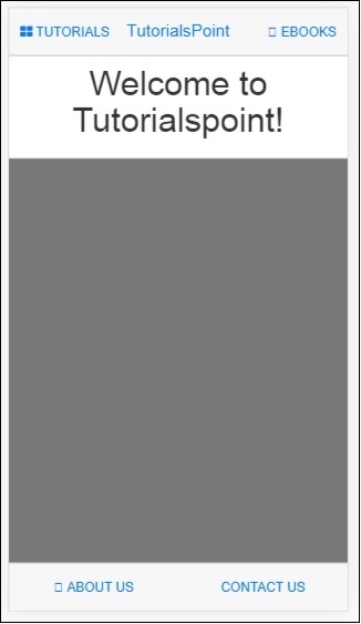
Let us work on the Overflow Navbar on the UI.
Following is the HTML code for the same −
Navbar-Top
<div class="navbar navbar-app navbar-absolute-top">
   <div class="btn-group pull-left">
      <div class="btn">
         <i class="fa fa-th-large "></i> Library
      </div>
   </div>
   <div class="navbar-brand navbar-brand-center" ui-yield-to="title">
      TutorialsPoint
   </div>
   <div class="btn-group pull-right" ui-yield-to="navbarAction">
      <div class="btn">
         <i class="fal fa-search"></i> eBooks
      </div>
   </div>
</div>
Navbar-Bottom
<div class="navbar navbar-app navbar-absolute-bottom">
   <div class="btn-group justified">
      <a href="https://www.tutorialspoint.com/about/index.htm" class="btn btn-navbar"><i class="fal fa-globe"></i> About us</a>
      <a href="https://www.tutorialspoint.com/about/contact_us.htm" class="btn btn-navbar"><i class="fal fa-map-marker-alt"></i> Contact us</a>
   </div>
</div>
This is how the display looks like −
Sidebars
The sidebars occupy the left and right side of the screen. They are always hidden and activated when the item connected to the left side or right side is clicked. It is the best way to utilize the space on the screen.
So far we have seen the working of navbars. Let us now make use of the navbar item on the left side and right side to open the sidebars.
You can place sidebars on the left side or right side.
Important CSS classes
The css classes for left side sidebar − sidebar sidebar-left.
The css classes for right side sidebar − sidebar sidebar-right.
The div container for sidebar is as follows −
<!-- Sidebars -->
<div class="sidebar sidebar-left"><!-- ... --></div>
<div class="sidebar sidebar-right"><!-- ... --></div>
Interaction with Sidebars
To open and close the sidebars added on the left side and right side you need to add the following to the html tag that will open the sidebars.
For example, to open left sidebar on click on a link you can add the following −
Sidebar makes use of sharedstate uiSidebarLeft and uiSidebarRight to toggle the sidebar items.
We are going to make use of the top navbar we added earlier. Add ui-toggle=uiSidebarLeft and ui-toggle="uiSidebarRight" and also the class sidebar-toggle and sidebar-right-toggle.
<div ui-toggle="uiSidebarLeft" class="btn sidebar-toggle"><i class="fa fa-th-large "></i> Library</div>
<div ui-toggle="uiSidebarRight" class="btn sidebar-right-toggle"><i class="fal fa-search"></i> Search</div>
Let us now add a div container for the left sidebar and right sidebar.
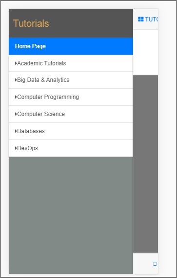
Left Sidebar
<div class="sidebar sidebar-left">
   <div class="scrollable">
      <h1 class="scrollable-header app-name">Tutorials</h1>
      <div class="scrollable-content">
         <div class="list-group" ui-turn-off='uiSidebarLeft'>
            <a class="list-group-item" href="/">Home Page </a>
            <a class="list-group-item" href="#/academic"><i class="fa fa-caret-right"></i>Academic Tutorials </a>
            <a class="list-group-item" href="#/bigdata"><i class="fa fa-caret-right"></i>Big Data & Analytics </a>
            <a class="list-group-item" href="#/computerProg"><i class="fa fa-caret-right"></i>Computer Programming </a>
            <a class="list-group-item" href="#/computerscience"><i class="fa fa-caret-right"></i>Computer Science </a>
            <a class="list-group-item" href="#/databases"><i class="fa fa-caret-right"></i>Databases </a>
            <a class="list-group-item" href="#/devops"><i class="fa fa-caret-right"></i>DevOps </a>
         </div>
      </div>
   </div>
</div>
You can make use of ui-turn-off='uiSidebarLeft' or ui-turn-off='uiSidebarRight' in your sidebar template to close the sidebar when clicked anywhere inside the sidebar. The sidebar will be closed by default when clicked anywhere outside the sidebar template.
In the left side bar when the user clicks on the links, the sidebar will be closed as we have added ui-turn-off='uiSidebarLeft' to the left sidebar template.
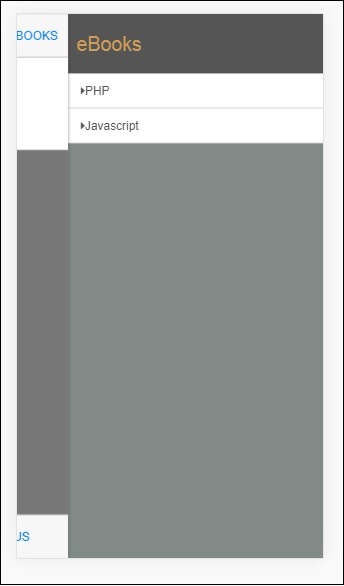
Right Sidebar
<div class="sidebar sidebar-right">
   <div class="scrollable">
      <h1 class="scrollable-header app-name">eBooks</h1>
      <div class="scrollable-content">
         <div class="list-group" ui-toggle="uiSidebarRight">
            <a class="list-group-item" href="#/php"><i class="fa fa-caret-right"></i>PHP </a>
            <a class="list-group-item" href="#/Javascript"><i class="fa fa-caret-right"></i>Javascript </a>
         </div>
      </div>
   </div>
</div>
The display of sidebar in the browser is as follows −
Click on Tutorials to get left sidebar menu as shown below −
Click on Ebooks to get right side menu as shown below −
Modals and Overlays
Modals and Overlays will show a pop-up type window on your screen. Overlays differ from modal only in how the container is displayed for it.
You need to make use of ngIf/uiIf or ngHide/uiHide along with uiState to activate/dismiss the overlay or modal.
The css for modal will be .modal, and for overlay, it will be .modal-overlay.
To show modal and overlay, add the following div container inside your index.html.
<div ui-yield-to="modals"></div>
Let us assign a modal to the navbar footer we have done earlier.
Here ABOUT US will act as a modal and CONTACT US will act as an overlay.
Add the following changes to the links of ABOUT US and CONTACT US −
<div class="navbar navbar-app navbar-absolute-bottom">
   <div class="btn-group justified">
      <a ui-turn-on="aboutus_modal" class="btn btn-navbar"><i class="fal fa-globe"></i> About us</a>
      <a ui-turn-on="contactus_overlayl" class="btn btn-navbar"><i class="fal fa-map-marker-alt"></i> Contact us</a>
   </div>
</div>
If we click on this link, the modal and overlay will open.
The content for modal and overlay is added inside src/home/home.html file.
The main content for modal and overlay has to be wrapped inside the following div container −
<div ui-content-for="modals">
   <div class="modal"><!-- ... --></div>
</div>
Let us add content to the modal and overlay view. The name we have used on the links i.e., ui-turn-on="aboutus_modal" and ui-turn-on="contactus_overlay", the same are used inside for the aboutus modal content and contactus overlay content.
<div ui-content-for="modals">
   <div class="modal" ui-if="aboutus_modal" ui-shared-state="aboutus_modal">
      <div class="modal-backdrop in"></div>
      <div class="modal-dialog">
         <div class="modal-content">
            <div class="modal-header">
               <button class="close"
                  ui-turn-off="aboutus_modal">×</button>
               <h4 class="modal-title">Modal</h4>
            </div>
            <div class="modal-body">
               <p>Testing Modal</p>
            </div>
            <div class="modal-footer">
               <button ui-turn-off="aboutus_modal" class="btn btn-default">Close</button>
               <button ui-turn-off="aboutus_modal" class="btn btn-primary">Save</button>
            </div>
         </div>
      </div>
   </div>
   <div class="modal modal-overlay" ui-if="contactus_overlay" ui-shared-state="contactus_overlay">
      <div class="modal-dialog">
         <div class="modal-content">
            <div class="modal-header">
               <button class="close"
                  ui-turn-off="contactus_overlay">×</button>
               <h4 class="modal-title">Overlay</h4>
            </div>
            <div class="modal-body">
               <p>Testing Overlay</p>
            </div>
            <div class="modal-footer">
               <button ui-turn-off="contactus_overlay" class="btn btn-default">Close</button>
               <button ui-turn-off="contactus_overlay" class="btn btn-primary">Save</button>
            </div>
         </div>
      </div>
   </div>
</div>
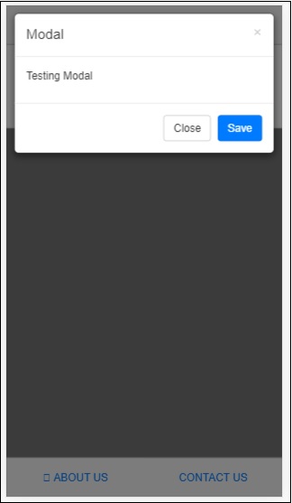
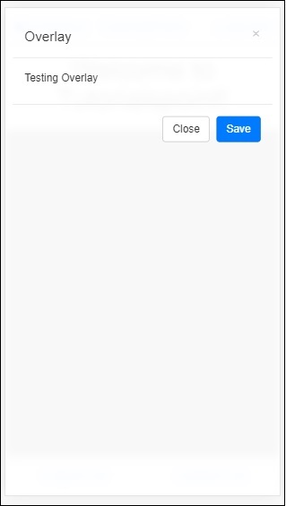
The display for modal and overlay is as follows −
Onclick of ABOUT US it will display modal as shown below −
Onclick of CONTACT US, it will display overlay as shown below −
Click on the close button to close the modal window.
