Article Categories
- All Categories
-
 Data Structure
-
 Networking
-
 RDBMS
RDBMS
-
 Operating System
-
 Java
Java
-
 MS Excel
-
 iOS
iOS
-
 HTML
HTML
-
 CSS
CSS
-
 Android
-
 Python
-
 C Programming
-
 C++
C++
-
 C#
C#
-
 MongoDB
-
 MySQL
MySQL
-
 Javascript
-
 PHP
PHP
-
 Economics & Finance
How to use CircularProgress Component in ReactJS?
The circular progress bar is an attractive UI for any application. We can show the circular loading indicator whenever our application fetches data from the server; users are uploading files or downloading data.
Here, we will learn different approaches to creating a circular progress bar using the various libraries.
Use the React-circular-progressbar NPM Package
The react-circular-progressbar is an NPM package, and we can import the ?circularProgressbar? component. It takes value as a prop to show circular progress.
Users should execute the below command in the terminal to install the react-circular-progressbar NPM package in the React application.
npm i react-circular-progressbar
Syntax
Users can follow the syntax below to use the ?CircularProgressbar? component of the react-circular-progressbar library.
<CircularProgressbar value = {40} />;
Example
In the example below, we will learn to create a primary circular loading indicator using the CircularProgressbar component. Also, we have imported the styles from the ?react-circular-progressbar? library.
import React from "react";

import { CircularProgressbar } from "react-circular-progressbar";
import "react-circular-progressbar/dist/styles.css";

function App() {
   return (
      <div>
         <div style = {{ width: "200px" }}>
            <CircularProgressbar value = {40} text = {`${40}%`} />
         </div>
      </div>
   );
}

export default App;
Output
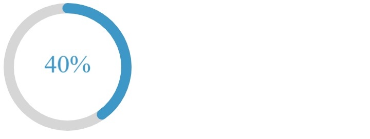
In the output, users can observe the circular progress component with 40% completed.

Example
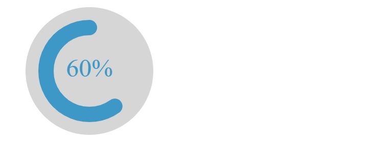
The example below will customize the circular progress bar by passing the props in the ?CircularProgressBar? component. We have passed the ?maxValue? to 10. So, here 1 means 10%, 2 means 20% and so on for the progress.
Also, it shows the progress counter-clockwise. Furthermore, we have increased the stroke width and increased the background padding. If users want, they can add custom CSS also as a value of the ?styles? prop002E
import React from "react";

import { CircularProgressbar } from "react-circular-progressbar";
import "react-circular-progressbar/dist/styles.css";

function App() {
   return (
      <div>
         <div style = {{ width: "200px" }}>
            <CircularProgressbar
               maxValue = {10}
               strokeWidth = {12}
               value = {6}
               counterClockwise = {true}
               background = {true}
               backgroundPadding = {10}
               text = {`${60}%`}
            />
         </div>
      </div>
   );
}

export default App;
Output

Use the Material UI Library to Create a Circular Progress
The Materia Ui library contains the CircularProgress component with different variants. Also, we can create an animated circular progress bar using the Material UI.
Users should execute the below command to install the Material UI.
npm install @mui/material @emotion/react @emotion/styled
Syntax
Users should follow the syntax below to use the CircularProgress component of the Material UI library.
<CircularProgress />
Example
In the example below, we have imported the ?CircularProgress? component from the Material UI and used it inside the App component. In the output, users can observe that it shows the animated circular progress bar.
import React from "react";
import CircularProgress from "@mui/material/CircularProgress";

function App() {
   return (
      <div>
         <div style = {{ width: "300px", marginLeft: 30 }}>
            <CircularProgress />
         </div>
      </div>
   );
}

export default App;
Output

Example
In the example below, we have used the setInterval() method to change the value of the ?progress? state at every 500 milliseconds by 5.
import React from "react";
import CircularProgress from "@mui/material/CircularProgress";

function App() {
   const [currentProgress, setProgress] = React.useState(0);
   React.useEffect(() => {
      const timerId = setInterval(() => {
         setProgress((prevProgress) =>
            prevProgress >= 100 ? 0 : prevProgress + 5
         );
      }, 500);
      return () => {
         clearInterval(timerId);
      };
   }, []);
   return (
      <div>
         <div style = {{ width: "300px", marginLeft: 30 }}>
            <CircularProgress variant = "determinate" value = {currentProgress} />
         </div>
      </div>
   );
}

export default App;
Output
In the output, users can observe that circular progress updates by 10 every second, and once it reaches 100, it resets to 0.

Users learned to add the circular progress bar in the React application. We used the two different libraries to create a circular progress bar. Also, we can show the labels with the circular progress bar using the above libraries.


