
Article Categories
- All Categories
-
 Data Structure
-
 Networking
-
 RDBMS
RDBMS
-
 Operating System
-
 Java
Java
-
 MS Excel
-
 iOS
iOS
-
 HTML
HTML
-
 CSS
CSS
-
 Android
-
 Python
-
 C Programming
-
 C++
C++
-
 C#
C#
-
 MongoDB
-
 MySQL
MySQL
-
 Javascript
-
 PHP
PHP
-
 Economics & Finance
How to use Paper Component in ReactJS?
In Material UI, the Paper component is very similar to the card component, and basically, it also creates a card of the required dimensions.
The main difference between the Card and Paper components is the ?Elevation? prop. The Elevation props allow setting the box shadow for the Paper component to add 3D effects.
Syntax
Users can follow the syntax below to use the Paper component of Material UI.
<Paper/>
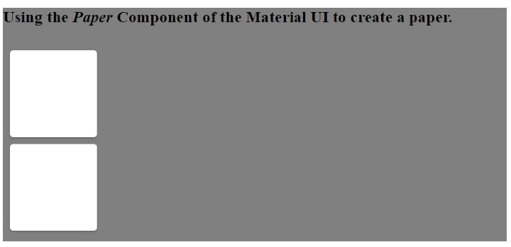
Example 1 (Basic use of Paper Component)
In the example below, we added the Paper component inside the Box component of Material UI. Also, we have set the dimensions of the Paper component by passing the props to the Box component.
import React from "react";
import Paper from "@mui/material/Paper";
import Box from "@mui/material/Box";
const App = () => {
   return (
      <div style = {{ backgroundColor: "grey" }}>
         <h3>
            {" "}
            Using the <i> Paper </i> Component of the Material UI to create a paper.{" "}
         </h3>
         <Box
            sx={{
               display: "inline-block", "& > :not(style)": {
                  m: 1,
                  width: 200,
                  height: 200,
               },
            }}
            >
            <Paper />
            <Paper />
         </Box>
      </div>
   );
};
export default App;
Output
In the output, users can observe papers similar to the card.
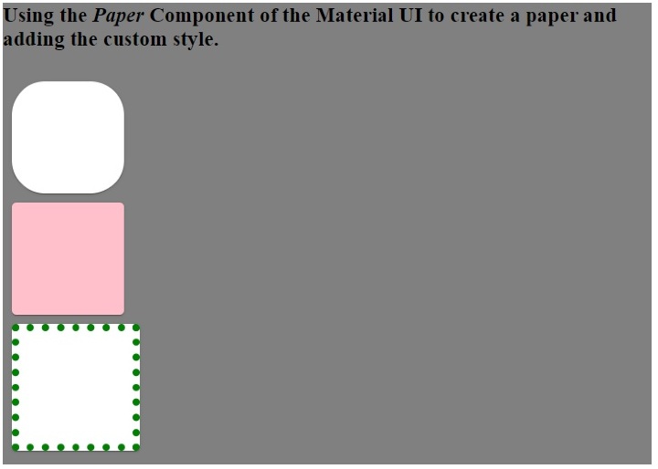
Example 2 (Add Custom CSS to Paper Component)
In the example below, we have passed the style as a prop of the Paper component. We have changed the border radius of the first Paper component. Furthermore, we have changed the background color of the second Paper component and the border of the third Paper component.
import React from "react";
import Paper from "@mui/material/Paper";
import Box from "@mui/material/Box";
const App = () => {
   return (
      <div style = {{ backgroundColor: "blue" }}>
         <h3>
            {" "}
            Using the <i> Paper </i> Component of the Material UI to create a paper and adding the custom style.{" "}
         </h3>
         <Box
            sx={{
               display: "inline-block", "& > :not(style)": {
                  m: 1,
                  width: 100,
                  height: 100,
               },
            }}
            >
            <Paper style = {{ borderRadius: "30px" }} />
            <Paper style = {{ backgroundColor: "pink" }} />
            <Paper style = {{ border: "7px dotted green" }} />
         </Box>
      </div>
   );
};
export default App;
Output
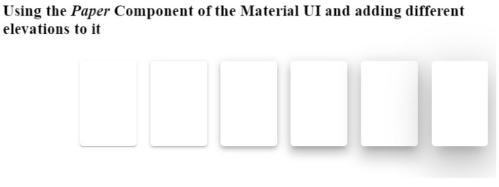
Example 3 (Using Elevation as a Prop)
In the example below, we have used the elevation as a prop of the Paper component. The elevation prop represents the box shadow and accepts the 0,1,2,3,4,8,12,16,24 as a value. The elevation applies the box-shadow of 0px for 0 value and 40px for 24 elevation value according to dark and light theme.
Increasing the elevation value increases the 3D effect on the Paper component as the box shadow increases.
import React from "react";
import Paper from "@mui/material/Paper";
import Box from "@mui/material/Box";
const App = () => {
   return (
      <div>
         <h3>
            {" "}
            Using the <i> Paper </i> Component of the Material UI and adding different elevations to it {" "}
         </h3>
         <Box
            sx = {{
               display: "flex", "& > :not(style)": {
                  m: 1,
                  width: 100,
                  height: 100,
               },
            }}
            >
            <Paper elevation = {0} />
            <Paper elevation = {1} />
            <Paper elevation = {2} />
            <Paper elevation = {4} />
            <Paper elevation = {8} />
            <Paper elevation = {12} />
            <Paper elevation = {24} />
         </Box>
      </div>
   );
};
export default App;
Output
Users learned to use the Paper component of Material UI in this tutorial. In the first example, we have seen the basic use of the Paper component. In the second example, we learned to pass custom CSS as a prop of the Paper component, and in the last example, we learned to use the elevation prop with the Paper component.

2K+ Views
