
Article Categories
- All Categories
-
 Data Structure
-
 Networking
-
 RDBMS
RDBMS
-
 Operating System
-
 Java
Java
-
 MS Excel
-
 iOS
iOS
-
 HTML
HTML
-
 CSS
CSS
-
 Android
-
 Python
-
 C Programming
-
 C++
C++
-
 C#
C#
-
 MongoDB
-
 MySQL
MySQL
-
 Javascript
-
 PHP
PHP
-
 Economics & Finance
How to set indeterminate state in the checkbox in Material UI?
There will be some scenarios where we need to set an indeterminate state at a point in time in a checkbox. A checkbox is a key component when there is a need to choose multiple options from a list of options.
In this article, we are going to learn how to set up an indeterminate state for a checkbox in Material UI. Creating a React project and adding the Material UI to it are prerequisites before continuing with the article. Let us begin and see how to set the indeterminate state in its entirety.
What is an Indeterminate State?
An indeterminate state is a state that is visually seen while using checkboxes. As there are only 2 states, i.e., checked and unchecked in checkboxes, we can see another third state i.e., indeterminate state, which works differently from the other two, meaning that some but not all the checkboxes are checked in a checkbox.
The indeterminate state is not a part of the HTML input components, but the same is being provided by Material UI for the use of custom design.
Steps to set indeterminate state
Below are the complete steps for setting up an indeterminate state in Material UI using React
Step 1: Create a new react app and Install MUI
To begin with, we must first have a React app with Material UI installed. Let?s create a new React app and install Mui by running the following command
npx create-react-app myproject
cd myproject
npm install @mui/material @emotion/react @emotion/styled
Step 2: Import the required components into React
Now, when the new React app is created, in the src folder there is a main App.js file. Open it and import the required components.
import React from "react";
import { FormControlLabel, Checkbox } from '@mui/material
Step 3: Define the states
Now, we first need to define the states for setting the indeterminate states between different checkboxes.
const [ipChecked, setIpChecked] = useState([true, false]);
const handleCheckOne = (e) => {
   setIpChecked([e.target.ipChecked, e.target.ipChecked]);
};
const handleCheckTwo = (e) => {
   setIpChecked([e.target.ipChecked, ipChecked[1]]);
};
const handleCheckThree = (e) => {
   setIpChecked([ipChecked[0], e.target.ipChecked]);
};
Step 4: Render the state
The final step is to render the states to the FormControlLabel component by rendering the Checkbox using the 'control' prop and use the indeterminate state with the defined state variables.
export default function App() {
   return (
      <FormControlLabel
         label="Parent"
         control={
            <Checkbox
               checked={ipChecked[0] && ipChecked[1]}
               indeterminate={ipChecked[0] !== ipChecked[1]}
               onChange={handleCheckOne }
            />
         }
      />
      <FormControlLabel
         label="Im One"
         control={<Checkbox checked={ipChecked[0]} onChange={handleCheckTwo} />}
      />
      <FormControlLabel
         label="Im Second"
         control={<Checkbox checked={ipChecked[1]} onChange={handleCheckThree} />}
      />
   )
}
Now, we have seen the complete steps to set an indeterminate state in the checkboxes with the help of Material UI using React. Let?s see some examples that use different approaches to do the needful.
Checkbox Label APIs
<Checkbox> This API is used to add a checkbox component feature to the project using Material UI.
Props
checked This prop is used to check the checkbox when true.
checkedIcon This prop is used to display an icon when checked.
classes This prop is used to override or add styles to an element.
color This prop is used to add color to the checkboxes. It includes primary, secondary, success, info, error, warning, etc.
defaultChecked This prop is used to check the checkbox when not controlled by user.
disabled This prop is used to disable the checkbox.
disableRipple This prop is used to disable the checkbox ripple effect.
icon This prop is used to display icons when unchecked.
id This prop is used to define checkbox id.
Inderterminate This prop is used to indeterminate the checkbox.
indeterminateIcon This prop is used to display the indeterminate icon in the checkbox.
inputProps This prop is used to add attributes to input element.
inputRef This prop is used to pass ref to checkbox.
onChange This prop is used to fire a callback function.
required This prop is used to add a required value for the input element.
size This prop is used to change the checkbox size.
sx This prop is used to add custom styles to the material UI components.
value This prop is used to define the component value.
Example
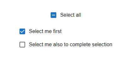
In this example, we have set an indeterminate state for the two child checkboxes. When the user selects any child input and if the selection from children is only one, the p\main parent checkbox will be in an indeterminate state meaning that here the select all checkbox will not show the checked icon. When the user selects both checkboxes, the select all shows the checked icon.
import { FormControlLabel } from "@mui/material";
import Checkbox from "@mui/material/Checkbox";
import React from "react";
import { useState } from "react";

export default function App() {
   const [inpChecked, setInpChecked] = useState([true, false]);

   const handleChkInpOne = (e) => {
      setInpChecked([e.target.checked, e.target.checked]);
   };

   const handleChkInpTwo = (e) => {
      setInpChecked([e.target.checked, inpChecked[1]]);
   };

   const handleChkInpThree = (e) => {
      setInpChecked([inpChecked[0], e.target.checked]);
   };

   const ChildInputs = (
      <div style={{ display: 'flex', flexDirection: 'column' }}>
         <FormControlLabel
            label="Select me first"
            control={<Checkbox checked={inpChecked[0]} onChange={handleChkInpTwo} />}
         />
         <FormControlLabel
            label="Select me also to complete selection"
            control={<Checkbox checked={inpChecked[1]} onChange={handleChkInpThree} />}
         />
      </div>
   );

   return (
      <div
         style={{
            display: "flex",
            marginTop: 30,
            flexDirection: "column",
            alignItems: "center",
            justifyContent: "center",
            gap: 10,
         }}>
         <FormControlLabel
            label="Select all"
            control={
               <Checkbox
                  checked={inpChecked[0] && inpChecked[1]}
                  indeterminate={inpChecked[0] !== inpChecked[1]}
                  onChange={handleChkInpOne}
               />
            }
         />
         {ChildInputs}
      </div>
   );
}
Output
Example
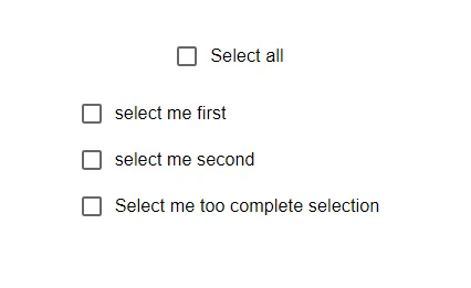
In this example, we have set an indeterminate state for the three child checkboxes. When the user selects any child input, if the selection from children is only one, the parent checkbox will be in an indeterminate state, meaning that the select all checkbox will not show the checked icon. When the user selects both checkboxes, the select all button shows the checked icon.
import { FormControlLabel } from "@mui/material";
import Checkbox from "@mui/material/Checkbox";
import React from "react";
import { useState } from "react";

export default function App() {
   const [inpChecked, setInpChecked] = useState([true, false, false]);

   const handleChkInpOne = (e) => {
      setInpChecked([e.target.checked, inpChecked[1], inpChecked[2]]);
   };

   const handleChkInpTwo = (e) => {
      setInpChecked([inpChecked[0], e.target.checked, inpChecked[2]]);
   };

   const handleChkInpThree = (e) => {
      setInpChecked([inpChecked[0], inpChecked[1], e.target.checked]);
   };

   const ChildInputs = (
      <div style={{ display: 'flex', flexDirection: 'column' }}>
         <FormControlLabel
            label="select me first"
            control={<Checkbox checked={inpChecked[0]} onChange={handleChkInpOne} />}
         />
         <FormControlLabel
            label="select me second"
            control={<Checkbox checked={inpChecked[1]} onChange={handleChkInpTwo} />}
         />
         <FormControlLabel
            label="Select me too complete selection"
            control={<Checkbox checked={inpChecked[2]} onChange={handleChkInpThree} />}
         />
      </div>
   );

   const determineIndeterminate = () => {
      return inpChecked.some((item) => item) && !inpChecked.every((item) => item);
   };

   return (
      <div
         style={{
            display: "flex",
            marginTop: 30,
            flexDirection: "column",
            alignItems: "center",
            justifyContent: "center",
            gap: 10,
         }}>
         <FormControlLabel
            label="Select all"
            control={
               <Checkbox
                  checked={inpChecked.every((i) => i)}
                  indeterminate={determineIndeterminate()}
                  onChange={(e) => setInpChecked([e.target.inpChecked, e.target.inpChecked, e.target.inpChecked])}
               />
            }
         />
         {ChildInputs}
      </div>
   );
}
Output
Conclusion
In this article, we learned how to set an indeterminate state for the checkbox in Material UI. When indeterminate is set, the value of the checked prop only impacts the form submitted values. It has no accessibility or UX implications. We have seen the complete stepbystep process to set the state and also seen two examples that demonstrate the state.

909 Views
