
Article Categories
- All Categories
-
 Data Structure
-
 Networking
-
 RDBMS
RDBMS
-
 Operating System
-
 Java
Java
-
 MS Excel
-
 iOS
iOS
-
 HTML
HTML
-
 CSS
CSS
-
 Android
-
 Python
-
 C Programming
-
 C++
C++
-
 C#
C#
-
 MongoDB
-
 MySQL
MySQL
-
 Javascript
-
 PHP
PHP
-
 Economics & Finance
Selected Reading
How to create boxplot for categories with grey color palette using ggplot2 in R?
To create boxplot for categories with grey color palette using ggplot2, we can follow the below steps −
- First of all, create a data frame.
- Then, create the boxplot for categories with default color of bars.
- Create the boxplot for categories with color of bars in grey palette.
Create the data frame
Let's create a data frame as shown below −
Group<-sample(c("Low","Medium","High"),25,replace=TRUE)
Score<-sample(1:100,25)
df<-data.frame(Group,Score)
df
On executing, the above script generates the below output(this output will vary on your system due to randomization) −
 Group Score
1 Low    57
2 Low    50
3 Medium 27
4 High   84
5 High  100
6 Low    95
7 Low    13
8 High   12
9 Medium 11
10 Medium 42
11 Medium 25
12 Low    5
13 High   85
14 Low    70
15 Medium 33
16 Medium 92
17 Low    58
18 High   88
19 High   61
20 High    8
21 High   39
22 Medium 38
23 High   37
24 High   96
25 Low    6
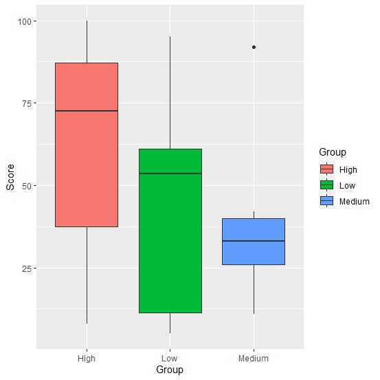
Create boxplot with bars in default colors
Loading ggplot2 package and creating boxplot with default colors of bars −
Group<-sample(c("Low","Medium","High"),25,replace=TRUE)
Score<-sample(1:100,25)
df<-data.frame(Group,Score)
library(ggplot2)
ggplot(df,aes(Group,Score,fill=Group))+geom_boxplot()
Output
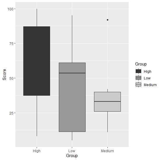
Create boxplot with bars in grey color palette
Use scale_fill_grey to create the boxplot with bars in grey color palette −
Group<-sample(c("Low","Medium","High"),25,replace=TRUE)
Score<-sample(1:100,25)
df<-data.frame(Group,Score)
library(ggplot2)
ggplot(df,aes(Group,Score,fill=Group))+geom_boxplot()+scale_fill_grey()
Output

Updated on: 2026-03-11T22:50:58+05:30
1K+ Views

Advertisements