
Article Categories
- All Categories
-
 Data Structure
-
 Networking
-
 RDBMS
RDBMS
-
 Operating System
-
 Java
Java
-
 MS Excel
-
 iOS
iOS
-
 HTML
HTML
-
 CSS
CSS
-
 Android
-
 Python
-
 C Programming
-
 C++
C++
-
 C#
C#
-
 MongoDB
-
 MySQL
MySQL
-
 Javascript
-
 PHP
PHP
-
 Economics & Finance
Selected Reading
How to create facetted plot with facets in horizontal direction using ggplot2 in R?
To create facetted plot with facets in horizontal direction using ggplot2 in R, we can follow the below steps −
- First of all, create a data frame.
- Then, create the facetted plot using facet_grid function of ggplot2 package.
- Use facet_grid function with reversed value of categorical column to create the facetted plot with facets in horizontal direction.
Create the data frame
Let's create a data frame as shown below −
x<-rnorm(25)
y<-rnorm(25)
Grp<-sample(LETTERS[1:3],25,replace=TRUE)
df<-data.frame(x,y,Grp)
df
On executing, the above script generates the below output(this output will vary on your system due to randomization) −
         x             y   Grp
1   0.04783437  -1.15182325 C
2   0.56696771  0.12167256 A
3  -1.19615960 -1.16038178 B
4   0.95960082  1.00415819 C
5   0.50725210  0.54469494 C
6  -0.37411224  1.60231699 B
7   1.42044733 -0.11057038 B
8   1.69437460  0.01264523 C
9   0.51677914  0.57436245 A
10 -0.04810441  0.54283138 C
11 -1.28024577 -0.53045053 A
12 -0.48968148  0.18115294 B
13  1.28769546  1.16062792 B
14  0.93050145  0.63649217 B
15  0.72614070  0.59524893 A
16 -0.19306114 -0.52972220 A
17 -0.56122938  0.45013366 C
18  0.77504861  0.31892391 C
19 -0.26756380 -0.32371074 C
20 -1.11077206  0.89716628 A
21 -0.60040090 -0.15187155 C
22 -0.31920172  0.25808226 A
23  1.16802977 1.73149549 B
24  1.69736349 1.36917698 C
25  0.93134640 -0.05803692 A
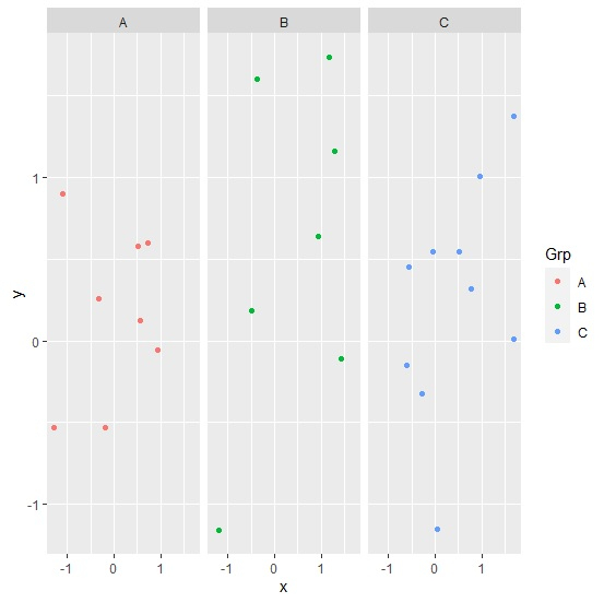
Create the facetted plot
Use facet_grid function to create point chart between x and y based on Grp column −
x<-rnorm(25)
y<-rnorm(25)
Grp<-sample(LETTERS[1:3],25,replace=TRUE)
df<-data.frame(x,y,Grp)
library(ggplot2)
ggplot(df,aes(x,y,col=Grp))+geom_point()+facet_grid(~Grp)
Output
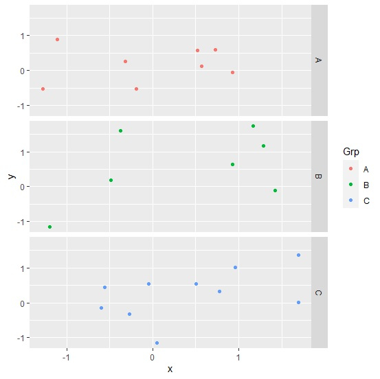
Create the facetted plot with facets in horizontal direction
Use facet_grid function to create point chart between x and y based on Grp column by providing Grp column name before tilde as shown below −
x<-rnorm(25)
y<-rnorm(25)
Grp<-sample(LETTERS[1:3],25,replace=TRUE)
df<-data.frame(x,y,Grp)
library(ggplot2)
ggplot(df,aes(x,y,col=Grp))+geom_point()+facet_grid(Grp~.)
Output

Updated on: 2026-03-11T22:50:58+05:30
650 Views

Advertisements