
Article Categories
- All Categories
-
 Data Structure
-
 Networking
-
 RDBMS
RDBMS
-
 Operating System
-
 Java
Java
-
 MS Excel
-
 iOS
iOS
-
 HTML
HTML
-
 CSS
CSS
-
 Android
-
 Python
-
 C Programming
-
 C++
C++
-
 C#
C#
-
 MongoDB
-
 MySQL
MySQL
-
 Javascript
-
 PHP
PHP
-
 Economics & Finance
How to change the color code of corrplot in R?
To change the color code of corrplot, we can use colorRampPalette function inside corrplot function. We can provide different colors in colorRampPalette that we want to display in the corrplot.
Check out the below given example to understand how it can be done.
Example
Following snippet creates a sample data frame −
x<-rpois(20,2)
y<-rpois(20,5)
z<-rpois(20,5)
a<-rpois(20,1)
b<-rpois(20,2)
df<-data.frame(x,y,z,a,b)
df
The following dataframe is created −
   x  y  z  a b
1  0  2  5  2 1
2  1  7  4  1 3
3  1  2  6  0 5
4  0  6  1  1 3
5  3  4  5  0 4
6  1  3  4  1 2
7  0  8 10  0 3
8  1  3  2  1 1
9  0  6  6  3 2
10 1  4  7  2 1
11 2  3  4  1 2
12 0  7 12  1 2
13 2  7  7  0 2
14 2  6  7  1 1
15 2  6  4  2 3
16 1  8  7  1 3
17 3  3 13  1 4
18 0  4  6  3 1
19 2  5  3  1 3
20 2  8  4  0 0
To find the correlation matrix, add the following code to the above snippet −
x<-rpois(20,2)
y<-rpois(20,5)
z<-rpois(20,5)
a<-rpois(20,1)
b<-rpois(20,2)
df<-data.frame(x,y,z,a,b)
Corr_M<-cor(df)
Corr_M
If you execute all the above given snippets as a single program, it generates the following output −
         x          y        z           a          b
x  1.00000000 -0.1124089  0.02748119 -0.42486657  0.2408651
y -0.11240888  1.0000000  0.15417565 -0.20276944 -0.1140731
z  0.02748119  0.1541756  1.00000000 -0.07005503  0.1766658
a -0.42486657 -0.2027694 -0.07005503  1.00000000 -0.3479217
b  0.24086512 -0.1140731  0.17666576 -0.34792175  1.0000000
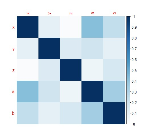
To load corrplot package and create a correlation matrix plot, add the following code to the above snippet −
library(corrplot)
corrplot(abs(Corr_M),method="color",cl.lim=c(0,1))
Outpu
If you execute all the above given snippets as a single program, it generates the following output −
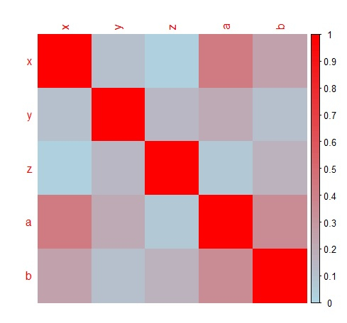
To create a correlation matrix plot with different colors, add the following code to the above snippet −
corrplot(abs(Corr_M),method="color",col=colorRampPalette(c("white","lightblue","red"))(100),cl.lim=c(0,1))
Output
If you execute all the above given snippets as a single program, it generates the following output −

7K+ Views
