
Article Categories
- All Categories
-
 Data Structure
-
 Networking
-
 RDBMS
RDBMS
-
 Operating System
-
 Java
Java
-
 MS Excel
-
 iOS
iOS
-
 HTML
HTML
-
 CSS
CSS
-
 Android
-
 Python
-
 C Programming
-
 C++
C++
-
 C#
C#
-
 MongoDB
-
 MySQL
MySQL
-
 Javascript
-
 PHP
PHP
-
 Economics & Finance
How to create Dark Mode in ReactJS using Material UI?
Using the Material UI library, we will learn to create a Dark Mode in ReactJS. The Material UI is the external react library that provides the designed react components that we can directly use in our react project by importing from the library.
In the world, most users like dark mode, and only some love light mode. The dark mode helps us decrease visitors' eye strain and look more luxurious. So, we should allow users to choose the either dark or light mode according to their preference.
In vanilla JavaScript or JQuery, we can create dark and light modes by adding and removing the class of dark themes. In React, we can use external libraries like the Material-Ui to achieve a dark mode in the application.
Users need to install the Material-Ui library in the react project before we start. Execute the below command in the terminal.
npm install @mui/material @emotion/react @emotion/styled
Syntax
Users can follow the syntax below to create dark mode using the Material-Ui library of ReactJS.
const darkTheme	 = createTheme({
   palette: {
      mode: "dark",
   },
});
<ThemeProvider theme={darkTheme}>
   <CssBaseline />
</ThemeProvider>
In the above syntax, we have used the ThemeProvider component from the Material-Ui and passed the darkTheme object as a prop of the ThemeProvider component. Furthermore, we need to use the CssBaseline component to apply CSS of the dark theme; Otherwise, it will not work properly.
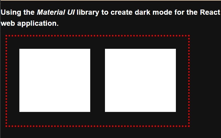
Example 1
In the example below, we have imported the ThemeProvider component and createTheme constructor from the material Ui library. After that, we used the createTheme() constructor and created the dark theme.
We need to bind the content of the component inside the ThemeProvider component and pass the theme object as a prop of the ThemeProvider component. In the output, users can observe the dark theme.
import { ThemeProvider, createTheme } from "@mui/mater/styles;
import CssBaseline from "@mui/material/CssBaseline";

const theme = createTheme({
   palette: {
      mode: "dark",
   },
});

function App() {
   const divStyle = {
      display: "flex",
      flexDireciton: "row",
      textAlign: "center",
      border: "5px dotted red",
      width: "600px",
      height: "300px",
      marginLeft: "1rem",
      padding: "1rem",
   };
   const ChildDivStyle = {
      height: "80%",
      width: "45%",
      margin: "1.5rem",
      backgroundColor: "White",
   };
   return (
      <ThemeProvider theme={theme}>
         <CssBaseline />
         <div>
            <h2>
               {" "}
               Using the <i> Material UI </i> library to create dark mode for the
               React web application. {" "}
            </h2>
            <div style = {divStyle}>
               <div style = {ChildDivStyle}> </div>
               <div style = {ChildDivStyle}> </div>
            </div>
         </div>
      </ThemeProvider>
   );
}
export default App;
Output
Steps for the Example 2
Users can follow the steps below to create an example 2.
Step 1 ? Import the ThemeProvider, CreateTheme, and CSSBaseline from the Material-Ui library.
Step 2 ? Now, use the ThemeProvider component and bind other components to apply themes.
Step 3 ? Next, create a button to toggle the theme. When a user clicks the button, it should invoke the handleThemeChange() function.
Step 4 ? Now, set the variables for the theme. We will select the light or dark theme based on the Boolean value of the ?themeLight? variable.
Step 5 ? Use the createTheme() constructor to create a theme based on the value of the themeLight variable. For the conditional theme, we can use the ternary operator.
Step 6 ? Next, also implement the handleThemeChange() function. In the handleThemeChange() function, alter the value of the themeLight variable to toggle between light and dark themes.
Example 2
In the example below, we have used the Material-Ui library to apply the dark and light themes to the react application. When users click the button, it changes from a light to a dark theme or a dark to a light theme.
import { ThemeProvider, createTheme } from "@mui/material/styles";
import CssBaseline from "@mui/material/CssBaseline";
import React from "react";
import { useState } from "react";

function App() {
   const [themeLight, setThemeType] = useState(true);
   const theme = createTheme({
      palette: {
         mode: themeLight ? "light" : "dark",
      },
   });
   function handleThemeChange() {
      setThemeType(!themeLight);
   }
   const divStyle = {
      textAlign: "center",
      border: "5px solid green",
      width: "500px",
      height: "400px",
      marginLeft: "1rem",
      padding: "1rem",
      fontSize: "1.2rem",
      color: "blue,",
   };
   const buttonStyle = {
      width: "15rem",
      height: "2rem",
      borderRadius: "10px",
      border: "1px solid green",
      backgroundColor: "darkGrey",
      fontSize: "1.5rem",
      padding: "2px",
      marginLeft: "1rem",
   };
   return (
      <ThemeProvider theme={theme}>
         <CssBaseline />
         <div>
            <h2>
               {" "}
               Using the <i> Material UI </i> library to create dark mode for the
               React web application. {" "}
            </h2>
            <h3> Use the button to toggle the theme. </h3>
            <div style = {divStyle}>
               <p>This is the content of the Div! </p>
               <p>This is another content of the Div! </p>
               <p>This is the test text of the Div! </p>
               <p>This is the last line of the Div! </p>
            </div>
         </div>
         <br></br>
         <button style = {buttonStyle} onClick = {handleThemeChange}>
           Change Theme
         </button>
      </ThemeProvider>
   );
}
export default App;
Output
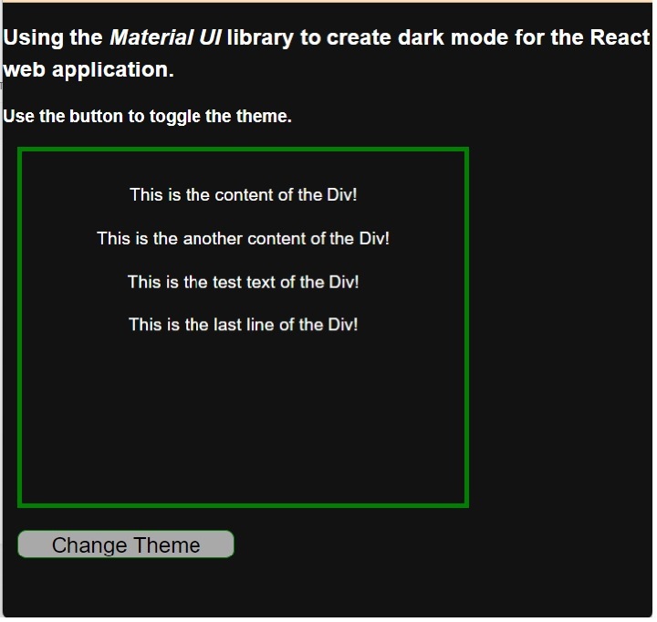
Users learned to toggle between the dark and light modes using the Material Ui library. Users can observe in the example output that Material UI changes the font color and background when we toggle to the dark mode from the light mode. It means it changes the CSS of HTML elements for which we haven?t defined the style, and it remains the same if we have applied CSS on any HTML elements.

2K+ Views
