- Seaborn - Home
- Seaborn - Introduction
- Seaborn - Environment Setup
- Importing Datasets and Libraries
- Seaborn - Figure Aesthetic
- Seaborn- Color Palette
- Seaborn - Histogram
- Seaborn - Kernel Density Estimates
- Visualizing Pairwise Relationship
- Seaborn - Plotting Categorical Data
- Distribution of Observations
- Seaborn - Statistical Estimation
- Seaborn - Plotting Wide Form Data
- Multi Panel Categorical Plots
- Seaborn - Linear Relationships
- Seaborn - Facet Grid
- Seaborn - Pair Grid
- Seaborn Useful Resources
- Seaborn - Quick Guide
- Seaborn - cheatsheet
- Seaborn - Useful Resources
- Seaborn - Discussion
Seaborn - Visualizing Pairwise Relationship
Datasets under real-time study contain many variables. In such cases, the relation between each and every variable should be analyzed. Plotting Bivariate Distribution for (n,2) combinations will be a very complex and time taking process.
To plot multiple pairwise bivariate distributions in a dataset, you can use the pairplot() function. This shows the relationship for (n,2) combination of variable in a DataFrame as a matrix of plots and the diagonal plots are the univariate plots.
Axes
In this section, we will learn what are Axes, their usage, parameters, and so on.
Usage
seaborn.pairplot(data,)
Parameters
Following table lists down the parameters for Axes −
| Sr.No. | Parameter & Description |
|---|---|
| 1 | data Dataframe |
| 2 | hue Variable in data to map plot aspects to different colors. |
| 3 | palette Set of colors for mapping the hue variable |
| 4 | kind Kind of plot for the non-identity relationships. {scatter, reg} |
| 5 | diag_kind Kind of plot for the diagonal subplots. {hist, kde} |
Except data, all other parameters are optional. There are few other parameters which pairplot can accept. The above mentioned are often used params.
Example
import pandas as pd
import seaborn as sb
from matplotlib import pyplot as plt
df = sb.load_dataset('iris')
sb.set_style("ticks")
sb.pairplot(df,hue = 'species',diag_kind = "kde",kind = "scatter",palette = "husl")
plt.show()
Output
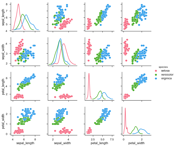
We can observe the variations in each plot. The plots are in matrix format where the row name represents x axis and column name represents the y axis.
The diagonal plots are kernel density plots where the other plots are scatter plots as mentioned.