- Materialize Tutorial
- Materialize - Home
- Materialize - Overview
- Materialize - Environment Setup
- Materialize - Colors
- Materialize - Grids
- Materialize - Helpers
- Materialize - Media
- Materialize - Shadows
- Materialize - Tables
- Materialize - Typography
- Materialize - Badges
- Materialize - Buttons
- Materialize - Breadcrumb
- Materialize - Cards
- Materialize - Chips
- Materialize - Collections
- Materialize - Footer
- Materialize - Form
- Materialize - Icons
- Materialize - Navbar
- Materialize - Pagination
- Materialize - Preloader
- Materialize - Collapsible
- Materialize - Dialogs
- Materialize - Dropdowns
- Materialize - Tabs
- Materialize - Waves
- Materialize Useful Resources
- Materialize - Quick Guide
- Materialize - Useful Resources
- Materialize - Discussion
Materialize - Quick Guide
Materialize - Overview
Materialize is a UI component library created with CSS, JavaScript, and HTML. Materialize reusable UI components help in constructing attractive, consistent, and functional web pages and web apps while adhering to modern web design principles such as browser portability, device independence, and graceful degradation.
Some of its salient features are as follows −
In-built responsive designing.
Standard CSS with minimal footprint.
New versions of common user interface controls such as buttons, checkboxes, and text fields adapted to follow Material Design concepts.
Enhanced and specialized features such as cards, tabs, navigation bars, toasts, and so on.
Free to use and requires jQuery JavaScript library to function properly.
Cross-browser, and can be used to create reusable web components.
Responsive Design
Materialize has in-built responsive designing so that the website created using Materialize will redesign itself as per the device size. Materialize classes are created in such a way that the website can fit any screen size.
The websites created using Materialize are fully compatible with PC, tablets, and mobile devices.
Extensible
Materialize is by design very minimal and flat. It is designed considering the fact that it is much easier to add new CSS rules than to overwrite the existing CSS rules. It supports shadows and bold colors. The colors and shades remain uniform across various platforms and devices.
And most important of all, it is absolutely free to use.
Materialize - Environment Setup
How to Use Materialize?
There are two ways to use Materialize −
Local Installation − You can download the materialize.min.css and materialize.min.js files on your local machine and include it in your HTML code.
CDN Based Version − You can include the materialize.min.css and materialize.min.js files into your HTML code directly from the Content Delivery Network (CDN).
Local Installation
Go to https://materializecss.com/getting-started.html to download the latest version available.
Then, put the downloaded materialize.min.js file in a directory of your website, e.g. /js and materialize.min.css in /css.
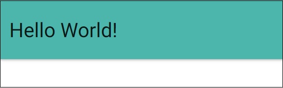
Example
Include the css and js file in your HTML file as follows.
<!DOCTYPE html>
<html>
   <head>
      <title>The Materialize Example</title>
         <meta name="viewport" content="width=device-width, initial-scale=1">
         <link rel="stylesheet" href="https://fonts.googleapis.com/icon?family=Material+Icons">
         <link rel="stylesheet" href="materialize.min.css">
         <script type="text/javascript" src="https://code.jquery.com/jquery-2.1.1.min.js"></script>
         <script src="materialize.min.js"></script>
   </head>
   <body>
      <div class="card-panel teal lighten-2"><h3>Hello World!</h3></div>
   </body>
</html>
It will produce the following result.
CDN Based Version
You can include the materialize.min.js and materialize.min.css files into your HTML code directly from the Content Delivery Network (CDN). cdnjs.cloudflare.com provides content for the latest version.
We are using cdnjs.cloudflare.com CDN version of the library throughout this tutorial.
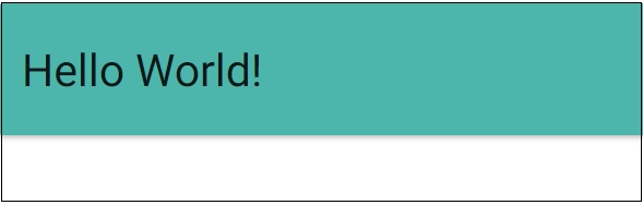
Example
Rewrite the above example using materialize.min.css and materialize.min.js from cdnjs.cloudflare.com CDN.
<!DOCTYPE html>
<html>
   <head>
      <title>The Materialize Example</title>
         <meta name="viewport" content="width=device-width, initial-scale=1">
         <link rel="stylesheet" href="https://fonts.googleapis.com/icon?family=Material+Icons">
         <link rel="stylesheet" href="https://cdnjs.cloudflare.com/ajax/libs/materialize/0.97.3/css/materialize.min.css">
         <script type="text/javascript" src="https://code.jquery.com/jquery-2.1.1.min.js"></script>
         <script src="https://cdnjs.cloudflare.com/ajax/libs/materialize/0.97.3/js/materialize.min.js"></script>
   </head>
   <body>
      <div class="card-panel teal lighten-2"><h3>Hello World!</h3></div>
   </body>
</html>
It will produce the following result.
Materialize - Colors
Materialize supports a rich set of color classes. These color classes are inspired and developed considering the colors used in marketing, road signs, and sticky notes.
- red
- pink
- purple
- deep-purple
- indigo
- blue
- light-blue
- cyan
- teal
- green
- light-green
- lime
- yellow
- amber
- orange
- deep-orange
- brown
- grey
- blue-grey
- black
- white
- transparent
Usage
Following is the list of lightness/darkness classes, which can be used to vary the color applied.
- lighten-1
- lighten-2
- lighten-3
- lighten-4
- lighten-5
- darken-1
- darken-2
- darken-3
- darken-4
- accent-1
- accent-2
- accent-3
- accent-4
Example
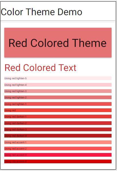
The following example demonstrates how to use the above classes to render the background or to change the color of the text. In case of background, add the classes as such and in case of text, suffix '-text' to color class and prefix 'text-' to lightning class.
<!DOCTYPE html>
<html>
   <head>
      <title>The Materialize Colors Example</title>
         <meta name="viewport" content="width=device-width, initial-scale=1">
         <link rel="stylesheet" href="https://fonts.googleapis.com/icon?family=Material+Icons">
         <link rel="stylesheet" href="https://cdnjs.cloudflare.com/ajax/libs/materialize/0.97.3/css/materialize.min.css">
         <script type="text/javascript" src="https://code.jquery.com/jquery-2.1.1.min.js"></script>
         <script src="https://cdnjs.cloudflare.com/ajax/libs/materialize/0.97.3/js/materialize.min.js"></script>
   </head>
   <body>
      <h2>Color Theme Demo</h2>
      <hr/>
      <div class="card-panel">
         <div class="card-panel red lighten-2">
            <h1>Red Colored Theme</h1>
         </div>
         <span class="red-text text-darken-2">
            <h2>Red Colored Text</h2>
         </span>
         <ul>
            <li class="red lighten-5"><p>Using red lighten-5</p></li>
            <li class="red lighten-4"><p>Using red lighten-4</p></li>
            <li class="red lighten-3"><p>Using red lighten-3</p></li>
            <li class="red lighten-2"><p>Using red lighten-2</p></li>
            <li class="red lighten-1"><p>Using red lighten-1</p></li>
            <li class="red"><p>Using red</p></li>
            <li class="red darken-1"><p>Using red darken-1</p></li>
            <li class="red darken-2"><p>Using red darken-2</p></li>
            <li class="red darken-3"><p>Using red darken-3</p></li>
            <li class="red darken-4"><p>Using red darken-4</p></li>
            <li class="red accent-1"><p>Using red accent-1</p></li>
            <li class="red accent-2"><p>Using red accent-2</p></li>
            <li class="red accent-3"><p>Using red accent-3</p></li>
            <li class="red accent-4"><p>Using red accent-4</p></li>
         </ul>
       </div>
    </body>
</html>
Result
Verify the result.
Materialize - Grids
Materialize provides a 12 column fluid responsive grid.
It uses the row and column style classes to define rows and columns respectively.
| Sr.No. | Class Name & Description |
|---|---|
| 1 | row Specifies a padding-less container to be used for responsive columns. This class is mandatory for responsive classes to be fully responsive. |
| 2 | col Specifies a column with sub-classes. |
col has several sub-classes meant for different types of screens.
Columns for Small Screen Devices
Following is a list of column-level styles for small screen devices, typically smartphones.
| Sr.No. | Class Name & Description |
|---|---|
| 1 | s1 Defines 1 of 12 columns with width as 08.33% |
| 2 | s2 Defines 2 of 12 columns with width as 16.66%. |
| 3 | s3 Defines 3 of 12 columns with width as 25.00%. |
| 4 | s4 Defines 4 of 12 columns with width as 33.33%. |
| s5 - s11 | |
| 12 | s12 Defines 12 of 12 columns with width as 100%. Default class for small screen phones. |
Columns for Medium Screen Devices
Following is a list of column-level styles for medium screen devices, typically tablets.
| Sr.No. | Class Name & Description |
|---|---|
| 1 | m1 Defines 1 of 12 columns with width as 08.33% |
| 2 | m2 Defines 2 of 12 columns with width as 16.66%. |
| 3 | m3 Defines 3 of 12 columns with width as 25.00%. |
| 4 | m4 Defines 4 of 12 columns with width as 33.33%. |
| m5 - m11 | |
| 12 | m12 Defines 12 of 12 columns with width as 100%. Default class for medium screen phones. |
Columns for Large Screen Devices
Following is a list of column-level styles for large screen devices, typically laptops.
| Sr.No. | Class Name & Description |
|---|---|
| 1 | l1 Defines 1 of 12 columns with width as 08.33% |
| 2 | l2 Defines 2 of 12 columns with width as 16.66%. |
| 3 | l3 Defines 3 of 12 columns with width as 25.00%. |
| 4 | l4 Defines 4 of 12 columns with width as 33.33%. |
| l5 - l11 | |
| 12 | l12 Defines 12 of 12 columns with width as 100%. Default class for large screen devices. |
Usage
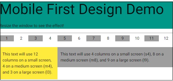
Each subclass determines the number of columns of the grid to be used based on the type of a device. Consider the following HTML snippet.
<div class="row">
   <div class="col s2 m4 l3">
      <p>This text will use 2 columns on a small screen, 4 on a medium screen, and 3 on a large screen.</p>
   </div>
</div>
Default columns to be used are 12 on a device, if a sub-class is not mentioned in the class attribute of an HTML element.
Example
<!DOCTYPE html>
<html>
   <head>
      <title>The Materialize Grids Example</title>
         <meta name="viewport" content="width=device-width, initial-scale=1">
         <link rel="stylesheet" href="https://fonts.googleapis.com/icon?family=Material+Icons">
         <link rel="stylesheet" href="https://cdnjs.cloudflare.com/ajax/libs/materialize/0.97.3/css/materialize.min.css">
         <script type="text/javascript" src="https://code.jquery.com/jquery-2.1.1.min.js"></script>
         <script src="https://cdnjs.cloudflare.com/ajax/libs/materialize/0.97.3/js/materialize.min.js"></script>
      </head>
      <body>
      <div class="teal">
            <h2>Mobile First Design Demo</h2>
            <p>Resize the window to see the effect!</p>
         </div>
         <hr/>
        <div class="row">
         <div class="col m1 grey center">1</div>
         <div class="col m1 center">2</div>
         <div class="col m1 grey center">3</div>
         <div class="col m1 center">4</div>
         <div class="col m1 grey center">5</div>
         <div class="col m1 center">6</div>
         <div class="col m1 center grey">7</div>
         <div class="col m1 center">8</div>
         <div class="col m1 center grey">9</div>
         <div class="col m1 center">10</div>
         <div class="col m1 center grey">11</div>
         <div class="col m1 center">12</div>
      </div>
      <div class="row">
         <div class="col m4 l3 yellow">
            <p>This text will use 12 columns on a small screen, 4 on a medium screen (m4), and 3 on a large screen (l3).</p>
         </div>
         <div class="col s4 m8 l9 grey">
            <p>This text will use 4 columns on a small screen (s4), 8 on a medium screen (m8), and 9 on a large screen (l9).</p>
         </div>
      </div>
   </body>
</html>
Result
Verify the result.
Materialize - Helpers
Materialize has several utility classes useful for day-to-day designing needs.
Color utility classes − For example, .red, .green, .grey and so on
Alignment utility classes − For example, .valign-wrapper, .left-align, .right-align, .center-align, .left, .right
Hiding Content utility classes as per device size − For example, .hide, .hide-on-small-only, .hide-on-med-only, .hide-on-med-and-down, .hide-on-med-and-up and .hide-on-large-only
Formatting utility classes − For example, truncate, hoverable
Example
<!DOCTYPE html>
<html>
<head>
<title>The Materialize Example<!/title>
<meta name="viewport" content="width=device-width, initial-scale=1">
<link rel="stylesheet" href="https://fonts.googleapis.com/icon?family=Material+Icons">
<link rel="stylesheet" href="https://cdnjs.cloudflare.com/ajax/libs/materialize/0.97.3/css/materialize.min.css">
<script type="text/javascript" src="https://code.jquery.com/jquery-2.1.1.min.js"><!/script>
<script src="https://cdnjs.cloudflare.com/ajax/libs/materialize/0.97.3/js/materialize.min.js"></script>
</head>
<body class="container">
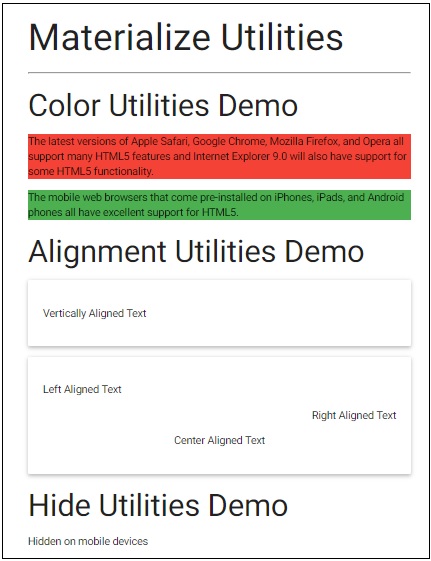
<h2>Materialize Utilities</h2>
<hr/>
<h3>Color Utilities Demo</h3>
<div class="red">
<p>The latest versions of Apple Safari, Google Chrome, Mozilla Firefox, and Opera all support many HTML5 features and Internet Explorer 9.0 will also have support for some HTML5 functionality.</p>
</div>
<div class="green">
<p>The mobile web browsers that come pre-installed on iPhones, iPads, and Android phones all have excellent support for HTML5.<!/p>
</div>
<h3>Alignment Utilities Demo</h3>
<div class="card-panel valign-wrapper">
<p class="valign">Vertically Aligned Text</p>
</div>
<div class="card-panel">
<div><p class="left-align">Left Aligned Text</p></div>
<div><p class="right-align">Right Aligned Text</p><!/div>
<div><p class="center-align">Center Aligned Text</p></div>
<div>
<h3>Hide Utilities Demo</h3>
<div class="hide">
<p>Hidden on all devices</p>
</div>
<div class="hide-on-small-only">
<p>Hidden on mobile devices</p>
</div>
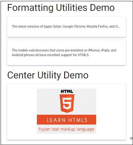
<h3>Formatting Utilities Demo</h3>
<div class="card-panel">
<p class="truncate">The latest versions of Apple Safari, Google Chrome, Mozilla Firefox, and Opera all support many HTML5 features and Internet Explorer 9.0 will also have support for some HTML5 functionality.<!/p>
</div>
<div class="card-panel hoverable">
<p>The mobile web browsers that come pre-installed on iPhones, iPads, and Android phones all have excellent support for HTML5.</p>
</div>
<h3>Center Utility Demo</h3>
<div class="card-panel center">
<img src="html5-mini-logo.jpg" alt="html5">
</div>
</body>
</html>
Result
Verify the result.
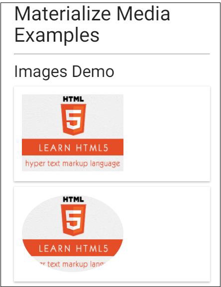
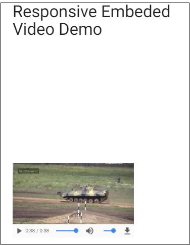
Materialize - Media
Materialize has several classes to make images and videos responsive to different sizes.
responsive-img − It makes an image to resize itself based on the screen size.
video-container − For responsive container having embedded videos.
responsive-video − Makes HTML5 videos responsive.
Example
<!DOCTYPE html>
<html>
   <head>
      <title>The Materialize Example</title>
         <meta name="viewport" content="width=device-width, initial-scale=1">
         <link rel="stylesheet" href="https://fonts.googleapis.com/icon?family=Material+Icons">
         <link rel="stylesheet" href="https://cdnjs.cloudflare.com/ajax/libs/materialize/0.97.3/css/materialize.min.css">
         <script type="text/javascript" src="https://code.jquery.com/jquery-2.1.1.min.js"></script>
         <script src="https://cdnjs.cloudflare.com/ajax/libs/materialize/0.97.3/js/materialize.min.js"></script>
   </head>
   <body class="container">
      <h2>Materialize Media Examples</h2>
      <hr/>
      <h3>Images Demo</h3>
      <div class="card-panel">
         <img src="html5-mini-logo.jpg" alt="" class="responsive-img">
      </div>
      <div class="card-panel">
         <img src="html5-mini-logo.jpg" alt="" class="circle responsive-img">
      </div>
      <h3>Responsive Embeded Video Demo</h3>
      <div class="video-container">
         <iframe width="540" height="200" src="http://www.youtube.com/embed/Q8TXgCzxEnw?rel=0" frameborder="0" allowfullscreen></iframe>
      </div>
      <div class="video-container">
         <video width="300" height="200" controls autoplay>
            <source src="http://www.tutorialspoint.com/html5/foo.ogg" type="video/ogg" />
            <source src="http://www.tutorialspoint.com/html5/foo.mp4" type="video/mp4" />
            Your browser does not support the video element.
         </video>
      </div>
   </body>
</html>
Result
Verify the result.
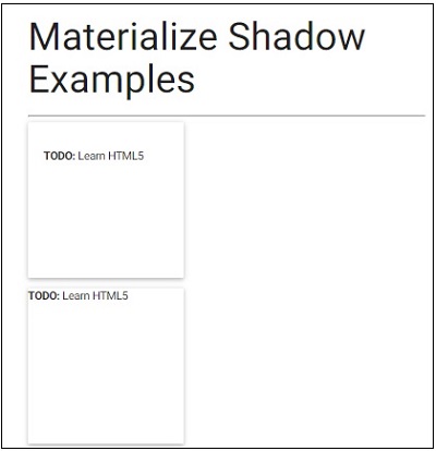
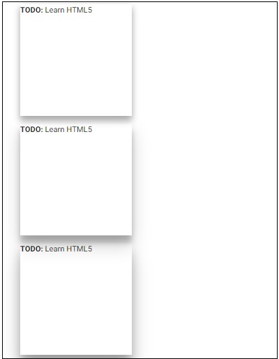
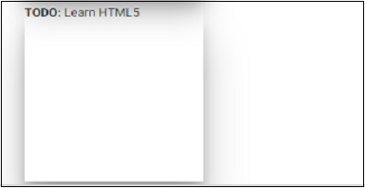
Materialize - Shadows
Materialize has several special classes to display containers as paper-like cards with shadow.
| Sr.No. | Class Name & Description |
|---|---|
| 1 | z-depth-0 Removes the shadow of elements having z-depth by default. |
| 2 | z-depth-1 Styles a container for any HTML content with 1px bordered shadow. Adds z-depth of 1. |
| 3 | z-depth-2 Styles a container for any HTML content with 2px bordered shadow. Adds z-depth of 2. |
| 4 | z-depth-3 Styles a container for any HTML content with 3px bordered shadow. Adds z-depth of 3. |
| 5 | z-depth-4 Styles a container for any HTML content with 4px bordered shadow. Adds z-depth of 4. |
| 6 | z-depth-5 Styles a container for any HTML content with 5px bordered shadow. Adds z-depth of 5. |
Example
<!DOCTYPE html>
<html>
   <head>
      <title>The Materialize Example</title>
         <meta name="viewport" content="width=device-width, initial-scale=1">
         <link rel="stylesheet" href="https://fonts.googleapis.com/icon?family=Material+Icons">
         <link rel="stylesheet" href="https://cdnjs.cloudflare.com/ajax/libs/materialize/0.97.3/css/materialize.min.css">
         <script type="text/javascript" src="https://code.jquery.com/jquery-2.1.1.min.js"></script>
         <script src="https://cdnjs.cloudflare.com/ajax/libs/materialize/0.97.3/js/materialize.min.js"></script>
   <style>
      div {
           width : 200px;
           height : 200px;
         }
   </style>
   </head>
   <body class="container">
      <h2>Materialize Shadow Examples</h2>
      <hr/>
         <div class="card-panel">
            <p><b>TODO:</b> Learn HTML5</p>
         </div>
         <div class="z-depth-1">
            <p><b>TODO:</b> Learn HTML5</p>
         </div>
         <div class="z-depth-2">
            <p><b>TODO:</b> Learn HTML5</p>
         </div>
         <div class="z-depth-3">
            <p><b>TODO:</b> Learn HTML5</p>
         </div>
            <div class="z-depth-4">
               <p><b>TODO:</b> Learn HTML5</p>
         </div>
            <div class="z-depth-5">
               <p><b>TODO:</b> Learn HTML5</p>
         </div>
   </body>
</html>
Result
Verify the result.
Materialize - Tables
Materialize can be used to display different types of tables using various styles over table.
| Sr.No. | Class Name & Description |
|---|---|
| 1 | None Represents a basic table without any border. |
| 2 | stripped Displays a stripped table. |
| 3 | bordered Draws a table with a border across rows. |
| 4 | highlight Draws a highlighted table. |
| 5 | centered Draws a table with all the text center aligned in the table. |
| 6 | responsive-table Draws a responsive table to show a horizontal scrollbar, if the screen is too small to display the content. |
Example
<!DOCTYPE html>
<html>
<head>
<title>The Materialize Example</title>
<meta name="viewport" content="width=device-width, initial-scale=1">
<link rel="stylesheet" href="https://fonts.googleapis.com/icon?family=Material+Icons">
<link rel="stylesheet" href="https://cdnjs.cloudflare.com/ajax/libs/materialize/0.97.3/css/materialize.min.css">
<script type="text/javascript" src="https://code.jquery.com/jquery-2.1.1.min.js"></script>
<script src="https://cdnjs.cloudflare.com/ajax/libs/materialize/0.97.3/js/materialize.min.js"></script>
<style>
div {
width : 200px;
height : 200px;
}
</style>
</head>
<body class="container">
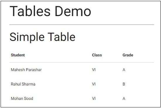
<h2>Tables Demo</h2>
<hr/>
<h3>Simple Table</h3>
<table>
<thead>
<tr><th>Student</th><th>Class</th><th>Grade</th></tr>
</thead>
<tbody>
<tr><td>Mahesh Parashar</td><td>VI</td><td>A</td></tr>
<tr><td>Rahul Sharma</td><td>VI</td><td>B</td></tr>
<tr><td>Mohan Sood</td><td>VI</td><td>A</td></tr>
</tbody>
</table>
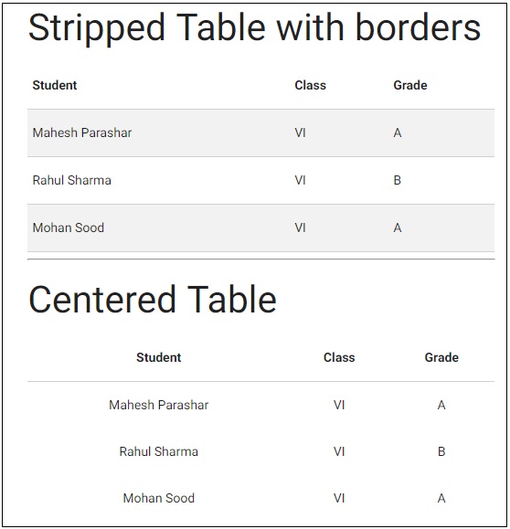
<h3>Stripped Table with borders</h3>
<table class="striped bordered">
<thead>
<tr><th>Student</th><th>Class</th><th>Grade</th></tr>
</thead>
<tbody>
<tr><td>Mahesh Parashar</td><td>VI</td><td>A</td></tr>
<tr><td>Rahul Sharma</td><td>VI</td><td>B</td></tr>
<tr><td>Mohan Sood</td><td>VI</td><td>A</td></tr>
</tbody>
</table>
<hr/>
<h3>Centered Table</h3>
<table class="centered">
<thead>
<tr><th>Student</th><th>Class</th><th>Grade</th></tr>
</thead>
<tbody>
<tr><td>Mahesh Parashar</td><td>VI</td><td>A</td></tr>
<tr><td>Rahul Sharma</td><td>VI</td><td>B</td></tr>
<tr><td>Mohan Sood</td><td>VI</td><td>A</td></tr>
</tbody>
</table>
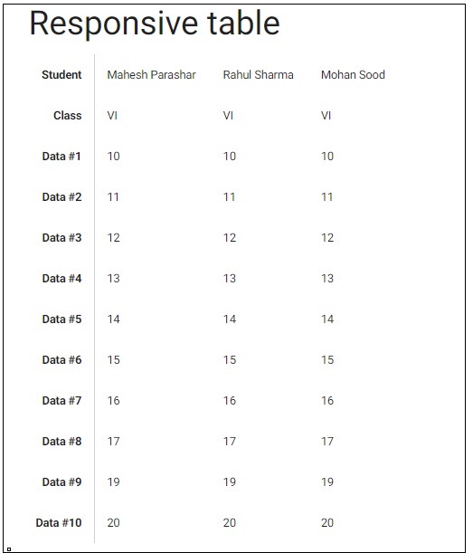
<h3>Responsive table</h3>
<table class="responsive-table">
<thead>
<tr>
<th>Student</th><th>Class</th><th>Data #1</th>
<th>Data #2</th><th>Data #3</th><th>Data #4</th>
<th>Data #5</th><th>Data #6</th><th>Data #7</th>
<th>Data #8</th><th>Data #9</th><th>Data #10</th>
</tr>
</thead>
<tbody>
<tr>
<td>Mahesh Parashar</td><td>VI</td><td>10</td>
<td>11</td><td>12</td><td>13</td><td>14</td><td>15</td>
<td>16</td><td>17</td><td>19</td><td>20</td>
</tr>
<tr>
<td>Rahul Sharma</td><td>VI</td><td>10</td>
<td>11</td><td>12</td><td>13</td><td>14</td><td>15</td>
<td>16</td><td>17</td><td>19</td><td>20</td>
</tr>
<tr><td>Mohan Sood</td><td>VI</td><td>10</td>
<td>11</td><td>12</td><td>13</td><td>14</td><td>15</td>
<td>16</td><td>17</td><td>19</td><td>20</td>
</tr>
</tbody>
</table>
</body>
</html>
Result
Verify the result.
Materialize - Typography
Materialize uses Roboto 2.0 as a standard font. It can be overridden using the following CSS style.
html {
   font-family: GillSans, Calibri, Trebuchet, sans-serif;
}
Following are the examples of headings, blockquotes and free-flow but responsive text.
Example
<!DOCTYPE html>
<html>
<head>
<title>The Materialize Typography Example</title>
<meta name="viewport" content="width=device-width, initial-scale=1">
<link rel="stylesheet" href="https://fonts.googleapis.com/icon?family=Material+Icons">
<link rel="stylesheet" href="https://cdnjs.cloudflare.com/ajax/libs/materialize/0.97.3/css/materialize.min.css">
<script type="text/javascript" src="https://code.jquery.com/jquery-2.1.1.min.js"></script>
<script src="https://cdnjs.cloudflare.com/ajax/libs/materialize/0.97.3/js/materialize.min.js"></script>
</head>
<body class="container">
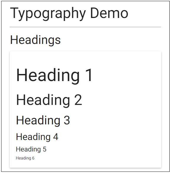
<h2>Typography Demo</h2>
<hr/>
<h3>Headings</h3>
<div class="card-panel">
<h1>Heading 1</h1>
<h2>Heading 2</h2>
<h3>Heading 3</h3>
<h4>Heading 4</h4>
<h6>Heading 6</h6>
</div>
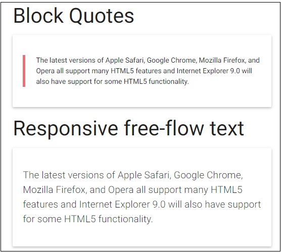
<h3>Block Quotes</h3>
<div class="card-panel">
<blockquote>
The latest versions of Apple Safari, Google Chrome, Mozilla Firefox, and Opera all support many HTML5 features and Internet Explorer 9.0 will also have support for some HTML5 functionality.
</blockquote>
</div>
<h3>Responsive free-flow text</h3>
<div class="card-panel">
<p class="flow-text">
The latest versions of Apple Safari, Google Chrome, Mozilla Firefox, and Opera all support many HTML5 features and Internet Explorer 9.0 will also have support for some HTML5 functionality.
</p>
</div>
</body>
</html>
Result
Verify the result.
Materialize - Badges
Materialize badge component is an onscreen notification, which can be a number or an icon. It is generally used to emphasize the number of items.
| Sr. No. | Class Name & Description |
|---|---|
| 1 | badge Identifies an element as an MDL badge component. Required for span element. |
| 2 | new Adds a "new" class to a badge component gives it a background. |
Following are the examples of using badges in different ways.
Example
<!DOCTYPE html>
<html>
<head>
<title>The Materialize Badges Example</title>
<meta name="viewport" content="width=device-width, initial-scale=1">
<link rel="stylesheet" href="https://fonts.googleapis.com/icon?family=Material+Icons">
<link rel="stylesheet" href="https://cdnjs.cloudflare.com/ajax/libs/materialize/0.97.3/css/materialize.min.css">
<script type="text/javascript" src="https://code.jquery.com/jquery-2.1.1.min.js"></script>
<script src="https://cdnjs.cloudflare.com/ajax/libs/materialize/0.97.3/js/materialize.min.js"></script>
</head>
<body class="container">
<h2>Badges Demo</h2>
<hr/>
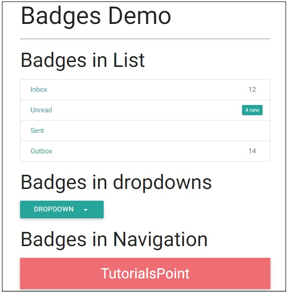
<h3>Badges in List</h3>
<div class="collection">
<a href="#" class="collection-item">Inbox<span class="badge">12</span></a>
<a href="#" class="collection-item">Unread<span class="new badge">4</span></a>
<a href="#" class="collection-item">Sent</a>
<a href="#" class="collection-item">Outbox<span class="badge">14</span></a>
</div>
<h3>Badges in dropdowns</h3>
<ul id="dropdown" class="dropdown-content">
<li><a href="#">Inbox<span class="badge">12</span></a></li>
<li><a href="#!">Unread<span class="new badge">4</span></a></li>
<li><a href="#">Sent</a></li>
<li><a href="#">Outbox<span class="badge">14</span></a></li>
</ul>
<a class="btn dropdown-button" href="#" data-activates="dropdown">Dropdown<i class="mdi-navigation-arrow-drop-down right"></i></a>
<h3>Badges in Navigation</h3>
<nav>
<div class="nav-wrapper">
<a href="" class="brand-logo">TutorialsPoint</a>
<ul id="nav-mobile" class="right hide-on-med-and-down">
<li><a href="">Inbox</a></li>
<li><a href="">Unread<span class="new badge">4</span></a></li>
<li><a href="#">Sent</a></li>
<li><a href="#">Outbox</a></li>
</ul>
</div>
</nav>
</body>
</html>
Result
Verify the result.
Materialize - Buttons
Materialize provides different CSS classes to apply various predefined visual and behavioral enhancements to the buttons. Following table mentions the available classes and their effects.
| Sr.No. | Class Name & Description |
|---|---|
| 1 | btn Sets button or anchor as a Materialize button, required. Sets raised display effect to a button. |
| 2 | btn-floating Creates a circular button. |
| 3 | btn-flat Sets flat display effect to a button, default. |
| 4 | btn-large Creates large buttons. |
| 5 | disabled Creates a disabled button. |
| 6 | type="submit" Represents an anchor or button as a primary button. |
| 7 | waves-effect Sets ripple click effect, can be used in combination with any other classes. |
Example
The following example demonstrates the use of mdl-button classes to show different types of buttons.
<!DOCTYPE html>
<html>
<head>
<title>The Materialize Buttons Example</title>
<meta name="viewport" content="width=device-width, initial-scale=1">
<link rel="stylesheet" href="https://fonts.googleapis.com/icon?family=Material+Icons">
<link rel="stylesheet" href="https://cdnjs.cloudflare.com/ajax/libs/materialize/0.97.3/css/materialize.min.css">
<script type="text/javascript" src="https://code.jquery.com/jquery-2.1.1.min.js"></script>
<script src="https://cdnjs.cloudflare.com/ajax/libs/materialize/0.97.3/js/materialize.min.js"></script>
</head>
<body class="container">
<div class="card-panel">
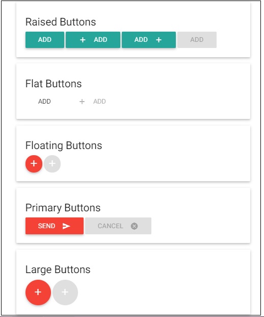
<h5>Raised Buttons</h5>
<button class="btn waves-effect waves-teal">Add</button></td>
<button class="btn waves-effect waves-teal"><i class="material-icons left">add</i>Add</button></td>
<button class="btn waves-effect waves-teal"><i class="material-icons right">add</i>Add</button></td>
<button class="btn waves-effect waves-teal disabled">Add</button></td>
</div>
<div class="card-panel">
<h5>Flat Buttons</h5>
<button class="btn-flat waves-effect waves-teal">Add</button></td>
<button class="btn-flat waves-effect waves-teal disabled" ><i class="material-icons left">add</i>Add</button></td>
</div>
<div class="card-panel">
<h5>Floating Buttons</h5>
<a class="btn-floating waves-effect waves-light red"><i class="material-icons">add</i></a>
<a class="btn-floating waves-effect waves-light red disabled" ><i class="material-icons">add</i></a>
</div>
<div class="card-panel">
<h5>Primary Buttons</h5>
<button class="btn waves-effect waves-light red" type="submit">Send<i class="material-icons right">send</i></button>
<button class="btn waves-effect waves-light red disabled" type="submit" >Cancel<i class="material-icons right">cancel</i></button>
</div>
<div class="card-panel">
<h5>Large Buttons</h5>
<a class="btn-floating btn-large waves-effect waves-light red"><i class="material-icons">add</i></a>
<a class="btn-floating btn-large waves-effect waves-light red disabled"><i class="material-icons">add</i></a>
</div>
</body>
</html>
Result
Verify the result.
Materialize - Breadcrumb
Materialize provides various CSS classes to create a nice breadcrumb in an easy way. The following table mentions the available classes and their effects.
| Sr.No. | Class Name & Description |
|---|---|
| 1 | nav-wrapper Sets the nav component as breadcrumb/nav bar wrapper. |
| 2 | breadcrumb Sets the anchor element as breadcrumb. Last anchor element is active, while rest are shown as greyed out. |
Example
The following example demonstrates the use of breadcrumb classes to showcase the navigation bar.
<!DOCTYPE html>
<html>
<head>
<title>The Materialize BreadCrumb Example</title>
<meta name="viewport" content="width=device-width, initial-scale=1">
<link rel="stylesheet" href="https://fonts.googleapis.com/icon?family=Material+Icons">
<link rel="stylesheet" href="https://cdnjs.cloudflare.com/ajax/libs/materialize/0.97.3/css/materialize.min.css">
<script type="text/javascript" src="https://code.jquery.com/jquery-2.1.1.min.js"></script>
<script src="https://cdnjs.cloudflare.com/ajax/libs/materialize/0.97.3/js/materialize.min.js"></script>
</head>
<body class="container">
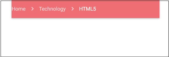
<nav>
<div class="nav-wrapper">
<div class="col s12">
<a href="#" class="breadcrumb">Home</a>
<a href="#" class="breadcrumb">Technology</a>
<a href="#" class="breadcrumb">HTML5</a>
</div>
</div>
</nav>
</body>
</html>
Result
Verify the result.
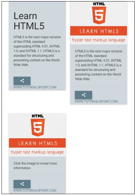
Materialize - Cards
Materialize provides different CSS classes to apply various predefined visual and behavioral enhancements to display various types of cards. Following table mentions the available classes and their effects.
| Sr.No. | Class Name & Description |
|---|---|
| 1 | card Identifies div element as a Materialize card container. Required on "outer" div. |
| 2 | card-content Identifies div as a card content container and is required on "inner" div. |
| 3 | card-title Identifies div as a card title container and is required on "inner" title div. |
| 4 | card-action Identifies div as a card actions container and assigns appropriate text characteristics to actions text. Required on "inner" actions div; content goes directly inside the div with no intervening containers. |
| 5 | card-image Identifies div as a card image container and is required on "inner" div. |
| 6 | card-reveal Identifies div as a revealed text container. |
| 7 | activator Identifies div as a revealed text container and image to be revealer. Used to show contextual information related to image. |
| 8 | card-panel Identifies div as a simple card with shadows and padding. |
| 9 | card-small Identifies div as a small sized card. Height − 300px; |
| 10 | card-medium Identifies div as a medium sized card. Height − 400px; |
| 11 | card-larger Identifies div as a large sized card. Height − 500px; |
Example
The following example showcases the use of card classes to showcase various types of cards.
<!DOCTYPE html>
<html>
   <head>
      <title>The Materialize Cards Example</title>
         <meta name="viewport" content="width=device-width, initial-scale=1">
         <link rel="stylesheet" href="https://fonts.googleapis.com/icon?family=Material+Icons">
         <link rel="stylesheet" href="https://cdnjs.cloudflare.com/ajax/libs/materialize/0.97.3/css/materialize.min.css">
         <script type="text/javascript" src="https://code.jquery.com/jquery-2.1.1.min.js"></script>
         <script src="https://cdnjs.cloudflare.com/ajax/libs/materialize/0.97.3/js/materialize.min.js"></script>
   </head>
   <body class="container">
      <div class="row">
         <div class="col s12 m6">
            <div class="card blue-grey lighten-4">
               <div class="card-content">
                  <span class="card-title"><h3>Learn HTML5</h3></span>
                  <p>HTML5 is the next major revision of the HTML standard superseding HTML 4.01, XHTML 1.0, and XHTML 1.1. HTML5 is a standard for structuring and presenting content on the World Wide Web.</p>
               </div>
               <div class="card-action">
                  <button class="btn waves-effect waves-light blue-grey"><i class="material-icons">share</i></button>
                  <a class="right blue-grey-text" href="http://www.tutorialspoint.com">www.tutorialspoint.com</a>
               </div>
            </div>
         </div>
               <div class="col s12 m6">
            <div class="card blue-grey lighten-4">
               <div class="card-image">
                  <img src="html5-mini-logo.jpg">
               </div>
               <div class="card-content">
                  <p>HTML5 is the next major revision of the HTML standard superseding HTML 4.01, XHTML 1.0, and XHTML 1.1. HTML5 is a standard for structuring and presenting content on the World Wide Web.</p>
               </div>
               <div class="card-action">
                  <button class="btn waves-effect waves-light blue-grey"><i class="material-icons">share</i></button>
                  <a class="right blue-grey-text" href="http://www.tutorialspoint.com">www.tutorialspoint.com</a>
               </div>
            </div>
         </div>
      </div>
      <div class="row">
         <div class="col s12 m6">
         <div class="card blue-grey lighten-4">
            <div class="card-image waves-effect waves-block waves-light">
               <img class="activator" src="html5-mini-logo.jpg">
            </div>
            <div class="card-content activator">
               <p>Click the image to reveal more information.</p>
            </div>
            <div class="card-reveal">
               <span class="card-title grey-text text-darken-4">HTML5<i class="material-icons right">close</i></span>
               <p>HTML5 is the next major revision of the HTML standard superseding HTML 4.01, XHTML 1.0, and XHTML 1.1. HTML5 is a standard for structuring and presenting content on the World Wide Web.</p>
            </div>
            <div class="card-action">
               <button class="btn waves-effect waves-light blue-grey"><i class="material-icons">share</i></button>
               <a class="right blue-grey-text" href="http://www.tutorialspoint.com">www.tutorialspoint.com</a>
            </div>
         </div>
      </div>
   </div>
   <div class="row">
      <div class="col s12 m3">
         <div class="card-panel teal">
            <span class="white-text">Simple Card</span>
         </div>
      </div>
      <div class="col s12 m3">
         <div class="card small teal">
            <span class="white-text">Small Card</span>
         </div>
      </div>
         <div class="col s12 m3">
            <div class="card medium teal">
               <span class="white-text">Medium Card</span>
            </div>
         </div>
         <div class="col s12 m3">
            <div class="card large teal">
               <span class="white-text">Large Card</span>
            </div>
         </div>
      </div>
   </body>
</html>
Result
Verify the result.
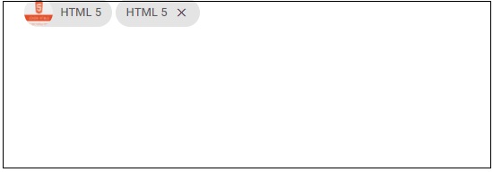
Materialize - Chips
Materialize provides a special component called Chip, which can be used to represent a small set of information. For example, a contact, tags, etc.
| Sr.No. | Class Name & Description |
|---|---|
| 1 | chip Set the div container as a chip. |
Example
The following example demonstrates the use of chip class to showcase creating various types of tags.
<!DOCTYPE html>
<html>
   <head>
      <title>The Materialize Chips Example</title>
         <meta name="viewport" content="width=device-width, initial-scale=1">
         <link rel="stylesheet" href="https://fonts.googleapis.com/icon?family=Material+Icons">
         <link rel="stylesheet" href="https://cdnjs.cloudflare.com/ajax/libs/materialize/0.97.3/css/materialize.min.css">
         <script type="text/javascript" src="https://code.jquery.com/jquery-2.1.1.min.js"></script>
         <script src="https://cdnjs.cloudflare.com/ajax/libs/materialize/0.97.3/js/materialize.min.js"></script>
   </head>
   <body class="container">
      <div class="chip">
         <img alt="HTML5" src="html5-mini-logo.jpg">HTML 5
      </div>
      <div class="chip">
         HTML 5<i class="material-icons">close</i>
      </div>
   </body>
</html>
Result
Verify the result.
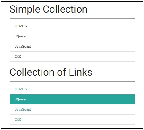
Materialize - Collections
Materialize provides special classes to represent various types of collections, where a collection represents a group of related information items.
| Sr.No. | Class Name & Description |
|---|---|
| 1 | collection Sets the div or ul container as a collection. |
| 2 | collection-item Sets the a or li item as a collection item. |
| 3 | active Shows the a or li item as an active collection item. |
| 4 | with-header Marks the collection to have a header. |
| 5 | collection-header Sets the a or li item as a collection header. |
| 6 | avatar Sets the a or li item as an avatar item. |
| 7 | dismissible Enables the collection items to be swiped away. Works on touch screen devices only. |
Example
Following example demonstrates the use of collection classes to showcase creating various types of collection.
<!DOCTYPE html>
<html>
<head>
<title>The Materialize Collections Example</title>
<meta name="viewport" content="width=device-width, initial-scale=1">
<link rel="stylesheet" href="https://fonts.googleapis.com/icon?family=Material+Icons">
<link rel="stylesheet" href="https://cdnjs.cloudflare.com/ajax/libs/materialize/0.97.3/css/materialize.min.css">
<script type="text/javascript" src="https://code.jquery.com/jquery-2.1.1.min.js"></script>
<script src="https://cdnjs.cloudflare.com/ajax/libs/materialize/0.97.3/js/materialize.min.js"></script>
</head>
<body class="container">
<h3>Simple Collection</h3><hr/>
<ul class="collection">
<li class="collection-item">HTML 5</li>
<li class="collection-item">JQuery</li>
<li class="collection-item">JavaScript</li>
<li class="collection-item">CSS</li>
</ul>
<h3>Collection of Links</h3><hr/>
<div class="collection">
<a href="#" class="collection-item">HTML 5</a>
<a href="#!" class="collection-item active">JQuery</a>
<a href="#!" class="collection-item">JavaScript</a>
<a href="#!" class="collection-item">CSS</a>
</div>
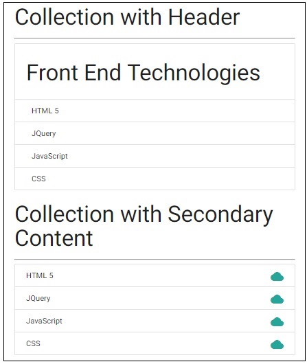
<h3>Collection with Header</h3><hr/>
<ul class="collection with-header">
<li class="collection-header"><h3>Front End Technologies</h3></li>
<li class="collection-item">HTML 5</li>
<li class="collection-item">JQuery</li>
<li class="collection-item">JavaScript</li>
<li class="collection-item">CSS</li>
</ul>
<h3>Collection with Secondary Content</h3><hr/>
<ul class="collection">
<li class="collection-item"><div>HTML 5<a href="#!" class="secondary-content"><i class="material-icons">cloud</i></a></div></li>
<li class="collection-item"><div>JQuery<a href="#!" class="secondary-content"><i class="material-icons">cloud</i></a></div></li>
<li class="collection-item"><div>JavaScript<a href="#!" class="secondary-content"><i class="material-icons">cloud</i></a></div></li>
<li class="collection-item"><div>CSS<a href="#!" class="secondary-content"><i class="material-icons">cloud</i></a></div></li>
</ul>
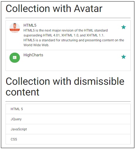
<h3>Collection with Avatar</h3><hr/>
<ul class="collection">
<li class="collection-item avatar">
<img alt="HTML5" src="html5-mini-logo.jpg" class="circle">
<span class="title">HTML5</span>
<p>HTML5 is the next major revision of the HTML standard superseding HTML 4.01, XHTML 1.0, and XHTML 1.1.<br/> HTML5 is a standard for structuring and presenting content on the World Wide Web.</p>
<a href="#!" class="secondary-content"><i class="material-icons">grade</i></a>
</li>
<li class="collection-item avatar">
<i class="material-icons circle green">insert_chart</i>
<span class="title">HighCharts</span>
<p></p>
<a href="#!" class="secondary-content"><i class="material-icons">grade</i></a>
</li>
</ul>
<h3>Collection with dismissible content</h3><hr/>
<ul class="collection">
<li class="collection-item dismissable">HTML 5</li>
<li class="collection-item dismissable">JQuery</li>
<li class="collection-item dismissable">JavaScript</li>
<li class="collection-item dismissable">CSS</li>
</ul>
</body>
</html>
Result
Verify the result.
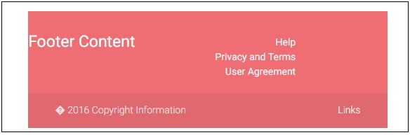
Materialize - Footer
Materialize provides special classes to represent various types of collections where a collection represents a group of related information items.
| Sr.No. | Class Name & Description |
|---|---|
| 1 | page-footer Sets the div container as a footer. |
| 2 | footer-copyright Sets the div container as a footer-copyright container. |
Example
Following example demonstrates the use of footer classes to showcase a sample footer.
<html>
   <head>
      <title>The Materialize Collections Example</title>
         <meta name="viewport" content="width=device-width, initial-scale=1">
         <link rel="stylesheet" href="https://fonts.googleapis.com/icon?family=Material+Icons">
         <link rel="stylesheet" href="https://cdnjs.cloudflare.com/ajax/libs/materialize/0.97.3/css/materialize.min.css">
         <script type="text/javascript" src="https://code.jquery.com/jquery-2.1.1.min.js"></script>
         <script src="https://cdnjs.cloudflare.com/ajax/libs/materialize/0.97.3/js/materialize.min.js"></script>
   </head>
   <body class="container">
      <footer class="page-footer">
         <div class="row">
            <div class="col s12 m6 l6">
               <h5 class="white-text">Footer Content</h5>
            </div>
            <div class="col">
               <ul>
                  <li><a href="#" class="grey-text text-lighten-4 right">Help</a></li>
                  <li><a href="#" class="grey-text text-lighten-4 right">Privacy and Terms</a></li>
                  <li><a href="#" class="grey-text text-lighten-4 right">User Agreement</a></li>
               </ul>
            </div>
         </div>
         <div class="footer-copyright">
            <div class="container">
               © 2016 Copyright Information
               <a class="grey-text text-lighten-4 right" href="#!">Links</a>
            </div>
         </div>
      </footer>
   </body>
</html>
Result
Verify the result.
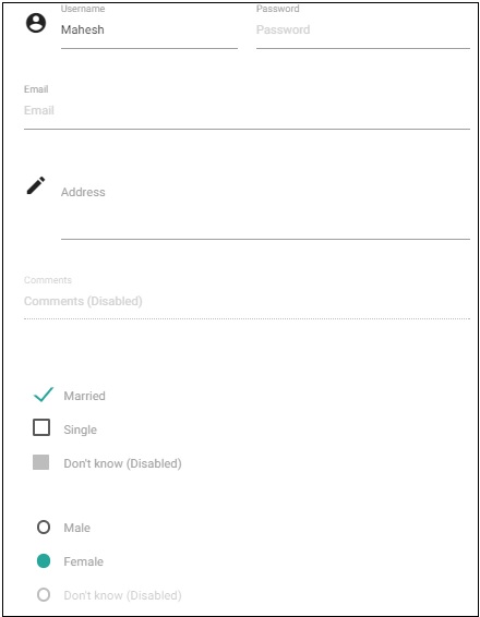
Materialize - Form
Materialize has a very beautiful and responsive CSS for form designing. Following CSS are used −
| Sr.No. | Class Name & Description |
|---|---|
| 1 | input-field Sets the div container as an input field container. Required. |
| 2 | validate Adds validation styles to an input field. |
| 3 | active Shows an input with active style. |
| 4 | materialize-textarea Used to style a text-area. Text-areas will auto resize to the text inside. |
| 5 | filled-in Shows a checkbox with filled box style. |
Example
Following example demonstrates the use of input classes to showcase a sample form.
<html>
   <head>
      <title>The Materialize Form Example</title>
         <meta name="viewport" content="width=device-width, initial-scale=1">
         <link rel="stylesheet" href="https://fonts.googleapis.com/icon?family=Material+Icons">
         <link rel="stylesheet" href="https://cdnjs.cloudflare.com/ajax/libs/materialize/0.97.3/css/materialize.min.css">
         <script type="text/javascript" src="https://code.jquery.com/jquery-2.1.1.min.js"></script>
         <script src="https://cdnjs.cloudflare.com/ajax/libs/materialize/0.97.3/js/materialize.min.js"></script>
   </head>
   <body class="container">
      <div class="row">
         <form class="col s12">
            <div class="row">
               <div class="input-field col s6">
                  <i class="material-icons prefix">account_circle</i>
                  <input placeholder="Username" value="Mahesh" id="name" type="text" class="active validate" required>
                  <label for="name">Username</label>
               </div>
               <div class="input-field col s6">
                  <label for="password">Password</label>
                  <input id="password" type="password" placeholder="Password" class="validate" required>
               </div>
            </div>
            <div class="row">
               <div class="input-field col s12">
                  <input placeholder="Email" id="email" type="email" class="validate">
                  <label for="email">Email</label>
               </div>
            </div>
            <div class="row">
               <div class="input-field col s12">
                  <i class="material-icons prefix">mode_edit</i>
                  <textarea id="address" class="materialize-textarea"></textarea>
                  <label for="address">Address</label>
               </div>
            </div>
            <div class="row">
               <div class="input-field col s12">
                  <input placeholder="Comments (Disabled)" id="comments" type="text" disabled>
                  <label for="comments">Comments</label>
               </div>
            </div>
            <div class="row">
               <div class="input-field col s12">
                  <p>
                     <input id="married" type="checkbox" checked="checked">
                     <label for="married">Married</label>
                  </p>
                  <p>
                     <input id="single" type="checkbox" class="filled-in" >
                     <label for="single">Single </label>
                  </p>
                  <p>
                     <input id="dontknow" type="checkbox" disabled="disabled">
                     <label for="dontknow">Don't know (Disabled)</label>
                  </p>
               </div>
            </div>
            <div class="row">
               <div class="input-field col s12">
                  <p>
                     <input id="male" type="radio" name="gender" value="male" checked>
                     <label for="male">Male</label>
                  </p>
                  <p>
                     <input id="female" type="radio" name="gender" value="female" checked>
                     <label for="female">Female  </label>
                  </p>
                  <p>
                     <input id="dontknow1" type="radio" name="gender" value="female" disabled>
                     <label for="dontknow1">Don't know (Disabled)</label>
                  </p>
               </div>
            </div>
         </form>
      </div>
   </body>
</html>
Result
Verify the result.
Important Input Controls
Materialize provides CSS for numerous types of input controls. Following table details the same.
| Sr.No. | Input Type Name & Description |
|---|---|
| 1 |
Various types of selects inputs |
| 2 |
Various types of switches |
| 3 |
Various types of file inputs |
| 4 |
Various types of range inputs |
| 5 |
Date Picker |
| 6 |
Character Counter |
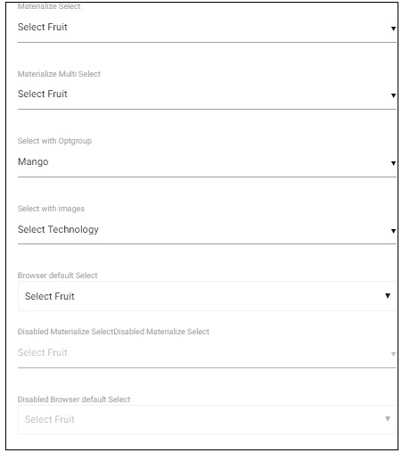
Selects
Example
The following example demonstrates different types of select options.
<html>
   <head>
      <title>The Materialize Selects Example</title>
      <meta name="viewport" content="width=device-width, initial-scale=1">
      <link rel="stylesheet" href="https://fonts.googleapis.com/icon?family=Material+Icons">
      <link rel="stylesheet" href="https://cdnjs.cloudflare.com/ajax/libs/materialize/0.97.3/css/materialize.min.css">
      <script type="text/javascript" src="https://code.jquery.com/jquery-2.1.1.min.js"></script>
      <script src="https://cdnjs.cloudflare.com/ajax/libs/materialize/0.97.3/js/materialize.min.js"></script>
      <script>
         $(document).ready(function() {
         $('select').material_select();
      });
      </script>
   </head>
   <body class="container">
      <div class="row">
         <form class="col s12">
            <div class="row">
               <label>Materialize Select</label>
               <select>
                  <option value="" disabled selected>Select Fruit</option>
                  <option value="1">Mango</option>
                  <option value="2">Orange</option>
                  <option value="3">Apple</option>
               </select>
            </div>
            <div class="row">
               <label>Materialize Multi Select</label>
               <select multiple>
                  <option value="" disabled selected>Select Fruit</option>
                  <option value="1">Mango</option>
                  <option value="2">Orange</option>
                  <option value="3">Apple</option>
               </select>
            </div>
            <div class="row">
               <label>Select with Optgroup</label>
               <select>
                  <optgroup label="Fruits">
                     <option value="1">Mango</option>
                     <option value="2">Orange</option>
                     <option value="3">Apple</option>
                  </optgroup>
                  <optgroup label="Vegs">
                     <option value="4">Brinjal</option>
                     <option value="5">Potato</option>
                     <option value="6">Tomato</option>
                  </optgroup>
               </select>
            </div>
            <div class="row">
               <label>Select with images</label>
               <select class="icons">
                  <option value="" disabled selected>Select Technology</option>
                  <option value="1" data-icon="html5-mini-logo.jpg" class="circle">HTML</option>
                  <option value="2">JavaScript</option>
                  <option value="3">CSS</option>
               </select>
            </div>
            <div class="row">
               <label>Browser default Select</label>
               <select class="browser-default">
                  <option value="" disabled selected>Select Fruit</option>
                  <option value="1">Mango</option>
                  <option value="2">Orange</option>
                  <option value="3">Apple</option>
               </select>
            </div>
            <div class="row">
               <label>Disabled Materialize Select </label><label>Disabled Materialize Select</label>
               <select disabled>
                  <option value="" disabled selected>Select Fruit</option>
                  <option value="1">Mango</option>
                  <option value="2">Orange</option>
                  <option value="3">Apple</option>
               </select>
            </div>
            <div class="row">
               <label>Disabled Browser default Select </label>
               <select class="browser-default" disabled>
                  <option value="" disabled selected>Select Fruit</option>
                  <option value="1">Mango</option>
                  <option value="2">Orange</option>
                  <option value="3">Apple</option>
               </select>
            </div>
         </form>
      </div>
   </body>
</html>
Result
Verify the result.
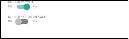
Switches
Example
The following example demonstrates different types of switches. A checkbox is styled as a switch by applying class switch on its parent div container.
<html>
   <head>
      <title>The Materialize Switches Example</title>
         <meta name="viewport" content="width=device-width, initial-scale=1">
         <link rel="stylesheet" href="https://fonts.googleapis.com/icon?family=Material+Icons">
         <link rel="stylesheet" href="https://cdnjs.cloudflare.com/ajax/libs/materialize/0.97.3/css/materialize.min.css">
         <script type="text/javascript" src="https://code.jquery.com/jquery-2.1.1.min.js"></script>
         <script src="https://cdnjs.cloudflare.com/ajax/libs/materialize/0.97.3/js/materialize.min.js"></script>
   </head>
   <body class="container">
      <div class="row">
         <form class="col s12">
            <div class="row">
               <label>Materialize Switch</label>
                  <div class="switch"><label>Off   <input type="checkbox" checked><span class="lever"></span>On</label></div>
            </div>
            <div class="row">
               <label>Materialize Disabled Switch</label>
                  <div class="switch"><label>Off<input disabled type="checkbox"><span class="lever"></span>On</label></div>
            </div>
         </form>
      </div>
   </body>
</html>
Result
Verify the result.
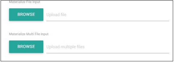
File
Example
The following example demonstrates different types of File Upload Controls.
<html>
   <head>
      <title>The Materialize File Example</title>
         <meta name="viewport" content="width=device-width, initial-scale=1">
         <link rel="stylesheet" href="https://fonts.googleapis.com/icon?family=Material+Icons">
         <link rel="stylesheet" href="https://cdnjs.cloudflare.com/ajax/libs/materialize/0.97.3/css/materialize.min.css">
         <script type="text/javascript" src="https://code.jquery.com/jquery-2.1.1.min.js"></script>
         <script src="https://cdnjs.cloudflare.com/ajax/libs/materialize/0.97.3/js/materialize.min.js"></script>
   </head>
   <body class="container">
      <div class="row">
         <form class="col s12">
            <div class="row">
               <label>Materialize File Input</label>
               <div class="file-field input-field">
                  <div class="btn">
                     <span>Browse</span>
                     <input type="file">
                  </div>
                  <div class="file-path-wrapper">
                     <input class="file-path validate" type="text" placeholder="Upload file">
                  </div>
               </div>
            </div>
            <div class="row">
               <label>Materialize Multi File Input</label>
               <div class="file-field input-field">
                  <div class="btn">
                     <span>Browse</span>
                     <input type="file" multiple>
                  </div>
                  <div class="file-path-wrapper">
                     <input class="file-path validate" type="text" placeholder="Upload multiple files">
                  </div>
               </div>
            </div>
         </form>
      </div>
   </body>
</html>
Result
Verify the result.
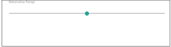
Range
Example
The following example demonstrates Materialize Range control.
<html>
   <head>
      <title>The Materialize Range Example</title>
         <meta name="viewport" content="width=device-width, initial-scale=1">
         <link rel="stylesheet" href="https://fonts.googleapis.com/icon?family=Material+Icons">
         <link rel="stylesheet" href="https://cdnjs.cloudflare.com/ajax/libs/materialize/0.97.3/css/materialize.min.css">
         <script type="text/javascript" src="https://code.jquery.com/jquery-2.1.1.min.js"></script>
         <script src="https://cdnjs.cloudflare.com/ajax/libs/materialize/0.97.3/js/materialize.min.js"></script>
   </head>
   <body class="container">
      <div class="row">
         <form class="col s12">
            <div class="row">
               <label>Materialize Range</label>
               <p class="range-field">
                  <input type="range" id="test" min="0" max="100" />
               </p>
            </div>
         </form>
      </div>
   </body>
</html>
Result
Verify the result.
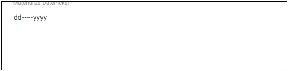
DatePicker
Example
The following example demonstrates Materialize DatePicker control.
<html>
   <head>
      <title>The Materialize Range Example</title>
      <meta name="viewport" content="width=device-width, initial-scale=1">
      <link rel="stylesheet" href="https://fonts.googleapis.com/icon?family=Material+Icons">
      <link rel="stylesheet" href="https://cdnjs.cloudflare.com/ajax/libs/materialize/0.97.3/css/materialize.min.css">
      <script type="text/javascript" src="https://code.jquery.com/jquery-2.1.1.min.js"></script>
      <script src="https://cdnjs.cloudflare.com/ajax/libs/materialize/0.97.3/js/materialize.min.js"></script>
   </head>
   <body class="container">
      <div class="row">
         <form class="col s12">
            <div class="row">
               <label>Materialize DatePicker</label>
               <input type="date" class="datepicker">
            </div>
         </form>
      </div>
   </body>
</html>
Result
Verify the result.
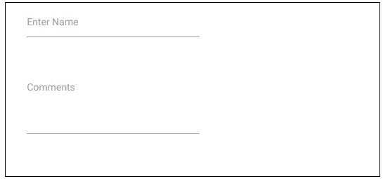
Character Counter
Example
The following example demonstrates Materialize Character Counter control. Setting the length to input text or text area activates this control.
<html>
   <head>
      <title>The Materialize DatePicker Example</title>
         <meta name="viewport" content="width=device-width, initial-scale=1">
         <link rel="stylesheet" href="https://fonts.googleapis.com/icon?family=Material+Icons">
         <link rel="stylesheet" href="https://cdnjs.cloudflare.com/ajax/libs/materialize/0.97.3/css/materialize.min.css">
         <script type="text/javascript" src="https://code.jquery.com/jquery-2.1.1.min.js"></script>
         <script src="https://cdnjs.cloudflare.com/ajax/libs/materialize/0.97.3/js/materialize.min.js"></script>
   </head>
   <body class="container">
      <div class="row">
         <form class="col s12">
            <div class="row">
               <div class="input-field col s6">
                  <input id="name" type="text" length="10">
                  <label for="name">Enter Name</label>
               </div>
            </div>
            <div class="row">
               <div class="input-field col s6">
                  <textarea id="comments" class="materialize-textarea" length="120"></textarea>
                     <label for="comments">Comments</label>
               </div>
            </div>
         </form>
      </div>
   </body>
</html>
Result
Verify the result.
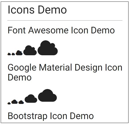
Materialize - Icons
Materialize supports the following popular icon libraries −
- Font Awesome Icons
- Google Material Icons
- Bootstrap Icons
Usage
To use an icon, put the name of the icon in the class of an HTML <i> element. To control the size of an icon, you can use the following classes −
| Sr.No. | Class Name & Description |
|---|---|
| 1 | tiny Draws an icon of very small size. 1rem. |
| 2 | small Draws an icon of small size. 2rem |
| 3 | medium Draws an icon of medium size. 4rem. |
| 4 | large Draws an icon of large size. 6rem. |
Example
<html>
   <head>
      <title>The Materialize Icons Example</title>
         <meta name="viewport" content="width=device-width, initial-scale=1">
         <link rel="stylesheet" href="https://fonts.googleapis.com/icon?family=Material+Icons">
         <link rel="stylesheet" href="https://cdnjs.cloudflare.com/ajax/libs/materialize/0.97.3/css/materialize.min.css">
         <script type="text/javascript" src="https://code.jquery.com/jquery-2.1.1.min.js"></script>
         <script src="https://cdnjs.cloudflare.com/ajax/libs/materialize/0.97.3/js/materialize.min.js"></script>
         <link rel="stylesheet" href="https://cdnjs.cloudflare.com/ajax/libs/font-awesome/4.4.0/css/font-awesome.min.css">
         <link rel="stylesheet" href="http://maxcdn.bootstrapcdn.com/bootstrap/3.3.4/css/bootstrap.min.css">
   </head>
   <body class="container">
      <h2>Icons Demo</h2>
      <hr/>
      <h3>Font Awesome Icon Demo</h3>
      <i class="fa fa-cloud tiny"></i>
      <i class="fa fa-cloud"></i>
      <i class="fa fa-cloud small"></i>
      <i class="fa fa-cloud medium"></i>
      <i class="fa fa-cloud large"></i>
      <h3>Google Material Design Icon Demo</h3>
      <i class="material-icons tiny">cloud</i>
      <i class="material-icons small">cloud</i>
      <i class="material-icons">cloud</i>
      <i class="material-icons medium">cloud</i>
      <i class="material-icons large">cloud</i>
      <h3>Bootstrap Icon Demo</h3>
      <i class="glyphicon glyphicon-cloud tiny"></i>
      <i class="glyphicon glyphicon-cloud"></i>
      <i class="glyphicon glyphicon-cloud small"></i>
      <i class="glyphicon glyphicon-cloud medium"></i>
      <i class="glyphicon glyphicon-cloud large"></i>
   </body>
</html>
Result
Verify the result.
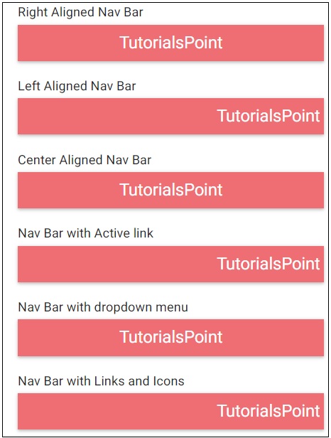
Materialize - Navbar
Materialize provides various CSS classes to create a nice navigation bar in an easy way. The following table mentions the available classes and their effects.
| Sr.No. | Class Name & Description |
|---|---|
| 1 | nav-wrapper Sets the nav component as nav bar/breadcrumb wrapper. |
| 2 | brand-logo Sets the anchor element as the main logo. |
| 3 | nav-mobile Sets the ul element as a navigation bar. |
Example
The following example demonstrates the use of navbar classes to showcase various navigation bar.
<html>
   <head>
      <title>The Materialize NavBar Example</title>
         <meta name="viewport" content="width=device-width, initial-scale=1">
         <link rel="stylesheet" href="https://fonts.googleapis.com/icon?family=Material+Icons">
         <link rel="stylesheet" href="https://cdnjs.cloudflare.com/ajax/libs/materialize/0.97.3/css/materialize.min.css">
         <script type="text/javascript" src="https://code.jquery.com/jquery-2.1.1.min.js"></script>
         <script src="https://cdnjs.cloudflare.com/ajax/libs/materialize/0.97.3/js/materialize.min.js"></script>
         <script>
            $( document ).ready(function()){
            $(".dropdown-button").dropdown();
            });
         </script>
   </head>
   <body class="container">
      <div class="row" style="width:560px;">
         <div class="col s12 m12 l12">
            <h5>Right Aligned Nav Bar</h5>
               <nav>
                  <div class="nav-wrapper">
                     <a href="#" class="brand-logo">TutorialsPoint</a>
                     <ul id="nav-mobile" class="right hide-on-med-and-down">
                        <li><a href="#">HTML5</a></li>
                        <li><a href="#">CSS</a></li>
                        <li><a href="#">JavaScript</a></li>
                     </ul>
                  </div>
               </nav>
            </div>
         </div>
         <div class="row" style="width:560px;">
            <div class="col s12 m12 l12">
               <h5>Left Aligned Nav Bar</h5>
                  <nav>
                     <div class="nav-wrapper">
                        <a href="#" class="brand-logo right">TutorialsPoint</a>
                        <ul id="nav-mobile" class="left  hide-on-med-and-down">
                           <li><a href="#">HTML5</a></li>
                           <li><a href="#">CSS</a></li>
                           <li><a href="#">JavaScript</a></li>
                        </ul>
                     </div>
                  </nav>
               </div>
            </div>
         <div class="row" style="width:560px;">
            <div class="col s12 m12 l12">
               <h5>Center Aligned Nav Bar</h5>
               <nav>
                  <div class="nav-wrapper">
                     <a href="#" class="brand-logo center">TutorialsPoint</a>
                     <ul id="nav-mobile" class="right hide-on-med-and-down">
                        <li><a href="#">Java</a></li>
                     </ul>
                  </div>
               </nav>
            </div>
         </div>
      <div class="row" style="width:560px;">
         <div class="col s12 m12 l12">
            <h5>Nav Bar with Active link</h5>
            <nav>
               <div class="nav-wrapper">
                  <a href="#" class="brand-logo right">TutorialsPoint</a>
                  <ul id="nav-mobile" class="left hide-on-med-and-down">
                     <li><a href="#">HTML5</a></li>
                     <li><a href="#">CSS</a></li>
                     <li class="active"><a href="#">JavaScript</a></li>
                  </ul>
               </div>
            </nav>
         </div>
      </div>
      <div class="row" style="width:560px;">
         <div class="col s12 m12 l12">
            <h5>Nav Bar with dropdown menu</h5>
            <ul id="javaDropDown" class="dropdown-content">
               <li><a href="#!">JSF</a></li>
               <li><a href="#!">JSP</a></li>
               <li class="divider"></li>
               <li><a href="#!">Servlets</a></li>
            </ul>
            <nav>
               <div class="nav-wrapper">
                  <a href="#" class="brand-logo center">TutorialsPoint</a>
                  <ul id="nav-mobile" class="right hide-on-med-and-down">
                                       <!-- Dropdown Trigger -->
                     <li><a class="dropdown-button" href="#!" data-activates="javaDropDown">Java<i class="material-icons right">arrow_drop_down</i></a></li>
                  </ul>
               </div>
            </nav>
         </div>
      </div>
      <div class="row" style="width:560px;">
         <div class="col s12 m12 l12">
            <h5>Nav Bar with Links and Icons</h5>
            <nav>
               <div class="nav-wrapper">
                  <a href="#" class="brand-logo right">TutorialsPoint</a>
                  <ul id="nav-mobile" class="left hide-on-med-and-down">
                     <li><a href="#"><i class="material-icons left">search </i>HTML5</a></li>
                     <li><a href="#"><i class="material-icons right">view_module</i>CSS</a></li>
                     <li><a href="#">JavaScript</a></li>
                  </ul>
               </div>
            </nav>
         </div>
      </div>
   </body>
</html>
Result
Verify the result.
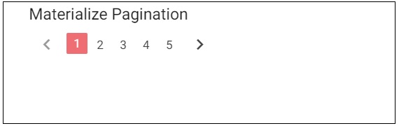
Materialize - Pagination
Materialize provides various CSS classes to create a nice pagination bar in an easy way. The following table mentions the available classes and their effects.
| Sr.No. | Class Name & Description |
|---|---|
| 1 | pagination Sets the ul element as a pagination component. |
Example
The following example demonstrates the use of navbar classes to showcase a pagination bar.
<html>
   <head>
      <title>The Materialize Pagination Example</title>
         <meta name="viewport" content="width=device-width, initial-scale=1">
         <link rel="stylesheet" href="https://fonts.googleapis.com/icon?family=Material+Icons">
         <link rel="stylesheet" href="https://cdnjs.cloudflare.com/ajax/libs/materialize/0.97.3/css/materialize.min.css">
         <script type="text/javascript" src="https://code.jquery.com/jquery-2.1.1.min.js"></script>
         <script src="https://cdnjs.cloudflare.com/ajax/libs/materialize/0.97.3/js/materialize.min.js"></script>
   </head>
   <body class="container">
      <div class="row" style="width:560px;">
         <div class="col s12 m12 l12" >
            <h5>Materialize Pagination</h5>
               <ul class="pagination">
                  <li class="disabled"><a href="#!"><i class="material-icons">chevron_left   </i></a></li>
                  <li class="active"><a href="#!">1</a></li>
                  <li class="waves-effect"><a href="#!">2</a></li>
                  <li class="waves-effect"><a href="#!">3</a></li>
                  <li class="waves-effect"><a href="#!">4</a></li>
                  <li class="waves-effect"><a href="#!">5</a></li>
                  <li class="waves-effect"><a href="#!"><i class="material-icons">chevron_right</i></a></li>
               </ul>
         </div>
      </div>
   </body>
</html>
Result
Verify the result.
Materialize - Preloader
Materialize provides various CSS classes to apply various predefined visual and behavioral enhancements to display various types of preloaders or progress bars. The following table mentions the available classes and their effects.
| Sr.No. | Class Name & Description |
|---|---|
| 1 | progress Identifies an element as a progress component. Required for div element. |
| 2 | determinate Sets the basic Materialize behavior to progress indicator. |
| 3 | indeterminate Sets animation to progress indicator. |
Example
Following is an example of using preloaders in different ways.
<html>
   <head>
      <title>The Materialize Preloader Example</title>
         <meta name="viewport" content="width=device-width, initial-scale=1">
         <link rel="stylesheet" href="https://fonts.googleapis.com/icon?family=Material+Icons">
         <link rel="stylesheet" href="https://cdnjs.cloudflare.com/ajax/libs/materialize/0.97.3/css/materialize.min.css">
         <script type="text/javascript" src="https://code.jquery.com/jquery-2.1.1.min.js"></script>
         <script src="https://cdnjs.cloudflare.com/ajax/libs/materialize/0.97.3/js/materialize.min.js"></script>
   </head>
   <body class="container">
      <h4>Default Preloader</h4>
      <div class="progress">
         <div class="determinate" style="width: 50%"></div>
      </div>
      <h4>Indeterminate Preloader</h4>
         <div class="progress">
      <div class="indeterminate"></div>
    </div>
    <h4>Circular Preloader</h4>
      <div class="preloader-wrapper big active">
         <div class="spinner-layer spinner-blue-only">
         <div class="circle-clipper left">
               <div class="circle"></div>
            </div>
            <div class="gap-patch">
               <div class="circle"></div>
            </div>
            <div class="circle-clipper right">
               <div class="circle"></div>
            </div>
         </div>
      </div>
   </body>
</html>
Result
Verify the result.
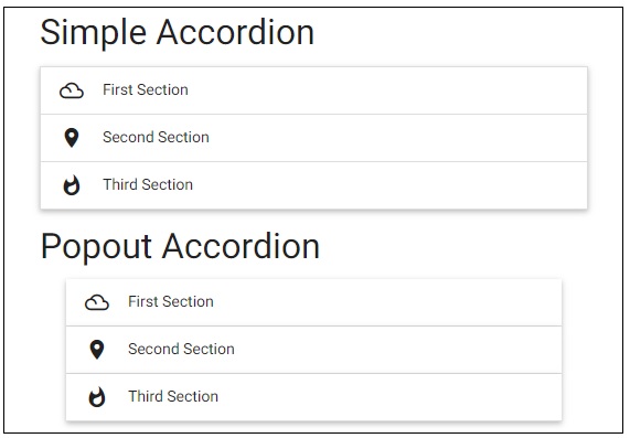
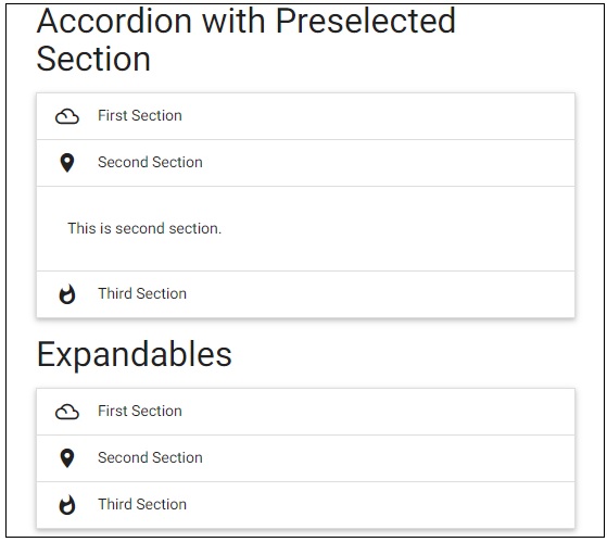
Materialize - Collapsible
Materialize provides various CSS classes to apply various predefined visual and behavioral enhancements to display various types of accordions. The following table mentions the available classes and their effects.
| Sr.No. | Class Name & Description |
|---|---|
| 1 | collapsible Identifies an element as a materialize collapsible component. Required for ul element. |
| 2 | collapsible-header Sets div as a section header. |
| 3 | collapsible-body Sets div as a section content container. |
| 4 | popout Creates a popout collapsible. |
| 5 | active Opens a section. |
| 6 | expandable Marks a collapsible component as expandable. |
| 7 | accordion Marks a collapsible component as accordion. |
Following is an example of using accordions in different ways.
Example
<html>
   <head>
      <title>The Materialize Collapsible Example</title>
         <meta name="viewport" content="width=device-width, initial-scale=1">
         <link rel="stylesheet" href="https://fonts.googleapis.com/icon?family=Material+Icons">
         <link rel="stylesheet" href="https://cdnjs.cloudflare.com/ajax/libs/materialize/0.97.3/css/materialize.min.css">
         <script type="text/javascript" src="https://code.jquery.com/jquery-2.1.1.min.js"></script>
         <script src="https://cdnjs.cloudflare.com/ajax/libs/materialize/0.97.3/js/materialize.min.js"></script>
   </head>
   <body class="container">
      <h4>Simple Accordion</h4>
      <ul class="collapsible" data-collapsible="accordion">
         <li>
            <div class="collapsible-header"><i class="material-icons">filter_drama</i>First Section</div>
               <div class="collapsible-body"><p>This is first section.</p></div>
         </li>
         <li>
            <div class="collapsible-header"><i class="material-icons">place</i>Second Section</div>
               <div class="collapsible-body"><p>This is second section.</p></div>
         </li>
         <li>
            <div class="collapsible-header"><i class="material-icons">whatshot</i>Third Section</div>
               <div class="collapsible-body"><p>This is third section.</p></div>
         </li>
      </ul>
      <h4>Popout Accordion</h4>
         <ul class="collapsible popout" data-collapsible="accordion">
            <li>
               <div class="collapsible-header"><i class="material-icons">filter_drama</i>First Section</div>
                  <div class="collapsible-body"><p>This is first section.</p></div>
            </li>
            <li>
               <div class="collapsible-header"><i class="material-icons">place</i>Second Section</div>
                  <div class="collapsible-body"><p>This is second section.</p></div>
            </li>
            <li>
               <div class="collapsible-header"><i class="material-icons">whatshot</i>Third Section</div>
                  <div class="collapsible-body"><p>This is third section.</p></div>
            </li>
         </ul>
         <h4>Accordion with Preselected Section</h4>
         <ul class="collapsible" data-collapsible="accordion">
            <li>
               <div class="collapsible-header"><i class="material-icons">filter_drama</i>First Section</div>
                  <div class="collapsible-body"><p>This is first section.</p></div>
           </li>
           <li>
            <div class="collapsible-header active"><i class="material-icons">place</i>Second Section</div>
               <div class="collapsible-body"><p>This is second section.</p></div>
           </li>
            <li>
               <div class="collapsible-header"><i class="material-icons">whatshot</i>Third Section</div>
                  <div class="collapsible-body"><p>This is third section.</p></div>
            </li>
         </ul>
         <h4>Expandables</h4>
         <ul class="collapsible" data-collapsible="expandable">
            <li>
               <div class="collapsible-header"><i class="material-icons">filter_drama</i>First Section</div>
                  <div class="collapsible-body"><p>This is first section.</p></div>
            </li>
               <li>
                  <div class="collapsible-header"><i class="material-icons">place</i>Second Section</div>
                        <div class="collapsible-body"><p>This is second section.</p></div>
                  </li>
               <li>
                  <div class="collapsible-header"><i class="material-icons">whatshot</i>Third Section</div>
               <div class="collapsible-body"><p>This is third section.</p></div>
            </li>
         </ul>
      </body>
   </html>
Result
Verify the result.
Materialize - Dialogs
Materialize provides various special methods to show unobtrusive alerts to the users. Materialize provides a term toast for them. Following is the syntax to show a dialog as a toast.
Materialize.toast(message, displayLength, className, completeCallback);
Where,
- message − Message to be displayed to the user.
- displayLength − Duration of the message after which it will disappear.
- className − Style class to be applied to the toast. For example, 'rounded'.
- completeCallback − Callback method to be called once toast is dismissed.
For tooltip, Materialize provides the following CSS classes.
| Sr.No. | Class Name & Description |
|---|---|
| 1 | tooltipped Identifies a component to have a tooltip. |
| 2 | data-position Position of the tooltip; bottom, top, left, or right. |
| 3 | data-delay Sets the duration of the tooltip after which it will disappear. |
| 4 | data-tooltip Sets the tooltip contents. |
Example
Following example demonstrates the use of toasts and tooltips.
<html>
<head>
<title>The Materialize Dialogs Example</title>
<meta name="viewport" content="width=device-width, initial-scale=1">
<link rel="stylesheet" href="https://fonts.googleapis.com/icon?family=Material+Icons">
<link rel="stylesheet" href="https://cdnjs.cloudflare.com/ajax/libs/materialize/0.97.3/css/materialize.min.css">
<script type="text/javascript" src="https://code.jquery.com/jquery-2.1.1.min.js"></script>
<script src="https://cdnjs.cloudflare.com/ajax/libs/materialize/0.97.3/js/materialize.min.js"></script>
<script>
function showToast(message, duration){
Materialize.toast(message, duration);
}
function showToast1(message, duration){
Materialize.toast('<i>'+ message + '</i>', duration);
}
function showToast2(message, duration){
Materialize.toast(message, duration, 'rounded');
}
function showToast3(message, duration){
Materialize.toast('Hello World!', duration, '', function toastCompleted(){
alert('Toast dismissed!');
});
}
</script>
</head>
<body class="container">
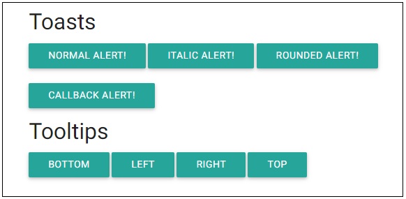
<h4>Toasts</h4>
<a class="btn" onclick="showToast('Hello World!', 3000)">Normal Alert!</a>
<a class="btn" onclick="showToast1('Hello World!', 3000)">Italic Alert!</a>
<a class="btn" onclick="showToast2('Hello World!', 3000)">Rounded Alert!</a>
<br/><br/>
<a class="btn" onclick="showToast3('Hello World!', 3000)">Callback Alert!</a>
<h4>Tooltips</h4>
<a class="btn tooltipped" data-position="bottom" data-delay="50" data-tooltip="I am in bottom!">Bottom</a>
<a class="btn tooltipped" data-position="left" data-delay="50" data-tooltip="I am in left!">Left</a>
<a class="btn tooltipped" data-position="right" data-delay="50" data-tooltip="I am in right!">Right</a>
<a class="btn tooltipped" data-position="top" data-delay="50" data-tooltip="I am in top!">Top</a>
</body>
</html>
Result
Verify the result.
Materialize - Dropdowns
Materialize provides dropdown CSS class to make a ul element as a dropdown and add the id of the ul element to the data-activates attribute of the button or anchor element. The following table mentions the available classes and their effects.
| Sr.No. | Class Name & Description |
|---|---|
| 1 | dropdown-content Identifies ul as a materialize dropdown component. Required for ul element. |
| 2 | data-activates id of the dropdown ul element. |
Following is an example of using a dropdown.
Example
<!DOCTYPE html>
<html>
<head>
<title>The Materialize Dropdowns Example</title>
<meta name="viewport" content="width=device-width, initial-scale=1">
<link rel="stylesheet" href="https://fonts.googleapis.com/icon?family=Material+Icons">
<link rel="stylesheet" href="https://cdnjs.cloudflare.com/ajax/libs/materialize/0.97.3/css/materialize.min.css">
<script type="text/javascript" src="https://code.jquery.com/jquery-2.1.1.min.js"></script>
<script src="https://cdnjs.cloudflare.com/ajax/libs/materialize/0.97.3/js/materialize.min.js"></script>
</head>
<body class="container">
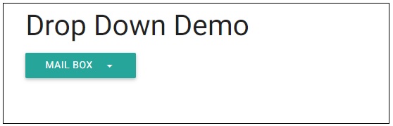
<h3>Drop Down Demo</h3>
<ul id="dropdown" class="dropdown-content">
<li><a href="#">Inbox<span class="badge">12</span></a></li>
<li><a href="#!">Unread<span class="new badge">4</span></a></li>
<li><a href="#">Sent</a></li>
<li class="divider"></li>
<li><a href="#">Outbox<span class="badge">14</span></a></li>
</ul>
<a class="btn dropdown-button" href="#" data-activates="dropdown">Mail Box<i class="mdi-navigation-arrow-drop-down right"></i></a>
</body>
</html>
Result
Verify the result.
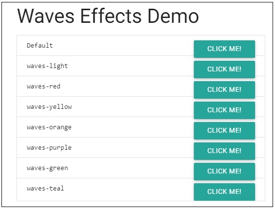
Materialize - Tabs
Materialize provides tabs CSS class to make a ul element as a tab. The following table mentions the available classes and their effects.
| Sr.No. | Class Name & Description |
|---|---|
| 1 | tabs Identifies ul as a materialize tab component. Required for ul element. |
| 2 | active Makes a tab active. |
Example
Following is an example of using a tab.
<!DOCTYPE html>
<html>
   <head>
      <title>The Materialize Tabs Example</title>
         <meta name="viewport" content="width=device-width, initial-scale=1">
         <link rel="stylesheet" href="https://fonts.googleapis.com/icon?family=Material+Icons">
         <link rel="stylesheet" href="https://cdnjs.cloudflare.com/ajax/libs/materialize/0.97.3/css/materialize.min.css">
         <script type="text/javascript" src="https://code.jquery.com/jquery-2.1.1.min.js"></script>
         <script src="https://cdnjs.cloudflare.com/ajax/libs/materialize/0.97.3/js/materialize.min.js"></script>
   </head>
   <body class="container">
      <h3>Tabs Demo</h3>
         <div class="row">
            <div class="col s12">
            <ul class="tabs">
               <li class="tab col s3"><a href="#inbox">Inbox</a></li>
               <li class="tab col s3"><a class="active" href="#unread">Unread</a></li>
               <li class="tab col s3 disabled"><a href="#outbox">Outbox (Disabled)</a></li>
               <li class="tab col s3"><a href="#sent">Sent</a></li>
            </ul>
         </div>
         <div id="inbox" class="col s12">Inbox</div>
          <div id="unread" class="col s12">Unread</div>
          <div id="outbox" class="col s12">Outbox (Disabled)</div>
         <div id="sent" class="col s12">Sent</div>
      </div>
   </body>
</html>
Result
Verify the result.
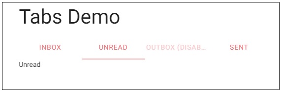
Materialize - Waves
Materialize uses Waves, an external library, to create ink effect outlined in Material Design. Following table mentions the available classes and their effects.
| Sr.No. | Class Name & Description |
|---|---|
| 1 | waves-effect Applies a wave effect on the control. |
| 2 | waves-light Applies a white colored wave effect. |
| 3 | waves-red Applies a red colored wave effect. |
| 4 | waves-green Applies a green colored wave effect. |
| 5 | waves-yellow Applies a yellow colored wave effect. |
| 6 | waves-orange Applies an orange colored wave effect. |
| 7 | waves-purple Applies a purple colored wave effect. |
| 8 | waves-teal Applies a teal colored wave effect. |
Example
Following is an example of using wave effects on buttons.
<!DOCTYPE html>
<html>
   <head>
      <title>The Materialize Waves Effects Example</title>
         <meta name="viewport" content="width=device-width, initial-scale=1">
         <link rel="stylesheet" href="https://fonts.googleapis.com/icon?family=Material+Icons">
         <link rel="stylesheet" href="https://cdnjs.cloudflare.com/ajax/libs/materialize/0.97.3/css/materialize.min.css">
         <script type="text/javascript" src="https://code.jquery.com/jquery-2.1.1.min.js"></script>
         <script src="https://cdnjs.cloudflare.com/ajax/libs/materialize/0.97.3/js/materialize.min.js"></script>
   </head>
   <body class="container">
      <h3>Waves Effects Demo</h3>
         <div class="collection waves-color-demo">
            <div class="collection-item">
            <code class=" language-markup">Default</code>
            <a href="#!" class="waves-effect btn secondary-content">Click Me!</a>
         </div>
         <div class="collection-item">
            <code class=" language-markup">waves-light</code>
            <a href="#!" class="waves-effect waves-light btn secondary-content">Click Me!</a>
         </div>
         <div class="collection-item">
            <code class=" language-markup">waves-red</code>
            <a href="#!" class="waves-effect waves-red btn secondary-content">Click Me!</a>
         </div>
         <div class="collection-item">
            <code class=" language-markup">waves-yellow</code>
            <a href="#!" class="waves-effect waves-yellow btn secondary-content">Click Me!</a>
         </div>
         <div class="collection-item">
            <code class=" language-markup">waves-orange</code>
            <a href="#!" class="waves-effect waves-orange btn secondary-content">Click Me!</a>
         </div>
         <div class="collection-item">
            <code class=" language-markup">waves-purple</code>
            <a href="#!" class="waves-effect waves-purple btn secondary-content">Click Me!</a>
         </div>
         <div class="collection-item">
            <code class=" language-markup">waves-green</code>
            <a href="#!" class="waves-effect waves-green btn secondary-content">Click Me!</a>
         </div>
         <div class="collection-item">
            <code class=" language-markup">waves-teal</code>
            <a href="#!" class="waves-effect waves-teal btn secondary-content">Click Me!</a>
         </div>
      </div>
   </body>
</html>
Result
Verify the result.