- Materialize Tutorial
- Materialize - Home
- Materialize - Overview
- Materialize - Environment Setup
- Materialize - Colors
- Materialize - Grids
- Materialize - Helpers
- Materialize - Media
- Materialize - Shadows
- Materialize - Tables
- Materialize - Typography
- Materialize - Badges
- Materialize - Buttons
- Materialize - Breadcrumb
- Materialize - Cards
- Materialize - Chips
- Materialize - Collections
- Materialize - Footer
- Materialize - Form
- Materialize - Icons
- Materialize - Navbar
- Materialize - Pagination
- Materialize - Preloader
- Materialize - Collapsible
- Materialize - Dialogs
- Materialize - Dropdowns
- Materialize - Tabs
- Materialize - Waves
- Materialize Useful Resources
- Materialize - Quick Guide
- Materialize - Useful Resources
- Materialize - Discussion
Materialize - Form
Materialize has a very beautiful and responsive CSS for form designing. Following CSS are used −
| Sr.No. | Class Name & Description |
|---|---|
| 1 | input-field Sets the div container as an input field container. Required. |
| 2 | validate Adds validation styles to an input field. |
| 3 | active Shows an input with active style. |
| 4 | materialize-textarea Used to style a text-area. Text-areas will auto resize to the text inside. |
| 5 | filled-in Shows a checkbox with filled box style. |
Example
Following example demonstrates the use of input classes to showcase a sample form.
<html>
   <head>
      <title>The Materialize Form Example</title>
         <meta name="viewport" content="width=device-width, initial-scale=1">
         <link rel="stylesheet" href="https://fonts.googleapis.com/icon?family=Material+Icons">
         <link rel="stylesheet" href="https://cdnjs.cloudflare.com/ajax/libs/materialize/0.97.3/css/materialize.min.css">
         <script type="text/javascript" src="https://code.jquery.com/jquery-2.1.1.min.js"></script>
         <script src="https://cdnjs.cloudflare.com/ajax/libs/materialize/0.97.3/js/materialize.min.js"></script>
   </head>
   <body class="container">
      <div class="row">
         <form class="col s12">
            <div class="row">
               <div class="input-field col s6">
                  <i class="material-icons prefix">account_circle</i>
                  <input placeholder="Username" value="Mahesh" id="name" type="text" class="active validate" required>
                  <label for="name">Username</label>
               </div>
               <div class="input-field col s6">
                  <label for="password">Password</label>
                  <input id="password" type="password" placeholder="Password" class="validate" required>
               </div>
            </div>
            <div class="row">
               <div class="input-field col s12">
                  <input placeholder="Email" id="email" type="email" class="validate">
                  <label for="email">Email</label>
               </div>
            </div>
            <div class="row">
               <div class="input-field col s12">
                  <i class="material-icons prefix">mode_edit</i>
                  <textarea id="address" class="materialize-textarea"></textarea>
                  <label for="address">Address</label>
               </div>
            </div>
            <div class="row">
               <div class="input-field col s12">
                  <input placeholder="Comments (Disabled)" id="comments" type="text" disabled>
                  <label for="comments">Comments</label>
               </div>
            </div>
            <div class="row">
               <div class="input-field col s12">
                  <p>
                     <input id="married" type="checkbox" checked="checked">
                     <label for="married">Married</label>
                  </p>
                  <p>
                     <input id="single" type="checkbox" class="filled-in" >
                     <label for="single">Single </label>
                  </p>
                  <p>
                     <input id="dontknow" type="checkbox" disabled="disabled">
                     <label for="dontknow">Don't know (Disabled)</label>
                  </p>
               </div>
            </div>
            <div class="row">
               <div class="input-field col s12">
                  <p>
                     <input id="male" type="radio" name="gender" value="male" checked>
                     <label for="male">Male</label>
                  </p>
                  <p>
                     <input id="female" type="radio" name="gender" value="female" checked>
                     <label for="female">Female  </label>
                  </p>
                  <p>
                     <input id="dontknow1" type="radio" name="gender" value="female" disabled>
                     <label for="dontknow1">Don't know (Disabled)</label>
                  </p>
               </div>
            </div>
         </form>
      </div>
   </body>
</html>
Result
Verify the result.
Important Input Controls
Materialize provides CSS for numerous types of input controls. Following table details the same.
| Sr.No. | Input Type Name & Description |
|---|---|
| 1 |
Various types of selects inputs |
| 2 |
Various types of switches |
| 3 |
Various types of file inputs |
| 4 |
Various types of range inputs |
| 5 |
Date Picker |
| 6 |
Character Counter |
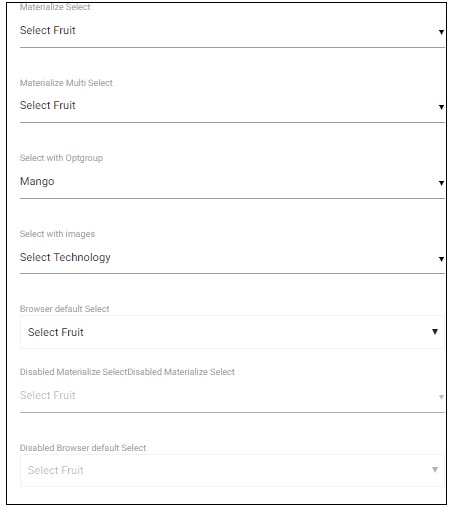
Selects
Example
The following example demonstrates different types of select options.
<html>
   <head>
      <title>The Materialize Selects Example</title>
      <meta name="viewport" content="width=device-width, initial-scale=1">
      <link rel="stylesheet" href="https://fonts.googleapis.com/icon?family=Material+Icons">
      <link rel="stylesheet" href="https://cdnjs.cloudflare.com/ajax/libs/materialize/0.97.3/css/materialize.min.css">
      <script type="text/javascript" src="https://code.jquery.com/jquery-2.1.1.min.js"></script>
      <script src="https://cdnjs.cloudflare.com/ajax/libs/materialize/0.97.3/js/materialize.min.js"></script>
      <script>
         $(document).ready(function() {
         $('select').material_select();
      });
      </script>
   </head>
   <body class="container">
      <div class="row">
         <form class="col s12">
            <div class="row">
               <label>Materialize Select</label>
               <select>
                  <option value="" disabled selected>Select Fruit</option>
                  <option value="1">Mango</option>
                  <option value="2">Orange</option>
                  <option value="3">Apple</option>
               </select>
            </div>
            <div class="row">
               <label>Materialize Multi Select</label>
               <select multiple>
                  <option value="" disabled selected>Select Fruit</option>
                  <option value="1">Mango</option>
                  <option value="2">Orange</option>
                  <option value="3">Apple</option>
               </select>
            </div>
            <div class="row">
               <label>Select with Optgroup</label>
               <select>
                  <optgroup label="Fruits">
                     <option value="1">Mango</option>
                     <option value="2">Orange</option>
                     <option value="3">Apple</option>
                  </optgroup>
                  <optgroup label="Vegs">
                     <option value="4">Brinjal</option>
                     <option value="5">Potato</option>
                     <option value="6">Tomato</option>
                  </optgroup>
               </select>
            </div>
            <div class="row">
               <label>Select with images</label>
               <select class="icons">
                  <option value="" disabled selected>Select Technology</option>
                  <option value="1" data-icon="html5-mini-logo.jpg" class="circle">HTML</option>
                  <option value="2">JavaScript</option>
                  <option value="3">CSS</option>
               </select>
            </div>
            <div class="row">
               <label>Browser default Select</label>
               <select class="browser-default">
                  <option value="" disabled selected>Select Fruit</option>
                  <option value="1">Mango</option>
                  <option value="2">Orange</option>
                  <option value="3">Apple</option>
               </select>
            </div>
            <div class="row">
               <label>Disabled Materialize Select </label><label>Disabled Materialize Select</label>
               <select disabled>
                  <option value="" disabled selected>Select Fruit</option>
                  <option value="1">Mango</option>
                  <option value="2">Orange</option>
                  <option value="3">Apple</option>
               </select>
            </div>
            <div class="row">
               <label>Disabled Browser default Select </label>
               <select class="browser-default" disabled>
                  <option value="" disabled selected>Select Fruit</option>
                  <option value="1">Mango</option>
                  <option value="2">Orange</option>
                  <option value="3">Apple</option>
               </select>
            </div>
         </form>
      </div>
   </body>
</html>
Result
Verify the result.
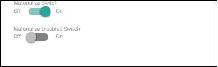
Switches
Example
The following example demonstrates different types of switches. A checkbox is styled as a switch by applying class switch on its parent div container.
<html>
   <head>
      <title>The Materialize Switches Example</title>
         <meta name="viewport" content="width=device-width, initial-scale=1">
         <link rel="stylesheet" href="https://fonts.googleapis.com/icon?family=Material+Icons">
         <link rel="stylesheet" href="https://cdnjs.cloudflare.com/ajax/libs/materialize/0.97.3/css/materialize.min.css">
         <script type="text/javascript" src="https://code.jquery.com/jquery-2.1.1.min.js"></script>
         <script src="https://cdnjs.cloudflare.com/ajax/libs/materialize/0.97.3/js/materialize.min.js"></script>
   </head>
   <body class="container">
      <div class="row">
         <form class="col s12">
            <div class="row">
               <label>Materialize Switch</label>
                  <div class="switch"><label>Off   <input type="checkbox" checked><span class="lever"></span>On</label></div>
            </div>
            <div class="row">
               <label>Materialize Disabled Switch</label>
                  <div class="switch"><label>Off<input disabled type="checkbox"><span class="lever"></span>On</label></div>
            </div>
         </form>
      </div>
   </body>
</html>
Result
Verify the result.
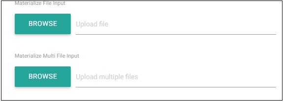
File
Example
The following example demonstrates different types of File Upload Controls.
<html>
   <head>
      <title>The Materialize File Example</title>
         <meta name="viewport" content="width=device-width, initial-scale=1">
         <link rel="stylesheet" href="https://fonts.googleapis.com/icon?family=Material+Icons">
         <link rel="stylesheet" href="https://cdnjs.cloudflare.com/ajax/libs/materialize/0.97.3/css/materialize.min.css">
         <script type="text/javascript" src="https://code.jquery.com/jquery-2.1.1.min.js"></script>
         <script src="https://cdnjs.cloudflare.com/ajax/libs/materialize/0.97.3/js/materialize.min.js"></script>
   </head>
   <body class="container">
      <div class="row">
         <form class="col s12">
            <div class="row">
               <label>Materialize File Input</label>
               <div class="file-field input-field">
                  <div class="btn">
                     <span>Browse</span>
                     <input type="file">
                  </div>
                  <div class="file-path-wrapper">
                     <input class="file-path validate" type="text" placeholder="Upload file">
                  </div>
               </div>
            </div>
            <div class="row">
               <label>Materialize Multi File Input</label>
               <div class="file-field input-field">
                  <div class="btn">
                     <span>Browse</span>
                     <input type="file" multiple>
                  </div>
                  <div class="file-path-wrapper">
                     <input class="file-path validate" type="text" placeholder="Upload multiple files">
                  </div>
               </div>
            </div>
         </form>
      </div>
   </body>
</html>
Result
Verify the result.
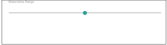
Range
Example
The following example demonstrates Materialize Range control.
<html>
   <head>
      <title>The Materialize Range Example</title>
         <meta name="viewport" content="width=device-width, initial-scale=1">
         <link rel="stylesheet" href="https://fonts.googleapis.com/icon?family=Material+Icons">
         <link rel="stylesheet" href="https://cdnjs.cloudflare.com/ajax/libs/materialize/0.97.3/css/materialize.min.css">
         <script type="text/javascript" src="https://code.jquery.com/jquery-2.1.1.min.js"></script>
         <script src="https://cdnjs.cloudflare.com/ajax/libs/materialize/0.97.3/js/materialize.min.js"></script>
   </head>
   <body class="container">
      <div class="row">
         <form class="col s12">
            <div class="row">
               <label>Materialize Range</label>
               <p class="range-field">
                  <input type="range" id="test" min="0" max="100" />
               </p>
            </div>
         </form>
      </div>
   </body>
</html>
Result
Verify the result.
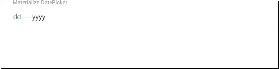
DatePicker
Example
The following example demonstrates Materialize DatePicker control.
<html>
   <head>
      <title>The Materialize Range Example</title>
      <meta name="viewport" content="width=device-width, initial-scale=1">
      <link rel="stylesheet" href="https://fonts.googleapis.com/icon?family=Material+Icons">
      <link rel="stylesheet" href="https://cdnjs.cloudflare.com/ajax/libs/materialize/0.97.3/css/materialize.min.css">
      <script type="text/javascript" src="https://code.jquery.com/jquery-2.1.1.min.js"></script>
      <script src="https://cdnjs.cloudflare.com/ajax/libs/materialize/0.97.3/js/materialize.min.js"></script>
   </head>
   <body class="container">
      <div class="row">
         <form class="col s12">
            <div class="row">
               <label>Materialize DatePicker</label>
               <input type="date" class="datepicker">
            </div>
         </form>
      </div>
   </body>
</html>
Result
Verify the result.
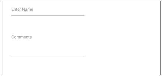
Character Counter
Example
The following example demonstrates Materialize Character Counter control. Setting the length to input text or text area activates this control.
<html>
   <head>
      <title>The Materialize DatePicker Example</title>
         <meta name="viewport" content="width=device-width, initial-scale=1">
         <link rel="stylesheet" href="https://fonts.googleapis.com/icon?family=Material+Icons">
         <link rel="stylesheet" href="https://cdnjs.cloudflare.com/ajax/libs/materialize/0.97.3/css/materialize.min.css">
         <script type="text/javascript" src="https://code.jquery.com/jquery-2.1.1.min.js"></script>
         <script src="https://cdnjs.cloudflare.com/ajax/libs/materialize/0.97.3/js/materialize.min.js"></script>
   </head>
   <body class="container">
      <div class="row">
         <form class="col s12">
            <div class="row">
               <div class="input-field col s6">
                  <input id="name" type="text" length="10">
                  <label for="name">Enter Name</label>
               </div>
            </div>
            <div class="row">
               <div class="input-field col s6">
                  <textarea id="comments" class="materialize-textarea" length="120"></textarea>
                     <label for="comments">Comments</label>
               </div>
            </div>
         </form>
      </div>
   </body>
</html>
Result
Verify the result.