- Materialize Tutorial
- Materialize - Home
- Materialize - Overview
- Materialize - Environment Setup
- Materialize - Colors
- Materialize - Grids
- Materialize - Helpers
- Materialize - Media
- Materialize - Shadows
- Materialize - Tables
- Materialize - Typography
- Materialize - Badges
- Materialize - Buttons
- Materialize - Breadcrumb
- Materialize - Cards
- Materialize - Chips
- Materialize - Collections
- Materialize - Footer
- Materialize - Form
- Materialize - Icons
- Materialize - Navbar
- Materialize - Pagination
- Materialize - Preloader
- Materialize - Collapsible
- Materialize - Dialogs
- Materialize - Dropdowns
- Materialize - Tabs
- Materialize - Waves
- Materialize Useful Resources
- Materialize - Quick Guide
- Materialize - Useful Resources
- Materialize - Discussion
Materialize - Dropdowns
Materialize provides dropdown CSS class to make a ul element as a dropdown and add the id of the ul element to the data-activates attribute of the button or anchor element. The following table mentions the available classes and their effects.
| Sr.No. | Class Name & Description |
|---|---|
| 1 | dropdown-content Identifies ul as a materialize dropdown component. Required for ul element. |
| 2 | data-activates id of the dropdown ul element. |
Following is an example of using a dropdown.
Example
<!DOCTYPE html>
<html>
<head>
<title>The Materialize Dropdowns Example</title>
<meta name="viewport" content="width=device-width, initial-scale=1">
<link rel="stylesheet" href="https://fonts.googleapis.com/icon?family=Material+Icons">
<link rel="stylesheet" href="https://cdnjs.cloudflare.com/ajax/libs/materialize/0.97.3/css/materialize.min.css">
<script type="text/javascript" src="https://code.jquery.com/jquery-2.1.1.min.js"></script>
<script src="https://cdnjs.cloudflare.com/ajax/libs/materialize/0.97.3/js/materialize.min.js"></script>
</head>
<body class="container">
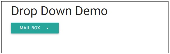
<h3>Drop Down Demo</h3>
<ul id="dropdown" class="dropdown-content">
<li><a href="#">Inbox<span class="badge">12</span></a></li>
<li><a href="#!">Unread<span class="new badge">4</span></a></li>
<li><a href="#">Sent</a></li>
<li class="divider"></li>
<li><a href="#">Outbox<span class="badge">14</span></a></li>
</ul>
<a class="btn dropdown-button" href="#" data-activates="dropdown">Mail Box<i class="mdi-navigation-arrow-drop-down right"></i></a>
</body>
</html>
Output
Verify the output.
Advertisements