- Machine Learning Basics
- Machine Learning - Home
- Machine Learning - Getting Started
- Machine Learning - Basic Concepts
- Machine Learning - Python Libraries
- Machine Learning - Applications
- Machine Learning - Life Cycle
- Machine Learning - Required Skills
- Machine Learning - Implementation
- Machine Learning - Challenges & Common Issues
- Machine Learning - Limitations
- Machine Learning - Reallife Examples
- Machine Learning - Data Structure
- Machine Learning - Mathematics
- Machine Learning - Artificial Intelligence
- Machine Learning - Neural Networks
- Machine Learning - Deep Learning
- Machine Learning - Getting Datasets
- Machine Learning - Categorical Data
- Machine Learning - Data Loading
- Machine Learning - Data Understanding
- Machine Learning - Data Preparation
- Machine Learning - Models
- Machine Learning - Supervised
- Machine Learning - Unsupervised
- Machine Learning - Semi-supervised
- Machine Learning - Reinforcement
- Machine Learning - Supervised vs. Unsupervised
- Machine Learning Data Visualization
- Machine Learning - Data Visualization
- Machine Learning - Histograms
- Machine Learning - Density Plots
- Machine Learning - Box and Whisker Plots
- Machine Learning - Correlation Matrix Plots
- Machine Learning - Scatter Matrix Plots
- Statistics for Machine Learning
- Machine Learning - Statistics
- Machine Learning - Mean, Median, Mode
- Machine Learning - Standard Deviation
- Machine Learning - Percentiles
- Machine Learning - Data Distribution
- Machine Learning - Skewness and Kurtosis
- Machine Learning - Bias and Variance
- Machine Learning - Hypothesis
- Regression Analysis In ML
- Machine Learning - Regression Analysis
- Machine Learning - Linear Regression
- Machine Learning - Simple Linear Regression
- Machine Learning - Multiple Linear Regression
- Machine Learning - Polynomial Regression
- Classification Algorithms In ML
- Machine Learning - Classification Algorithms
- Machine Learning - Logistic Regression
- Machine Learning - K-Nearest Neighbors (KNN)
- Machine Learning - Naïve Bayes Algorithm
- Machine Learning - Decision Tree Algorithm
- Machine Learning - Support Vector Machine
- Machine Learning - Random Forest
- Machine Learning - Confusion Matrix
- Machine Learning - Stochastic Gradient Descent
- Clustering Algorithms In ML
- Machine Learning - Clustering Algorithms
- Machine Learning - Centroid-Based Clustering
- Machine Learning - K-Means Clustering
- Machine Learning - K-Medoids Clustering
- Machine Learning - Mean-Shift Clustering
- Machine Learning - Hierarchical Clustering
- Machine Learning - Density-Based Clustering
- Machine Learning - DBSCAN Clustering
- Machine Learning - OPTICS Clustering
- Machine Learning - HDBSCAN Clustering
- Machine Learning - BIRCH Clustering
- Machine Learning - Affinity Propagation
- Machine Learning - Distribution-Based Clustering
- Machine Learning - Agglomerative Clustering
- Dimensionality Reduction In ML
- Machine Learning - Dimensionality Reduction
- Machine Learning - Feature Selection
- Machine Learning - Feature Extraction
- Machine Learning - Backward Elimination
- Machine Learning - Forward Feature Construction
- Machine Learning - High Correlation Filter
- Machine Learning - Low Variance Filter
- Machine Learning - Missing Values Ratio
- Machine Learning - Principal Component Analysis
- Machine Learning Miscellaneous
- Machine Learning - Performance Metrics
- Machine Learning - Automatic Workflows
- Machine Learning - Boost Model Performance
- Machine Learning - Gradient Boosting
- Machine Learning - Bootstrap Aggregation (Bagging)
- Machine Learning - Cross Validation
- Machine Learning - AUC-ROC Curve
- Machine Learning - Grid Search
- Machine Learning - Data Scaling
- Machine Learning - Train and Test
- Machine Learning - Association Rules
- Machine Learning - Apriori Algorithm
- Machine Learning - Gaussian Discriminant Analysis
- Machine Learning - Cost Function
- Machine Learning - Bayes Theorem
- Machine Learning - Precision and Recall
- Machine Learning - Adversarial
- Machine Learning - Stacking
- Machine Learning - Epoch
- Machine Learning - Perceptron
- Machine Learning - Regularization
- Machine Learning - Overfitting
- Machine Learning - P-value
- Machine Learning - Entropy
- Machine Learning - MLOps
- Machine Learning - Data Leakage
- Machine Learning - Resources
- Machine Learning - Quick Guide
- Machine Learning - Useful Resources
- Machine Learning - Discussion
Machine Learning - Data Distribution
In machine learning, data distribution refers to the way in which data points are distributed or spread out across a dataset. It is important to understand the distribution of data in a dataset, as it can have a significant impact on the performance of machine learning algorithms.
Data distribution can be characterized by several statistical measures, including mean, median, mode, standard deviation, and variance. These measures help to describe the central tendency, spread, and shape of the data.
Some common types of data distribution in machine learning are given below −
Normal Distribution
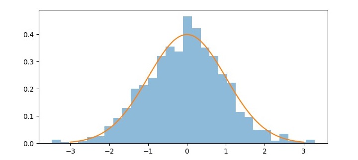
Normal distribution, also known as Gaussian distribution, is a continuous probability distribution that is widely used in machine learning and statistics. It is a bell-shaped curve that describes the probability distribution of a random variable that is symmetric around the mean. The normal distribution has two parameters, the mean (μ) and the standard deviation (σ).
In machine learning, normal distribution is often used to model the distribution of error terms in linear regression and other statistical models. It is also used as a basis for various hypothesis tests and confidence intervals.
One important property of normal distribution is the empirical rule, also known as the 68- 95-99.7 rule. This rule states that approximately 68% of the observations fall within one standard deviation of the mean, 95% of the observations fall within two standard deviations of the mean, and 99.7% of the observations fall within three standard deviations of the mean.
Python provides various libraries that can be used to work with normal distributions. One such library is scipy.stats, which provides functions for calculating the probability density function (PDF), cumulative distribution function (CDF), percent point function (PPF), and random variables for normal distribution.
Example
Here is an example of using scipy.stats to generate and visualize a normal distribution −
import numpy as np
from scipy.stats import norm
import matplotlib.pyplot as plt

# Generate a random sample of 1000 values from a normal distribution
mu = 0 # Mean
sigma = 1 # Standard deviation
sample = np.random.normal(mu, sigma, 1000)

# Calculate the PDF for the normal distribution
x = np.linspace(mu - 3*sigma, mu + 3*sigma, 100)
pdf = norm.pdf(x, mu, sigma)
# Plot the histogram of the random sample and the PDF of the normal
distribution
plt.figure(figsize=(7.5, 3.5))
plt.hist(sample, bins=30, density=True, alpha=0.5)
plt.plot(x, pdf)
plt.show()
In this example, we first generate a random sample of 1000 values from a normal distribution with mean 0 and standard deviation 1 using np.random.normal. We then use norm.pdf to calculate the PDF for the normal distribution and np.linspace to generate an array of 100 evenly spaced values between μ -3σ and μ +3σ
Finally, we plot the histogram of the random sample using plt.hist and overlay the PDF of the normal distribution using plt.plot.
Output
The resulting plot shows the bell-shaped curve of the normal distribution and the histogram of the random sample that approximates the normal distribution.
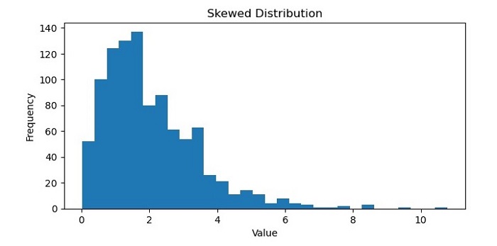
Skewed Distribution
A skewed distribution in machine learning refers to a dataset that is not evenly distributed around its mean, or average value. In a skewed distribution, the majority of the data points tend to cluster towards one end of the distribution, with a smaller number of data points at the other end.
There are two types of skewed distributions: left-skewed and right-skewed. A left-skewed distribution, also known as a negative-skewed distribution, has a long tail towards the left side of the distribution, with the majority of data points towards the right side. In contrast, a right-skewed distribution, also known as a positive-skewed distribution, has a long tail towards the right side of the distribution, with the majority of data points towards the left side.
Skewed distributions can occur in many different types of datasets, such as financial data, social media metrics, or healthcare records. In machine learning, it is important to identify and handle skewed distributions appropriately, as they can affect the performance of certain algorithms and models. For example, skewed data can lead to biased predictions and inaccurate results in some cases and may require preprocessing techniques such as normalization or data transformation to improve the performance of the model.
Example
Here is an example of generating and plotting a skewed distribution using Python's NumPy and Matplotlib libraries −
import numpy as np
import matplotlib.pyplot as plt

# Generate a skewed distribution using NumPy's random function
data = np.random.gamma(2, 1, 1000)

# Plot a histogram of the data to visualize the distribution
plt.figure(figsize=(7.5, 3.5))
plt.hist(data, bins=30)

# Add labels and title to the plot
plt.xlabel('Value')
plt.ylabel('Frequency')
plt.title('Skewed Distribution')

# Show the plot
plt.show()
Output
On executing this code, you will get the following plot as the output −
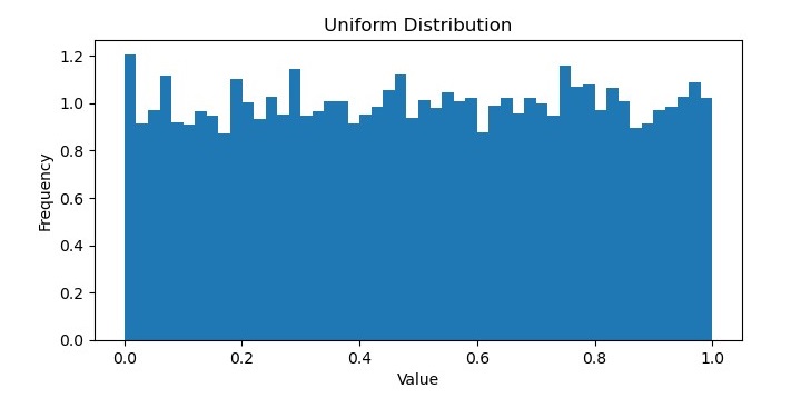
Uniform Distribution
A uniform distribution in machine learning refers to a probability distribution in which all possible outcomes are equally likely to occur. In other words, each value in a dataset has the same probability of being observed, and there is no clustering of data points around a particular value.
The uniform distribution is often used as a baseline for comparison with other distributions, as it represents a random and unbiased sampling of the data. It can also be useful in certain types of applications, such as generating random numbers or selecting items from a set without bias.
In probability theory, the probability density function of a continuous uniform distribution is defined as −
$$f\left ( x \right )=\left\{\begin{matrix} 1 & for\: a\leq x\leq b \\ 0 & otherwise \\ \end{matrix}\right.$$
where a and b are the minimum and maximum values of the distribution, respectively. mean of a uniform distribution is $\frac{a+b}{2} $ and the variance is $\frac{\left ( b-a \right )^{2}}{12}$
Example
In Python, the NumPy library provides functions for generating random numbers from a uniform distribution, such as numpy.random.uniform(). These functions take as arguments the minimum and maximum values of the distribution and can be used to generate datasets with a uniform distribution.
Here is an example of generating a uniform distribution using Python's NumPy library −
import numpy as np
import matplotlib.pyplot as plt

# Generate 10,000 random numbers from a uniform distribution between 0 and 1
uniform_data = np.random.uniform(low=0, high=1, size=10000)

# Plot the histogram of the uniform data
plt.figure(figsize=(7.5, 3.5))
plt.hist(uniform_data, bins=50, density=True)

# Add labels and title to the plot
plt.xlabel('Value')
plt.ylabel('Frequency')
plt.title('Uniform Distribution')

# Show the plot
plt.show()
Output
It will produce the following plot as the output −
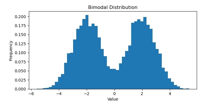
Bimodal Distribution
In machine learning, a bimodal distribution is a probability distribution that has two distinct modes or peaks. In other words, the distribution has two regions where the data values are most likely to occur, separated by a valley or trough where the data is less likely to occur.
Bimodal distributions can arise in various types of data, such as biometric measurements, economic indicators, or social media metrics. They can represent different subpopulations within the dataset, or different modes of behavior or trends over time.
Bimodal distributions can be identified and analyzed using various statistical methods, such as histograms, kernel density estimations, or hypothesis testing. In some cases, bimodal distributions can be fitted to specific probability distributions, such as the Gaussian mixture model, which allows for modeling the underlying subpopulations separately.
Example
In Python, libraries such as NumPy, SciPy, and Matplotlib provide functions for generating and visualizing bimodal distributions.
For example, the following code generates and plots a bimodal distribution −
import numpy as np
import matplotlib.pyplot as plt

# Generate 10,000 random numbers from a bimodal distribution
bimodal_data = np.concatenate((np.random.normal(loc=-2, scale=1, size=5000),
   np.random.normal(loc=2, scale=1, size=5000)))

# Plot the histogram of the bimodal data
plt.figure(figsize=(7.5, 3.5))
plt.hist(bimodal_data, bins=50, density=True)

# Add labels and title to the plot
plt.xlabel('Value')
plt.ylabel('Frequency')
plt.title('Bimodal Distribution')

# Show the plot
plt.show()
Output
On executing this code, you will get the following plot as the output −