- Machine Learning Basics
- Machine Learning - Home
- Machine Learning - Getting Started
- Machine Learning - Basic Concepts
- Machine Learning - Python Libraries
- Machine Learning - Applications
- Machine Learning - Life Cycle
- Machine Learning - Required Skills
- Machine Learning - Implementation
- Machine Learning - Challenges & Common Issues
- Machine Learning - Limitations
- Machine Learning - Reallife Examples
- Machine Learning - Data Structure
- Machine Learning - Mathematics
- Machine Learning - Artificial Intelligence
- Machine Learning - Neural Networks
- Machine Learning - Deep Learning
- Machine Learning - Getting Datasets
- Machine Learning - Categorical Data
- Machine Learning - Data Loading
- Machine Learning - Data Understanding
- Machine Learning - Data Preparation
- Machine Learning - Models
- Machine Learning - Supervised
- Machine Learning - Unsupervised
- Machine Learning - Semi-supervised
- Machine Learning - Reinforcement
- Machine Learning - Supervised vs. Unsupervised
- Machine Learning Data Visualization
- Machine Learning - Data Visualization
- Machine Learning - Histograms
- Machine Learning - Density Plots
- Machine Learning - Box and Whisker Plots
- Machine Learning - Correlation Matrix Plots
- Machine Learning - Scatter Matrix Plots
- Statistics for Machine Learning
- Machine Learning - Statistics
- Machine Learning - Mean, Median, Mode
- Machine Learning - Standard Deviation
- Machine Learning - Percentiles
- Machine Learning - Data Distribution
- Machine Learning - Skewness and Kurtosis
- Machine Learning - Bias and Variance
- Machine Learning - Hypothesis
- Regression Analysis In ML
- Machine Learning - Regression Analysis
- Machine Learning - Linear Regression
- Machine Learning - Simple Linear Regression
- Machine Learning - Multiple Linear Regression
- Machine Learning - Polynomial Regression
- Classification Algorithms In ML
- Machine Learning - Classification Algorithms
- Machine Learning - Logistic Regression
- Machine Learning - K-Nearest Neighbors (KNN)
- Machine Learning - Naïve Bayes Algorithm
- Machine Learning - Decision Tree Algorithm
- Machine Learning - Support Vector Machine
- Machine Learning - Random Forest
- Machine Learning - Confusion Matrix
- Machine Learning - Stochastic Gradient Descent
- Clustering Algorithms In ML
- Machine Learning - Clustering Algorithms
- Machine Learning - Centroid-Based Clustering
- Machine Learning - K-Means Clustering
- Machine Learning - K-Medoids Clustering
- Machine Learning - Mean-Shift Clustering
- Machine Learning - Hierarchical Clustering
- Machine Learning - Density-Based Clustering
- Machine Learning - DBSCAN Clustering
- Machine Learning - OPTICS Clustering
- Machine Learning - HDBSCAN Clustering
- Machine Learning - BIRCH Clustering
- Machine Learning - Affinity Propagation
- Machine Learning - Distribution-Based Clustering
- Machine Learning - Agglomerative Clustering
- Dimensionality Reduction In ML
- Machine Learning - Dimensionality Reduction
- Machine Learning - Feature Selection
- Machine Learning - Feature Extraction
- Machine Learning - Backward Elimination
- Machine Learning - Forward Feature Construction
- Machine Learning - High Correlation Filter
- Machine Learning - Low Variance Filter
- Machine Learning - Missing Values Ratio
- Machine Learning - Principal Component Analysis
- Machine Learning Miscellaneous
- Machine Learning - Performance Metrics
- Machine Learning - Automatic Workflows
- Machine Learning - Boost Model Performance
- Machine Learning - Gradient Boosting
- Machine Learning - Bootstrap Aggregation (Bagging)
- Machine Learning - Cross Validation
- Machine Learning - AUC-ROC Curve
- Machine Learning - Grid Search
- Machine Learning - Data Scaling
- Machine Learning - Train and Test
- Machine Learning - Association Rules
- Machine Learning - Apriori Algorithm
- Machine Learning - Gaussian Discriminant Analysis
- Machine Learning - Cost Function
- Machine Learning - Bayes Theorem
- Machine Learning - Precision and Recall
- Machine Learning - Adversarial
- Machine Learning - Stacking
- Machine Learning - Epoch
- Machine Learning - Perceptron
- Machine Learning - Regularization
- Machine Learning - Overfitting
- Machine Learning - P-value
- Machine Learning - Entropy
- Machine Learning - MLOps
- Machine Learning - Data Leakage
- Machine Learning - Resources
- Machine Learning - Quick Guide
- Machine Learning - Useful Resources
- Machine Learning - Discussion
Machine Learning - Confusion Matrix
It is the easiest way to measure the performance of a classification problem where the output can be of two or more type of classes. A confusion matrix is nothing but a table with two dimensions viz. "Actual" and "Predicted" and furthermore, both the dimensions have "True Positives (TP)", "True Negatives (TN)", "False Positives (FP)", "False Negatives (FN)" as shown below −
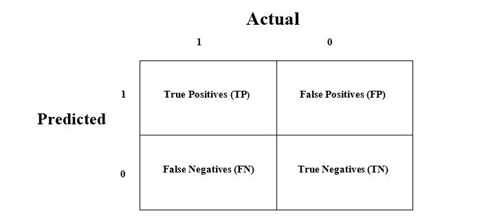
Explanation of the terms associated with confusion matrix are as follows −
True Positives (TP) − It is the case when both actual class & predicted class of data point is 1.
True Negatives (TN) − It is the case when both actual class & predicted class of data point is 0.
False Positives (FP) − It is the case when actual class of data point is 0 & predicted class of data point is 1.
False Negatives (FN) − It is the case when actual class of data point is 1 & predicted class of data point is 0.
How to Implement Confusion Matrix in Python?
To implement the confusion matrix in Python, we can use the confusion_matrix() function from the sklearn.metrics module of the scikit-learn library. Here is an simple example of how to use the confusion_matrix() function −
from sklearn.metrics import confusion_matrix

# Actual values
y_actual = [0, 1, 0, 1, 1, 0, 0, 1, 1, 1]

# Predicted values
y_pred = [0, 1, 0, 1, 0, 1, 0, 0, 1, 1]

# Confusion matrix
cm = confusion_matrix(y_actual, y_pred)
print(cm)
In this example, we have two arrays: y_actual contains the actual values of the target variable, and y_pred contains the predicted values of the target variable. We then call the confusion_matrix() function, passing in y_actual and y_pred as arguments. The function returns a 2D array that represents the confusion matrix.
The output of the code above will look like this −
[[3 1]
 [2 4]]
We can also visualize the confusion matrix using a heatmap. Below is how we can do that using the heatmap() function from the seaborn library
import seaborn as sns

# Plot confusion matrix as heatmap
sns.heatmap(cm, annot=True, cmap='summer')
This will produce a heatmap that shows the confusion matrix −
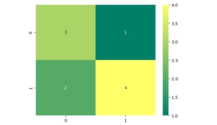
In this heatmap, the x-axis represents the predicted values, and the y-axis represents the actual values. The color of each square in the heatmap indicates the number of samples that fall into each category.