- Angular 8 Tutorial
- Angular 8 - Home
- Angular 8 - Introduction
- Angular 8 - Installation
- Creating First Application
- Angular 8 - Architecture
- Angular Components and Templates
- Angular 8 - Data Binding
- Angular 8 - Directives
- Angular 8 - Pipes
- Angular 8 - Reactive Programming
- Services and Dependency Injection
- Angular 8 - Http Client Programming
- Angular 8 - Angular Material
- Routing and Navigation
- Angular 8 - Animations
- Angular 8 - Forms
- Angular 8 - Form Validation
- Authentication and Authorization
- Angular 8 - Web Workers
- Service Workers and PWA
- Angular 8 - Server Side Rendering
- Angular 8 - Internationalization (i18n)
- Angular 8 - Accessibility
- Angular 8 - CLI Commands
- Angular 8 - Testing
- Angular 8 - Ivy Compiler
- Angular 8 - Building with Bazel
- Angular 8 - Backward Compatibility
- Angular 8 - Working Example
- Angular 9 - What’s New?
- Angular 8 Useful Resources
- Angular 8 - Quick Guide
- Angular 8 - Useful Resources
- Angular 8 - Discussion
Angular 8 - Angular Material
Angular Material provides a huge collection of high-quality and ready-made Angular component based on Material design. Let us learn how to include Angular material in Angular application and use its component.
Configure Angular Material
Let us see how to configure Angular Material in Angular application.
Open command prompt and go to project root folder.
cd /go/to/expense-manager
Add Angular material package using below command −
ng add @angular/material
Angular CLI will ask certain question regarding theme, gesture recognition and browser animations. Select your any theme of your choice and then answer positively for gesture recognition and browser animation.
Installing packages for tooling via npm.
Installed packages for tooling via npm.
Choose a prebuilt theme name, or "custom" for a custom theme: Indigo/Pink        [ Preview: https://material.angular.i
o?theme=indigo-pink ]
Set up HammerJS for gesture recognition? Yes
Set up browser animations for Angular Material? Yes
Angular material packages each UI component in a separate module. Import all the necessary module into the application through root module (src/app/app.module.ts)
import { MatTableModule } from '@angular/material/table';
import { MatButtonModule } from '@angular/material/button';
import { MatIconModule } from '@angular/material/icon';

@NgModule({
  imports: [
    MatTableModule,
    MatButtonModule,
    MatIconModule
  ]
})
Change the edit button using ExpenseEntryListComponent template (src/app/expense-entry-list/expense-entry-list.component.html) as specified below −
<div class="col-sm" style="text-align: right;">
    <!-- <button type="button" class="btn btn-primary">Edit</button> -->
    <button mat-raised-button color="primary">Edit</button>
</div>
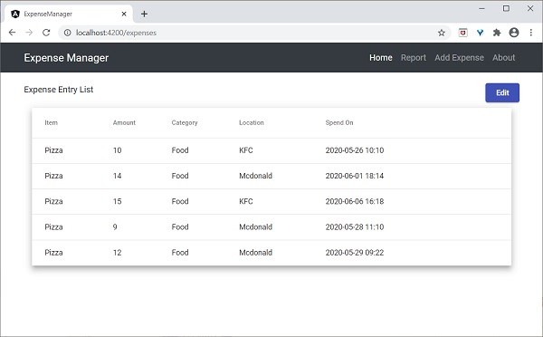
Run the application and test the page.
ng serve
The output of the application is as follows −
Here, the application clearly shows the Angular Material button.
Working example
Some of the important UI elements provided by Angular Material package.
- Form field
- Input
- Checkbox
- Radio button
- Select
- Button
- DatePicker
- List
- Card
- Grid list
- Table
- Paginator
- Tabs
- Toolbar
- Menu
- Dialog
- Snackbar
- Progress bar
- Icon
- Divider
Using material component is quite easy and we will learn one of the frequently used material component, Material Table by working on a sample project.
Open command prompt and go to project root folder.
ng add @angular/material
Let us change our ExpenseEntryListComponent(src/app/expense-entry-list/expense-entry-list.component.ts) and use Material Table component.
Declare a variable, displayedColumns and assign the list of column to be displayed.
displayedColumns: string[] = ['item', 'amount', 'category', 'location', 'spendOn' ];
Add material table as specified below in the ExpenseEntryListComponent template (src/app/expense-entry-list/expense-entry-list.component.html) and remove our existing list.
<div class="mat-elevation-z8">
   <table mat-table [dataSource]="expenseEntries">
      <ng-container matColumnDef="item">
         <th mat-header-cell *matHeaderCellDef> Item </th>
         <td mat-cell *matCellDef="let element" style="text-align: left"> {{element.item}} </td>
      </ng-container>

      <ng-container matColumnDef="amount">
         <th mat-header-cell *matHeaderCellDef > Amount </th>
         <td mat-cell *matCellDef="let element" style="text-align: left"> {{element.amount}} </td>
      </ng-container>

      <ng-container matColumnDef="category">
         <th mat-header-cell *matHeaderCellDef> Category </th>
         <td mat-cell *matCellDef="let element" style="text-align: left"> {{element.category}} </td>
      </ng-container>

      <ng-container matColumnDef="location">
         <th mat-header-cell *matHeaderCellDef> Location </th>
         <td mat-cell *matCellDef="let element" style="text-align:left"> {{element.location}} </td>
      </ng-container>

      <ng-container matColumnDef="spendOn">
         <th mat-header-cell *matHeaderCellDef> Spend On </th>
         <td mat-cell *matCellDef="let element" style="text-align: left"> {{element.spendOn}} </td>
      </ng-container>

      <tr mat-header-row *matHeaderRowDef="displayedColumns"></tr>
      <tr mat-row *matRowDef="let row; columns: displayedColumns;"></tr>
   </table>
</div>
Here,
mat-table property is used to convert the normal table in to material table.
[dataSource] property is used to specify the data source of the table.
Material table is template based and each column can be designed using separate template. ng-container is used to create template.
matColumnDef is used to specify the column of the data source applied to the particular ng-container.
mat-header-cell is used to specify the header text for each column.
mat-cell is used to specify the content of each column.
mat-header-row and mat-row is used to specify the order of the column in row.
We have used only the basic features of the Material table. Material table has many more features such as sorting, pagination, etc.
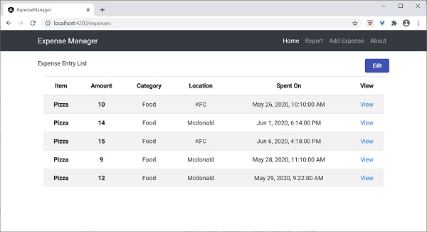
Run the application.
ng serve
The output of the application is as follows −