- Silverlight - Home
- Silverlight - Overview
- Silverlight - Environment Setup
- Silverlight - Getting Started
- Silverlight - XAML Overview
- Silverlight - Project Types
- Silverlight - Fixed Layouts
- Silverlight - Dynamic Layout
- Constrained vs. Unconstrained
- Silverlight - CSS
- Silverlight - Controls
- Silverlight - Buttons
- Silverlight - Content Model
- Silverlight - ListBox
- Silverlight - Templates
- Silverlight - Visual State
- Silverlight - Data Binding
- Silverlight - Browser Integration
- Silverlight - Out-of-Browser
- Silverlight - Applications, Resources
- Silverlight - File Access
- Silverlight - View Model
- Silverlight - Input Handling
- Silverlight - Isolated Storage
- Silverlight - Text
- Silverlight - Animation
- Silverlight - Video and Audio
- Silverlight - Printing
Silverlight - RadioButton
The RadioButton is a button that allows a user to select a single option from a group of options. A User is limited to select a single option from a related list of options but which are mutually exclusive. It has only two options −
- Selected
- Cleared
The RadioButton also derives from ToggleButton and uses the same IsChecked property and the same Checked, Unchecked, and Indeterminate events. Along with these, the RadioButton adds a single property named GroupName, which allows you to control how radio buttons are placed into the groups.
Ordinarily, radio buttons are grouped by their container. That means if you place three RadioButton controls in a single StackPanel, they form a group from which you can select just one of the three.
On the other hand, if you place a combination of radio buttons in two separate StackPanel controls, you have two independent groups on your hands.
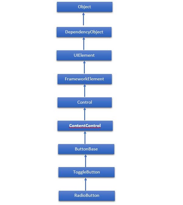
The hierarchical inheritance of RadioButton class is as follows −
Given below are the most commonly used properties of RadioButton.
| Sr. No. | Property & Description |
|---|---|
| 1 | Background Gets or sets a brush that provides the background of the control. (Inherited from Control) |
| 2 | BorderBrush Gets or sets a brush that describes the border fill of a control. (Inherited from Control) |
| 3 | BorderThickness Gets or sets the border thickness of a control. (Inherited from Control) |
| 4 | Content Gets or sets the content of a ContentControl. (Inherited from ContentControl) |
| 5 | ClickMode Gets or sets a value that indicates when the Click event occurs, in terms of device behavior. (Inherited from ButtonBase) |
| 6 | ContentTemplate Gets or sets the data template that is used to display the content of the ContentControl. (Inherited from ContentControl) |
| 7 | FontFamily Gets or sets the font used to display text in the control. (Inherited from Control) |
| 8 | FontSize Gets or sets the size of the text in this control. (Inherited from Control) |
| 9 | FontStyle Gets or sets the style in which the text is rendered. (Inherited from Control) |
| 10 | FontWeight Gets or sets the thickness of the specified font. (Inherited from Control) |
| 11 | Foreground Gets or sets a brush that describes the foreground color. (Inherited from Control) |
| 12 | Height Gets or sets the suggested height of a FrameworkElement. (Inherited from FrameworkElement) |
| 13 | HorizontalAlignment Gets or sets the horizontal alignment characteristics that are applied to a FrameworkElement when it is composed in a layout parent, such as a panel or items control. (Inherited from FrameworkElement) |
| 14 | IsChecked Gets or sets whether the ToggleButton is checked. (Inherited from ToggleButton) |
| 15 | IsEnabled Gets or sets a value indicating whether the user can interact with the control. (Inherited from Control) |
| 16 | IsPressed Gets a value that indicates whether a ButtonBase is currently in a pressed state. (Inherited from ButtonBase) |
| 17 | IsThreeState Gets or sets a value that indicates whether the control supports three states. (Inherited from ToggleButton) |
| 18 | Margin Gets or sets the outer margin of a FrameworkElement. (Inherited from FrameworkElement) |
| 19 | Name Gets or sets the identifying name of the object. When a XAML processor creates the object tree from XAML markup, run-time code can refer to the XAML-declared object by this name. (Inherited from FrameworkElement) |
| 20 | Opacity Gets or sets the degree of the object's opacity. (Inherited from UIElement) |
| 21 | Resources Gets the locally defined resource dictionary. In XAML, you can establish resource items as child object elements of a frameworkElement.Resources property element, through XAML implicit collection syntax. (Inherited from FrameworkElement) |
| 22 | Style Gets or sets an instance Style that is applied for this object during layout and rendering. (Inherited from FrameworkElement) |
| 23 | Template Gets or sets a control template. The control template defines the visual appearance of a control in UI, and is defined in XAML markup. (Inherited from Control) |
| 24 | VerticalAlignment Gets or sets the vertical alignment characteristics that are applied to a FrameworkElement when it is composed in a parent object such as a panel or items control. (Inherited from FrameworkElement) |
| 25 | Visibility Gets or sets the visibility of a UIElement. A UIElement that is not visible is not rendered and does not communicate its desired size to layout. (Inherited from UIElement) |
| 26 | Width Gets or sets the width of a FrameworkElement. (Inherited from FrameworkElement) |
Given below are the commonly used methods of RadioButton.
| Sr. No. | Method & Description |
|---|---|
| 1 | ClearValue Clears the local value of a dependency property. (Inherited from DependencyObject) |
| 2 | FindName Retrieves an object that has the specified identifier name. (Inherited from FrameworkElement) |
| 3 | OnApplyTemplate Invoked whenever application code or internal processes (such as a rebuilding layout pass) call ApplyTemplate. In simplest terms, this means the method is called just before a UI element displays in your app. Override this method to influence the default post-template logic of a class. (Inherited from FrameworkElement) |
| 4 | OnContentChanged Invoked when the value of the Content property changes. (Inherited from ContentControl) |
| 5 | OnDragEnter Called before the DragEnter event occurs. (Inherited from Control) |
| 6 | OnDragLeave Called before the DragLeave event occurs. (Inherited from Control) |
| 7 | OnDragOver Called before the DragOver event occurs. (Inherited from Control) |
| 8 | OnDrop Called before the Drop event occurs. (Inherited from Control) |
| 9 | OnGotFocus Called before the GotFocus event occurs. (Inherited from Control) |
| 10 | OnKeyDown Called before the KeyDown event occurs. (Inherited from Control) |
| 11 | OnKeyUp Called before the KeyUp event occurs. (Inherited from Control) |
| 12 | OnLostFocus Called before the LostFocus event occurs. (Inherited from Control) |
| 13 | OnToggle Called when the ToggleButton receives toggle stimulus. (Inherited from ToggleButton) |
| 14 | SetBinding Attaches a binding to a FrameworkElement, using the provided binding object. (Inherited from FrameworkElement) |
Given below are the commonly used events of RadioButton.
| Sr. No. | Event & Description |
|---|---|
| 1 | Checked Fires when a ToggleButton is checked. (Inherited from ToggleButton) |
| 2 | Click Occurs when a button control is clicked. (Inherited from ButtonBase) |
| 3 | DataContextChanged Occurs when the value of the FrameworkElement.DataContext property changes. (Inherited from FrameworkElement) |
| 4 | DragEnter Occurs when the input system reports an underlying drag event with this element as the target. (Inherited from UIElement) |
| 5 | DragLeave Occurs when the input system reports an underlying drag event with this element as the origin. (Inherited from UIElement) |
| 6 | DragOver Occurs when the input system reports an underlying drag event with this element as the potential drop target. (Inherited from UIElement) |
| 7 | DragStarting Occurs when a drag operation is initiated. (Inherited from UIElement) |
| 8 | GotFocus Occurs when a UIElement receives focus. (Inherited from UIElement) |
| 9 | Holding Occurs when an otherwise unhandled Hold interaction occurs over the hit test area of this element. (Inherited from UIElement) |
| 10 | Intermediate Fires when the state of a ToggleButton is switched to the indeterminate state. (Inherited from ToggleButton) |
| 11 | IsEnabledChanged Occurs when the IsEnabled property changes. (Inherited from Control) |
| 12 | KeyDown Occurs when a keyboard key is pressed while the UIElement has focus. (Inherited from UIElement) |
| 13 | KeyUp Occurs when a keyboard key is released while the UIElement has focus. (Inherited from UIElement) |
| 14 | LostFocus Occurs when a UIElement loses focus. (Inherited from UIElement) |
| 15 | SizeChanged Occurs when either the ActualHeight or the ActualWidth property changes value on a FrameworkElement. (Inherited from FrameworkElement) |
| 16 | Unchecked Occurs when a ToggleButton is unchecked. (Inherited from ToggleButton) |
Example
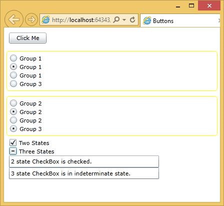
Let us have a look at a simple example, which contains different buttons.
<UserControl x:Class = "Buttons.MainPage"
   xmlns = "http://schemas.microsoft.com/winfx/2006/xaml/presentation"
   xmlns:x = "http://schemas.microsoft.com/winfx/2006/xaml"
   xmlns:d = "http://schemas.microsoft.com/expression/blend/2008"
   xmlns:mc = "http://schemas.openxmlformats.org/markup-compatibility/2006"
   mc:Ignorable = "d"
   d:DesignHeight = "300" d:DesignWidth = "400">

   <StackPanel x:Name = "LayoutRoot" Background = "White">
      <Button x:Name = "button" Content = "Click Me" HorizontalAlignment = "Left"
         Margin = "10" VerticalAlignment = "Top" Width = "75"/>

      <StackPanel>

         <Border Margin = "5" Padding = "5" BorderBrush = "Yellow" BorderThickness = "1"
            CornerRadius = "5">

            <StackPanel>
               <RadioButton Content = "Group 1"/>
               <RadioButton Content = "Group 1"/>
               <RadioButton Content = "Group 1"/>
               <RadioButton GroupName = "Group3" Content = "Group 3"/>
            </StackPanel>

         </Border>

         <Border Margin = "5" Padding = "5" BorderBrush = "Yellow" BorderThickness = "1"
            CornerRadius = "5">

            <StackPanel>
               <RadioButton Content = "Group 2"/>
               <RadioButton Content = "Group 2"/>
               <RadioButton Content = "Group 2"/>
               <RadioButton GroupName = "Group3" Content = "Group 3"/>
            </StackPanel>
         </Border>

      </StackPanel>

      <CheckBox x:Name = "checkBox1" Content = "Two States" HorizontalAlignment = "Left"
         VerticalAlignment = "Top" Checked = "HandleCheck" Margin = "10,0,0,0"
         Unchecked = "HandleUnchecked" Width = "90"/>

      <CheckBox x:Name = "checkBox2" Content = "Three States" HorizontalAlignment = "Left"
         VerticalAlignment = "Top" Width = "90" IsThreeState = "True" Margin = "10,0,0,0"
         Indeterminate = "HandleThirdState" Checked = "HandleCheck"
         Unchecked = "HandleUnchecked"/>

      <TextBox x:Name = "textBox1" HorizontalAlignment = "Left" Margin = "10,0,0,0"
         TextWrapping = "Wrap" VerticalAlignment = "Top" Width = "300"/>

      <TextBox x:Name = "textBox2" HorizontalAlignment = "Left"
         Margin = "10,0,0,0" Height = "23" TextWrapping = "Wrap"
         VerticalAlignment = "Top" Width = "300"/>

   </StackPanel>

</UserControl>
Here, there are two containers holding radio buttons but three groups. The final radio button at the bottom of each group box is part of a third group. There are also two state and three state checkboxes.
Given below is the C# code for event implementation.
using System.Windows;
using System.Windows.Controls;

namespace Buttons {

   public partial class MainPage : UserControl {

      public MainPage() {
         InitializeComponent();
      }

      private void HandleCheck(object sender, RoutedEventArgs e) {
         CheckBox cb = sender as CheckBox;

         if (cb.Name == "checkBox1") textBox1.Text = "2 state CheckBox is checked.";
         else textBox2.Text = "3 state CheckBox is checked.";
      }

      private void HandleUnchecked(object sender, RoutedEventArgs e) {
         CheckBox cb = sender as CheckBox;

         if (cb.Name == "checkBox1") textBox1.Text = "2 state CheckBox is unchecked.";
         else textBox2.Text = "3 state CheckBox is unchecked.";
      }

      private void HandleThirdState(object sender, RoutedEventArgs e) {
         CheckBox cb = sender as CheckBox;
         textBox2.Text = "3 state CheckBox is in indeterminate state.";
      }

   }
}
The following web page is displayed when the above code is compiled and executed.