
Article Categories
- All Categories
-
 Data Structure
-
 Networking
-
 RDBMS
RDBMS
-
 Operating System
-
 Java
Java
-
 MS Excel
-
 iOS
iOS
-
 HTML
HTML
-
 CSS
CSS
-
 Android
-
 Python
-
 C Programming
-
 C++
C++
-
 C#
C#
-
 MongoDB
-
 MySQL
MySQL
-
 Javascript
-
 PHP
PHP
-
 Economics & Finance
Plot different colors for different categorical levels using matplotlib
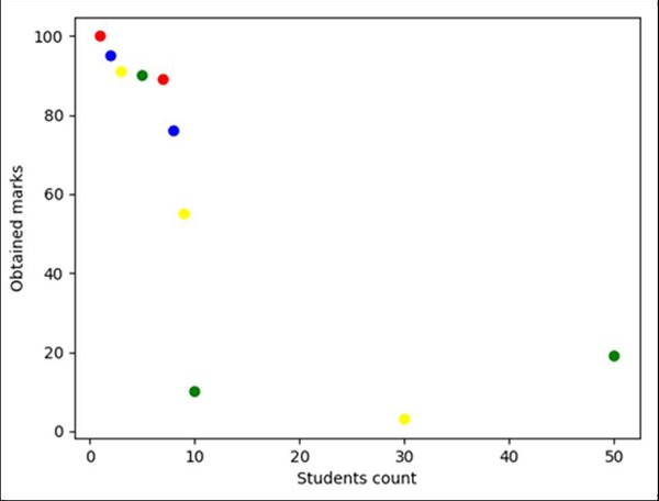
We can plot a diagram where a number of students will be plotted on the X-axis and the marks obtained by them will be plotted on the Y-axis. Also, we can set the color for different marks obtained by the students.
Steps
Make a list of the number of students.
Make a list of marks that have been obtained by the students.
To represent the color of each scattered point, we can have a list of colors.
Using Panda, we can have a list representing the axes of the data frame.
Create fig and ax variables using subplots method, where default nrows and ncols are 1.
Set the “Students count” label using the plt.xlabel() method.
Set the “Obtained marks” label using the plt.ylabel() method.
To create a scatter point use a data frame, i.e., created in step 4, points are students_count, marks and color.
To show the figure, use the plt.show() method.
Example
from matplotlib import pyplot as plt
import pandas as pd

no_of_students = [1, 2, 3, 5, 7, 8, 9, 10, 30, 50]
marks_obtained_by_student = [100, 95, 91, 90, 89, 76, 55, 10, 3, 19]
color_coding = ['red', 'blue', 'yellow', 'green', 'red', 'blue', 'yellow', 'green', 'yellow', 'green']

df = pd.DataFrame(dict(students_count=no_of_students,
marks=marks_obtained_by_student, color=color_coding))

fig, ax = plt.subplots()

plt.xlabel('Students count')
plt.ylabel('Obtained marks')

ax.scatter(df['students_count'], df['marks'], c=df['color'])

plt.show()
Output

1K+ Views
