
Article Categories
- All Categories
-
 Data Structure
-
 Networking
-
 RDBMS
RDBMS
-
 Operating System
-
 Java
Java
-
 MS Excel
-
 iOS
iOS
-
 HTML
HTML
-
 CSS
CSS
-
 Android
-
 Python
-
 C Programming
-
 C++
C++
-
 C#
C#
-
 MongoDB
-
 MySQL
MySQL
-
 Javascript
-
 PHP
PHP
Different plotting using pandas and matplotlib
Pandas and Matplotlib are the libraries available in python to perform data analysis and visualization for the given input data. Following are some different plots that can be plotted using the pandas and matplotlib libraries.
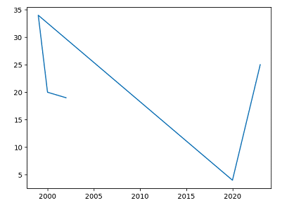
Using Line Plot
The line plot is the simplest plot to visualize the data over the time; this plot can be plotted using the pandas and matplotlib libraries. We have the plot() function available in the matplotlib library to plot the line plot. Following is the syntax.
import matplotlib.pyplot as plt
plt.plot(x,y)
Where,
matplotlib.pylot is the library.
plt is the alias name.
plot is the function to plot the line plot.
x, y are the input data to be plotted.
Example
In the following example, we will create a line plot using the pandas library to visualize the data provided
import matplotlib.pyplot as plt
import pandas as pd
data = {"year":[2002,2000,1999,2020,2023],"age":[19,20,34,4,25]}
pandas_data = pd.DataFrame(data)
print(pandas_data)
plt.plot(data["year"],data["age"])
plt.show()
Output
year  age
0  2002   19
1  2000   20
2  1999   34
3  2020    4
4  2023   25
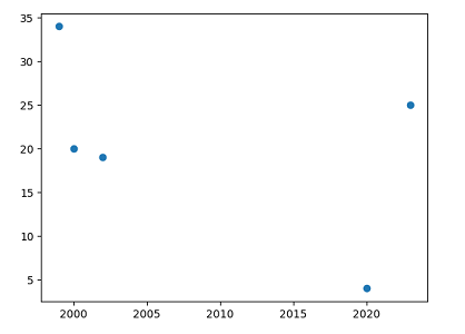
Using Scatter plot
A scatter plot is used to plot the relationship between defined data elements. We have the function namely scatter() to plot the scatter plot in matplotlib library. Following is the syntax.
plt.scatter(x,y)
Example
In the following example, we will create a scatter plot using the Dataframe feature of the pandas library to visualize the provided data.
import matplotlib.pyplot as plt
import pandas as pd
data = {"year":[2002,2000,1999,2020,2023],"age":[19,20,34,4,25]}
pandas_data = pd.DataFrame(data)
print(pandas_data)
plt.scatter(data["year"],data["age"])
plt.show()
Output
year  age
0  2002   19
1  2000   20
2  1999   34
3  2020    4
4  2023   25
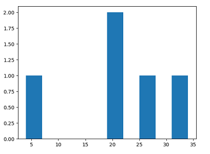
Using Histogram
The Histogram plot is used to display the distribution of the single variable on the plot. In matplotlib library, we have the hist() function to plot the histogram plot. Following is the syntax.
plt.hist(x)
Example
In this example, we will plot the histogram plot by using the hist() function available in matplotlib library.
import matplotlib.pyplot as plt
import pandas as pd
data = {"year":[2002,2000,1999,2020,2023],"age":[19,20,34,4,25]}
pandas_data = pd.DataFrame(data)
print(pandas_data)
plt.hist(data["age"])
plt.show()
Output
year  age
0  2002   19
1  2000   20
2  1999   34
3  2020    4
4  2023   25
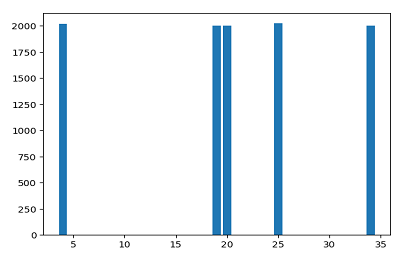
Using Bar chart
The bar chart is used to compare different categories of data. Matplotlib library provides a function namely bar() used to plot bar chart. Following is the syntax -
plt.bar(x,y)
Example
In this example, we will plot the bar chart using the bar() function available in matplotlib library.
import matplotlib.pyplot as plt
import pandas as pd
data = {"year":[2002,2000,1999,2020,2023],"age":[19,20,34,4,25]}
pandas_data = pd.DataFrame(data)
print(pandas_data)
plt.bar(data["age"],data["year"])
plt.show()
Output
year  age
0  2002   19
1  2000   20
2  1999   34
3  2020    4
4  2023   25

522 Views
