
Article Categories
- All Categories
-
 Data Structure
-
 Networking
-
 RDBMS
RDBMS
-
 Operating System
-
 Java
Java
-
 MS Excel
-
 iOS
iOS
-
 HTML
HTML
-
 CSS
CSS
-
 Android
-
 Python
-
 C Programming
-
 C++
C++
-
 C#
C#
-
 MongoDB
-
 MySQL
MySQL
-
 Javascript
-
 PHP
PHP
-
 Economics & Finance
Selected Reading
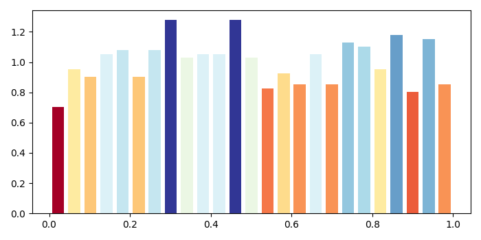
Plot a histogram with colors taken from colormap in Matplotlib
To plot a histogram with colors taken from colormap, we can use the setp() method.
Steps
Create data points using numpy.
Plot data (Step 1) using hist() method, with bins=25, rwidth=.75,...etc.
Returned values n, bins and patches can help to find col.
Get a colormap instance for name "RdYlBu".
Zip the col and patches.
Now, using setp() method, set the property of each patch.
To display the figure, use show() method.
Example
import numpy as np
from matplotlib import pyplot as plt
plt.rcParams["figure.figsize"] = [7.00, 3.50]
plt.rcParams["figure.autolayout"] = True
data = np.random.random(1000)
n, bins, patches = plt.hist(data, bins=25, density=True, color='red', rwidth=0.75)
col = (n-n.min())/(n.max()-n.min())
cm = plt.cm.get_cmap('RdYlBu')
for c, p in zip(col, patches):
   plt.setp(p, 'facecolor', cm(c))
plt.show()
Output

Updated on: 2021-05-07T07:59:54+05:30
2K+ Views

Advertisements