
Article Categories
- All Categories
-
 Data Structure
-
 Networking
-
 RDBMS
RDBMS
-
 Operating System
-
 Java
Java
-
 MS Excel
-
 iOS
iOS
-
 HTML
HTML
-
 CSS
CSS
-
 Android
-
 Python
-
 C Programming
-
 C++
C++
-
 C#
C#
-
 MongoDB
-
 MySQL
MySQL
-
 Javascript
-
 PHP
PHP
Selected Reading
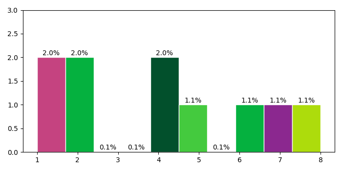
Plot a histogram with Y-axis as percentage in Matplotlib
To plot a histogram with Y-axis as percentage in matplotlib, we can take the following steps −
Create a list of numbers as y.
Create a number of bins.
Plot a histogram using hist() method, where y, bins, and edgecolor are passed in the argument.Store the patches to set the percentage on Y-axis.
Create a list of colors from the given alphanumeric numbers.
To set the percentage, iterate the patches (obtained in step 3).
Set the Y-axis ticks range.
To display the figure, use show() method.
Example
import random
import numpy as np
from matplotlib import pyplot as plt
plt.rcParams["figure.figsize"] = [7.00, 3.50]
plt.rcParams["figure.autolayout"] = True
y = [4, 1, 8, 7, 6, 4, 2, 1, 2, 5]
nbins = 10
_, _, patches = plt.hist(y, bins=nbins, edgecolor='white')
colors = ["#" + ''.join([random.choice('0123456789ABCDEF') for j in range(6)])
for i in range(nbins)]
for patch in patches:
   patch.set_facecolor(colors[np.random.randint(100) % nbins])
   x = patch.get_x() + patch.get_width() / 2
   y = patch.get_height() + .05
   plt.annotate('{:.1f}%'.format(y), (x, y), ha='center')
plt.ylim(0, 3)
plt.show()
Output

Updated on: 2021-05-06T13:57:06+05:30
3K+ Views

Advertisements