- Copilot Studio - Home
- Build Your First Copilot
- Copilot Studio - Free Trial
- Power CAT Copilot Studio Kit
- Copilot Studio - Custom Entities
- Copilot Studio - Trigger Phrases
- Copilot Studio - Adaptive Cards
- Classic Bot vs Modern Copilot
- Copilot Studio - Power Automate Flow
- Share Your Copilot-built
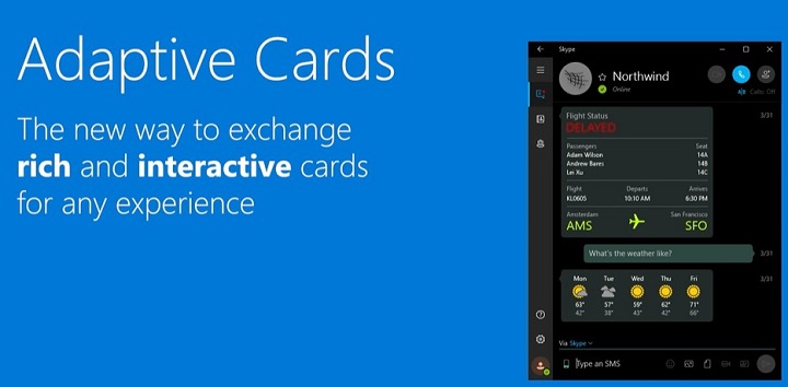
Microsoft Copilot Studio - Adaptive Cards
For all the Microsoft Copilot Studio users, the work has become easier for you. If you want to develop custom output for the chatbot, whenever any user interacts with it, you just need to use the pre-built templates. You can also build your custom templates with images to show in the output of your chatbot response. But what are these templates? These are called the Adaptive Cards, which are highly powerful and adaptive JSON-based cards that will allow you to create custom UI elements.
In this tutorial, we will see how these adaptive cards work and how to integrate them with your Copilots to create custom dynamic responses.
Why There Is a Need for Adaptive Cards?

Adaptive cards help you to create a highly dynamic user-friendly UI interface for your Copilot, including elements like buttons, form fields, images, text, etc. which makes your Copilot look fantastic from the first user interaction. These cards are nothing but JSON snippets which can adapt any Microsoft applications UI interface.
For example, some pre-built adaptive cards follow the theme of Microsoft Teams if they are used for it. On the other hand, that same card will adapt itself to any other Microsoft application like Excel or PowerBI.
Moreover, you can build your custom cards in real-time by visiting the Adaptive Cards. You can start pasting your logo, any image, or insert elements like buttons, icons, etc. by drag and drop method. Finally, you just have to copy the JSON code and paste it into your Copilot environment.
Prerequisites for Using Adaptive Cards
Before we begin, ensure you have the following −
- Access to Copilot Studio.
- A basic understanding of JSON format.
- Familiarity with Copilot Studios topics and trigger phrases.
- Optional an account with Adaptive Cards Designer for faster prototyping.
A Step-by-Step Guide for Adapting Adaptive Cards
Step 1: Designing the Adaptive Card
Here, you dont need to write the whole JSON code for developing adaptive cards. Heres how you can create your first adaptive card −
Choose a Template or Start Fresh
- Visit the Adaptive Cards Designer.
- You can either choose from pre-built templates (like forms or announcements) or start from scratch by selecting "New Card."
Add Components to Your Card
- Text − Drag a "TextBlock" component to add text.
- Images − You can use the "Image" component to display images or directly paste your copied image onto a card. After that, you can also set the URL property to point to an image source like https://example.com/image.png.
- Input Fields − Adding user input options like text boxes (Input.Text), date pickers (Input.Date), or multiple-choice options (Input.ChoiceSet).
For example, to create a simple feedback form, you might add a TextBlock for instructions, followed by an Input.Text for the users feedback.
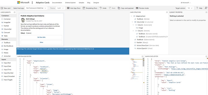
Preview Your Design
Once the components are in place, the Designers Preview Panel shows you what the Adaptive Card will look like when rendered in a chatbot. This live preview helps adjust the layout and content.
Copy the JSON
When satisfied, click on the Copy JSON button. This JSON structure defines the card and can be used directly in Microsoft Copilot Studio.
Step 2: Creating a Topic in Microsoft Copilot Studio
With your Adaptive Card JSON ready, the next step is to integrate it into Copilot Studio.
1. Open Copilot Studio
Log in to Copilot Studio and navigate to the Topics section where youll create or modify topics that represent conversational flows.
2. Create a New Topic

- Click on New Topic to create a Phrase.
- Give your topic a clear and descriptive name, such as User Survey.
3. Define Trigger Phrases
Trigger phrases activate the topic. For example, for a feedback form, you might use phrases like −
- "Give feedback"
- "Provide survey"
- "I have commented"
Add several trigger phrases to ensure your chatbot can recognize various ways users might request this action.
Step 3: Integrating the Adaptive Card in Copilot Studio
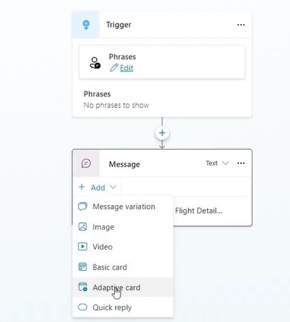
1. Add the Adaptive Card
Within the topic editor, locate the "Add Adaptive Card" option. Youll see a space where you can paste your JSON.
2. Paste the JSON
Paste the JSON that you copied from the Adaptive Cards Designer. Make sure the syntax is correctmismatched brackets or missing commas can cause issues. A well-formed JSON looks like this −
{
   "type": "AdaptiveCard",
   "body": [
      {
         "type": "TextBlock",
         "text": "Please provide your feedback:"
      },
      {
         "type": "Input.Text",
         "id": "feedbackText",
         "placeholder": "Type your feedback here"
      },
      {
         "type": "Action.Submit",
         "title": "Submit"
      }
   ],
   "version": "1.3"
}
3. Test the Card
Before moving forward, click on the "Test" button to simulate the chatbots response when a user triggers this topic. This is a good time to confirm that the card renders correctly and inputs work as expected.
Step 4: Customising the Adaptive Card for User Interaction
Adaptive Cards are not static. You can enrich their functionality with input fields and dynamic responses based on user interactions.
1. Adding Input Fields
Modify the JSON to include input fields for text, choices, or dates. Heres an example of a ChoiceSet for a feedback form −
{
   "type": "Input.ChoiceSet",
   "id": "feedbackType",
   "value": "1",
   "choices": [
      {
         "title": "Bug Report",
         "value": "1"
      },
      {
         "title": "Feature Request",
         "value": "2"
      }
   ]
}
This allows users to choose between different feedback types, such as bug reports or feature requests.
2. Adding Action Buttons
You can add action buttons to your Adaptive Card that trigger events when clicked, such as submitting the form or opening an external link −
{
   "type": "Action.OpenUrl",
   "title": "Learn More",
   "url": "https://example.com"
}
For form submission, use: {
   "type": "Action.Submit",
   "title": "Submit"
}
3. Integrating Variables
If you want to make the card dynamic, you can insert variables from Copilot Studio into your Adaptive Card. For example, you can greet a user by their name −
{
   "type": "TextBlock",
   "text": "Hello, ${username}!"
}
Step 5: Handling Responses from Adaptive Cards
Once users interact with the Adaptive Card, youll want to handle their input in a meaningful way.
1. Action Handlers
After users submit a form or make a selection, you can configure Microsoft Copilot Studio to respond accordingly −
- Redirect them to a confirmation message.
- Trigger another topic.
- Send the input to an API endpoint for processing.
For example, after a feedback form submission, you might redirect the user to a thank-you message −
{
   "type": "TextBlock",
   "text": "Thank you for your feedback!"
}
Step 6: Testing and Publishing the Adaptive Card
1. Preview the Entire Flow
Microsoft Copilot Studio offers a preview mode that allows you to simulate the entire user interaction. Test the flow thoroughly to ensure that the card renders, inputs are processed, and responses are correct.
2. Publish Your Bot
Once satisfied with the design and functionality, click on the Publish button to make your chatbot live. Your Adaptive Card is now integrated and ready to interact with real users!
Advanced Features of Adaptive Cards
Adaptive Cards offer a range of advanced features to make your chatbot even more interactive −
Conditional Elements − You can hide or show components based on user actions, such as displaying additional options only if a user selects a specific choice.
Actionable Cards − Besides submitting forms, Adaptive Cards can trigger workflows, connect with external services, and more.
For more on conditional elements, check out the official documentation.
Best Practices for Designing Adaptive Cards
Version − Make sure you have the version on your Copilot that matches that of your JSON builder. If not, then you can change the Target Version inside the Adaptive Cards website to match the Bot Framework WebChat.

Simplicity is Key − While Adaptive Cards can be feature-rich, avoid overwhelming users with too many inputs or complex designs.
Mobile Optimization − Test the card on both desktop and mobile platforms to ensure responsiveness.
Validate JSON − Always validate your JSON to avoid errors during integration. Use the JSON Validator.
Following these easy steps, you can easily develop custom card responses for your chatbot, making the user interface more advanced and interactive. It's all up to your creativity, and how you want to design your bot framework.
