
Article Categories
- All Categories
-
 Data Structure
-
 Networking
-
 RDBMS
RDBMS
-
 Operating System
-
 Java
Java
-
 MS Excel
-
 iOS
iOS
-
 HTML
HTML
-
 CSS
CSS
-
 Android
-
 Python
-
 C Programming
-
 C++
C++
-
 C#
C#
-
 MongoDB
-
 MySQL
MySQL
-
 Javascript
-
 PHP
PHP
-
 Economics & Finance
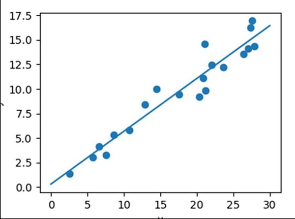
Linear regression with Matplotlib/Numpy
To get a linear regression plot, we can use sklearn’s Linear Regression class, and further, we can draw the scatter points.
Steps
Get x data using np.random.random((20, 1)). Return random floats in the half-open interval[20, 1).
Get the y data using np.random.normal() method. Draw random samples from a normal (Gaussian) distribution.
Get ordinary least squares Linear Regression, i.e., model.
Fit the linear model.
Return evenly spaced numbers over a specified interval, using linspace() method.
Predict using the linear model, using predict() method.
Create a new figure, or activate an existing figure, with a given figsize tuple (4, 3).
Add an axis to the current figure and make it the current axes, using axes() method.
A scatter plot of *y* vs. *x* with varying marker size and/or color.
Plot the line using x_new and y_new obtained from step 5 and 6.
Set the X-axis label using plt.xlabel() method.
Set the Y-axis label using plt.ylabel() method.
Adjust the axis properties using ax.axis('tight').
To show the figure, use plt.show() method.
Example
import numpy as np
import matplotlib.pyplot as plt
from sklearn.linear_model import LinearRegression

x = 30 * np.random.random((20, 1))

y = 0.5 * x + 1.0 + np.random.normal(size=x.shape)

model = LinearRegression()
model.fit(x, y)

x_new = np.linspace(0, 30, 100)
y_new = model.predict(x_new[:, np.newaxis])

plt.figure(figsize=(4, 3))
ax = plt.axes()
ax.scatter(x, y)
ax.plot(x_new, y_new)

ax.set_xlabel('x')
ax.set_ylabel('y')

ax.axis('tight')

plt.show()
Output

9K+ Views
