
Article Categories
- All Categories
-
 Data Structure
-
 Networking
-
 RDBMS
RDBMS
-
 Operating System
-
 Java
Java
-
 MS Excel
-
 iOS
iOS
-
 HTML
HTML
-
 CSS
CSS
-
 Android
-
 Python
-
 C Programming
-
 C++
C++
-
 C#
C#
-
 MongoDB
-
 MySQL
MySQL
-
 Javascript
-
 PHP
PHP
-
 Economics & Finance
Selected Reading
How to plot the confidence interval of the regression model using ggplot2 with transparency in R?
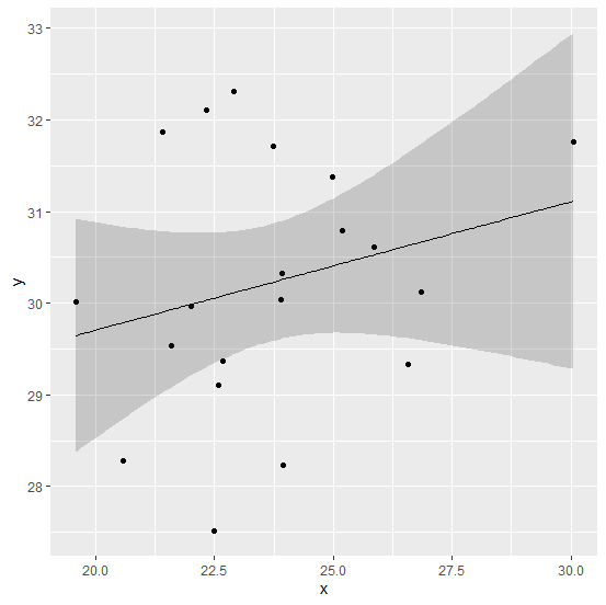
To plot the confidence interval of the regression model, we can use geom_ribbon function of ggplot2 package but by default it will have dark grey color. It can become transparent with the help of alpha argument inside the same function, the alpha argument can be adjusted as per our requirement but the most recommended value by me is 0.2.
Example
Consider the below data frame −
> x<-rnorm(20,25,2.24)
> y<-rnorm(20,30,1.27)
> df<-data.frame(x,y)
> df
Output
      x         y
1 22.67102 29.37057
2 21.59415 29.54027
3 20.56817 28.27672
4 24.97228 31.38193
5 21.41651 31.86811
6 23.94699 28.22775
7 23.90155 30.03807
8 26.57466 29.32966
9 22.32727 32.10336
10 30.04399 31.76219
11 26.84023 30.12260
12 23.73143 31.71349
13 22.57145 29.10705
14 25.86364 30.61687
15 25.17939 30.79297
16 22.49971 27.51084
17 22.01182 29.96766
18 23.93069 30.31963
19 19.57823 30.01839
20 22.90537 32.30613
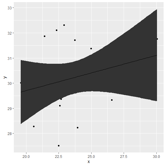
Loading ggplot2 package and creating a regression model plot with confidence interval −
Example
> library(ggplot2)
> ggplot(df,aes(x,y))+geom_point()+geom_ribbon(stat="smooth",method="lm",se=TRUE)+geom_line(stat="smooth",method="lm")
Output
Creating the plot with transparent confidence interval −
Example
> ggplot(df,aes(x,y))+geom_point()+geom_ribbon(stat="smooth",method="lm",se=TRUE,alpha=0.2)+geom_line(stat="smooth",method="lm")
Output

Updated on: 2026-03-11T22:50:54+05:30
959 Views

Advertisements