
Article Categories
- All Categories
-
 Data Structure
-
 Networking
-
 RDBMS
RDBMS
-
 Operating System
-
 Java
Java
-
 MS Excel
-
 iOS
iOS
-
 HTML
HTML
-
 CSS
CSS
-
 Android
-
 Python
-
 C Programming
-
 C++
C++
-
 C#
C#
-
 MongoDB
-
 MySQL
MySQL
-
 Javascript
-
 PHP
PHP
-
 Economics & Finance
How to create normal probability plot in R with confidence interval bands?
To create normal probability plot in R with confidence interval bands, we can use qqPlot function of QTLRel package. We simply need to pass the vector name that contains normal distribution values inside qqPlot function or directly introduce the vector inside the function as shown in the below given examples.
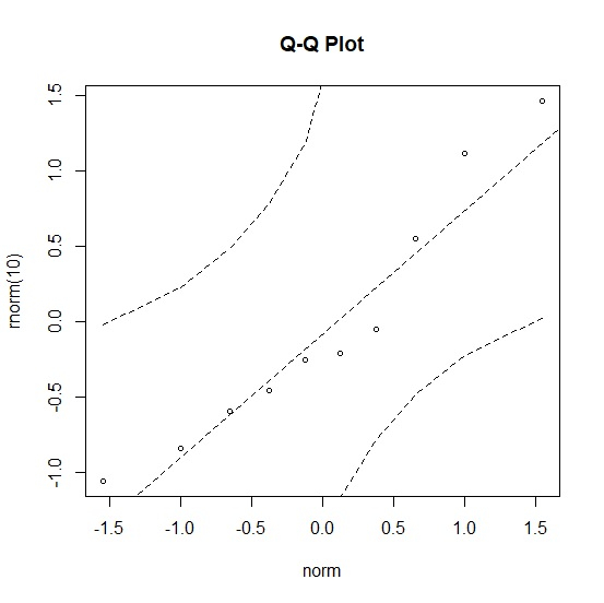
Example 1
Use the following code to create normal probability plot −
library("QTLRel")
qqPlot(rnorm(10))
Output
If you execute the above given snippet, it generates the following Output −
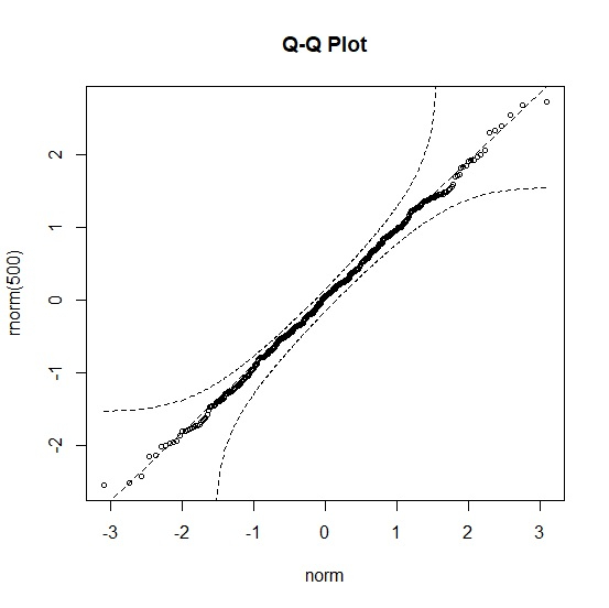
Example 2
Add the following code to the above snippet to create normal probability plot −
qqPlot(rnorm(500))
Output
If you execute the above given snippet, it generates the following Output −
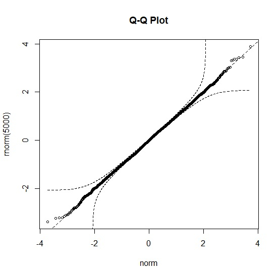
Example 3
Add the following code to the above snippet to create normal probability plot −
qqPlot(rnorm(5000))
Output
If you execute the above given snippet, it generates the following Output −

2K+ Views
