
Article Categories
- All Categories
-
 Data Structure
-
 Networking
-
 RDBMS
RDBMS
-
 Operating System
-
 Java
Java
-
 MS Excel
-
 iOS
iOS
-
 HTML
HTML
-
 CSS
CSS
-
 Android
-
 Python
-
 C Programming
-
 C++
C++
-
 C#
C#
-
 MongoDB
-
 MySQL
MySQL
-
 Javascript
-
 PHP
PHP
-
 Economics & Finance
Selected Reading
How to plot the regression line starting from origin using ggplot2 in R?
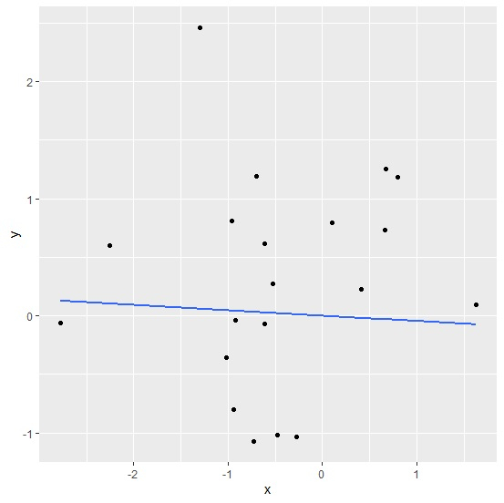
The regression line starting from origin means that the intercept of the model is dropped from the regression model. To plot the regression line starting from origin, we can use the formula by subtracting 1 in geom_smooth function of ggplot2 package.
Consider the below data frame −
Example
x<-rnorm(20)
y<-rnorm(20)
df<-data.frame(x,y)
df
Output
       x        y
1    0.7936844   1.18542740
2   -0.6143234  -0.06681784
3   -0.5260676   0.26993531
4   -0.9181893  -0.03549873
5   -0.2728913  -1.03655161
6   -0.7030962   1.18929567
7   -0.6145780   0.61194367
8   -2.7765935  -0.06167213
9   -2.2535913   0.59793773
10  -0.7330266  -1.07433426
11   0.6723913   1.25331326
12   1.6307157   0.09585268
13  -0.4791150  -1.01449433
14  -0.9577056   0.80677202
15   0.1023982   0.79843355
16  -1.0203498  -0.35537811
17  -0.9433246  -0.80303154
18   0.6654104   0.73242246
19  -1.2954933   2.46313259
20   0.4077880   0.23019373
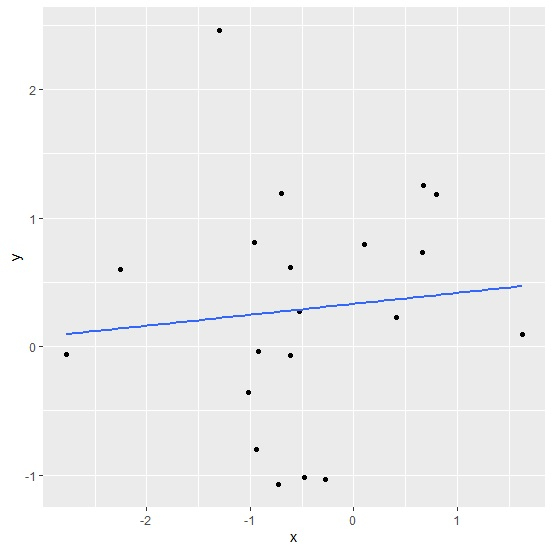
Loading ggplot2 package and creating regression line for the linear regression model between x and y −
Example
library(ggplot2) ggplot(df,aes(x,y))+geom_point()+geom_smooth(method=lm,se=FALSE)
`geom_smooth()` using formula 'y ~ x'
Output
Creating regression line starting from origin for the linear regression model between x and y −
Example
ggplot(df,aes(x,y))+geom_point()+geom_smooth(method=lm,se=FALSE,formula=y~x-1)
Output

Updated on: 2026-03-11T22:50:55+05:30
1K+ Views

Advertisements