
Article Categories
- All Categories
-
 Data Structure
-
 Networking
-
 RDBMS
RDBMS
-
 Operating System
-
 Java
Java
-
 MS Excel
-
 iOS
iOS
-
 HTML
HTML
-
 CSS
CSS
-
 Android
-
 Python
-
 C Programming
-
 C++
C++
-
 C#
C#
-
 MongoDB
-
 MySQL
MySQL
-
 Javascript
-
 PHP
PHP
-
 Economics & Finance
How to make your text stand out using Canva tools?
Creating a template in Canva means a panorama of different elements and components all working together in harmony to enhance the design. But at times the presence of multiple elements that can overshadow the most important part of the design is the text. If you are someone who wants to enhance the appearance of your text so that it is not completely overwhelmed by the other elements of your design, then you have come to the right place.
But making your design stand out can be a very difficult task, especially when there is such a plethora of features available on the platform. In this article, we will discuss a few tips and tricks to help you with the job.
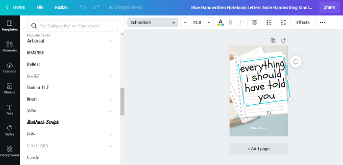
Use Fonts that Stand Out
One of the most effective methods would be to use fonts that stand out but do not overshadow the other elements. Also, a very important thing to remember which choosing the fonts is that the typeface should be restricted to a limited number of fonts as it makes it easy for the brain to read the design. It also makes the design look more compact.
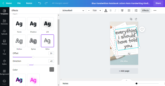
Apply Effects on Text
Canva allows to apply a number of effects to your text. All you need to do is select the text you want to edit and from the Effects option on the toolbar above the work screen toggle with the effect, you want to apply to your text.
The effects include components such as Shadow, Splice, Echo, Glitch, Curve, Neon, Hollow, and Lift. Add any two if these effects to your text and the look the text will go through a complete transformation.
Limit the Color Scheme of Fonts
When choosing the font colors, it’s very obvious that we tend to go overboard, owing to the overwhelming number of options available. But it’s always better to limit the color scheme of your font. It’s always is preferable to use colors that contrast and complement each other and also complement the aesthetic of your design.
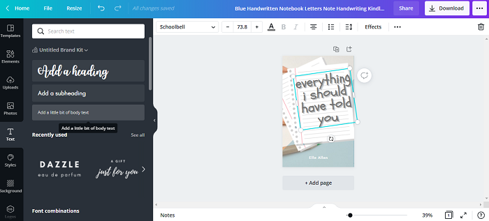
Placement of Text Boxes
Be thoughtful with the placement of your text boxes so that when the text is entered, they are all placed in a way where they can be all clearly read and also look visually pleasing.
Limit the Number of Elements
The most useful and effective tip would be to limit the number of elements in your design. Use a limited number of fonts, colour frames, and shapes so that the design appears neat and complete.
1K+ Views
