
Article Categories
- All Categories
-
 Data Structure
-
 Networking
-
 RDBMS
RDBMS
-
 Operating System
-
 Java
Java
-
 MS Excel
-
 iOS
iOS
-
 HTML
HTML
-
 CSS
CSS
-
 Android
-
 Python
-
 C Programming
-
 C++
C++
-
 C#
C#
-
 MongoDB
-
 MySQL
MySQL
-
 Javascript
-
 PHP
PHP
How to Implement TabLayout with Icon in Android?
The TabLayout with icons has become a popular UI component in Android development. It simplifies navigation within an app by offering a horizontal layout of tabs. Each tab represents a distinct category or feature and can be enhanced visually by incorporating icons. This combination of icons and labels makes it easier for users to grasp the purpose of each tab.
By selecting a tab, the corresponding content is displayed. This is typically done within a ViewPager. To implement TabLayout with icons, one needs to create the necessary layouts and manage fragments or activities for each tab's content. It also involves customizing the appearance to suit the app's design. This navigation solution not only enhances user experience but also improves app usability by providing a user-friendly and visually appealing interface.
TabLayout
TabLayout, a UI component in the Android framework, offers users a user-friendly way to incorporate a horizontal layout of tabs. This versatile feature is commonly employed for efficient organization and seamless navigation between multiple screens or sections within an app. Each tab represents a distinct category or feature, allowing users to effortlessly switch between them by simply tapping on the corresponding tab.
TabLayout is a commonly used component together with a ViewPager. The ViewPager takes charge of managing the content related to each tab. This combination allows for the seamless navigation between different fragments or activities based on the selected tab. Additionally, TabLayout offers various customization options such as adding icons, setting text labels, and applying styles. These features make it adaptable and versatile to suit various app designs and requirements.
Approaches
There are different approaches to implementing TabLayout in Android and we will be looking at some of the common methods to do so:
Method 1: Using a custom view for tab items
Method 2: Using the default TabLayout setup with icons
Method 1: Using a custom view for tab items
One approach to incorporating a TabLayout with icons in Android involves utilizing a customized view for each tab item. This method entails designing a unique XML layout file for the tab item, which includes an ImageView for the icon and a TextView for the title. In your activity or fragment, you can then set up the TabLayout alongside a ViewPager, followed by creating custom tab views for each individual tab.
The custom view of each tab allows for easy retrieval. Within this view, one can locate both the ImageView and the TextView components, enabling the customization of icons and titles as needed. By incorporating a custom view, users gain enhanced control over the appearance and layout of tab items within a TabLayout, empowering them to seamlessly display icons alongside corresponding titles.
Algorithm
The XML layout file for the main activity or fragment should be created, which includes the TabLayout and ViewPager.
Additionally, a separate XML layout file should be created for the custom tab item, consisting of an ImageView and TextView for the icon and title respectively.
To obtain references to the TabLayout and ViewPager in the activity or fragment, their respective IDs should be used.
The ViewPager needs to be set up with an appropriate adapter to handle the content of the tabs.
In order to link the TabLayout with the ViewPager, utilize the setupWithViewPager() method.
Iteratively go through each tab in the TabLayout using a loop. For every tab, retrieve its Tab object and customize its view by employing setCustomView() method.
Within this custom view, locate both ImageView and TextView using their respective IDs.
Set relevant icon and title information for each tab by calling methods such as setImageResource() and setText() on ImageView and TextView accordingly.
Repeat steps iteratively for all tabs in order to configure their custom views with desired icons and titles as needed.Customization options are available to adjust appearance and behavior of the TabLayout according to specific requirements.
Furthermore, additional functionality can be integrated such as responding to tab selection events or updating content within ViewPager based on tab changes.
Example
// activity_main.xml
<?xml version="1.0" encoding="utf-8"?>
<RelativeLayout xmlns:android="http://schemas.android.com/apk/res/
android"
   xmlns:app="http://schemas.android.com/apk/res-auto"
   xmlns:tools="http://schemas.android.com/tools"
   android:layout_width="match_parent"
   android:layout_height="match_parent"
   tools:context=".MainActivity">

   <com.google.android.material.tabs.TabLayout
      android:id="@+id/tab_layout"
      android:layout_width="match_parent"
      android:layout_height="wrap_content"
      android:layout_alignParentBottom="true"
      app:tabGravity="fill"
      app:tabMode="fixed"
      app:tabIndicatorHeight="0dp" />

   <androidx.viewpager2.widget.ViewPager2
      android:id="@+id/view_pager"
      android:layout_width="match_parent"
      android:layout_height="match_parent"
      android:layout_above="@id/tab_layout" />

</RelativeLayout>

//MainActivity.java
import androidx.appcompat.app.AppCompatActivity;
import androidx.viewpager2.widget.ViewPager2;

import android.os.Bundle;

import com.google.android.material.tabs.TabLayout;
import com.google.android.material.tabs.TabLayoutMediator;

public class MainActivity extends AppCompatActivity {

   private static final String[] tabTitles = {"Tab 1", "Tab 2", "Tab 3"};
   private static final int[] tabIcons = {R.drawable.ic_tab1, R.drawable.ic_tab2, R.drawable.ic_tab3};

   @Override
   protected void onCreate(Bundle savedInstanceState) {
      super.onCreate(savedInstanceState);
      setContentView(R.layout.activity_main);

      TabLayout tabLayout = findViewById(R.id.tab_layout);
      ViewPager2 viewPager = findViewById(R.id.view_pager);
      viewPager.setAdapter(new ViewPagerAdapter(this));

      new TabLayoutMediator(tabLayout, viewPager, (tab, position) -> {
         tab.setIcon(tabIcons[position]);
         tab.setText(tabTitles[position]);
      }).attach();
   }
}

// ViewPagerAdapter.java
import android.content.Context;
import android.view.LayoutInflater;
import android.view.View;
import android.view.ViewGroup;
import android.widget.TextView;

import androidx.annotation.NonNull;
import androidx.recyclerview.widget.RecyclerView;

public class ViewPagerAdapter extends RecyclerView.Adapter<ViewPagerAdapter.ViewHolder> {

   private final Context context;

   public ViewPagerAdapter(Context context) {
      this.context = context;
   }

   @NonNull
   @Override
   public ViewHolder onCreateViewHolder(@NonNull ViewGroup parent, int viewType) {
      View view = LayoutInflater.from(context).inflate(R.layout.item_view_pager, parent, false);
      return new ViewHolder(view);
   }

   @Override
   public void onBindViewHolder(@NonNull ViewHolder holder, int position) {
      holder.textView.setText("Page " + (position + 1));
   }

   @Override
   public int getItemCount() {
      return 3; // Change this value based on the number of tabs
   }

   public static class ViewHolder extends RecyclerView.ViewHolder {
      TextView textView;

      public ViewHolder(View itemView) {
         super(itemView);
         textView = itemView.findViewById(R.id.textView);
      }
   }
}
ic_tab1.png, ic_tab2.png, ic_tab3.png in res/drawable

// item_view_pager.xml
<?xml version="1.0" encoding="utf-8"?>
<LinearLayout xmlns:android="http://schemas.android.com/apk/res/
android"
   android:layout_width="match_parent"
   android:layout_height="match_parent"
   android:gravity="center"
   android:orientation="vertical">

   <TextView
      android:id="@+id/textView"
      android:layout_width="wrap_content"
      android:layout_height="wrap_content"
      android:textAppearance="?android:textAppearanceLarge" />

</LinearLayout>
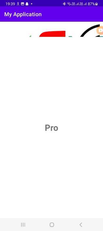
Output
Method 2: Using the default TabLayout setup with icons
An alternative way to implement a TabLayout with icons in Android is by utilizing the default TabLayout setup, which supports the inclusion of icons. This approach eliminates the need for creating a custom view, as it permits direct icon assignment for each tab.
Once you have configured the TabLayout with a ViewPager, you can easily navigate through each tab and utilize the setIcon() method to designate the desired icon resource.
By leveraging this method, you take advantage of the built-in capabilities of the TabLayout for managing tab selection and styling while streamlining implementation. This straightforward approach simplifies associating icons with tabs within the TabLayout, facilitating the attainment of your intended visual representation without requiring additional modifications.
Algorithm
The XML layout file needs to be created for the main activity or fragment. This includes incorporating the TabLayout and ViewPager components.
To start, obtain references to the TabLayout and ViewPager in your activity or fragment.
Next, set up the ViewPager with an appropriate adapter to handle the content of the tabs. Link the TabLayout with the ViewPager using the setupWithViewPager() method.
Afterwards, iterate through each tab in the TabLayout and retrieve their respective Tab objects using the getTabAt() method.
If a Tab object is not null, you can customize its appearance by setting an icon using setIcon().
Additionally, make any ne-cessary adjustments to suit your desired appearance and behavior for the TabLayout.
Lastly, handle any additional functionality that may be required, such as responding to tab selection e-vents or updating the content within ViewPager based on tab changes.
Program
// activity_main.xml
<?xml version="1.0" encoding="utf-8"?>
<RelativeLayout xmlns:android="http://schemas.android.com/apk/res/android"
   xmlns:app="http://schemas.android.com/apk/res-auto"
   xmlns:tools="http://schemas.android.com/tools"
   android:layout_width="match_parent"
   android:layout_height="match_parent"
   tools:context=".MainActivity">

   <com.google.android.material.tabs.TabLayout
      android:id="@+id/tab_layout"
      android:layout_width="match_parent"
      android:layout_height="wrap_content"
      android:layout_alignParentBottom="true"
      app:tabGravity="fill"
      app:tabMode="fixed"
      app:tabIndicatorHeight="0dp" />

   <androidx.viewpager2.widget.ViewPager2
      android:id="@+id/view_pager"
      android:layout_width="match_parent"
      android:layout_height="match_parent"
      android:layout_above="@id/tab_layout" />

</RelativeLayout>

// MainActivity.java
import androidx.appcompat.app.AppCompatActivity;
import androidx.viewpager2.widget.ViewPager2;

import android.os.Bundle;

import com.google.android.material.tabs.TabLayout;
import com.google.android.material.tabs.TabLayoutMediator;

public class MainActivity extends AppCompatActivity {

   private static final int[] tabIcons = {
         R.drawable.ic_tab1,
         R.drawable.ic_tab2,
         R.drawable.ic_tab3
   };

   @Override
   protected void onCreate(Bundle savedInstanceState) {
      super.onCreate(savedInstanceState);
      setContentView(R.layout.activity_main);

      TabLayout tabLayout = findViewById(R.id.tab_layout);
      ViewPager2 viewPager = findViewById(R.id.view_pager);
      viewPager.setAdapter(new ViewPagerAdapter(this));

      TabLayoutMediator mediator = new TabLayoutMediator(tabLayout, viewPager,
            (tab, position) -> tab.setIcon(tabIcons[position])
      );
      mediator.attach();
   }
}

// ViewPagerAdapter.java
import android.content.Context;
import android.view.LayoutInflater;
import android.view.View;
import android.view.ViewGroup;
import android.widget.TextView;

import androidx.annotation.NonNull;
import androidx.recyclerview.widget.RecyclerView;

public class ViewPagerAdapter extends RecyclerView.Adapter<
ViewPagerAdapter.ViewHolder> {

   private final Context context;

   public ViewPagerAdapter(Context context) {
      this.context = context;
   }

   @NonNull
   @Override
   public ViewHolder onCreateViewHolder(@NonNull ViewGroup parent, int viewType) {
      View view = LayoutInflater.from(context).inflate(R.layout.item_view_pager, parent, false);
      return new ViewHolder(view);
   }

   @Override
   public void onBindViewHolder(@NonNull ViewHolder holder, int position) {
      holder.textView.setText("Page " + (position + 1));
   }

   @Override
   public int getItemCount() {
      return 3; // Change this value based on the number of tabs
   }

   public static class ViewHolder extends RecyclerView.ViewHolder {
      TextView textView;

      public ViewHolder(View itemView) {
         super(itemView);
         textView = itemView.findViewById(R.id.textView);
      }
   }
}

ic_tab1.png, ic_tab2.png, ic_tab3.png in res/drawable

// item_view_pager.xml
<?xml version="1.0" encoding="utf-8"?>
<LinearLayout xmlns:android="http://schemas.android.com/apk/res/android"
   android:layout_width="match_parent"
   android:layout_height="match_parent"
   android:gravity="center"
   android:orientation="vertical">

   <TextView
      android:id="@+id/textView"
      android:layout_width="wrap_content"
      android:layout_height="wrap_content"
      android:textAppearance="?android:textAppearanceLarge" />

</LinearLayout>
Output

Conclusion
In conclusion, the incorporation of a TabLayout with icons can be achieved through two main approaches: utilizing a custom view for tab items or employing the default TabLayout setup. The custom view method offers greater flexibility and personalization by creating distinct XML layout files for each tab item. Conversely, the default setup simplifies the process by directly assigning icons to individual tabs.

1K+ Views
