
Article Categories
- All Categories
-
 Data Structure
-
 Networking
-
 RDBMS
RDBMS
-
 Operating System
-
 Java
Java
-
 MS Excel
-
 iOS
iOS
-
 HTML
HTML
-
 CSS
CSS
-
 Android
-
 Python
-
 C Programming
-
 C++
C++
-
 C#
C#
-
 MongoDB
-
 MySQL
MySQL
-
 Javascript
-
 PHP
PHP
-
 Economics & Finance
How to create Instagram Like button in ReactJS?
Most of all, you have used Instagram and have looked at the Like button given below every post. There are two things to notice about Instagram Like button: one is its shape is a heart shape which we need to create, and another is it fills up with red colour when we Like someone's post.
There are two different ways to create Instagram Like button. One is created from scratch using CSS and JavaScript, and another uses two different icons. One is filled, and another is outlined.
Use the Material UI library
We will use the FormControlLabel component from the Material UI library. It contains various components like a checkbox, switch, radio button etc., to handle form data.
In our case, we can use the ?checkbox? component inside the FormControlLabel component. Also, we can import the FavouriteIcon and FaviouriteBorderIcon from the Material UI library and use them as a checked and unchecked value of the checkbox component.
Syntax
Users can follow the syntax below to use the various components of the Material UI to create an Instagram Like button.
<FormControlLabel
   control = {
      <Checkbox
         icon = {<FavoriteBorderIcon />}
         checkedIcon = {<FavoriteIcon />}
      />
   }
   Label = "Like"
/>
In the above syntax, we have passed the different icons as props for icons and checkedIcon prop.
Example
In the example below, we have imported two different components and two icons from the Material UI library. We have used the checkbox component as a value of control props in the FormControlLabel component.
Also, in the checkbox component, we have passed two icons as a prop. We have used the FaviouriteBorderIcon from the Material UI as a value of icon prop to show outlined heart when the button is unclicked. Also, we have used the FavouriteIcon as a value of the checkedIcon prop to show the filled heart shape icon when the user clicks the button.
<div class="code-mirror language-reactjs" contenteditable="plaintext-only" spellcheck="false" style="outline: none; overflow-wrap: break-word; overflow-y: auto; white-space: pre-wrap;">import React from "react";
import FormControlLabel from "@mui/material/FormControlLabel";
import FavoriteIcon from "@mui/icons-material/Favorite";
import FavoriteBorderIcon from "@mui/icons-material/FavoriteBorder";
import Checkbox from "@mui/material/Checkbox";

function App() {
   return (
      <div style = {{ padding: "10px" }}>
         <h2>
            {" "}
            Creating the Instagram Like button in ReactJs using{" "}
            <i> Materia UI FormControlLabel </i> component.{" "}
         </h2>
         {/* showing different icons according to whether the checkbox is checked.   */}
         <FormControlLabel
            control = {
               <Checkbox
                  icon = {<FavoriteBorderIcon />}
                  checkedIcon = {<FavoriteIcon />}
               />
            }
            label = "Like"
         />
      </div>
   );
};
export default App;
</div>
Output
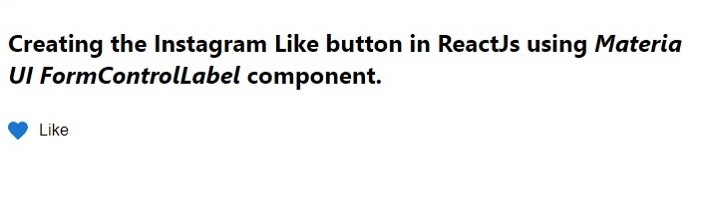
In the above output, users can observe that when they click icon becomes filled, and when they again click icon becomes outlined as previously.
Use the CSS to create heart shape icon and manage its colour with react hooks
We can create a heart shape using custom CSS. If you imagine, a heart shape is like a square rotated by 45deg and two half circles on the two sides.
Also, we can manage the border of the square and two circles so that we can make it look like a heart. Afterwards, we can set the background colour when the user clicks the heart-shaped button.
Syntax
Users can follow the syntax below to manage filled and outlined heart icons with React hooks.
{clicked ? (
   <span onClick = {handleClick} class = "heart-clicked"> </span>
) : (
      <span onClick = {handleClick} class = "heart"> </span>
   )}
In the above syntax, when a clicked variable becomes true, it shows the heart icon with the ?heart-clicked? class name, which is filled. Otherwise, it shows a heart icon with a ?heart? class name which is outlined.
Example
In the example below, we use the useState() hooks to track users who have clicked or unclicked the button, and according to that, we toggle the value of the clicked variable.
In the HTML part, we show the different span components with different class names based on whether users click the button or not.
Filename: App.js
<div class="code-mirror language-reactjs" contenteditable="plaintext-only" spellcheck="false" style="outline: none; overflow-wrap: break-word; overflow-y: auto; white-space: pre-wrap;">import React from "react";
import { useState } from "react";
import "./App.css";
function App() {
const [clicked, setClicked] = useState(false);
function handleClick(event) {
setClicked(!clicked);
}
return (
<div style = {{ padding: "10px" }}>
<h2>
{" "}
Creating the Instagram Like button in ReactJs using <i>
{" "}
CSS only{" "}
</i>{" "}
</h2>
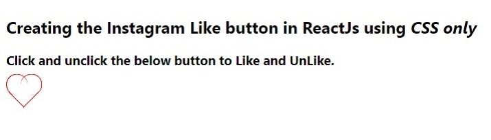
<h3> Click and unclick the below button to Like and UnLike. </h3>
{clicked ? (
<span onClick = {handleClick} class = "heart-clicked"> </span>
) : (
<span onClick = {handleClick} class = "heart"> </span>
)}
</div>
);
}
export default App;
</div>
Filename - App.css
In the below CSS code, we manage two classes. The ?heart? class contains a design for the outlined heart shape, and the ?heart-clicked? class contains a design for the filled heart shape.
To create a heart, we first created the square. After that, we added circles after and before the heart shape. Also, we have cut out the half circle by removing the border of two sides. Also, we have rotated the square and circle in such a way so that it looks perfect heart shape.
<div class="code-mirror language-reactjs" contenteditable="plaintext-only" spellcheck="false" style="outline: none; overflow-wrap: break-word; overflow-y: auto; white-space: pre-wrap;">.heart,
.heart-clicked {
   border: 1px solid red;
   border-top: none;
   border-right: none;
   display: inline-block;
   height: 30px;
   margin: 0 10px;
   position: relative;
   top: 0;
   transform: rotate(-45deg);
   width: 30px;
}
.heart-clicked {
   background-color: red;
}
.heart:before,
.heart:after,
.heart-clicked:before,
.heart-clicked:after {
   content: "";
   border: 1px solid red;
   border-radius: 50%;
   height: 30px;
   position: absolute;
   width: 30px;
   border-top-left-radius: 15px;
   border-top-right-radius: 15px;
}
.heart-clicked:before,
.heart-clicked:after {
   background-color: red;
}
.heart:before,
.heart-clicked:before {
   top: -15px;
   left: 0;
   border-bottom: none;
   border-left: none;
   transform: rotate(-45deg);
}
.heart:after,
.heart-clicked:after {
   left: 15px;
   top: 0;
   border-bottom: none;
   border-left: none;
   transform: rotate(45deg);
}
</div>
Output
In this tutorial, we learned two approaches to creating an Instagram Like button. If users want an easy way to implement, they should use the first approach using the Material UI library. If users want more customization, they should use the second approach, using custom CSS.
However, both approaches are easy to implement and very beginner friendly.

2K+ Views
