
Article Categories
- All Categories
-
 Data Structure
-
 Networking
-
 RDBMS
RDBMS
-
 Operating System
-
 Java
Java
-
 MS Excel
-
 iOS
iOS
-
 HTML
HTML
-
 CSS
CSS
-
 Android
-
 Python
-
 C Programming
-
 C++
C++
-
 C#
C#
-
 MongoDB
-
 MySQL
MySQL
-
 Javascript
-
 PHP
PHP
-
 Economics & Finance
How to create Dialog Box in ReactJS?
The dialog box is a popup box like a modal in ReactJS. In vanilla JavaScript, maybe you have used the alert() method, which allows us to show an alert message in the alert box. Also, vanilla JavaScript provides the confirm box and prompt box to take user input.
The dialog box also allows us to perform all operations. We can add the normal HTML to the dialog box according to our requirements, and it works as a popup box.
In this tutorial, we will use the various libraries to create a dialog box.
Use the Material-Ui library
The Material-Ui library provides many UI?s for the react, and a dialog box is one of them. We can install the Material-Ui npm package in our project and import it.
Users can execute the below command in the terminal to install the material-Ui in the project.
npm install @mui/material @emotion/react @emotion/styled
Syntax
Users can follow the syntax below to use the Material-Ui library to create a dialog box.
<Dialog onClose={handleClose} open={open}>
   {/* add HTML here for dialog*/}
</Dialog>
In the above syntax, we have imported the Dialog from the Material-Ui and used it as a component. Also, we need to pass the value of open as a prop to handle the show and hide the dialog box.
Steps of Example 1
Step 1 ? Import the Dialog and DialogTitle components from the Material-Ui library.
Step 2 ? Use the Dialog component in our app to add dialog. Also, use the DialogTitle component inside the Dialog component to create a title for a dialog box.
Step 3 ? Also, pass the open variable as a prop of Dialog, suggesting the dialog is opened or closed. Furthermore, we are invoking the handleClose() function when the onClose event triggers.
Step 4 ? In the handleClose() function, use the handleDisplay() function and set the value of the openDialog variable to false to hide the dialog.
Step 5 ? Also, create a button to open the dialog. When users click the button, it should invoke the openDialogBox() function, which sets the value of the openDialog variable to true.
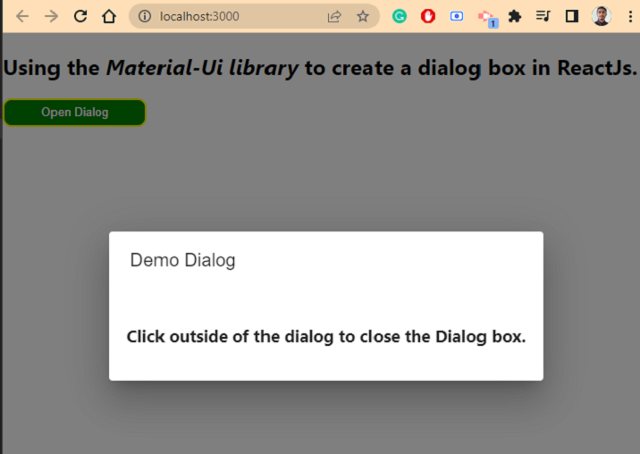
Example 1
In the example below, we have created the simple dialog box using the Material-UI library. We have created various functions to hide and show dialog boxes. Also, we have added the row HTML inside the Dialog component and given some styles.
import * as React from "react";
import DialogTitle from "@mui/material/DialogTitle";
import Dialog from "@mui/material/Dialog";
import { height } from "@mui/system";

export default function App(props) {
   const [openDialog, handleDisplay] = React.useState(false);

   const handleClose = () => {
      handleDisplay(false);
   };

   const openDialogBox = () => {
      handleDisplay(true);
   };
   const dialogStyle = {
      padding: "20px",
   };
   const buttonStyle = {
      width: "10rem",
      fontsize: "1.5rem",
      height: "2rem",
      padding: "5px",
      borderRadius: "10px",
      backgroundColor: "green",
      color: "White",
      border: "2px solid yellow",
   };
   return (
      <>
         <h2>
            Using the <i> Material-Ui library </i> to create a dialog box in ReactJs.
         </h2>
         <button style = {buttonStyle} onClick = {openDialogBox}>
            Open Dialog
         </button>
         <Dialog onClose = {handleClose} open = {openDialog}>
            <DialogTitle> Demo Dialog </DialogTitle>
            <h3 style = {dialogStyle}>
               Click outside of the dialog to close the Dialog box.
            </h3>
         </Dialog>
      </>
   );
}
Output
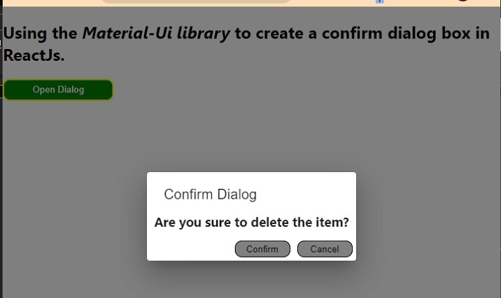
Example 2
In the example below, we have used the Material-Ui library to create a confirm box. The confirm box contains the confirm and cancel buttons. So, whatever button the user presses, we can perform some operations according to that.
Here, we just close the confirm box even when the user clicks confirm box. Still, developers can create separate functions and handle the confirm button click separately rather than just closing the confirm dialog.
import * as React from "react";
import DialogTitle from "@mui/material/DialogTitle";
import Dialog from "@mui/material/Dialog";

export default function App(props) {
   const [openDialog, handleDisplay] = React.useState(false);

   const handleClose = () => {
      handleDisplay(false);
   };

   const openDialogBox = () => {
      handleDisplay(true);
   };
   const buttonStyle = {
      width: "10rem",
      fontsize: "1.5rem",
      height: "2rem",
      padding: "5px",
      borderRadius: "10px",
      backgroundColor: "green",
      color: "White",
      border: "2px solid yellow",
   };
   const divStyle = {
      display: "flex",
      felxDirection: "row",
      position: "absolute",
      right: "0px",
      bottom: "0px",
      // padding: "1rem",
   };
   const confirmButtonStyle = {
      width: "5rem",
      height: "1.5rem",
      fontsize: "1rem",
      backgroundColor: "grey",
      color: "black",
      margin: "5px",
      borderRadius: "10px",
      border: "1px solid black",
   };
   return (
      <>
         <h2>
            Using the <i> Material-Ui library </i> to create a confirm dialog box in ReactJs.
         </h2>
         <button style = {buttonStyle} onClick = {openDialogBox}>
            Open Dialog
         </button>
         <Dialog onClose = {handleClose} open = {openDialog}>
            <DialogTitle> Confirm Dialog </DialogTitle>
            <h3 style = {{ marginTop: "-10px", padding: "5px 10px" }}>
                  Are you sure to delete the item? {" "}
            </h3>
            <br></br>
            <div style = {divStyle}>
               <button style = {confirmButtonStyle} onClick = {handleClose}>
                  Confirm
               </button>
               <button style = {confirmButtonStyle} onClick = {handleClose}>
                  Cancel
               </button>
            </div>
         </Dialog>
      </>
   );
}
Output
In this tutorial, we have seen two examples of creating various dialog boxes using the Material-Ui library. However, users can also use the react-js-dialog-box library, allowing developers to create and customize the dialog boxes.

13K+ Views
