
Article Categories
- All Categories
-
 Data Structure
-
 Networking
-
 RDBMS
RDBMS
-
 Operating System
-
 Java
Java
-
 MS Excel
-
 iOS
iOS
-
 HTML
HTML
-
 CSS
CSS
-
 Android
-
 Python
-
 C Programming
-
 C++
C++
-
 C#
C#
-
 MongoDB
-
 MySQL
MySQL
-
 Javascript
-
 PHP
PHP
-
 Economics & Finance
How to create progress bar in ReactJS?
We can use the progress bar to track how many percentage of a particular task is completed. Maybe you have seen the progress bar on many websites while uploading a file, and it is one of the best use cases of the progress bar to show the uploaded percentage of uploading the file.
Another best use case of the progress bar is showing the download completion percentage. We can use different CSS styles for the progress bar to animate and improve user experience.
In this tutorial, we will learn to create a progress bar using libraries and from scratch in ReactJS.
Use the react-progress-bar component of the ranmonak library
The react-progress-bar component of the ranmonak NPM package allows us to add a progress bar in the react application. Users need to execute the below command to the terminal to install the ranmonak library in the current react application.
npm i @ramonak/react-progress-bar
Syntax
Users can follow the syntax below to create the progress bar using react-progress-bar.
import ProgressBar from "@ramonak/react-progress-bar";
<ProgressBar completed={50} bgColor="grey" animateOnRender={true} />
We have imported the ProgressBar component from the ramonak/react-progress-bar in the above syntax.
Example
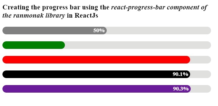
In the example below, we have used the ProgressBar component to create a progress bar. Also, we have passed the props to customize the progress bar. We have used the bgColor props to change the progress bar's background colour. We can pass the percentage for the progress bar as a value of completed props.
The animateOnRender prop allows us to animate the progress bar. The isLabelVisible allows us to show and hide the label on the progress bar.
import React from "react";
import ProgressBar from "@ramonak/react-progress-bar";
export default function App() {
   const mainDiv = {
      width: "600px",
   };
   return (
      <div style = {mainDiv}>
         <h3>
            {" "}
            Creating the progress bar using the <i> react-progress-bar component of the ranmonak library </i> in ReactJs
         </h3>
         <ProgressBar completed = {50} bgColor = "grey" animateOnRender = {true} />
         <br></br>
         <ProgressBar completed = {30} bgColor = "green" isLabelVisible = {false} />
         <br></br>
         <ProgressBar completed = {90} bgColor = "red" animateOnRender = {true} isLabelVisible = {false} />
         <br></br>
         <ProgressBar completed = {90.1} bgColor = "black" />
         <br></br>
         <ProgressBar completed = {90.3} animateOnRender = {true} />
      </div>
   );
}
Output
Use the ProgressBar component of react-bootstrap
The react-bootstrap library contains the ProgressBar component, which we can import into the application and use props to customize the progress bar.
Users can use the below command to install react-bootstrap and bootstrap libraries in the application.
npm install react-bootstrap bootstrap
Syntax
Users can follow the syntax below to use the ProgressBar component from the reactbootstrap library.
<ProgressBar now={70} label={`70% completed`} animated />
In the above syntax, we have passed the ?now? props to show the percentage in the progress bar.
Example
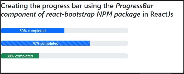
We have imported the ProgressBar component from react-bootstrap and CSS from Bootstrap libraries in the example below. After that, we created the multiple progress bar by passing various props to the ProgressBar component.
The ?animated? props allow us to animate the progress bar. We can pass the completed percentage as a value of the ?now? attribute. Also, we have used the label props to pass the label to the progress bar.
import React from "react";
import { ProgressBar } from "react-bootstrap";
import "bootstrap/dist/css/bootstrap.min.css";
export default function App() {
   const mainDiv = {
      width: "400px",
      textAlign: "center",
   };
   return (
      <div>
         <h4>
            {" "}
            Creating the progress bar using the{" "}<i> ProgressBar component of react-bootstrap NPM package </i> in  ReactJs
         </h4>
         <br></br>
         <div style = {mainDiv}>
            <ProgressBar now = {50} label = {`50% completed`} />
            <br></br>
            <ProgressBar now = {70} label = {`70% completed`} animated />
            <br></br>
            <ProgressBar now = {30} label = {`30% completed`} variant = "success" />
         </div>
      </div>
   );
}
Output
Create a progress bar from scratch in ReactJS
We can use HTML and CSS to create the progress bar from scratch in ReactJS. We can use two nested divs to create a progress bar and add CSS to customize the progress bar.
Syntax
Users can follow the syntax below to create a progress bar from scratch in ReactJS.
<div class = "mainDiv">
   <div class = "childDiv"></div>
</div>
In the above syntax, mainDiv works as a progress bar. We can set the width equal to the completed percentage of the childDiv.
Example
Filename - App.js
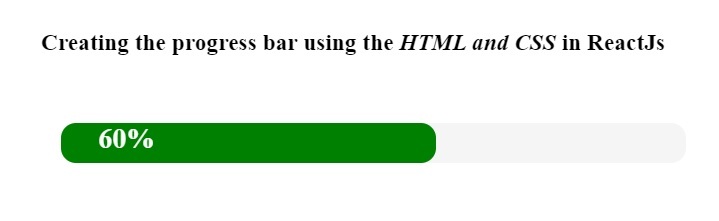
In the below file, we have created the div with the ?mainDiv? class name and added another div with the ?childDiv? class name. Also, we have added the <span> element inside the childDiv to set a label for the progress bar.
import React from "react";
import "./App.css";
export default function App() {
   return (
      <div>
         <h3>
            {" "}
            Creating the progress bar using the <i> HTML and CSS </i> in ReactJs
         </h3>
         <br></br>
         <div class = "mainDiv">
            <div class = "childDiv">
               <span class = "text"> 60% </span>
            </div>
         </div>
      </div>
   );
}
Filename - App.css
In the below file, we have given the width for the mainDiv. Also, we have applied some CSS to the progress bar. In the childDiv, we have set 60% width, showing the 60% completion percentage.
.mainDiv {
   height: 2rem;
   width: 500px;
   background-color: whitesmoke;
   border-radius: 12px;
   margin: 1rem;
}
.childDiv {
   height: 100%;
   width: 60%;
   background-color: green;
   border-radius: 12px;
   text-align: left;
}
.text {
   color: white;
   padding-left: 30px;
   font-size: 1.4rem;
   font-weight: 700;
}
Output
We have learned three approaches to creating a progress bar in this tutorial. Users can use the first and second approaches if they want to create a progress bar from the library, and users should use the third approach to create a progress bar from scratch.

10K+ Views
