- Excel Charts - Home
- Excel Charts - Introduction
- Excel Charts - Creating Charts
- Excel Charts - Types
- Excel Charts - Column Chart
- Excel Charts - Line Chart
- Excel Charts - Pie Chart
- Excel Charts - Doughnut Chart
- Excel Charts - Bar Chart
- Excel Charts - Area Chart
- Excel Charts - Scatter (X Y) Chart
- Excel Charts - Bubble Chart
- Excel Charts - Stock Chart
- Excel Charts - Surface Chart
- Excel Charts - Radar Chart
- Excel Charts - Combo Chart
- Excel Charts - Chart Elements
- Excel Charts - Chart Styles
- Excel Charts - Chart Filters
- Excel Charts - Fine Tuning
- Excel Charts - Design Tools
- Excel Charts - Quick Formatting
- Excel Charts - Aesthetic Data Labels
- Excel Charts - Format Tools
- Excel Charts - Sparklines
- Excel Charts - PivotCharts
Excel Charts - Introduction
In Microsoft Excel, charts are used to make a graphical representation of any set of data. A chart is a visual representation of data, in which the data is represented by symbols such as bars in a bar chart or lines in a line chart.
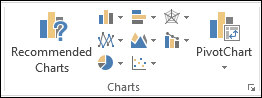
Charts Group
You can find the Charts group under the INSERT tab on the Ribbon.
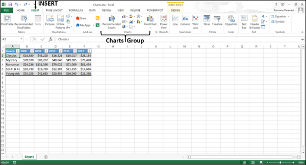
The Charts group on the Ribbon looks as follows −
The Charts group is formatted in such a way that −
Types of charts are displayed.
The subgroups are clubbed together.
It helps you find a chart suitable to your data with the button Recommended Charts.
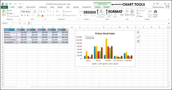
Chart Tools
When you click on a chart, a new tab Chart Tools is displayed on the ribbon. There are two tabs under CHART TOOLS −
- DESIGN
- FORMAT
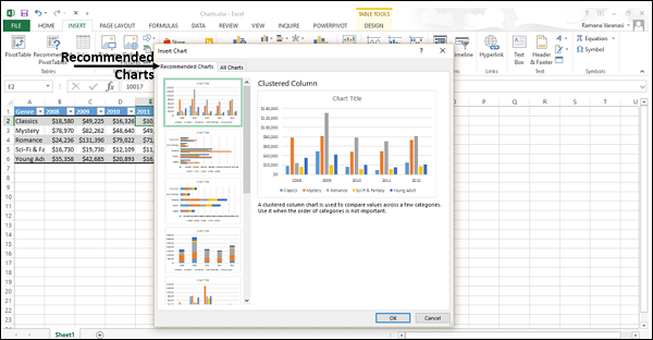
Recommended Charts
The Recommended Charts command on the Insert tab helps you to create a chart that is just right for your data.
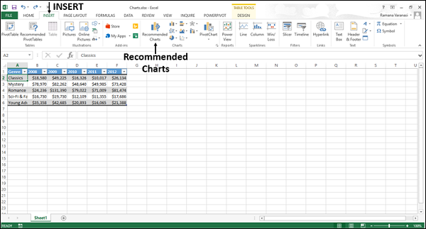
To use Recommended charts −
Step 1 − Select the data.
Step 2 − Click Recommended Charts.
A window displaying the charts that suit your data will be displayed.