
Article Categories
- All Categories
-
 Data Structure
-
 Networking
-
 RDBMS
RDBMS
-
 Operating System
-
 Java
Java
-
 MS Excel
-
 iOS
iOS
-
 HTML
HTML
-
 CSS
CSS
-
 Android
-
 Python
-
 C Programming
-
 C++
C++
-
 C#
C#
-
 MongoDB
-
 MySQL
MySQL
-
 Javascript
-
 PHP
PHP
-
 Economics & Finance
Create an interactive chart with series-selection checkbox in Excel
Most of the time, we will insert a chart in order to better present the data, and sometimes, we will use a chart that allows for more than one series option. In this particular scenario, you could wish to display the series by ticking the corresponding checkboxes.
Interactive Chart with Series-Selection
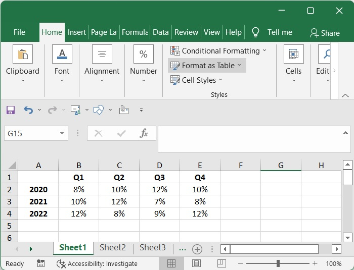
Suppose you have access to the financial data for a corporation called My Company Ltd., and you are interested in determining how the company's revenue has changed over the course of the last several quarters. At the same time, you should also evaluate the development in relation to the years that came before.
Step 1
Collect the quarterly results from 2020 to 2022 and organise them.
Step 2
For the creation of the checkbox, choose the Developer tab, then go to Insert, then Form Controls, and finally select the checkbox.
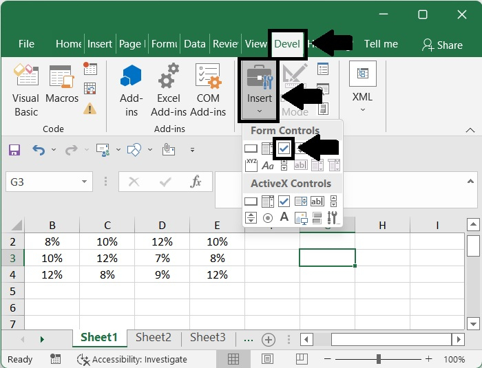
Step 3
You may enter the check box into the worksheet by clicking anywhere in the worksheet.
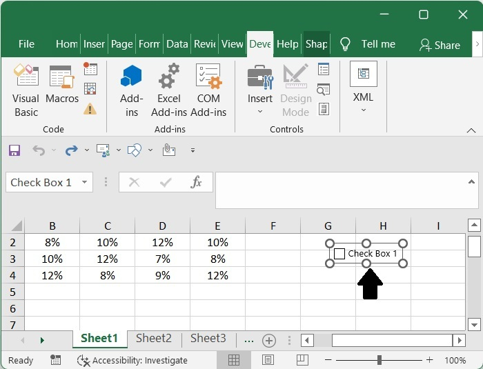
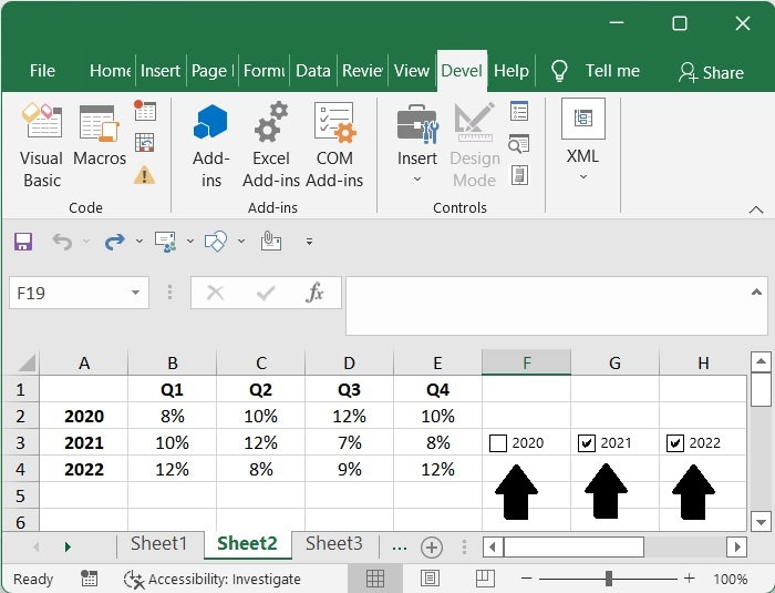
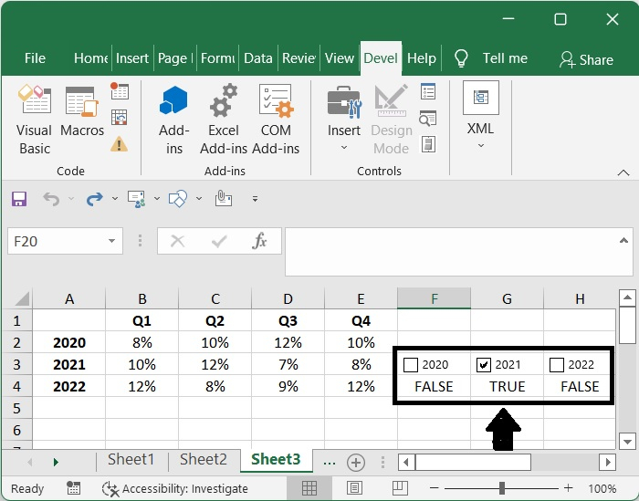
Then, give the first checkbox a name that begins with "2020" by rightclicking on it, selecting "Edit Text" from the context menu, and making the necessary changes (the first series name you will use in chart). It is necessary to repeat this step in order to alter the label of either checkbox 2 or checkbox 3.
Step 4
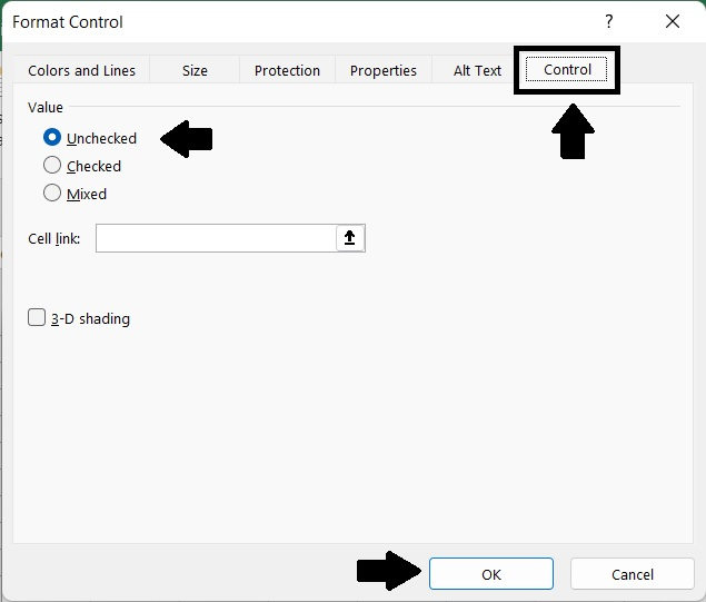
Right-click on the check box and choose Format Control,
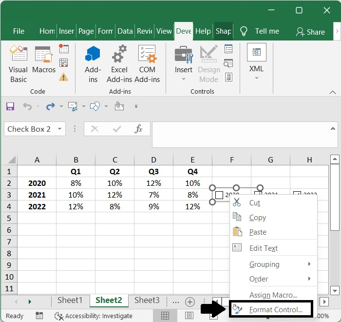
Then pick Unchecked in the Value section, set a link to an empty cell, and then click the OK button. The check box will be formatted. And repeat it for the other checkbox.
If the checkbox is ticked, return the value TRUE; otherwise, return the value FALSE. This is a must, so please verify it.
Step 5
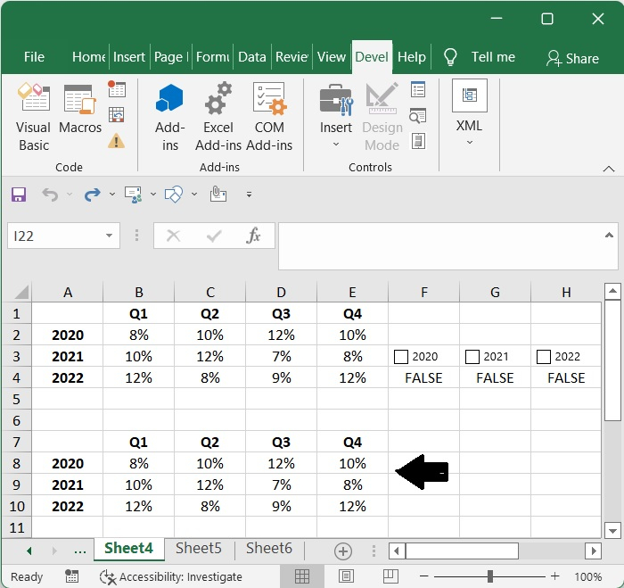
Make a copy of the raw data for the chart beginning at A1 and ending at E4 and paste it somewhere else.
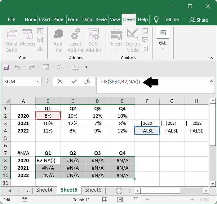
Step 6
=IF($F$4,B2,NA())
Erase all of the data, and then make use of the formula that is below ?
Here,
- $F$4 ? Indicates whether the checkbox's value is TRUE or FALSE.
- B2 ? Represents the actual value.

Verify that if you choose the particular checkbox, then the data for this year will be shown, and if not, # N/A will appear in its place.
Step 7
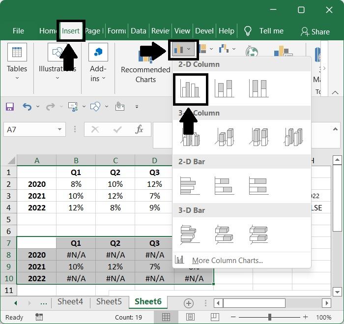
Now choose the data range that you pasted, but leave off the sources data.
After selecting all of the data, go to the Insert menu, then pick Charts, then Column, then Clustered Column. This will put a column chart into the document, and each quarter will have three column bars.
Step 8
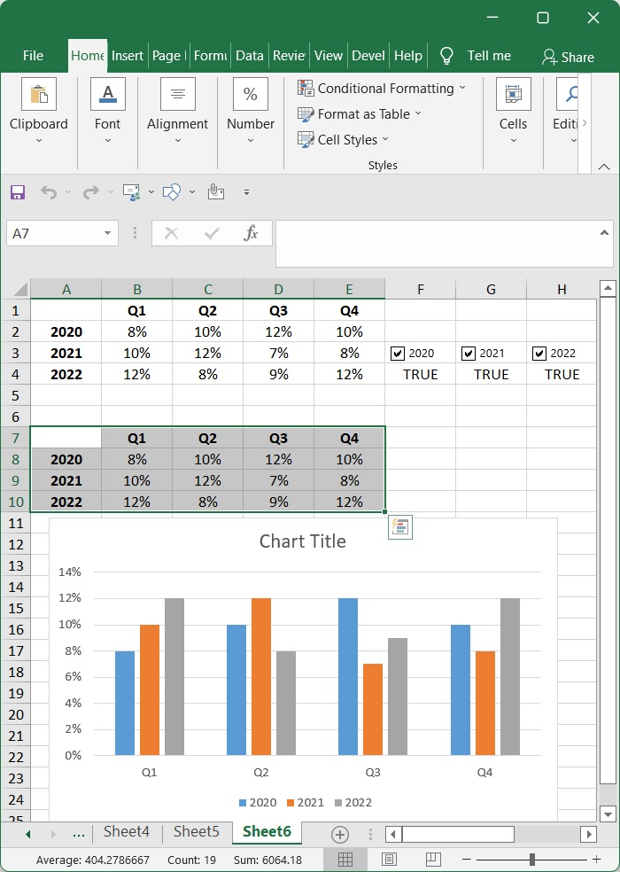
That brings us to the end of the discussion. You already have a dynamic chart prepared.
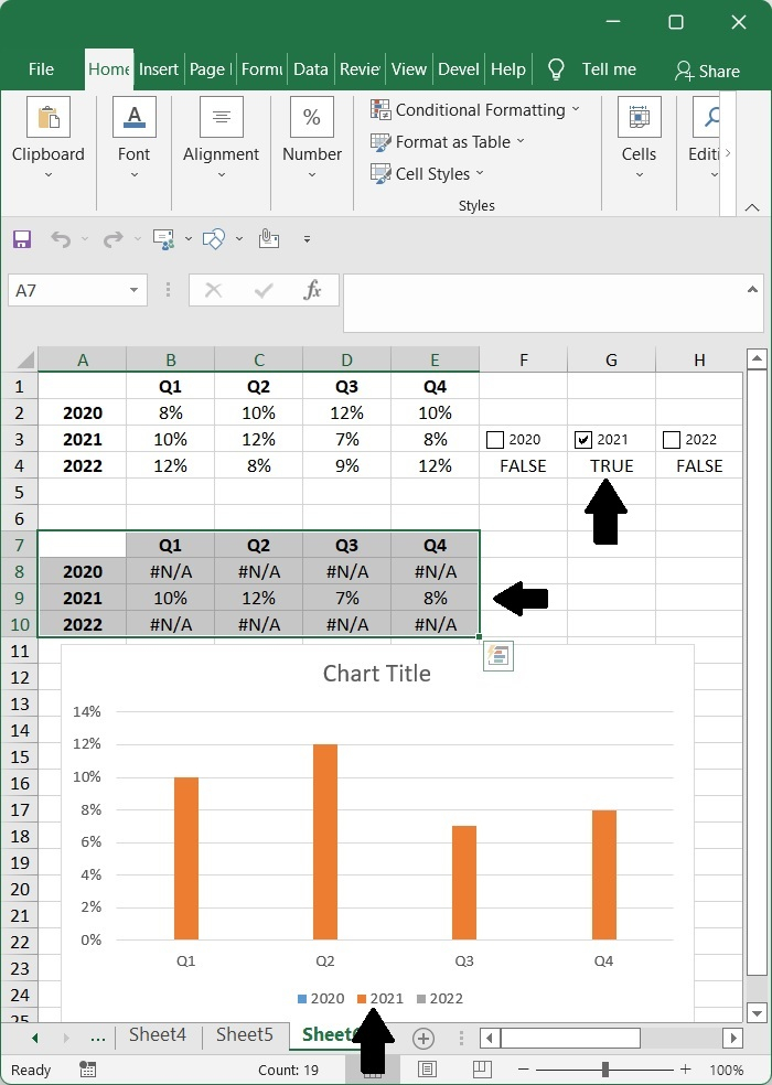
Now, if you uncheck the checkbox for a year, the data will be removed from the chart. However, if you check the box again, the data will be reinstated.

703 Views
