
Article Categories
- All Categories
-
 Data Structure
-
 Networking
-
 RDBMS
RDBMS
-
 Operating System
-
 Java
Java
-
 MS Excel
-
 iOS
iOS
-
 HTML
HTML
-
 CSS
CSS
-
 Android
-
 Python
-
 C Programming
-
 C++
C++
-
 C#
C#
-
 MongoDB
-
 MySQL
MySQL
-
 Javascript
-
 PHP
PHP
-
 Economics & Finance
How to create an Image Slider in ReactJS?
Image slider is crucial in any web application to show multiple images with good UX. Whenever we go on any prestigious site like amazon.com or cardekho.com, they show images in the slider, and these websites need to show multiple images for every product. Now, what if they show every single image without a slider, users can?t see the image properly, and it looks worst.
So, in this tutorial, we will learn various approaches to creating an image slider in ReactJS.
Use the react-simple-image-slider Npm package
The react-simple-image-slider allows us to create an image slider in ReactJS. Users need to download the NPM package by executing the following command in the project directory.
npm i react-simple-image-slider
After installing the react-simple-image-slider NPM package, users can import it into the application and use it.
Syntax
Users can follow the syntax below to use the simpleImageSlider component.
<SimpleImageSlider
   width={690}
   height={470}
   images={sliderImages}
   showNavs={true}
/>
In the above syntax, we used the SimpleImageSlider component and passed some props to the component.
Example
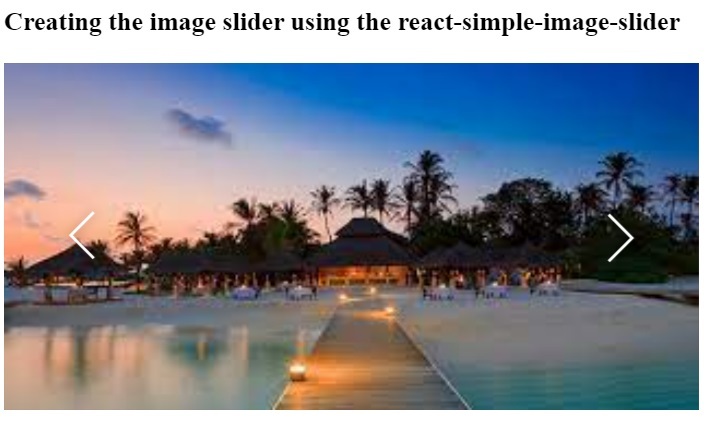
In the example below, we have created the basic image slider using the SImpleImageSlider component. We have passed the width and height values as a prop, and the number for width and height is in pixels. Also, we have created the sliderImages arrays of objects containing the URL as a property. After that, we passed the sliderImages array as a prop in the component.
import React from "react";
import SimpleImageSlider from "react-simple-image-slider";
export default function App() {
   const sliderImages = [
      {
         url: "https://encryptedtbn0.gstatic.com/images?q=tbn:ANd9GcTdUmK6fRPfPQIMyOxUOjiTnR2VYizvkkWUxLhGoVJNobm5Id3fpRhsIGtPj3H06ujPb4&usqp=CAU",
      },
      {
         url: "https://encryptedtbn0.gstatic.com/images?q=tbn:ANd9GcQduUpBWhSdgkWqqIrSmw5MMU697Xlx3SCjlB4eZSv0Q&s",
      },
      {
         url: "https://encryptedtbn0.gstatic.com/images?q=tbn:ANd9GcTnzApyh1ZmbXLBUg_iFRio23hzRyAJfwBRfnVozXdEnu-NK4jFt2_gsYujKf-CbT6Cr_A&usqp=CAU",
      },
      {
         url: "https://encryptedtbn0.gstatic.com/images?q=tbn:ANd9GcTDnfOIY9gjVyoT4ulMp55roiV5KefqaDByUc0HdD8p3tdpXuwxTaXjhLdyUFeQzZ2ZwE&usqp=CAU",
      },
      {
         url: "https://encryptedtbn0.gstatic.com/images?q=tbn:ANd9GcR3IVlvufXIDZXxq0O8SVqwU2HeO6y7as0OXJl-YT55BA&s",
      },
      {
         url: "https://encryptedtbn0.gstatic.com/images?q=tbn:ANd9GcQs_7aafRRY4vEbWz2wydowaogMmGI7mRVG6MQfZVtKDFXUGqt5iF-Mu0AYMQBEeznPkU&usqp=CAU",
      },
      {
         url: "https://smartslider3.com/wpcontent/uploads/2019/01/photo_slideshow.jpg",
      },
   ];
   return (
      <div>
         <h3>
            {" "}
            Creating the image slider using the react-simple-image-slider
         </h3>
         <SimpleImageSlider
            width={500}
            height={250}
            images={sliderImages}
            showNavs={true}
         />
      </div>
   );
}
Output
Example
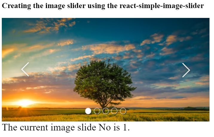
The SimpleImageSlider component takes various props to customize the image slider. Here, we have passed the showBullets prop to show the bullet indicator in the below slider. The showNav prop is used to show left and right arrows. The autoPlay prop allows us to change the image slider automatically, and also we have set the auto-play duration. Also, we invoke the callback function whenever the image slide changes and update the slide number.
import React, { useState } from "react";
import SimpleImageSlider from "react-simple-image-slider";
export default function App() {
   const [imageNum, setImageNum] = useState(1);
   const sliderImages = [
      {
         url: "https://img.freepik.com/free-photo/wide-angle-shot-singletree-growing-clouded-sky-during-sunset-surrounded-by-grass_181624-22807.jpg",
      },
      {
         url: "https://thumbs.dreamstime.com/b/lone-tree-meadow-sunriseidyllic-fabulous-landscapes-39659821.jpg",
      },
      {
         url: "https://encryptedtbn0.gstatic.com/images?q=tbn:ANd9GcSprPgYofGmXXPfuEDcZ_XI294n0bME5dTX9TGvINmPiA&s",
      },
      {
         url: "https://i.pinimg.com/474x/81/ca/47/81ca47eaae35615ba9a9bb57560aaa3c.jpg",
      },
      {
         url: "https://encryptedtbn0.gstatic.com/images?q=tbn:ANd9GcTof2fniv0mZzN8DByLmb6ILU4MvV_SGr_wptMeAut_dPaYMBkeHnHhD5egzU7MB0GSqE&usqp=CAU",
      },
   ];
   return (
      <div>
         <h3>
            {" "}
            Creating the image slider using the react-simple-image-slider
         </h3>
         <SimpleImageSlider
            width={500}
            height={250}
            images={sliderImages}
            showBullets={true}
            showNavs={true}
            autoPlay={true}
            onStartSlide = {(index, length) => {
               setImageNum(index);
            }}
               autoPlayDelay = {3}
         />
         <div style = {{ fontSize: "1.5rem" }}>
            The current image slide No is {imageNum}.
         </div>
      </div>
   );
}
Output
Create an image slider from scratch in ReactJS
This section will teach us to create an image slider from scratch. Here, we will create prevSlide(), and nextSlide() functions to change the images in the slider.
Before we start, users need to install the material ui library in the react project, as we will use the arrow icon from it.
npm install @mui/material @emotion/react @emotion/styled
Syntax
Users can follow the syntax below to change the images slides in the ReactJS slider.
<span class="kwd">const</span><span class="pln"> nextSlide </span><span class="pun">=</span><span class="pln"> </span><span class="pun">()</span><span class="pln"> </span><span class="pun">=></span><span class="pln"> </span><span class="pun">{</span><span class="pln">
   setCurrent</span><span class="pun">(</span><span class="pln">activeImageNum </span><span class="pun">===</span><span class="pln"> length </span><span class="pun">-</span><span class="pln"> </span><span class="lit">1</span><span class="pln"> </span><span class="pun">?</span><span class="pln"> </span><span class="lit">0</span><span class="pln"> </span><span class="pun">:</span><span class="pln"> activeImageNum </span><span class="pun">+</span><span class="pln"> </span><span class="lit">1</span><span class="pun">);</span><span class="pln">
</span><span class="pun">};</span><span class="pln">
</span><span class="kwd">const</span><span class="pln"> prevSlide </span><span class="pun">=</span><span class="pln"> </span><span class="pun">()</span><span class="pln"> </span><span class="pun">=></span><span class="pln"> </span><span class="pun">{</span><span class="pln">
   setCurrent</span><span class="pun">(</span><span class="pln">activeImageNum </span><span class="pun">===</span><span class="pln"> </span><span class="lit">0</span><span class="pln"> </span><span class="pun">?</span><span class="pln"> length </span><span class="pun">-</span><span class="pln"> </span><span class="lit">1</span><span class="pln"> </span><span class="pun">:</span><span class="pln"> activeImageNum </span><span class="pun">-</span><span class="pln"> </span><span class="lit">1</span><span class="pun">);</span><span class="pln">
</span><span class="pun">};</span>
In the above syntax, the activeImageNum variable keeps track of the current image in the slider. The nextSlide() function changes the value of the activeImageNum variable based on the current value of activeImageNum. The prevSlide() function decreases the value of the activeImageNum variable by 1.
Example
Filename - App.Js
In the below file, we have added the arrow icon to navigate images in the slider. We have used the arrow icons from the Material UI. When a user clicks the left arrow, we invoke the prevSlide() function, and when the user clicks the right arrow icon, we invoke the nextSlide() function.
In the HTML part, we check if the slide's index is equal to activeImageNum; only show the image; otherwise, hide the image.
import React from "react";
import { useState } from "react";
import ArrowBackIosIcon from "@mui/icons-material/ArrowBackIos";
import ArrowForwardIosIcon from "@mui/icons-material/ArrowForwardIos";
import "./App.css";
export default function App() {
   const sliderImages = [
      {
         url: "https://encryptedtbn0.gstatic.com/images?q=tbn:ANd9GcTdUmK6fRPfPQIMyOxUOjiTnR2VYizvkkWUxLhGoVJNobm5Id3fpRhsIGtPj3H06ujPb4&usqp=CAU",
      },
      {
         url: "https://encryptedtbn0.gstatic.com/images?q=tbn:ANd9GcQduUpBWhSdgkWqqIrSmw5MMU697Xlx3SCjlB4eZSv0Q&s",
      },
      {
         url: "https://encryptedtbn0.gstatic.com/images?q=tbn:ANd9GcTnzApyh1ZmbXLBUg_iFRio23hzRyAJfwBRfnVozXdEnu-NK4jFt2_gsYujKf-CbT6Cr_A&usqp=CAU",
      },
      {
         url: "https://encryptedtbn0.gstatic.com/images?q=tbn:ANd9GcTDnfOIY9gjVyoT4ulMp55roiV5KefqaDByUc0HdD8p3tdpXuwxTaXjhLdyUFeQzZ2ZwE&usqp=CAU",
      },
      {
         url: "https://encryptedtbn0.gstatic.com/images?q=tbn:ANd9GcR3IVlvufXIDZXxq0O8SVqwU2HeO6y7as0OXJl-YT55BA&s",
      },
      {
         url: "https://encryptedtbn0.gstatic.com/images?q=tbn:ANd9GcQs_7aafRRY4vEbWz2wydowaogMmGI7mRVG6MQfZVtKDFXUGqt5iF-Mu0AYMQBEeznPkU&usqp=CAU",
      },
      {
         url: "https://smartslider3.com/wpcontent/uploads/2019/01/photo_slideshow.jpg",
      },
   ];
   const [activeImageNum, setCurrent] = useState(0);
   const length = sliderImages.length;
   const nextSlide = () => {
      setCurrent(activeImageNum === length - 1 ? 0 : activeImageNum + 1);
   };
   const prevSlide = () => {
      setCurrent(activeImageNum === 0 ? length - 1 : activeImageNum - 1);
   };
   if (!Array.isArray(sliderImages) || sliderImages.length <= 0) {
      return null;
   }
   return (
      <div>
         <h2>
            {" "}
            Creating the image slider from scratch in ReactJS
         </h2>
         <section className = "image-slider">
            <div class = "left">
               <ArrowBackIosIcon onClick = {prevSlide} />
            </div>
            <div class="right">
               <ArrowForwardIosIcon onClick = {nextSlide} />
            </div>
            {sliderImages.map((currentSlide, ind) => {
               return (
                  <div
                     className={ind === activeImageNum ? "currentSlide active" : "currentSlide"}
                     key={ind}
                  >
                     {ind === activeImageNum && <img src={currentSlide.url} className="image" />}
                  </div>
               );
            })}
         </section>
      </div>
   );
}
Filename - App.css
.image-slider {
   position: relative;
   height: 400px;
   display: flex;
   justify-content: center;
   align-items: center;
}
.image {
   width: 450px;
   height: 300px;
   border-radius: 12px;
}
.left {
   position: absolute;
   left: 3rem;
   top: 50%;
   font-size: 1rem;
   color: blue;
   z-index: 5;
   cursor: pointer;
   user-select: none;
}
.right {
   position: absolute;
   right: 3rem;
   top: 50%;
   font-size: 2rem;
   color: blue;
   z-index: 5;
   cursor: pointer;
   user-select: none;
}
.currentSlide {
   transition-duration: 0.5s ease;
   opacity: 0;
}
.currentSlide.active {
   opacity: 1;
   transition-duration: 0.5s;
   transform: scale(1.2);
}
h2 {text-align: center;}
Output


19K+ Views
