
Article Categories
- All Categories
-
 Data Structure
-
 Networking
-
 RDBMS
RDBMS
-
 Operating System
-
 Java
Java
-
 MS Excel
-
 iOS
iOS
-
 HTML
HTML
-
 CSS
CSS
-
 Android
-
 Python
-
 C Programming
-
 C++
C++
-
 C#
C#
-
 MongoDB
-
 MySQL
MySQL
-
 Javascript
-
 PHP
PHP
-
 Economics & Finance
How to create discrete sliders in Material UI?
Developers can easily implement sliders thanks to the Slider component provided by Material UI. In the Material UI, sliders can either be continuous or discrete. While discrete sliders limit the selection to particular, predefined values, continuous sliders let users choose any value within a given range. In this article, we are going to learn how to create discrete sliders in Material UI.
What are Discrete Sliders?
The discrete slider allows the user only to select the value in a particular range as compared to the other sliders. To use the discrete sliders in React, we can adjust the slider to a specific value by referencing its value indicator. To perform this, we can create a mark for each step with a prop called ?marks? and assign its value to true.
API Used
<Slider> This API is used to create the slider component, allowing the users to make selections in a different range of items in React MUI
Props
aria-label This prop is used to add the slider label.
aria-labelledby This prop is used to add id of the element having slider label.
aria-valuetext This prop is used to add a name to the value of the slider.
classes This prop is used to override or add styles to component.
color This prop is used to add different colors to slider component.
components This prop is used to add components for each slider slot.
componentsProps This prop is used to add props for slot components.
defaultValue This prop is used to add defaut value.
disabled This prop is used to disable the slider component.
disableSwap This prop allows you to not swap the slider when moving pointer over a thumb while dragging another thumb.
getAriaLabel This prop is used to add a function returning the name of the slider label.
getAriaValueText This prop is used to add a function returning the current value of the slider label.
marks This prop is used to add predetermined value to the slider.
max This prop is used to add the max value to a slider.
min This prop is used to add the min value to a slider.
name This prop is used to add the name of hidden input.
onChange This prop is used to add a callback function when slider value is triggered.
orientation This prop is used to change slider component orientation.
size This prop is used to change the size of the slider.
slotProps This prop is used to add different props inside the slider.
slots This prop is used to add componen inside the slider.
step This prop is used to add the steps in the sliders.
sx This prop is used to add styles in Material UI.
track This prop is used to add different tracks to a slider.
value This prop is used to add a value to the slider.
valueLabelDisplay This prop is used to control the displayed value of label.
Steps to Create Discrete Sliders
Below are the steps for creating discrete sliders in Material UI with their respective syntaxes
Step 1: Create a React Application
Before we move further to create sliders, we must have a React application. To create a new React app, run the below commands in your terminal
npx create react app sliderproject
Once the project is created, navigate to its directory by running
cd sliderproject
Step 2: Install the Material UI
Once you have created the react app, it's time to install the Material UI into the react application. To install MUI, run the following command
npm install @mui/material @emotion/react @emotion/styled
Step 3: Import and Define the Slider
Now, let?s import and define the slider component in the main App component.
import React from "react";
import Slider from "@mui/material/Slider"

const App = () => {
   return (
      <div>
         <Slider
            defaultValue={30}
            step={10}
            marks
            min={10}
            max={110}
         />
      </div>
   );
};
export default App;
Step 4: Run the Project
To run the react MUI application, run the below command in the terminal
npm run start
That?s all about the creation of discrete sliders. Now, let?s see some examples of different approaches.
Example
In this example, we have created a discrete slider with small steps involved. When the user slides over the slider, the user can use the small steps to select any value on the slider.
import React from "react";
import Slider from "@mui/material/Slider"

const App = () => {
   function valuetext(val) {
      return `${val}`;
   }

   return (
      <div style={{padding: 40,width: '50%'}}>
         <Slider
            aria-label="Small steps"
            defaultValue={0.0004}
            getAriaValueText={valuetext}
            step={0.0004}
            marks
            min={0.0005}
            max={0.01}
            valueLabelDisplay="auto"
         />
      </div>
   );
};
export default App;
Output

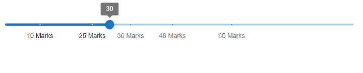
Example
In this example, we have created a discrete slider with custom marks. To create the custom marks, we first created an array of data having value and a label, and then passed the array to the ?marks? prop so that when the user slides over the slider, the user can use the custom steps to select any value on the slider.
import React from "react";
import Slider from "@mui/material/Slider"

const customMarks = [
   {
      value: 10,
      label: '10 Marks',
   },
   {
      value: 25,
      label: '25 Marks',
   },
   {
      value: 36,
      label: '36 Marks',
   },
   {
      value: 48,
      label: '48 Marks',
   },
   {
      value: 65,
      label: '65 Marks',
   },
];

const App = () => {

   function valuetext(val) {
      return `${val}`;
   }

   return (
      <div style={{padding: 40,width: '50%'}}>
         <Slider
            aria-label="custom marks"
            defaultValue={48}
            getAriaValueText={valuetext}
            step={10}
            marks={customMarks}
            valueLabelDisplay="on"
         />
      </div>
   );
};

export default App;
Output
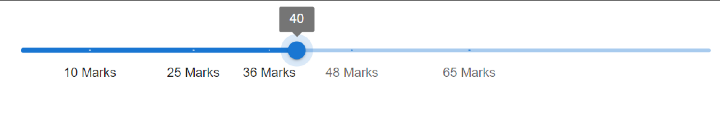
Example
In this example, we have created a discrete slider with restricted values. To restrict the user from selecting a specific value, use the step prop and pass the value as null. Now, when the user slides over the slider, the user cannot select any specific value on the slider except for the values defined to be used.
import React from "react";
import Slider from "@mui/material/Slider"

const customMarks = [
   {
      value: 10,
      label: '10 Marks',
   },
   {
      value: 25,
      label: '25 Marks',
   },
   {
      value: 36,
      label: '36 Marks',
   },
   {
      value: 48,
      label: '48 Marks',
   },
   {
      value: 65,
      label: '65 Marks',
   },
];

const App = () => {
   function valuetext(val) {
      return `${val}`;
   }

   return (
      <div style={{padding: 40,width: '50%'}}>
         <Slider
            aria-label="custom marks"
            defaultValue={48}
            getAriaValueText={valuetext}
            step={null}
            marks={customMarks}
            valueLabelDisplay="on"
         />
      </div>
   );
};

export default App;
Output
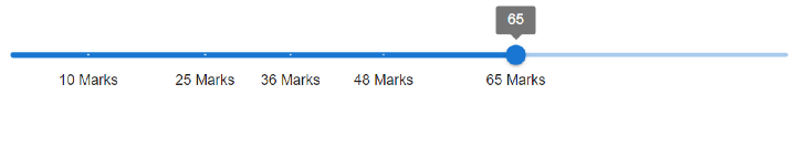
Example
In this example, we have created a discrete slider with always visible values.
import React from "react";
import Slider from "@mui/material/Slider"

const customMarks = [
   {
      value: 10,
      label: '10 Marks',
   },
   {
      value: 25,
      label: '25 Marks',
   },
   {
      value: 36,
      label: '36 Marks',
   },
   {
      value: 48,
      label: '48 Marks',
   },
   {
      value: 65,
      label: '65 Marks',
   },
];

const App = () => {

   function valuetext(val) {
      return `${val}`;
   }

   return (
      <div style={{padding: 40,width: '50%'}}>
         <Slider
            aria-label="custom marks"
            defaultValue={48}
            getAriaValueText={valuetext}
            step={15}
            marks={customMarks}
            valueLabelDisplay="on"
         />
      </div>
   );
};

export default App;
Output
Conclusion
In this article, we have learned how we can create discrete sliders using MUI in React. To have a complete understanding of the discrete sliders, we have learned the complete steps along with different examples and their outputs.

398 Views
