Article Categories
- All Categories
-
 Data Structure
-
 Networking
-
 RDBMS
RDBMS
-
 Operating System
-
 Java
Java
-
 MS Excel
-
 iOS
iOS
-
 HTML
HTML
-
 CSS
CSS
-
 Android
-
 Python
-
 C Programming
-
 C++
C++
-
 C#
C#
-
 MongoDB
-
 MySQL
MySQL
-
 Javascript
-
 PHP
PHP
-
 Economics & Finance
How can I use Tkinter to visualize time-series data?
Data visualization is a powerful tool for understanding and interpreting complex information. When it comes to analyzing time-series data, having a clear visual representation can greatly enhance our understanding of trends, patterns, and anomalies over time. Tkinter, the standard GUI toolkit for Python, provides a convenient and versatile platform for creating interactive data visualizations. In this article, we will explore how to leverage Tkinter to visualize time-series data effectively.
Understanding Time-Series Data
Before we dive into Tkinter and its capabilities, let's first establish a clear understanding of time-series data. Time-series data is a sequence of data points collected at regular intervals over time. It is commonly used in various domains, such as finance, weather forecasting, and stock market analysis. Each data point in a time series corresponds to a specific timestamp or time period, making it ideal for analyzing trends, patterns, and relationships over time.
Now, let's explore how we can utilize Tkinter to visualize time-series data effectively.
Step 1: Prepare the Data
First, we need to load and preprocess the time-series data. This involves reading the data from a file or a database, parsing timestamps, and organizing the data into a suitable format for visualization. Depending on the specific requirements of your data, you may need to perform data cleaning, aggregation, or transformation steps.
Step 2: Design the GUI
Next, we design the graphical user interface (GUI) using Tkinter. This involves creating the main window, defining the layout, and adding the necessary components for visualization, such as labels, buttons, and canvas.
import tkinter as tk

# Create the main window
window = tk.Tk()
window.geometry("720x500")

window.title("Time-Series Data Visualization")

# Create components for visualization
label = tk.Label(window, text="Time-Series Data Visualization")
label.pack()

canvas = tk.Canvas(window, width=800, height=400)
canvas.pack()

# Add other GUI components and configure layout

# Start the Tkinter event loop
window.mainloop()
Step 3: Plotting the Time-Series Data
Now, let's integrate the time-series data into our Tkinter visualization by plotting it on the canvas. We can use various Tkinter drawing methods, such as create_line, create_rectangle, or create_polygon, depending on the chosen visualization technique.
# Assuming 'data' is a list of (timestamp, value) tuples

# Convert timestamps to canvas coordinates
x_scale = canvas.winfo_width() / (max_timestamp - min_timestamp)
y_scale = canvas.winfo_height() / (max_value - min_value)

# Plot the time-series data
for i in range(len(data) - 1):
   x1 = (data[i][0] - min_timestamp) * x_scale
   y1 = canvas.winfo_height() - (data[i][1] - min_value) * y_scale
   x2 = (data[i + 1][0] - min_timestamp) * x_scale
   y2 = canvas.winfo_height() - (data[i + 1][1] - min_value) * y_scale

   canvas.create_line(x1, y1, x2, y2, fill="blue", width=2)
Step 4: Adding Interactivity
To enhance the visualization, we can add interactive features to the Tkinter application. For example, we can include buttons or sliders to control the time range or granularity, or tooltips to display additional information when hovering over data points.
Step 5: Enhancing the Visualization
To make the time-series data visualization more informative and visually appealing, we can incorporate additional elements such as axis labels, legends, color mapping, annotations, or interactive features like zooming or panning.
Step 6: Finalize and Refine
Once the basic time-series visualization is implemented, it is crucial to review and refine the visualization based on feedback and testing. This involves ensuring the accuracy of data representation, optimizing the performance of the visualization, and refining the visual elements for better clarity and aesthetics.
During this phase, consider gathering feedback from users or domain experts to ensure that the visualization effectively communicates the intended information and insights from the time-series data.
Example
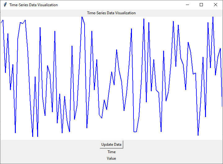
Below is a complete implementation example that incorporates all six steps mentioned above
import tkinter as tk
import random

# Step 1: Prepare the Data
data = []
timestamp = 0
for _ in range(100):
   data.append((timestamp, random.randint(0, 100)))
   timestamp += 1

# Step 2: Design the GUI
window = tk.Tk()
window.geometry("720x500")
window.title("Time-Series Data Visualization")

label = tk.Label(window, text="Time-Series Data Visualization")
label.pack()

canvas_width = 800
canvas_height = 400
canvas = tk.Canvas(window, width=canvas_width, height=canvas_height, bg="white")
canvas.pack()

# Step 3: Plotting the Time-Series Data
def plot_data():
   x_scale = canvas_width / len(data)
   y_scale = canvas_height / 100

   for i in range(len(data) - 1):
      x1 = i * x_scale
      y1 = canvas_height - data[i][1] * y_scale
      x2 = (i + 1) * x_scale
      y2 = canvas_height - data[i + 1][1] * y_scale

      canvas.create_line(x1, y1, x2, y2, fill="blue", width=2)

plot_data()

# Step 4: Adding Interactivity
def update_data():
   # Generate new random data
   data.clear()
   timestamp = 0
   for _ in range(100):
      data.append((timestamp, random.randint(0, 100)))
      timestamp += 1

   # Clear the canvas and replot the data
   canvas.delete("all")
   plot_data()

button = tk.Button(window, text="Update Data", command=update_data)
button.pack()

# Step 5: Enhancing the Visualization
x_label = tk.Label(window, text="Time")
x_label.pack()

y_label = tk.Label(window, text="Value")
y_label.pack()

# Step 6: Finalize and Refine
# Additional refinements can be made here based on specific requirements

# Start the Tkinter event loop
window.mainloop()
Output

Conclusion
In this article, we explored the steps involved in using Tkinter to visualize time-series data. We covered preparing the data, designing the GUI, plotting the time-series data, adding interactivity, and enhancing the visualization. By following these steps, you can create customized and interactive time-series visualizations to gain valuable insights from your data.
Data visualization with Tkinter opens up endless possibilities for exploring and understanding time-series data, empowering you to make data-driven decisions and uncover valuable insights. So, go ahead and leverage the power of Tkinter to visualize your time-series data in a meaningful and engaging way.


