
Article Categories
- All Categories
-
 Data Structure
-
 Networking
-
 RDBMS
RDBMS
-
 Operating System
-
 Java
Java
-
 MS Excel
-
 iOS
iOS
-
 HTML
HTML
-
 CSS
CSS
-
 Android
-
 Python
-
 C Programming
-
 C++
C++
-
 C#
C#
-
 MongoDB
-
 MySQL
MySQL
-
 Javascript
-
 PHP
PHP
-
 Economics & Finance
How can Tensorflow be used with Estimators to visualize the data, and the ROC curve?
The titanic dataset model can be visualized and the ROC curve can be visualized to understand the performance with the help of the ‘matplotlib’ and ‘roc_curve’ (which is present in the ‘sklearn.metrics’ module) methods respectively.
Read More: What is TensorFlow and how Keras work with TensorFlow to create Neural Networks?
We will use the Keras Sequential API, which is helpful in building a sequential model that is used to work with a plain stack of layers, where every layer has exactly one input tensor and one output tensor.
A neural network that contains at least one layer is known as a convolutional layer. We can use the Convolutional Neural Network to build learning model.
We are using the Google Colaboratory to run the below code. Google Colab or Colaboratory helps run Python code over the browser and requires zero configuration and free access to GPUs (Graphical Processing Units). Colaboratory has been built on top of Jupyter Notebook.
An Estimator is TensorFlow's high-level representation of a complete model. It is designed for easy scaling and asynchronous training.
Estimators use feature columns to describe how the model would interpret the raw input features. An Estimator expects a vector of numeric inputs, and feature columns will help describe how the model should convert every feature in the dataset.
Example
from sklearn.metrics import roc_curve
from matplotlib import pyplot as plt
print("The ROC curve, the true positive rate, and the false positive rate are plotted")
fpr, tpr, _ = roc_curve(y_eval, probs)
plt.plot(fpr, tpr)
plt.title('ROC curve')
plt.xlabel('false positive rate')
plt.ylabel('true positive rate')
plt.xlim(0,)
plt.ylim(0,)
Code credit −https://www.tensorflow.org/tutorials/estimator/linear
Output
The ROC curve, the true positive rate, and the false positive rate are plotted
(0.0, 1.05)
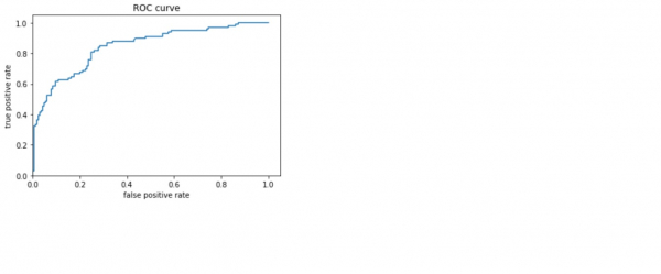
Explanation
- The receiver operating characteristic (ROC) is visualized.
- This gives an idea about the tradeoff between the true positive rate and false positive rate.

258 Views
