- Seaborn - Home
- Seaborn - Introduction
- Seaborn - Environment Setup
- Importing Datasets and Libraries
- Seaborn - Figure Aesthetic
- Seaborn- Color Palette
- Seaborn - Histogram
- Seaborn - Kernel Density Estimates
- Visualizing Pairwise Relationship
- Seaborn - Plotting Categorical Data
- Distribution of Observations
- Seaborn - Statistical Estimation
- Seaborn - Plotting Wide Form Data
- Multi Panel Categorical Plots
- Seaborn - Linear Relationships
- Seaborn - Facet Grid
- Seaborn - Pair Grid
- Seaborn Useful Resources
- Seaborn - Quick Guide
- Seaborn - cheatsheet
- Seaborn - Useful Resources
- Seaborn - Discussion
Seaborn.catplot() method
The Seaborn.catplot() method is used to plot categorical plots. With the use of one of many visual representations, this function gives users access to a number of axes-level functions that illustrate the connection between numerical data and one or more category variables. The underlying axes-level function is chosen by the kind parameter.
The kind parameter takes the following values and the distinction of the different categorical plots that can be drawn are listed below.
Categorical Scatter plots consist of cat plot, strip plot and swarm plot.
Categorical distribution plots consist of box plot, violin plot and boxen plot.
Categorical estimate plots consist of bar plot, point plot and count plot.
Syntax
Following is the syntax of seaborn.catplot() method.
seaborn.catplot(*, x=None, y=None, hue=None, data=None, row=None, col=None, col_wrap=None, estimator=<function mean at 0x7ff320f315e0>, ci=95, n_boot=1000, units=None, seed=None, order=None, hue_order=None, row_order=None, col_order=None, kind='strip', height=5, aspect=1, orient=None, color=None, palette=None, legend=True, legend_out=True, sharex=True, sharey=True, margin_titles=False, facet_kws=None, **kwargs
Parameters
Some of the parameters of this method are listed below.
| S.No | Name and Description |
|---|---|
| 1 | x,y These parameters take names of variables as input that plot the long form data. |
| 2 | data This is the dataframe that is used to plot graphs. |
| 3 | hue Names of variables in the dataframe that are needed for plotting the graph. |
| 4 | kind This parameter takes different values such as swarm, strip etc and the nature of the graph depends on this. |
| 5 | height These parameter takes scalar values and takes the height of the plot in inches. |
| 6 | aspect This parameter takes a scalar value. aspect*height will give the width of the plot. |
| 7 | orient It takes values h or v and the orientation of the graph is determined based on this. |
| 8 | row, col These are categorical variables from the dataframe that are to be plotted. |
Let us load the Seaborn library and the dataset before moving on to the developing the plots.
Loading the seaborn library
To load or import the Seaborn library the following line of code can be used.
Import seaborn as sns
Loading the dataset
In this article, we will make use of the Tips dataset inbuilt in the seaborn library. the following command is used to load the dataset.
tips=sns.load_dataset("tips")
The below mentioned command is used to view the first 5 rows in the dataset. This enables us to understand what variables can be used to plot a graph.
tips.head()
The below is the output for the above piece of code.
index,total_bill,tip,sex,smoker,day,time,size
0,16.99,1.01,Female,No,Sun,Dinner,2
1,10.34,1.66,Male,No,Sun,Dinner,3
2,21.01,3.5,Male,No,Sun,Dinner,3
3,23.68,3.31,Male,No,Sun,Dinner,2
4,24.59,3.61,Female,No,Sun,Dinner,4
Now that we have loaded the data, we will move on to plotting the data.
Example 1
In this example, we will understand how to generate a simple catplot() by passing x,y and hue parameters to the method.
to do so, the following line of code can be used.
import seaborn as sns
import matplotlib.pyplot as plt
tips=sns.load_dataset("tips")
tips.head()
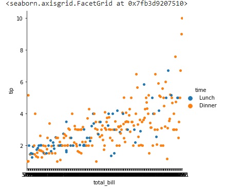
sns.catplot(data=tips,x="total_bill",y="tip",hue="time")
plt.show()
Output
The plot produced will look like the following image shown below.
Example 2
In this example, we will understand how to modify the size of the plot by using the height and aspect parameters. we will pass values to these parameters and observe the changes in the size of the plot.
import seaborn as sns
import matplotlib.pyplot as plt
tips=sns.load_dataset("tips")
tips.head()
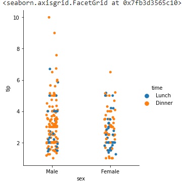
sns.catplot(data=tips,x="sex",y="tip",hue="time",height=5, aspect=.8)
plt.show()
the above line of code can be used to generate a catplot() with changed plot dimensions.
Output
the output graph produced for this will look like the below plot.
Example 3
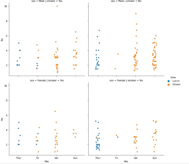
Since, catplot() plots categorical plots, we will understand the usage of row and col parameters. row and col parameters take categorical variables from the dataframe and plot them on the facet.
we are using the tips dataset and it has 4 categorical variables, sex, day, time and smoker. we are making use of all these four variables in the following plot.
import seaborn as sns
import matplotlib.pyplot as plt
tips=sns.load_dataset("tips")
tips.head()
sns.catplot(data=tips,x="day",y="tip",hue="time",col="smoker",row="sex")
plt.show()
The above line of code can be used to plot all four categorical variables in the tips dataset using the catplot() method.
Output
The output graph produced can be seen below.
Example 4
There are many parameters in the seaborn.catplot() method. Kind is a very useful parameter. The value passed to this parameter determines the nature of the plot drawn. it can take different values such as strip, swarm, box, violin, boxen, point, bar, or count.
The working of this parameter can be understood in the code given below.
import seaborn as sns
import matplotlib.pyplot as plt
tips=sns.load_dataset("tips")
tips.head()
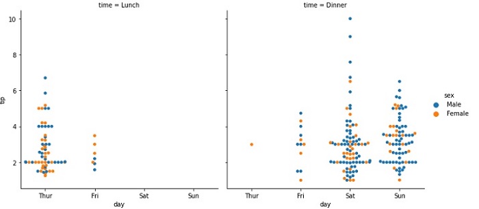
sns.catplot(data=tips,x="day",y="tip",hue="sex",col="time",kind="swarm")
plt.show()
Output
The output produced by the above line where kind of the plot is swarm can be seen below.