- Excel Power View - Home
- Overview
- Creation
- Sheet
- Visualizations
- Table Visualization
- Matrix Visualization
- Card Visualization
- Chart Visualizations
- Line Chart Visualization
- Bar Chart Visualization
- Column Chart Visualization
- Scatter & Bubble Chart Visualization
- Pie Chart Visualization
- Map Visualization
- Multiple Visualizations
- Tiles Visualizations
- Advanced Features
- Excel Power View and Data Model
- Hierarchies
- Key Performance Indicators
- Formatting a Report
- Sharing
Excel Power View - Visualizations
Power View is an interactive data exploration and visualization tool in Excel. Power View supports various visualizations such as Tables, Matrices, Cards, Charts such as Bar, Column, Scatter, Line, Pie and Bubble Charts and Maps. You can also create sets of multiple charts (charts with same axis) in Power View.
In this chapter, you will understand each Power View visualization briefly. You will understand the details in the subsequent chapters.
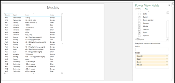
Table Visualization
For every visualization that you want to create on a Power View sheet, you have to start by creating a Table first. You can then quickly switch among the visualizations to find the one that best suits your data.
The Table looks like any other data table with columns representing fields and rows representing data values. You can select and deselect fields in the Power View Fields list to choose the fields that are to be displayed in the Table.
Switch Visualization
Once you create a Table visualization that is default, you can convert it into any other visualization as follows −
Click on Table visualization. Two tabs, POWER VIEW and DESIGN appear on the Ribbon.
Click the DESIGN tab.
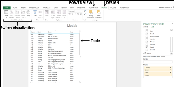
There are several visualization options in the Switch Visualization group on the Ribbon. You can choose any of these options.
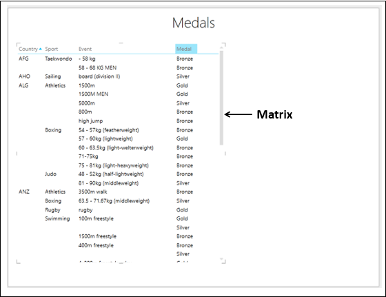
Matrix Visualization
Matrix Visualization is similar to a Table Visualization as it also contains rows and columns of data. However, a matrix has some additional features such as displaying the data without repeating values, displaying totals and subtotals by columns and/or rows, drill down/drill up a hierarchy, etc.
Card Visualization
In a card visualization, you will have a series of snapshots that display the data from each row in the table, laid out like an index card.
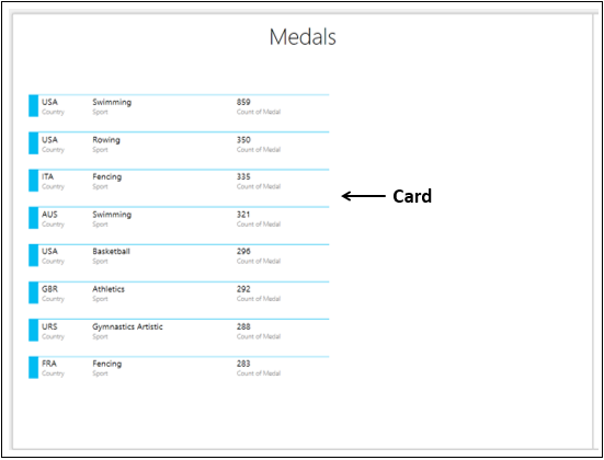
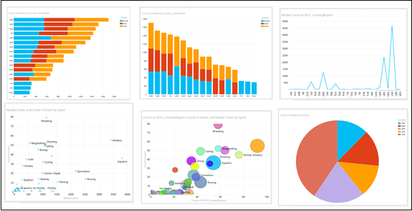
Chart Visualizations
In Power View, you have a number of Chart options: Bar, Column, Line, Scatter, Bubble, and Pie.
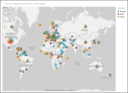
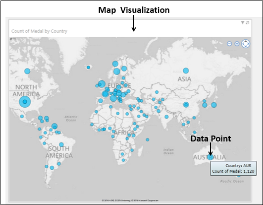
Map Visualization
If your data has fields pertaining to geography, you can use Maps in Power View to display the values. Maps in Power View use Bing map tiles and hence you need to make sure that you are online when you are displaying a Map visualization.
You can use Pie Charts for data points in a Map Visualization.