- Excel Power View - Home
- Overview
- Creation
- Sheet
- Visualizations
- Table Visualization
- Matrix Visualization
- Card Visualization
- Chart Visualizations
- Line Chart Visualization
- Bar Chart Visualization
- Column Chart Visualization
- Scatter & Bubble Chart Visualization
- Pie Chart Visualization
- Map Visualization
- Multiple Visualizations
- Tiles Visualizations
- Advanced Features
- Excel Power View and Data Model
- Hierarchies
- Key Performance Indicators
- Formatting a Report
- Sharing
Excel Power View - Pie Chart Visualization
Pie charts in Power View can be simple or sophisticated. You will learn about these two types of Power View visualizations and data exploration and visualization with Pie Charts in this chapter.
As you know, you need to start with a Table and then convert it to Pie Chart visualization.
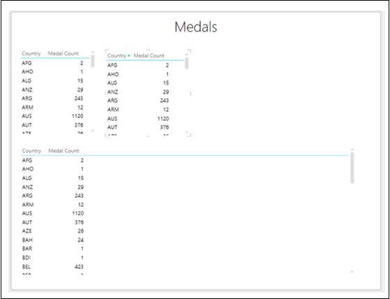
Select the fields Country and Medal Count. By default, Table will be displayed.
Add two more Tables to Power View with the same fields.
Adjust the size of the visualizations to appear as below.
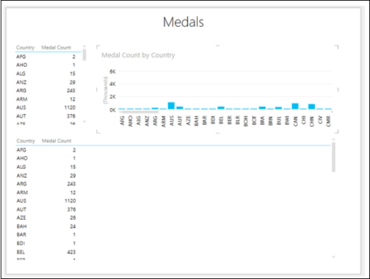
- Click on the Table to the top right side of the Power View.
- Click the DESIGN tab on the Ribbon.
- Click Column Chart in the Switch Visualization group.
- Click Stacked Column. The Table will be converted to Column Chart.
- Adjust the size of Column Chart to display more number of Country values.
Switching to Pie Chart Visualization
Convert the Table at the lower portion of Power View to Pie Chart as follows −
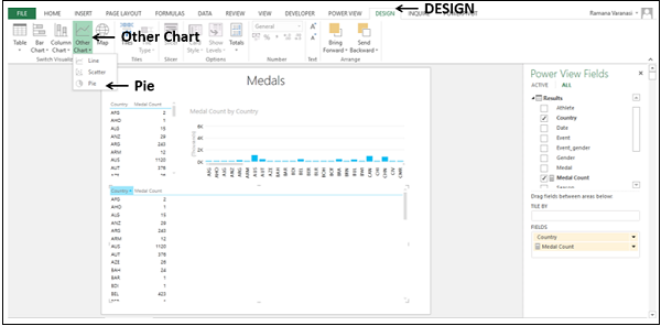
Click on the Table.
Click the DESIGN tab.
Click Other Chart in the Switch Visualization group.
Select Pie from the dropdown list.
The Table visualization will be converted to Pie Chart visualization. A warning message appears at the top of the Chart - Too many ountry values. Not displaying all data. Filter the data or choose another field.
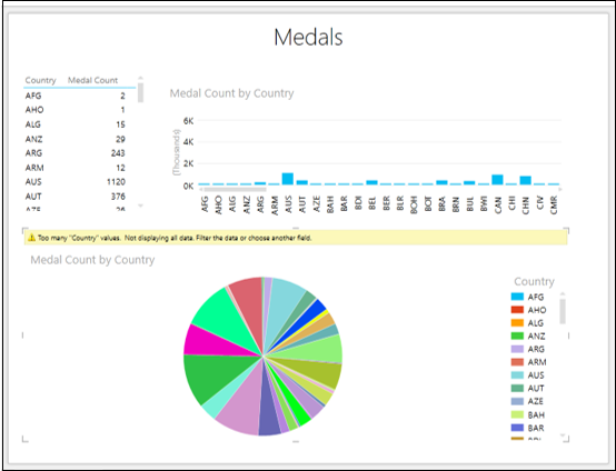
You can see that there are too many slices in the Pie chart as there are many Country values. Note that Pie Charts work well only when the number of categories is 8 or less.
You can reduce the number of categories by filtering the values as follows −
Set the filtering criteria as Medal Count is greater than or equal to 1300 in all the visualizations in Power View.
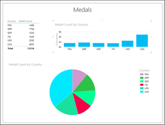
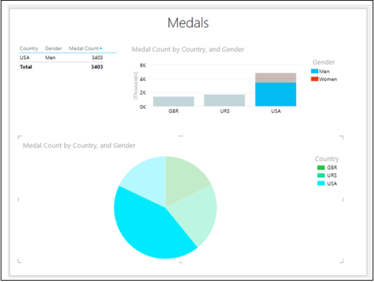
You have a Simple Pie Chart visualization, wherein the Medal Count values are shown by the Pie sizes and Country values by colors, as shown in the Legend.
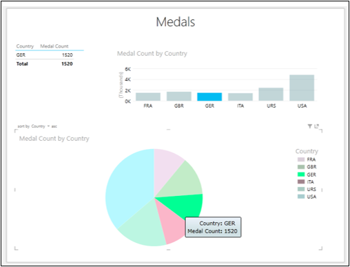
Exploring Data with Simple Pie Chart Visualization
You can explore data interactively with Simple Pie Chart as follows −
Click on a Pie slice. That slice will be highlighted and others will be inactive. The corresponding Column in the Column Chart also will be highlighted. In the Table, only the values corresponding to the highlighted Pie slice will be displayed.
Place the cursor on the highlighted Pie slice. The data values corresponding to that Pie slice will be displayed.
Sophisticated Pie Chart Visualizations
You can make your Pie Chart visualization sophisticated to add more powerful data exploration features. You have two types of Sophisticated Pie Chart visualizations −
- Pie Chart that drills down when you double-click on a Pie slice.
- Pie Chart that shows sub-slices within the larger Pie slices.
Exploring Data with Sophisticated Pie Chart Visualizations
Exploring Data with Pie Chart that drills down
Click on the Pie Chart.
Drag the field Gender to COLOR area, to below the field Country in the Power View Fields pane. This means you have two categories.
In the Table, add Gender to FIELDS.
In the Column Chart, add Gender to LEGEND area.
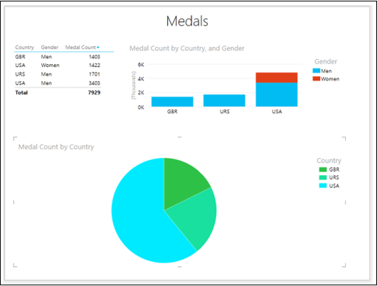
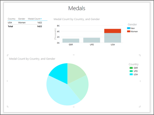
In the Pie Chart, there is a single slice with one color for each category - Country.
Double-click on the USA slice. The Pie Chart in your Power View will be changed to show values by Gender, which is the second category, for the selected first category (USA). The colors of the Pie Chart now show the percentages of the second field, i.e., Gender, corresponding to Country - USA. In other words, the Pie Chart was drilled down.
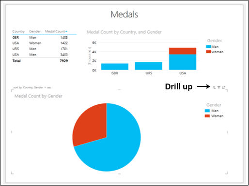
A small arrow - Drill up appears on the top right corner of the Pie Chart.
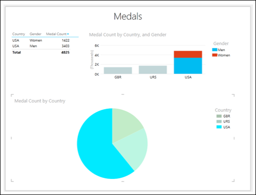
Click on a Pie slice. That Pie slice will be highlighted and the other one will become inactive.
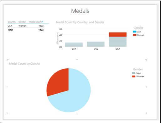
The Table is filtered showing only the values corresponding to the highlighted Pie slice. In the Column Chart, the portion of the Column corresponding to the highlighted Pie slice is highlighted and the rest becomes inactive.
- Click the drill up arrow. The Pie Chart returns to its previous state.
- Click on the Pie slice USA
The Pie slice is highlighted. The Table is filtered to show only those values. In the Column Chart, the Column corresponding to the Pie slice is highlighted.
Exploring Data with Pie Chart that shows sub-slices
To explore data with Pie chart that shows sub-slices, proceed as follows −
Click on the Pie Chart.
Drag the field Gender from COLOR area to SLICES area in the Power View Fields pane.
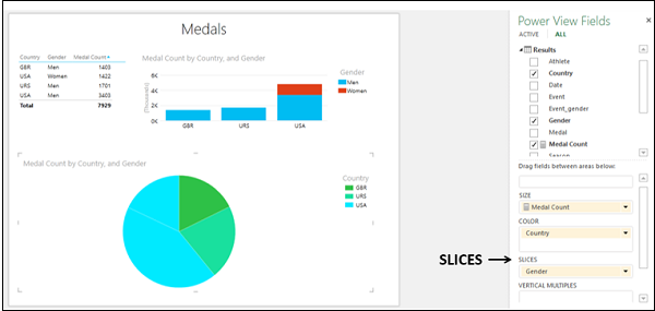
In the Pie Chart, there are two Pie slices of same color for the Country value - USA. Click on one of these Pie slices.
You will observe the following changes in Power View −
In the Pie Chart, the selected Pie slice is highlighted and other slices are grayed out.
In the Column Chart, the Column for the Country value USA highlights the Medal Count for the selected Pie slice.
The Table shows only the values corresponding to the selected Pie slice.
Click on the other Pie slice of the Country value USA. You will observe the changes as given above for this selected Pie slice.