- Excel Power View - Home
- Overview
- Creation
- Sheet
- Visualizations
- Table Visualization
- Matrix Visualization
- Card Visualization
- Chart Visualizations
- Line Chart Visualization
- Bar Chart Visualization
- Column Chart Visualization
- Scatter & Bubble Chart Visualization
- Pie Chart Visualization
- Map Visualization
- Multiple Visualizations
- Tiles Visualizations
- Advanced Features
- Excel Power View and Data Model
- Hierarchies
- Key Performance Indicators
- Formatting a Report
- Sharing
Excel Power View - Advanced Features
In the previous chapters you have learnt about the different possible Power View visualizations, Multiples and Tiles. The fields you select for display in the visualizations depend on what you want to explore, analyze and present. For example, in most of the visualizations that you have seen so far, we have chosen Medal to analyze Medal Count by medal type. You might want to explore, analyze and present the data gender-wise. In such a case, you need to choose the field Gender.
Further, visualization also depends on the data you are displaying. Throughout this tutorial, we have chosen Olympics data in order to visualize the power of Power View, the ease with which you can handle large data and switch over different visualizations on the fly. However, your data set might be different.
You need to choose a visualization that best suits your data. If you are not sure about the suitability, you can just play around with the visualizations to choose the right one as switching across the visualizations is quick and simple in Power View. Moreover, you can also do it in the presentation view, in order to answer any queries that can arise during a presentation.
You have also seen how you can have a combination of visualizations in a Power View and the interactive nature of the visualizations. You will learn advanced features in Power View in this chapter. These features come handy for reporting.
Creating a Default Field Set for Table
You might have to use the same field set for different visualizations in a Power View. As you are aware, to display any visualization, you need to create a Table visualization first. If the fields for the Table visualization are from the same data table, you can create a default field set for Table so that you can select the default field set with one click, instead of selecting the fields for the Table visualization repeatedly.
Click the POWERPIVOT tab on the Ribbon.
Click Manage in the Data Model group.
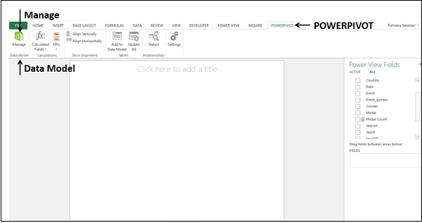
The Power Pivot window appears −
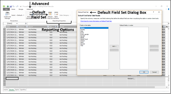
Click the tab Results to display the Results data table in the Power Pivot window.
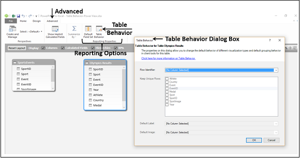
Click the Advanced tab on the Ribbon.
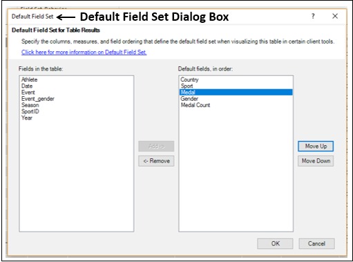
Click Default Field Set in the Reporting Options group. The Default Field Set dialog box appears.
Click the Fields you want to select holding down the Ctrl key in the Fields in the table box.
Click Add.
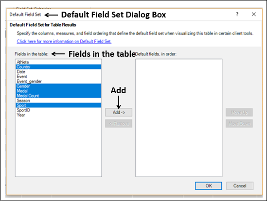
The selected fields appear in the Default fields, in order box on the right side.
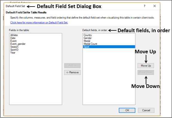
Click the Move Up or Move Down buttons to order the fields in the Default fields, in order box and click OK.
Click on the Power View sheet in the Excel window. A message Data Model is changed appears and click OK to make those changes in Power View.
Click on the data table name Results in the Power View Fields list. Table visualization with the default field set appears in Power View
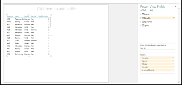
Note that you have to click only on the data table name in the Power View Fields list to select the default field set. If you click on the arrow next to data table name, it expands showing all the fields in the data table and in Power View, Table visualization does not appear.
Click in the empty space to the right of Table visualization in Power View.
Click on the data table name - Results in the Power View Fields list. Another Table visualization with the default field set appears in Power View.

As you can see, you are able to create a Table visualization with 5 fields in the desired order with a single click using the default field set. This eliminates the cumbersome selection of the 5 fields in the desired order with 5 clicks each time you want to display a
Table (or any other) visualization. However, you should be sure of which fields should be in the default field set in a data table. Hence, this feature can be used after data exploration, visualization is complete, and you are ready to produce reports. You might have to produce several reports, in which case this feature comes handy.
Setting Table Behavior
You can set the default table behavior that Power View uses to create report labels automatically for the data table. This becomes useful when you create visualizations from the same data table, perhaps for many different reports.
Suppose you have a data table Olympics Results in the Data Model
Click on the data table Olympics Results in the Power Pivot window.
Click the Advanced tab on the Ribbon.
Click Table Behavior in the Reporting Options group. The Table Behavior dialog box appears
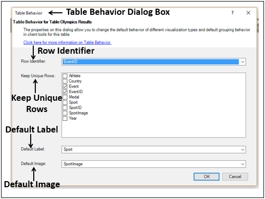
Select EventID under the Row Identifier box. This column should have unique values in the data table.
Check the boxes Event and EventID in the Keep Unique Rows box. These columns should have row values that are unique, and should not be aggregated when creating Power View reports.
Select Sport in the Default Label box.
Select SportImage in the Default Image box.
Click OK.
To visualize the Table behavior that you have set, select the fields as follows −
Click on Power View.
Select the fields Sport, SportImage, Event, Year, Athlete, Country and Medal in that order. By default, Table visualization appears.
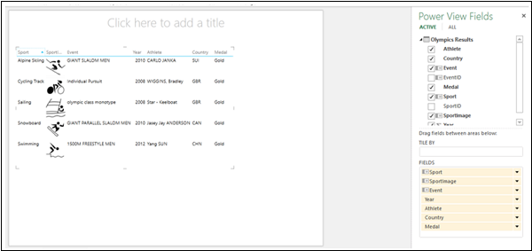
Switch visualization to Card.
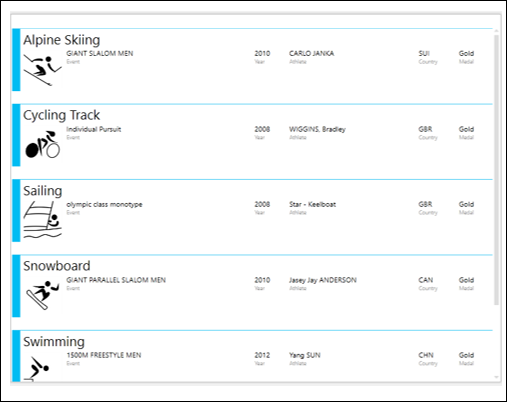
The Sport field values are larger than the other field values and appear as headings for the Cards. This is because you have set Sport as the Default Label in the Table Behavior dialog box. Further, you have set SportImage as the Default Image that appears on each Card based on the Sport value.
Filtering Values in a View
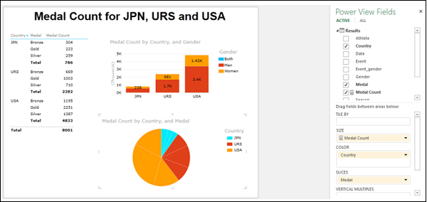
Suppose you have three Power View visualizations Matrix, Stacked Column Chart and sophisticated Pie Chart in the same Power View, each displaying different aspects of data.
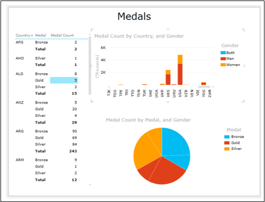
You can see that all the three visualizations are displaying data for all the Country values.
Suppose you want to display data only for USA, URS and JPN. You can apply the filter criteria on the field Country in View rather than in each visualization separately.
Click in the Filters area.
Click the VIEW tab. The Filters area will be empty and no fields will be displayed, as you have not yet selected any.
Drag the field Country from Power View Fields list to Filters area. The field Country with all the values appears in the Filters area.
Check the boxes - USA, URS and JPN.
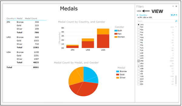
You can see that all the visualizations in the Power View were filtered at once.
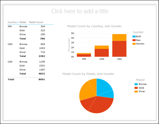
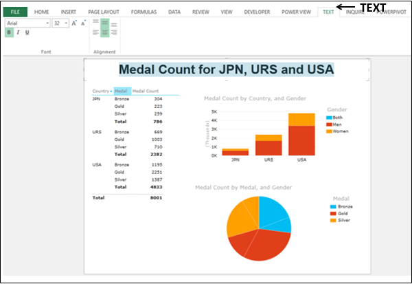
Adding Title to Power View
The Title in the Power View is common to all visualizations. Hence, it should be meaningful across the visualizations. At the top of the Power View, you will see Click here to add a title.
- Click the placeholder and type Medal Count for JPN, URS and USA.
- Click the Text tab on the Ribbon and format the Title.
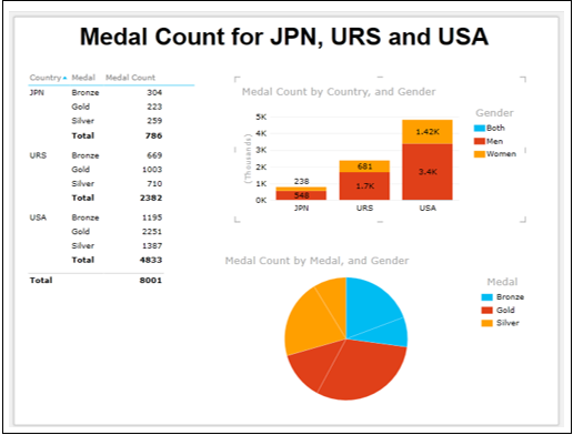
Adding Data Labels in a Chart Visualization
You can add Data Labels in a Chart visualization.
Click on the Clustered Column Chart.
Click the LAYOUT tab on the Ribbon.
Click Data Labels in the Labels group.
Select Show from the dropdown list.
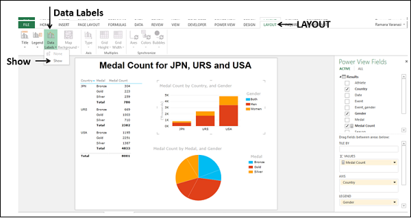
Data Labels appear in the Column Chart.
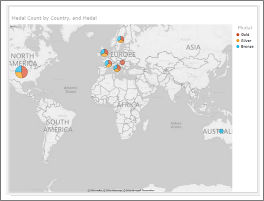
Interactive Data Visualization in Power View
The efficiency of Power View is in its ability to make you visualize data interactively within no time.
- Click on the Pie Chart.
- Drag Medal from COLOR area to SLICES area.
- Drag Country from Power View Fields list to COLOR area.
The Pie Chart shows Country values JPN, URS and USA as you have applied this filter to VIEW.
Click on the Pie Slice USA, Gold.
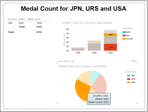
The Matrix is filtered to show only the values corresponding to the highlighted Pie Slice. In the Column Chart, the distribution of Gold Medals among Men and Women is highlighted for USA. Thus, efficient presentations with Power View is just a click away.
Changing the Sort Order of a Field
As you are aware, each field will have default sort order. In the visualizations that you have seen so far, the Medal field is sorted by the default order Bronze, Gold, and Silver. This is because the text field is sorted in ascending order. However, while reporting, you might want to display the order as Gold, Silver and Bronze as it would be more appealing.
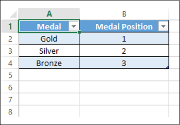
Add a field by which you can sort the Medal field in the desired order as follows −
- Create a new worksheet in your workbook.
- Create an Excel table as given below.
- Name the table as Medal_Position.
Click the POWERPIVOT tab on the Ribbon.
Click on Add to Data Model in the Tables group.
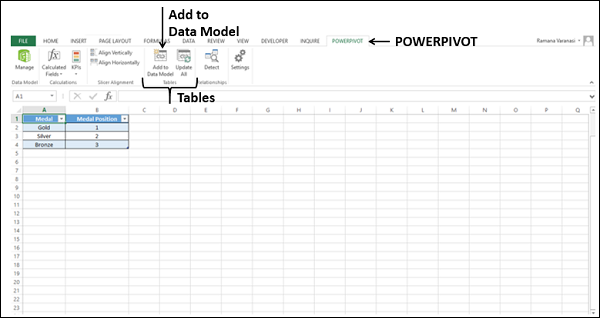
The table Medal_Position will be added to Data Model as a data table.
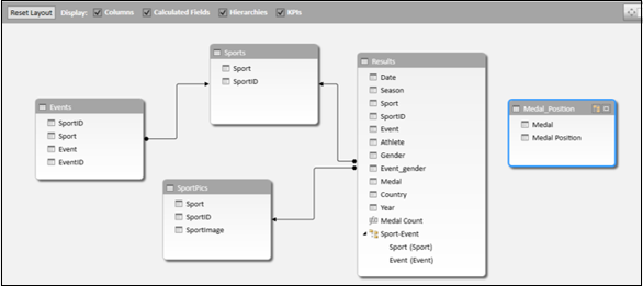
Create a relationship between the data tables Results and Medal Position with the field Medal.
Add the field Medal Position to Results data table as follows −
- Click on the Data View in the Power Pivot window.
- Click the Results tab.
- Click the Design tab on the Ribbon.
- Click Add.
- The Add Column on the extreme right of the data table will be highlighted.
- Type the following DAX formula in the formula bar and press Enter.
=RELATED(Medal_Position[Medal Position])
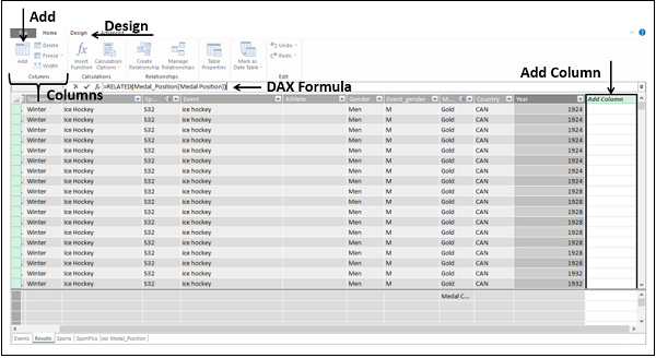
A new column will be added to the Results data table. The header of the column would be Calculated Column1.
Change the column header to Medal Position by double clicking on it.
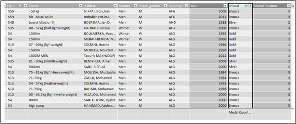
As you can observe, the Medal Position column is filled as per the values in the Medal column and as defined in the Medal_Position data table.
Specify how Power View should sort the Medal field as follows −
Select the Medal column.
Click the Home tab on the Ribbon.
Click Sort by Column in the Sort and Filter group.
Select Sort by Column from the dropdown list.
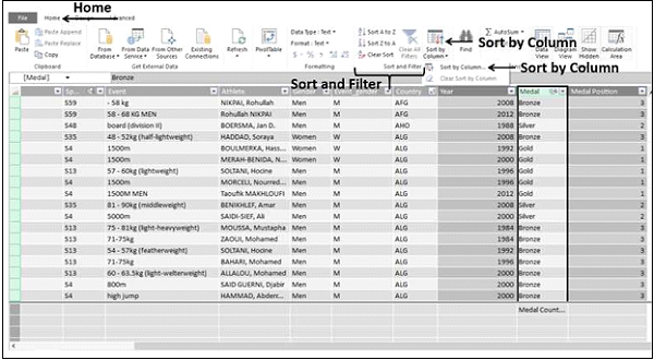
The Sort by Column dialog box appears.
- Ensure Medal is in the Sort Column box.
- Select Medal Position in the By Column box.
- Click OK.
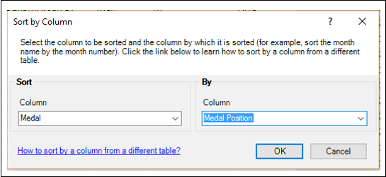
The visualizations will be updated automatically to the new sort order.
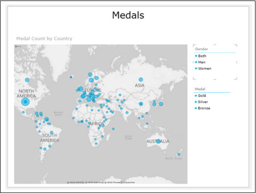
Filtering Visualizations with Slicers
You can filter Power View visualizations with Slicers.
Click on Power View next to the Map.
Drag the field Gender from Power View Fields list to Power View. A Table appears by default.
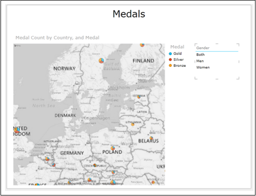
Click the DESIGN tab on the Ribbon.
Click Slicer in the Slicer group.
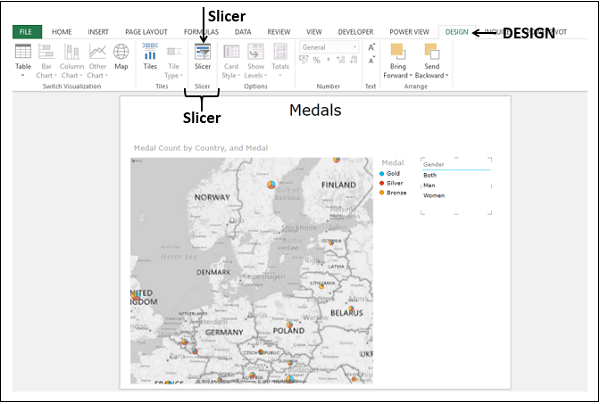
The table will be converted to a Slicer.
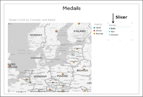
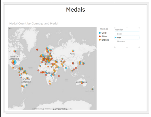
When you click any of the options in the Slicer, the Map will immediately reflect the selection. Click Men.
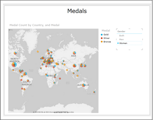
Now click Women.
You can have any number of Slicers in Power View.
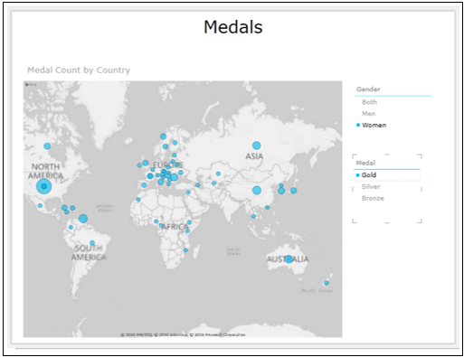
Click on the Map.
Deselect the field Medal.
Click Power View in any empty space.
Drag the field Medal to Power View. The table appears by default.
Click Slicer on the Ribbon. Another Slicer Medal appears in Power View.
You can have any combination of filters with the two Slicers.
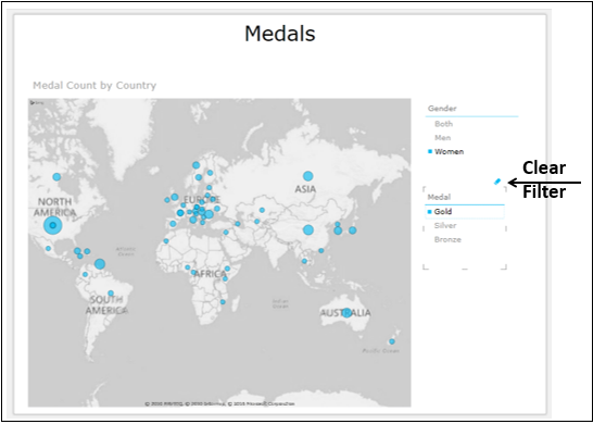
- Click on Women in the Gender Slicer.
- Click on Gold in the Medal Slicer.
You can clear a filter by clicking on the Clear Filter icon that looks like Eraser on the top right corner of the Slicer.
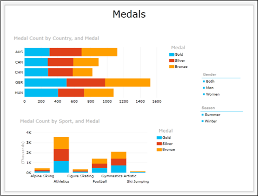
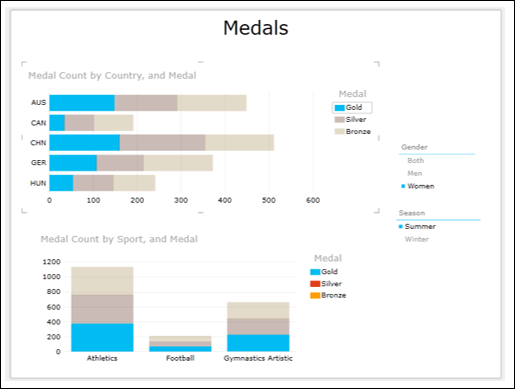
Creating Interactive Bar and Column Charts
You can have interactive Bar and Column Charts in a Power View.
- Create a Table with Country and Medal Count.
- Switch to Stacked Bar Chart.
- Create a Table with Sport and Medal Count.
- Switch to Stacked Column Chart.
- Add a Slicer for Gender.
- Add a Slicer for Season.
- Filter Stacked Bar Chart to display few Country values.
- Filter Stacked Column Chart to display few Sport values.
You Power View looks as follows −
- Click on Summer in Season Slicer.
- Click on Women in Gender Slicer.
- Click on Gold in the Legend.
You can select any combination of the filters and display the results immediately.
